 Blog
Blog

Here are CSS clip paths for common shapes we usually use on our web designs. You can apply it to an HTML element with a background color or a background image. This can also be applied directly to images to get the desired clipping effect.
Check out the demo below for clipped background images and related CSS clip-path codes for them. You can also use this awesome tool to upload your image file and clip it as you wish.
Demo
Tool Link - https://tools.webdevpuneet.com/css-clip-path-generator/
Open demo in a full window - https://demos.webdevpuneet.com/css/clipping/background-clippings.html
CSS usage
.select-element{
  height: 200px;
  width: 200px;
  background: url('https://webdevpuneet.com/wp-content/uploads/2021/05/cat1.png') no-repeat center center;
  clip-path: polygon(50% 0%, 100% 38%, 82% 100%, 18% 100%, 0% 38%); /* Clip Path */
}
Clip path codes for various shapes:
Triangle

clip-path: polygon(50% 0%, 0% 100%, 100% 100%);
Trapezoid

clip-path: polygon(20% 0%, 80% 0%, 100% 100%, 0% 100%);
Parallelogram

clip-path: polygon(25% 0%, 100% 0%, 75% 100%, 0% 100%);
Rhombus

clip-path: polygon(50% 0%, 100% 50%, 50% 100%, 0% 50%);
Pentagon

clip-path: polygon(50% 0%, 100% 38%, 82% 100%, 18% 100%, 0% 38%);
Hexagon

clip-path: polygon(25% 0%, 75% 0%, 100% 50%, 75% 100%, 25% 100%, 0% 50%);
Heptagon

clip-path: polygon(50% 0%, 90% 20%, 100% 60%, 75% 100%, 25% 100%, 0% 60%, 10% 20%);
Octagon

clip-path: polygon(30% 0%, 70% 0%, 100% 30%, 100% 70%, 70% 100%, 30% 100%, 0% 70%, 0% 30%);
Nonagon

clip-path: polygon(50% 0%, 83% 12%, 100% 43%, 94% 78%, 68% 100%, 32% 100%, 6% 78%, 0% 43%, 17% 12%);
Decagon

clip-path: polygon(50% 0%, 80% 10%, 100% 35%, 100% 70%, 80% 90%, 50% 100%, 20% 90%, 0% 70%, 0% 35%, 20% 10%);
Star

clip-path: polygon(50% 0%, 61% 35%, 98% 35%, 68% 57%, 79% 91%, 50% 70%, 21% 91%, 32% 57%, 2% 35%, 39% 35%);
Circle

clip-path: circle(50% at 50% 50%);
Frame
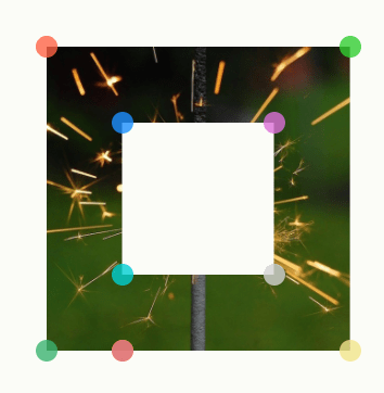
clip-path: polygon(0% 0%, 0% 100%, 25% 100%, 25% 25%, 75% 25%, 75% 75%, 25% 75%, 25% 100%, 100% 100%, 100% 0%);
Right Chevron
clip-path: polygon(75% 0%, 100% 50%, 75% 100%, 0% 100%, 25% 50%, 0% 0%);
Left Chevron
clip-path: polygon(100% 0%, 75% 50%, 100% 100%, 25% 100%, 0% 50%, 25% 0%);
Left Arrow
clip-path: polygon(40% 0%, 40% 20%, 100% 20%, 100% 80%, 40% 80%, 40% 100%, 0% 50%);
Right Arrow
clip-path: polygon(0% 20%, 60% 20%, 60% 0%, 100% 50%, 60% 100%, 60% 80%, 0% 80%);
Tool Link - https://tools.webdevpuneet.com/css-clip-path-generator/