

Every front-end developer knows the routine. You finish a layout on a 27-inch monitor, it looks perfect, you ship it, and then someone sends a screenshot from their phone: the nav wraps onto two lines, a table pushes the whole page sideways, and the “Buy now” button sits below the fold. Dragging the edge of your browser window to fake a phone is slow and imprecise, and Chrome DevTools device mode only shows one device at a time.
The free Responsive Preview tool on webdevpuneet.com is built for exactly that check. Paste a URL (or paste raw HTML) and see it at the exact CSS viewport sizes of 18 current devices, from a 344px Galaxy Z Fold to a 2560px QHD monitor. You can put several devices side by side, compare staging against production, wrap the preview in a realistic device frame with browser bars, sweep the width from 320px to 1920px to find breaking points, outline every element that overflows on mobile, and save visible-area or full-page screenshots. There’s nothing to install and no account to create.
This guide covers every feature, with screenshots of each one, and explains how the tool works under the hood so you know what the preview can and can’t tell you.
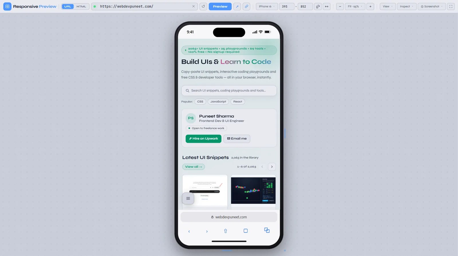
Quick start: test a page in 30 seconds
- Open the Responsive Preview tool.
- Paste a URL into the address bar and press Enter. You can leave out
https://; the tool adds it. - Pick a device from the Device menu, or type a width and height.
- Press R to rotate, M for several devices at once, and F to fit everything on screen.
- Open Screenshot to save a PNG, or click the link button to copy a URL that reopens this exact setup.
How it works (and why the result is accurate)
The tool loads your page in an <iframe> whose width and height are set to the device’s CSS viewport, for example 393×852 for an iPhone 16. Inside that iframe the page really is 393 CSS pixels wide. window.innerWidth returns 393, @media (max-width: 400px) matches, vw units and clamp() values resolve against 393px, and your JavaScript breakpoints fire exactly as they would on the phone.
To fit a 1920px desktop frame on a laptop screen, the tool doesn’t shrink the iframe. It keeps the iframe at full size and scales the whole frame down visually with a CSS transform: scale(), with transform-origin pinned top-left. Zoom changes only what you see. The page inside never knows it was zoomed, so the layout you’re looking at is the real 1920px layout, just smaller.
What it does not emulate: touch events, devicePixelRatio, (hover: none) and (pointer: coarse) media features, or the user-agent string. If your CSS or JavaScript branches on those, use Chrome DevTools device emulation or a real phone for that last check. For layout, reflow, breakpoints and overflow, the iframe approach gives you the true result.
Two ways to load a page: URL mode and HTML mode
The URL | HTML switch at the start of the address bar decides where the page comes from.
| URL mode | HTML mode | |
|---|---|---|
| What you load | Any public page: production, staging, a client’s site | HTML you paste, or an .html file you drop on the preview |
| Best for | Checking live and staging sites, comparing two URLs | Code that isn’t online yet, components, email-style layouts, UI snippets |
| Inspect tools (overflow finder, synced scrolling, light/dark) | Not available (the page is on another domain, so the tool can’t look inside it) | Available |
| Visible-area screenshot | Yes | Yes |
| Full-page screenshot | Yes (public URLs only) | No (there’s no public URL to render) |
| Shareable link | Yes, the URL keeps the whole setup | Only the settings: the HTML stays in your browser, so the link isn’t useful to anyone else |
In URL mode, recent addresses drop down under the address bar as you type, so you can jump back to the staging site you checked an hour ago. The ↺ button reloads the frame, ↗ opens the page in a new tab, and the link button copies a shareable URL.
18 real device sizes, plus any size you like
Generic “Mobile S / Mobile L” presets don’t tell you much. The Device menu lists the CSS viewport sizes of current devices people actually own, grouped by type. Landscape isn’t listed separately, because Rotate swaps any preset in one click.
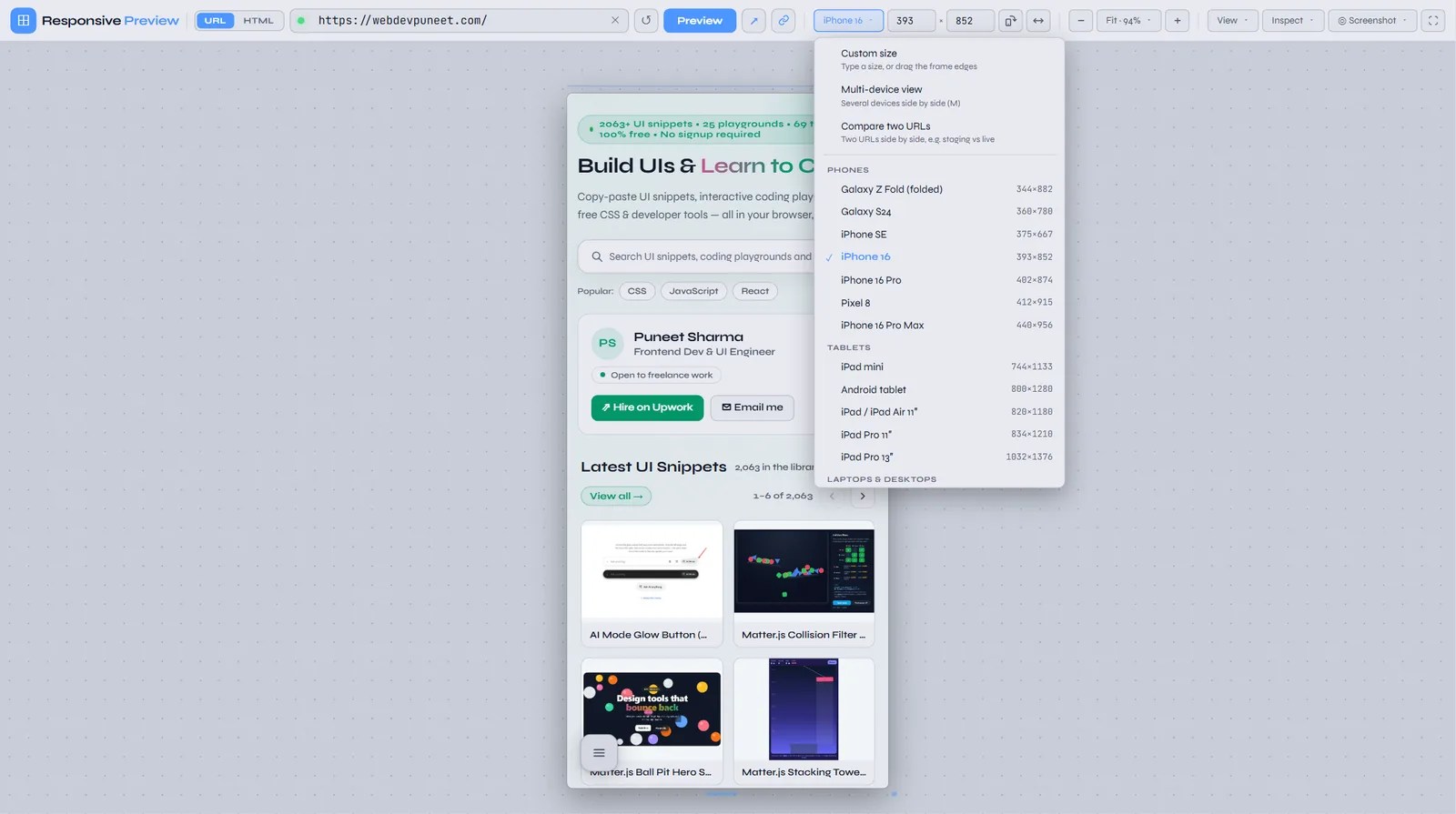
| Device | Type | CSS viewport (portrait) |
|---|---|---|
| Galaxy Z Fold (folded) | Phone | 344 × 882 |
| Galaxy S24 | Phone | 360 × 780 |
| iPhone SE | Phone | 375 × 667 |
| iPhone 16 | Phone | 393 × 852 |
| iPhone 16 Pro | Phone | 402 × 874 |
| Pixel 8 | Phone | 412 × 915 |
| iPhone 16 Pro Max | Phone | 440 × 956 |
| iPad mini | Tablet | 744 × 1133 |
| Android tablet | Tablet | 800 × 1280 |
| iPad / iPad Air 11″ | Tablet | 820 × 1180 |
| iPad Pro 11″ | Tablet | 834 × 1210 |
| iPad Pro 13″ | Tablet | 1032 × 1376 |
| Laptop HD | Laptop | 1366 × 768 |
| MacBook Air 13″ | Laptop | 1470 × 956 |
| Laptop (most common) | Laptop | 1536 × 864 |
| MacBook Pro 16″ | Laptop | 1728 × 1117 |
| Desktop Full HD | Desktop | 1920 × 1080 |
| Desktop QHD | Desktop | 2560 × 1440 |
A few of these are worth testing on purpose. The 344px Z Fold is narrower than the 360px most people design for, so it catches buttons and headings that only just fit. 1536×864 is what a 1920×1080 Windows laptop reports at the default 125% display scaling, which makes it one of the most common desktop viewports on the web. 1366×768 is still common on budget and office laptops.
Custom sizes, drag-to-resize and saved presets
For anything not in the list, type a width and height into the two size boxes (200px up to 3840px), or drag the frame’s right edge, bottom edge or corner. The size boxes update live as you drag, so you can find the exact pixel where a layout breaks. Choose Custom size in the Device menu to start from the current size. If you use a size often, such as the exact viewport from a bug report, choose Save as a preset and it appears under My sizes in the Device menu from then on.
The breakpoint ruler
Above the frame, a ruler marks the common breakpoints at 375, 768, 1024, 1280 and 1440px. A blue badge shows the live width and the Tailwind breakpoint that’s active at that width (base, sm 640, md 768, lg 1024, xl 1280, 2xl 1536). If you use Tailwind’s default breakpoints, that badge tells you which md: or lg: classes are applying right now. You can hide the ruler from the View menu.
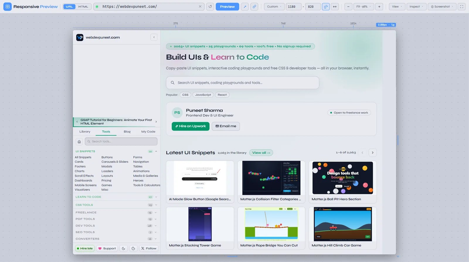
lg: classes are active.Rotate to landscape
Click Rotate (the phone icon next to the size boxes) or press R to swap width and height. It works on presets, custom sizes and every frame in multi-device view at once. Landscape phones are where sticky headers, fixed bottom bars and 100vh hero sections most often go wrong, because the viewport is only around 400px tall.
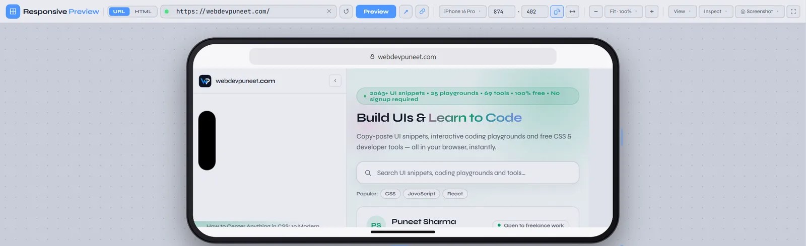
See it like a visitor: device frames and browser bars
Two switches in the View menu turn a plain rectangle into something that looks like the real device and gives the page the same amount of space.
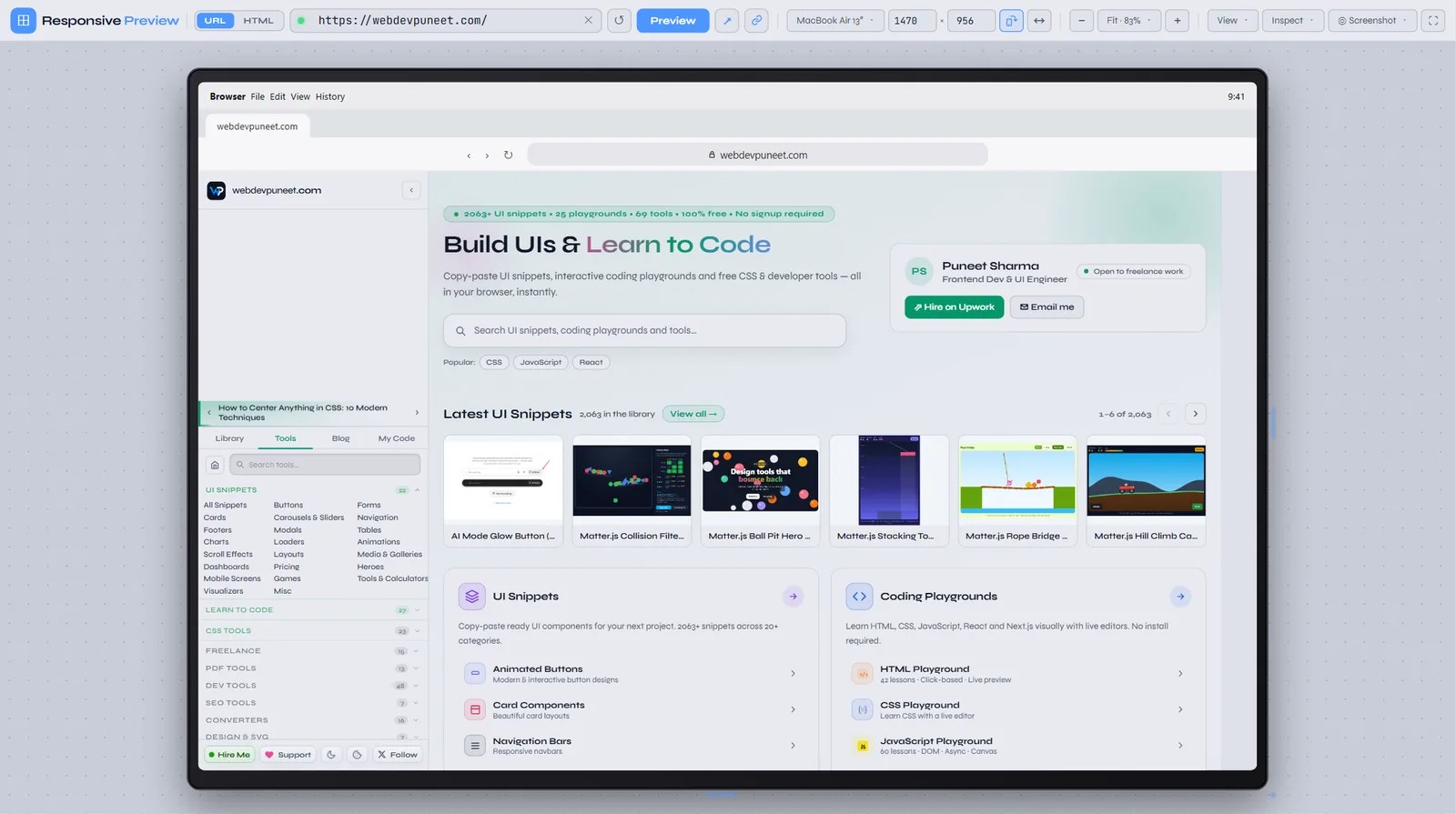
Device frame draws a bezel to scale around the preview: the Dynamic Island on current iPhones, a punch-hole camera on Pixel and Galaxy phones, the home button and thick bezels of the iPhone SE, rounded tablet bezels, and a monitor bezel for laptops and desktops. The frame is drawn at the device’s own scale, so it’s the right size at any zoom level.
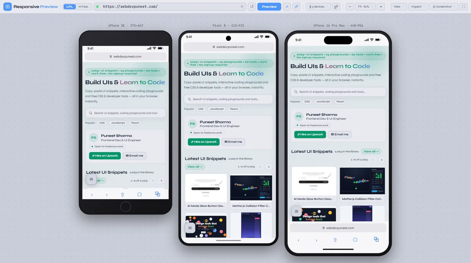
Browser bars matter more than they look. A phone’s 852px screen height is not what your visitor sees: the status bar, the address bar and the toolbar take part of it. With browser bars on, the tool adds the status bar, Safari’s bottom address bar and toolbar on iPhone, Chrome’s top address bar and the gesture bar on Android, Safari’s bar on iPad and Chrome’s tab strip on Android tablets, and the browser chrome plus the macOS menu bar or Windows taskbar on desktops. They take space from the page exactly as they do on the device, so the bottom edge of the frame becomes the real fold.
That makes the most important landing-page question easy to answer: is the main call to action visible without scrolling? Compare the screenshot below with the first one in this post. Without bars, the page gets the full 852px. With bars, a lot less is visible before the first scroll.
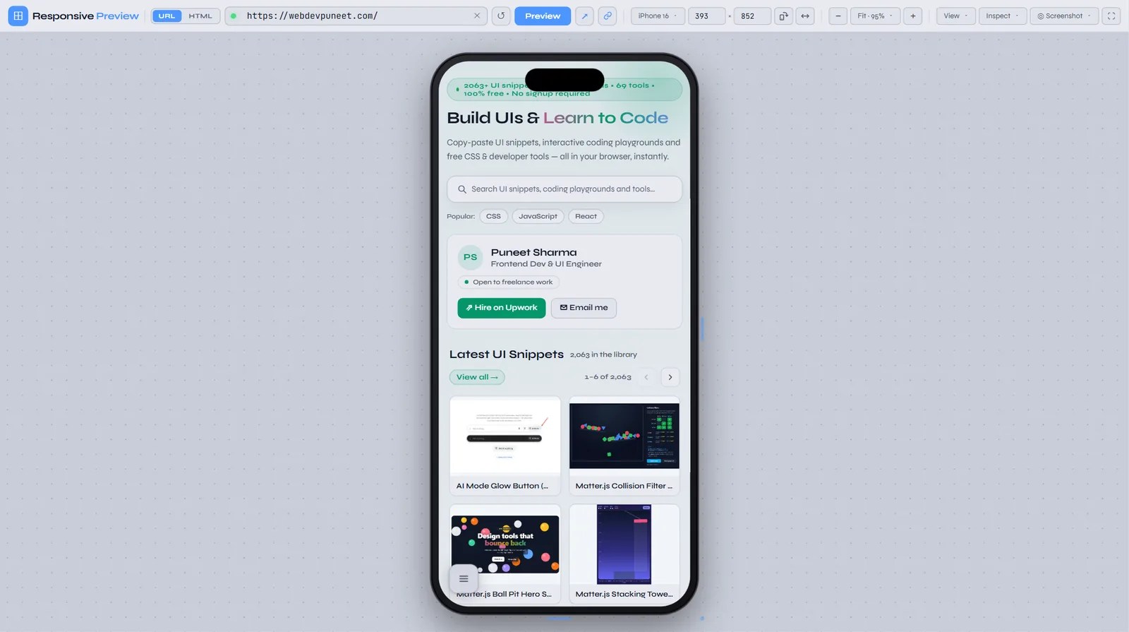
Bar heights are approximations. Real heights change with browser version, settings and whether the address bar has collapsed during scrolling. For an exact check of a specific browser, test on the device itself. For “is my hero too tall?” decisions, the approximation is close enough.
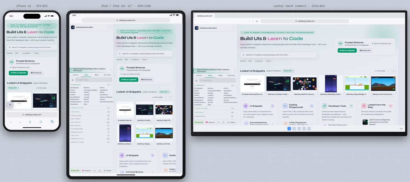
Multi-device view: phone, tablet and laptop at once
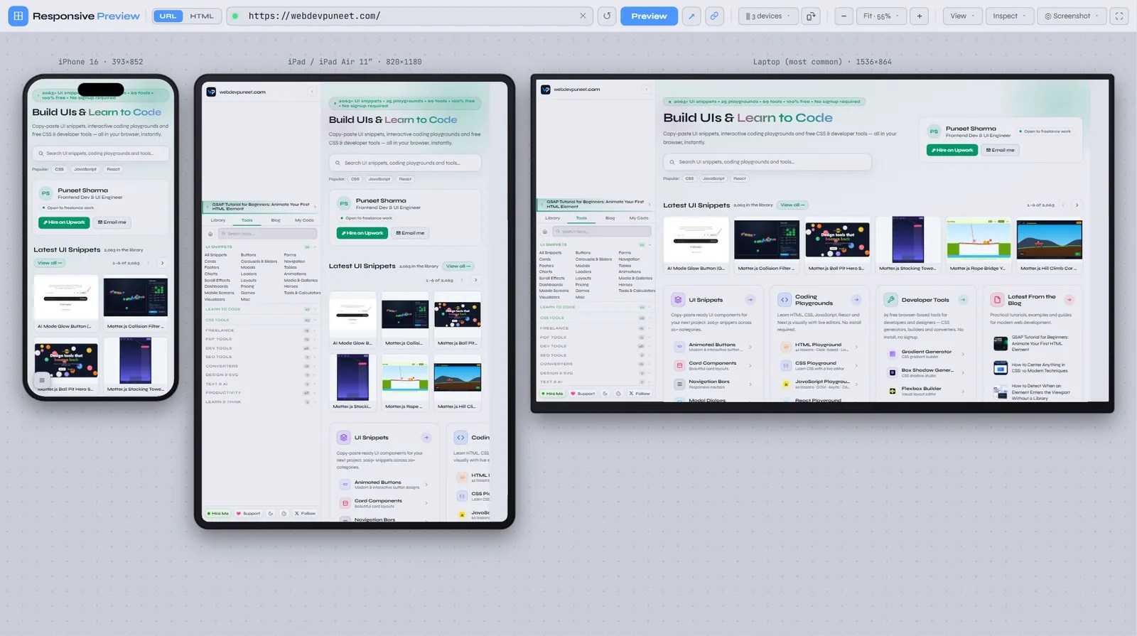
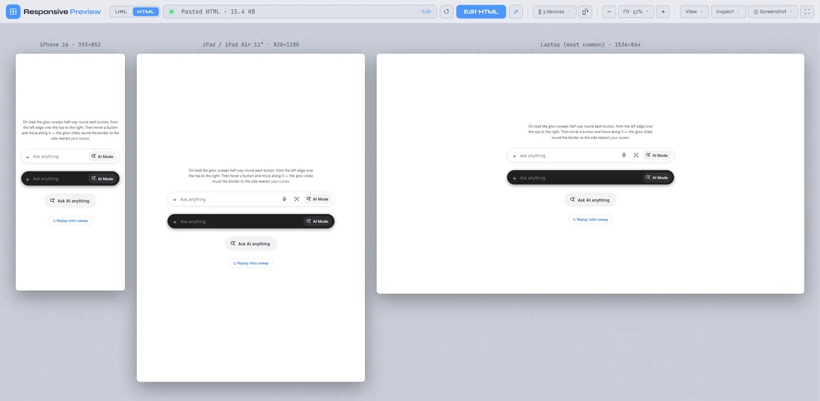
Checking one device at a time means you only notice the side effects of a CSS change later. Turn on Multi-device view in the Device menu (or press M) and the page loads in several frames side by side. iPhone 16, iPad and a 1536px laptop are shown by default. Tick or untick any of the 18 presets in the same menu to build your own set. Rotate, zoom, device frames and browser bars apply to every frame, and Fit scales the whole row to fit your screen.
Compare two URLs: staging vs production
Choose Compare two URLs in the Device menu and a second address bar appears. Load your production URL as A and your staging or preview deployment as B, and both render side by side at the same device size. It works just as well for before-and-after checks around a deploy, two variants of a landing page, or your page next to a competitor’s.
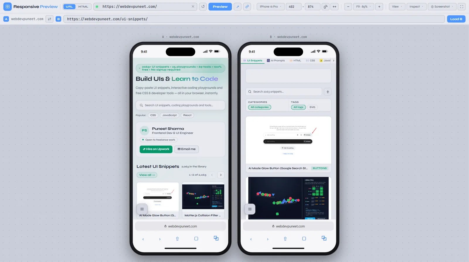
The size boxes, Rotate, zoom, device frames, browser bars and the width sweep all apply to both frames, and both URLs are kept in the shareable link. That makes the link handy for a pull request: “here’s main vs this branch on an iPhone SE”.
Width sweep: find every breaking point automatically
Presets test the sizes you thought of. Layouts usually break at the sizes you didn’t: the 610px where two cards squeeze before wrapping, or the 1100px where the nav runs out of room. Click the sweep button next to Rotate (or press S) and the frame animates from 320px to 1920px wide at the current height, while the ruler badge shows the live width. Watch for text jumping, columns snapping and elements spilling out of their containers.
Click the button again (it shows a stop square while running), drag the frame, or pick a device to stop the sweep at the current width and look closer.
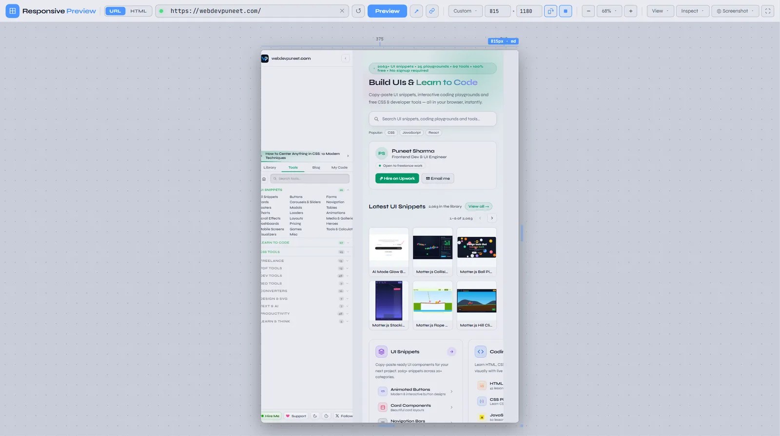
md). The stop button is active in the toolbar.HTML mode: test code that isn’t online yet
Most responsive testers only take URLs, which means you need to deploy before you can test. Switch the address bar to HTML and you can paste a full page or just a fragment, or drop an .html file anywhere on the preview. The Open file button in the dialog works too. Your HTML is kept in your browser’s local storage, so a reload brings it back.
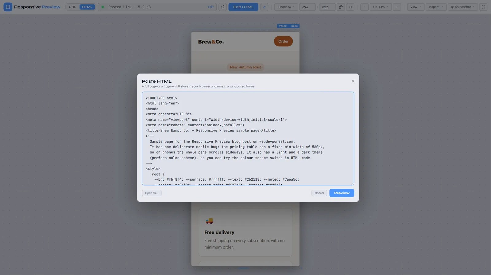
Security note for the curious: pasted code runs in an iframe sandboxed without allow-same-origin, so it gets an opaque origin. It can run its own scripts, but it can’t read webdevpuneet.com’s cookies or local storage. The inspect features below talk to the frame through postMessage instead of reaching into it.
To try everything in this section, use the sample page made for this post: open the Brew & Co. sample page, save it with Ctrl+S (or view the source and copy it), then drop the file onto the preview or paste the code. It has one deliberate mobile bug and a dark theme.
Overflow finder: what’s making my page scroll sideways?
Horizontal scrolling on mobile is one of the most common responsive bugs, and one of the most annoying to track down. One element with a fixed width, a long unbroken URL, a 100vw section on a page with a vertical scrollbar, or a negative margin, and the whole page wobbles sideways under your thumb. Open Inspect → Overflow finder and the tool outlines in red every element that extends past the viewport. A badge above the frame tells you how many there are and how wide the page has become.
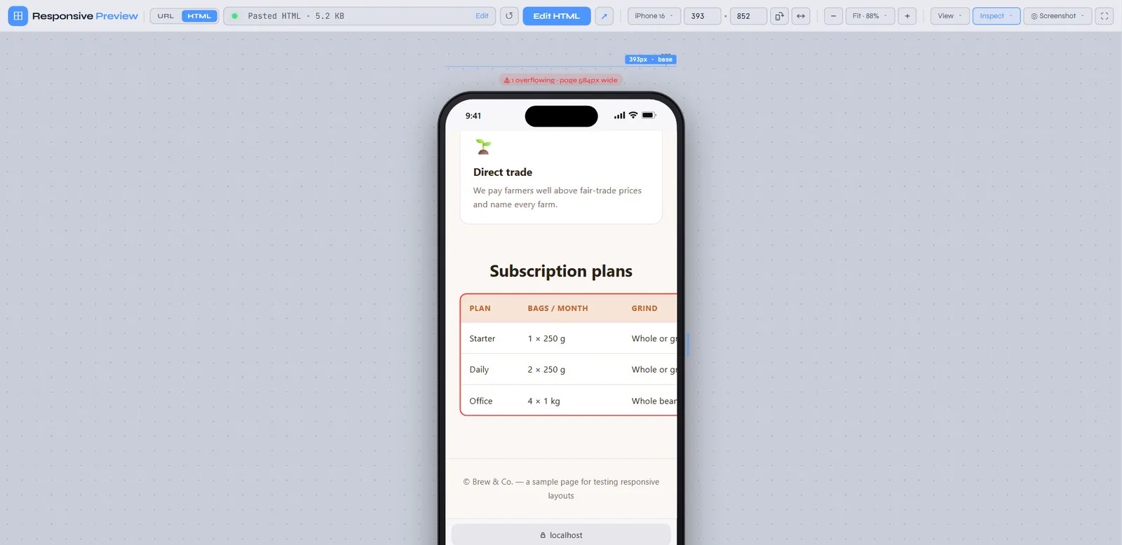
Elements inside a container that clips them (overflow-x: hidden, auto or scroll) are skipped, because they don’t make the page scroll. That keeps the list to the real culprits. On the sample page the culprit is this rule:
.price-table { width: 100%; min-width: 560px; }Two common fixes: wrap the table in a scroll container so only the table scrolls (.table-wrap { overflow-x: auto; }), or drop the min-width and stack the cells on small screens. The outlines update as you resize, so you can drag the frame and watch them disappear once the fix works.
Light and dark mode: force prefers-color-scheme
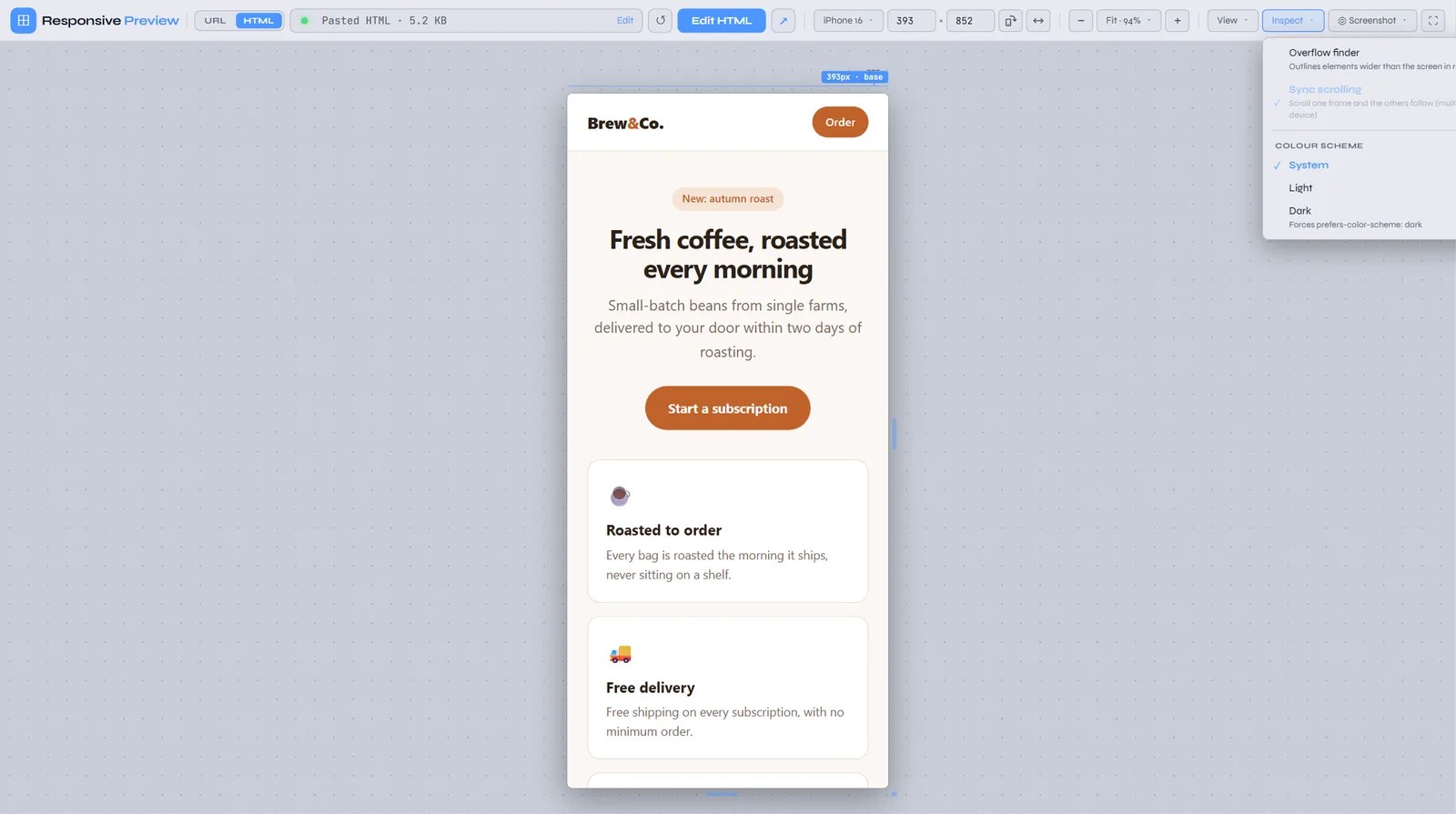
If your CSS uses @media (prefers-color-scheme: dark), you normally have to switch your whole OS theme to check the dark version. In HTML mode, Inspect → Colour scheme has System, Light and Dark. Choosing Dark rewrites the page’s prefers-color-scheme media queries so the dark rules apply, and sets color-scheme on the root so form controls and scrollbars follow. Choosing System puts everything back.
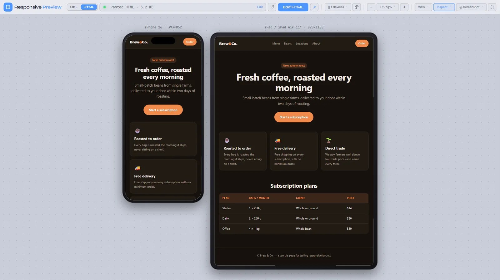
It works on <style> blocks and stylesheets the page can read, including <link media="(prefers-color-scheme: dark)">. Stylesheets loaded from another domain can’t be rewritten from inside the page, so a theme that lives entirely in a CDN stylesheet won’t switch.
Synced scrolling across devices
In multi-device view, Inspect → Sync scrolling keeps every frame at the same relative scroll position. Scroll the phone to the pricing section and the tablet and laptop scroll there too, so you can compare one section across sizes without scrolling three frames by hand.
Test any UI snippet in one click
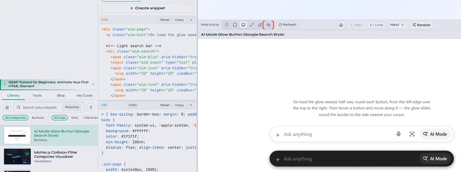
Every one of the 2,063+ components in the UI Snippets library has a Test in Responsive Preview button in its preview toolbar on desktop, next to the pop-out button. Click it and the snippet opens in a new tab in this tool, already in HTML mode, with its HTML, CSS, JavaScript and any CDN libraries it uses. You can check a button, card, navbar or pricing table on a Z Fold and an iPad before you copy it into your project. It works the same for your own snippets in My Code, including your edits.
Screenshots: every type the tool can take
The Screenshot menu offers two kinds of PNG. They work in completely different ways, so it’s worth knowing which to use.
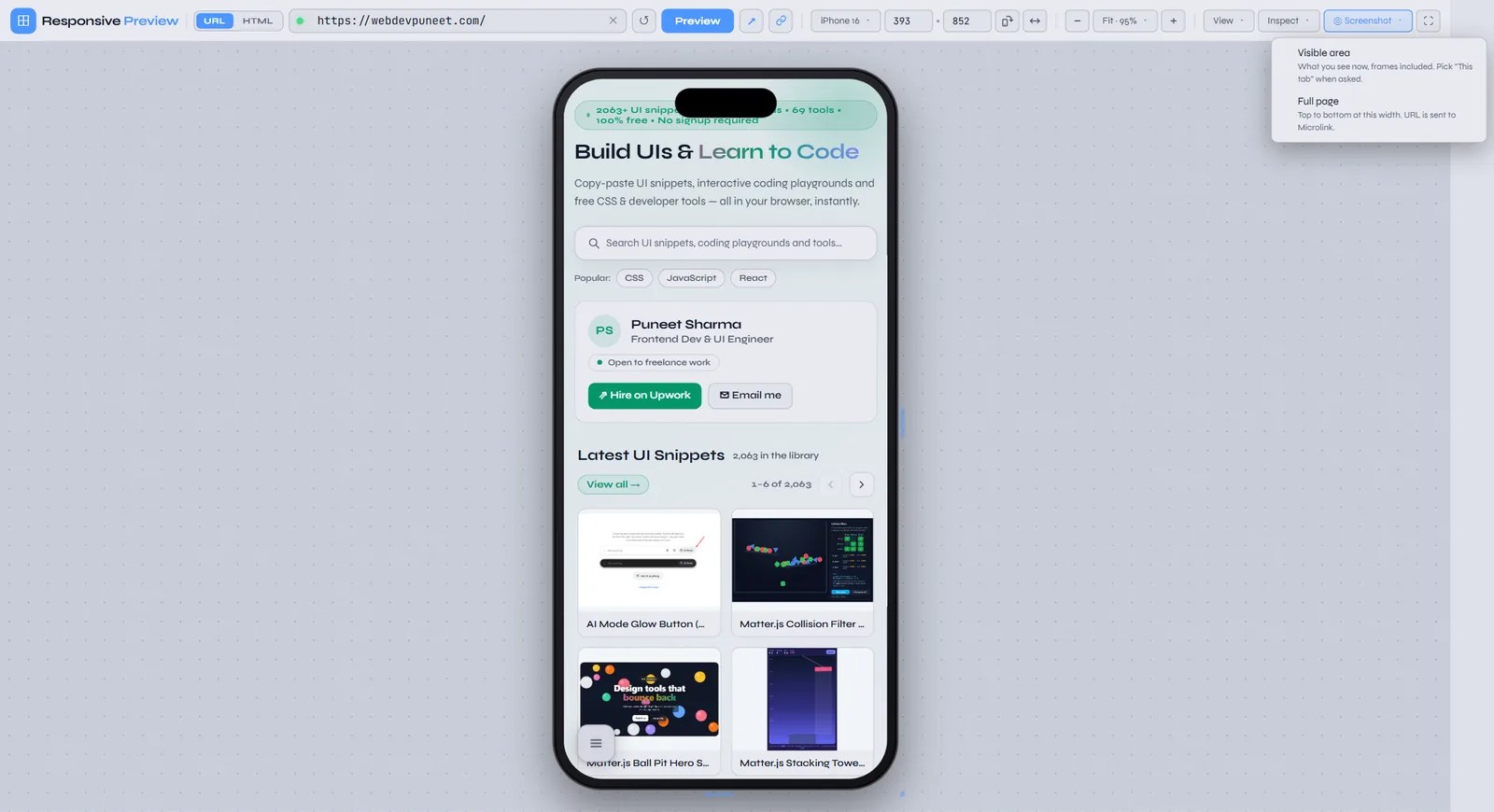
Visible area: exactly what’s on screen
Visible area captures what you see in the preview, with the device frame and browser bars included if they’re on. In multi-device view and compare mode it captures the whole row in one image, which is handy for a design review, a client update or a bug report.
Under the hood: a page can’t read the pixels of an iframe from another domain, so the tool uses your browser’s screen-capture API (getDisplayMedia). When the browser asks what to share, choose This tab. The tool grabs one frame, crops it to the preview and downloads it as responsive-<site>-<width>x<height>.png (or -multi / -compare). Nothing is uploaded.
Tips for sharp results:
- The PNG is saved at the size it’s shown on screen. At 50% zoom you get a half-size image, so set zoom to 100% when you need true device pixels.
- Make sure the whole frame is visible first (press F to fit). Anything scrolled out of view is cut off.
- Use desktop Chrome, Edge or Firefox. Mobile browsers don’t offer tab capture.
- The browser asks for permission each time. That’s a browser rule, not a tool setting.
Full page: the whole page, top to bottom
Full page renders the entire scrolling page as one tall PNG at the current frame width, from the header down to the footer. A page can’t scroll or measure another domain’s iframe, and the tool runs entirely in your browser, so it sends the URL and viewport size to the free Microlink screenshot service. Microlink opens the page in a headless browser at that width and returns the image. In multi-device and compare mode you get one PNG per frame, named like fullpage-<site>-393px.png.

Things to know about full-page captures:
- The page must be publicly reachable.
localhost, VPN-only staging and pages behind a login won’t work, and pasted HTML can’t be sent. - The URL leaves your browser. Don’t use it for pages with private tokens in the query string.
- The free tier has a daily request limit, and some sites block automated browsers. Either case shows a “Full-page capture failed” message.
- It can take 5 to 20 seconds. Lazy-loaded images and scroll animations may look different from a manual scroll.
- Browser bars and device frames aren’t drawn on full-page captures. It’s the page itself.
Which screenshot should I use?
| Visible area | Full page | |
|---|---|---|
| What you get | What’s on screen right now | The whole scrolling page, top to bottom |
| Device frame and browser bars | Included if turned on | Not included |
| Multi-device / compare | One image with every frame | One image per frame |
| Works with | URL mode and HTML mode, any reachable page (localhost too) | Public URLs only |
| Where it runs | In your browser (tab capture) | Microlink’s servers |
| Resolution | On-screen size (use 100% zoom for 1:1) | Exact device width |
| Best for | Bug reports, design reviews, social posts, comparing devices | Archiving a page, full-length design QA, sharing a whole layout |
Zoom, fit, fullscreen and backgrounds
The zoom menu sits between the − and + buttons. Fit to window (or F) picks the largest zoom that keeps every frame, bezel and ruler fully visible. While Fit is selected, it re-fits whenever you resize the window, change device or turn on frames. You can also choose 25%, 50%, 75% or 100%, and the − / + buttons (or keys) step by 5%. As explained above, zoom is purely visual: the page always renders at the full device width.
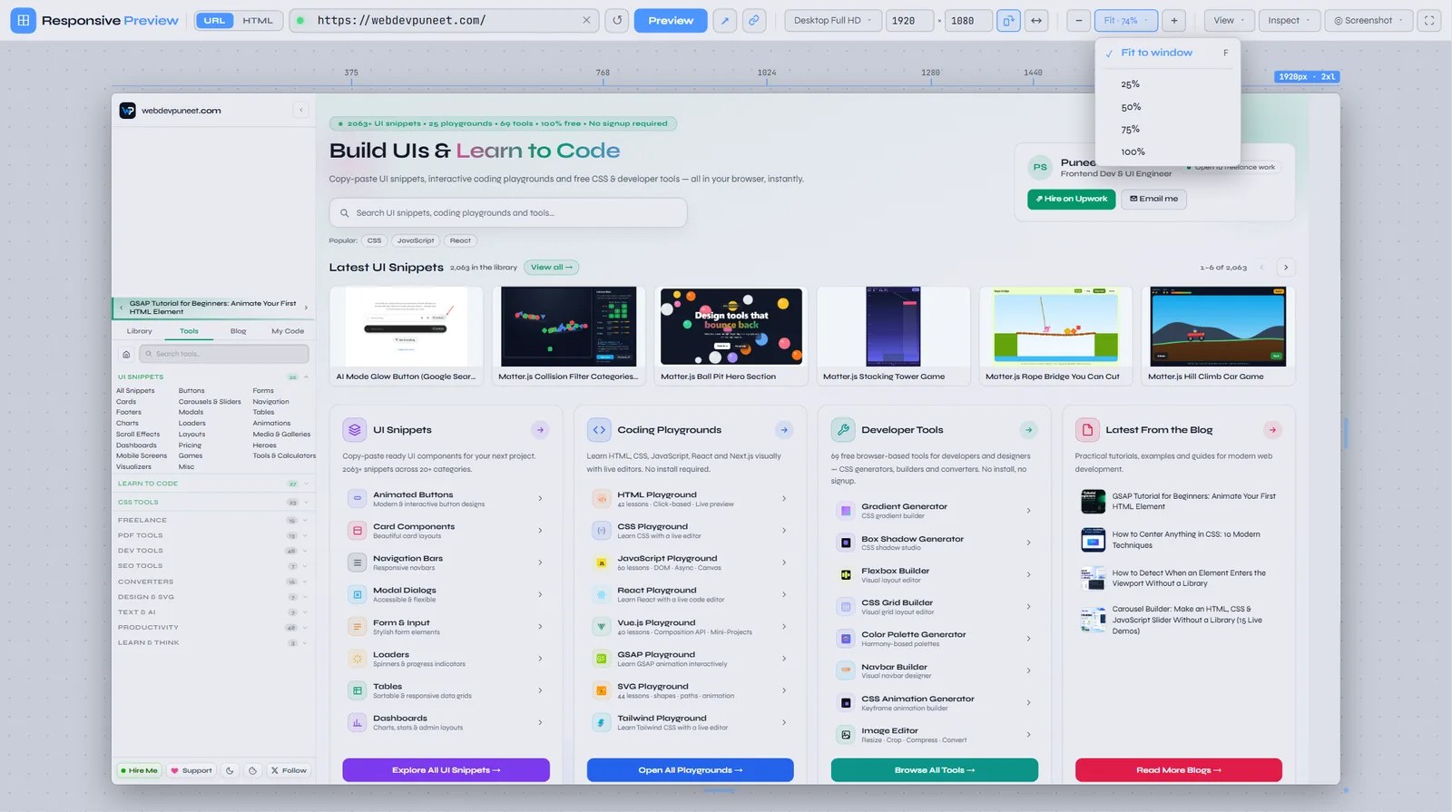
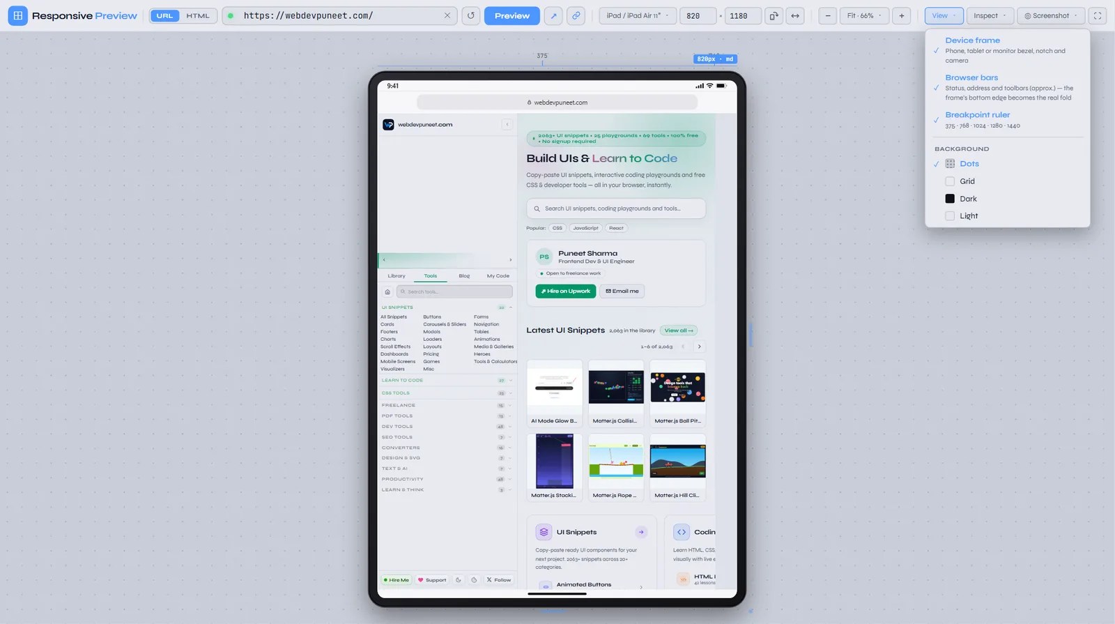
The ⛶ button puts the preview into fullscreen, hiding the toolbar and the rest of the site. That’s useful for screen-shares and client walkthroughs. Press Esc to exit. The View menu also changes the canvas background (Dots, Grid, Dark, Light), which helps when a page is mostly white or mostly dark.
Share the exact setup with a link
Every setting lives in the page URL, so the address bar is always a link to exactly what you’re looking at. The link button next to the address bar copies it. Paste it into Slack, a Jira ticket or a PR description, and whoever opens it sees the same site, device, orientation, zoom and options. You can also build links by hand:
| Parameter | Meaning | Example |
|---|---|---|
link | The page to load | link=https://example.com |
d | Device preset id | d=iphone-16, d=ipad-pro-13, d=desktop |
w, h | Custom width and height | w=1180&h=820 |
r | Rotated (landscape) | r=1 |
m | Multi-device set | m=iphone-se,ipad,laptop |
cmp, link2 | Compare mode and the B URL | cmp=1&link2=https://staging.example.com |
frame | Device frame on | frame=1 |
ui | Browser bars on | ui=1 |
z | Fixed zoom % (leave out for Fit) | z=50 |
bg | Canvas background | bg=dark |
For example, this link opens webdevpuneet.com on a Z Fold, an iPhone 16 and an iPad mini, with frames and browser bars on.
Keyboard shortcuts
| Key | Action |
|---|---|
| R | Rotate (portrait / landscape) |
| F | Fit to window |
| M | Multi-device view on / off |
| S | Start / stop the width sweep |
| + / − | Zoom in / out by 5% |
| Esc | Close a menu or dialog, leave fullscreen |
When a site won’t load in the preview
Many large sites send X-Frame-Options: DENY or SAMEORIGIN, or Content-Security-Policy: frame-ancestors 'none'. Those headers stop any other site from showing them in an iframe, as protection against clickjacking. Google, GitHub, most banks and many social networks do this. No iframe-based tester can show them, and browsers don’t tell the parent page when a frame was refused. So after every load the tool shows a reminder bar with an Open in new tab link, and if a page hasn’t loaded after 12 seconds it shows an error in the frame.
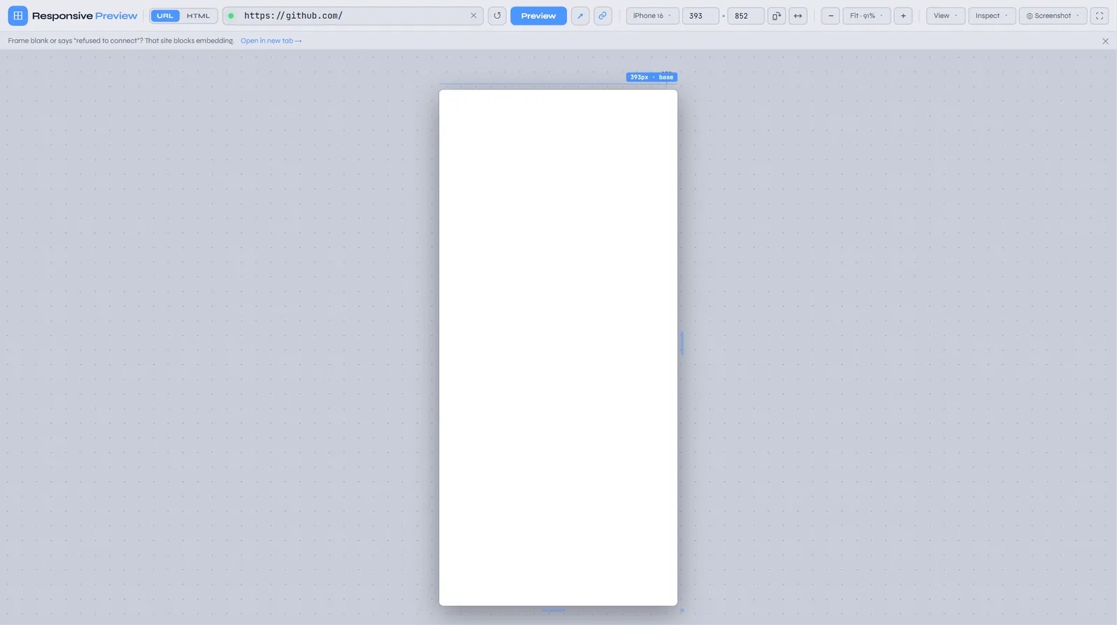
If it’s your site that’s blocked, you have options. Allow your testing origin in frame-ancestors on staging, save the page and use HTML mode, or test in Chrome DevTools device mode, which isn’t affected by these headers.
Localhost: typing http://localhost:3000 often works, because the iframe loads from your own machine. Some browsers block a public HTTPS page from framing a local HTTP server, and some dev servers send X-Frame-Options. If yours does, HTML mode is the easy way round: save the rendered page (or copy the generated HTML) and drop it in.
A responsive QA checklist you can run with the tool
- Smallest phone first. Load the Galaxy Z Fold (344px). Long words, buttons side by side and fixed-width elements fail here first.
- Find horizontal overflow. In HTML mode, turn on the overflow finder. In URL mode, scroll the frame sideways: if it moves, something is too wide.
- Check the fold. Turn on browser bars on iPhone 16 and Pixel 8. Are the headline and main call to action visible before scrolling?
- Rotate. Landscape phones expose oversized sticky headers and
100vhsections. - Sweep. Run the width sweep and note every width where something jumps. Those are your missing breakpoints.
- Tablet. iPad mini and iPad Air are where “is it mobile or desktop?” layouts often look half-finished.
- Common laptops. 1366×768 and 1536×864 have little height, so check hero sections and modals.
- Dark mode. If you support it, force Dark and check contrast, images and borders.
- Compare with production. Put the staging URL next to live before you merge.
- Document it. Save a multi-device screenshot for the PR and paste the setup link next to it.
Frequently asked questions
Is this as accurate as testing on a real phone?
For layout, yes. The page renders at the device’s real CSS viewport, so media queries, viewport units and container queries behave exactly as on the device. What differs is the rendering engine (you’re using your desktop browser, not mobile Safari), touch input, device pixel ratio and the user-agent string. Use the tool for fast layout checks across many sizes, and keep a real device or two for a final check of touch interactions and Safari-specific bugs.
How is this different from Chrome DevTools device mode?
DevTools device mode emulates touch, DPR and the user agent, which this tool doesn’t, and it isn’t blocked by X-Frame-Options. On the other hand it shows one device at a time. This tool adds side-by-side devices, two-URL comparison, device frames with browser bars, a width sweep, an overflow finder, forced dark mode, full-page screenshots and shareable setup links, and anyone you send a link to can use it without opening DevTools. The two work well together.
Why are the device sizes smaller than the phone’s screen resolution?
Phones have high-density screens. An iPhone 16 has 1179×2556 physical pixels, but a device pixel ratio of 3 means the browser reports a CSS viewport of 393×852. CSS media queries use CSS pixels, so those are the numbers that matter for responsive design, and the ones the tool uses.
Can I test a site on localhost or a staging server?
Staging servers work like any URL, as long as your browser can reach them and they allow framing. Localhost often works too. If it doesn’t, save the page and use HTML mode. Full-page screenshots need a publicly reachable URL, because Microlink loads the page from its own servers.
Is my pasted HTML uploaded anywhere?
No. It stays in your browser’s local storage and runs in a sandboxed iframe with no access to the site’s storage. The only feature that sends anything to a server is the full-page screenshot, which sends a URL, and it isn’t available for pasted HTML.
Why can’t the overflow finder or dark mode work on a URL?
The browser’s same-origin policy stops one site from reading or changing another site’s page inside an iframe. That’s what keeps your bank safe from the sites you visit. The tool can show a page from another domain, but it can’t measure its elements or rewrite its stylesheets. Pasted HTML runs in a sandbox the tool can talk to, so the inspect features work there.
Is it free? Do I need an account?
It’s completely free, with no sign-up, no browser extension and no usage limit, except Microlink’s own daily limit on full-page screenshots. It runs in any modern desktop browser.
Start testing
Open the Responsive Preview tool, paste the page you’re working on, and run it through the smallest phone, a landscape rotation and the width sweep. Most layouts have at least one surprise waiting. If you’re building the layout itself, the CSS Grid Builder, Flexbox Builder, CSS Clamp Generator for fluid type and Media Queries Generator pair well with it. For ready-made responsive components, browse the UI Snippets library and test any of them with one click.
Discover more from WebDevPuneet
Subscribe to get the latest posts sent to your email.


