



Copy & paste
Source Code
<div class="grid">
  <article class="card">
    <div class="thumb" style="background:#6366f1"></div>
    <div class="body">
      <span class="tag">Design</span>
      <h3>Building design systems at scale</h3>
      <p>How to create consistent components across large teams.</p>
    </div>
  </article>
  <article class="card">
    <div class="thumb" style="background:#0ea5e9"></div>
    <div class="body">
      <span class="tag">Dev</span>
      <h3>Performance budgets that actually work</h3>
      <p>Practical strategies for keeping your app fast.</p>
    </div>
  </article>
  <article class="card">
    <div class="thumb" style="background:#10b981"></div>
    <div class="body">
      <span class="tag">CSS</span>
      <h3>Modern layout with CSS Grid and Subgrid</h3>
      <p>Unlock alignment superpowers with one property.</p>
    </div>
  </article>
</div>
* { box-sizing: border-box; margin: 0; padding: 0; }
body { font-family: system-ui, sans-serif; background: #f8fafc; padding: 24px; }
.grid {
display: grid;
grid-template-columns: repeat(auto-fill, minmax(220px, 1fr));
gap: 16px;
}
.card {
background: #fff;
border-radius: 12px;
overflow: hidden;
border: 1px solid #e2e8f0;
transition: box-shadow 0.15s, transform 0.15s;
}
.card:hover { box-shadow: 0 8px 24px rgba(0,0,0,0.08); transform: translateY(-2px); }
.thumb { height: 120px; }
.body { padding: 16px; }
.tag {
font-size: 11px;
font-weight: 700;
text-transform: uppercase;
letter-spacing: 0.5px;
color: #6366f1;
background: rgba(99,102,241,0.08);
padding: 2px 8px;
border-radius: 4px;
display: inline-block;
margin-bottom: 10px;
}
h3 { font-size: 14px; font-weight: 700; color: #1e293b; line-height: 1.4; margin-bottom: 8px; }
p { font-size: 13px; color: #64748b; line-height: 1.55; }Extend with AI
Take This Snippet Further With AI
The AI prompt for this one is for Patreon supporters ($3 a month, 7 days free), along with a site with no ads. Supporters enter the passcode once and it is remembered in this browser.
What's included
Features
About this UI Snippet
Responsive Card Grid — CSS Grid auto-fill minmax Without Media Queries
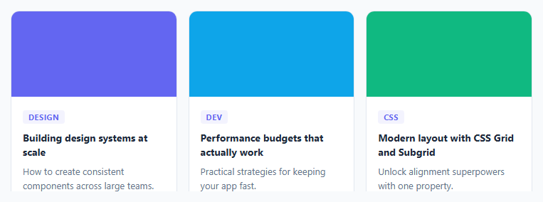
The responsive card grid is one of the most common layout patterns in web development. Blog post listings of article cards, product grids, team member pages, feature showcases — they all need a multi-column grid that reflows to fewer columns on smaller screens. The traditional approach uses multiple @media queries to change the column count. The modern CSS Grid approach does it in a single declaration with no breakpoints at all.
The auto-fill minmax pattern
grid-template-columns: repeat(auto-fill, minmax(220px, 1fr)) is the core of this snippet. auto-fill tells the browser to create as many columns as will fit in the available width. minmax(220px, 1fr) sets the minimum column width to 220px and the maximum to 1fr (equal share of remaining space). The browser calculates how many 220px columns fit, creates that many, and scales them up equally to fill the row. When the container narrows, fewer columns fit, and the grid automatically reflows to a new row — no media query needed.
auto-fill vs auto-fit
auto-fill creates columns even if there are no items to fill them — empty columns remain in the grid and occupy space. auto-fit collapses empty columns to zero width, allowing filled columns to expand. For a card grid where you want cards to always be a consistent size, auto-fill is usually the right choice. For a grid where you want a single card to fill the full width when alone, use auto-fit.
The hover lift effect
Cards use transition: box-shadow 0.15s, transform 0.15s and :hover { box-shadow: 0 8px 32px rgba(0,0,0,0.1); transform: translateY(-3px); }. The translateY(-3px) moves the card 3px upward and the shadow deepens simultaneously, creating the illusion of the card lifting off the page. Both transitions are hardware-accelerated.
Card structure
Each card uses the <article> element — semantically correct for a self-contained content item. The thumbnail uses a coloured div (replace with an <img> tag for real images). The body contains a tag chip, headline, and metadata row.
Changing the minimum card width
The 220px minimum determines how many columns appear at each screen width. Increase it to 280px or 320px for fewer, wider cards. Decrease it to 160px for more compact cards. The grid recalculates automatically — no other CSS changes needed.
Step by step
How to Use
- 1Load the snippetClick "Responsive Card Grid" in the sidebar. Resize the preview panel to see the grid reflow between 1, 2, and 3 columns without any media queries.
- 2Change the minimum card widthIn the CSS panel, update the 220px value in minmax(220px, 1fr). Larger values create fewer columns; smaller values create more.
- 3Update the card contentIn the HTML panel, replace the thumb colours, tag labels, titles, and meta text with your real content. Add or remove article.card elements as needed.
- 4Replace the colour thumbs with imagesReplace each .thumb div with an <img> tag. Add object-fit: cover; width: 100%; to the .thumb CSS rule.
- 5Adjust the hover liftChange translateY(-3px) and the box-shadow on .card:hover in the CSS panel to increase or reduce the lift effect.
- 6Export in your formatClick "HTML" for a standalone file, "JSX" for a React component, or "Tailwind" for a React + Tailwind version.
Real-world uses
Common Use Cases
Got questions?
Frequently Asked Questions
repeat(auto-fill, minmax(220px, 1fr)) tells the browser to fill the row with as many 220px columns as fit. When the container width changes, the browser recalculates and reflows automatically. There is no fixed column count — the grid adapts to any container width.
auto-fill creates columns even if they have no items, leaving empty space. auto-fit collapses empty columns to zero and lets filled columns expand. For a card grid with consistent card sizes, auto-fill is usually correct. For a grid where a lone card should fill the full width, use auto-fit.
Adjust the minmax minimum value. A 320px minimum gives 3 columns on desktop, 2 on tablet, 1 on mobile. For fixed column counts at specific widths, add a media query overriding grid-template-columns — for example: @media (max-width: 600px) { .grid { grid-template-columns: 1fr; } }.
Replace <div class="thumb" style="background:#6366f1"></div> with <img class="thumb" src="your-image.jpg" alt="description" />. Add object-fit: cover; width: 100%; to .thumb in the CSS panel to maintain the fixed height and crop the image.
The grid already stretches cards to equal height in the same row by default (align-items: stretch is the grid default). For consistent height across all rows regardless of content, set a fixed height on .card or use a fixed aspect ratio on the thumbnail.
Yes. Click "JSX" to download a React component or "Tailwind" for a Tailwind version. In React, map over a cards array and render each article element. The CSS grid layout works identically in React — no framework-specific grid library needed.