


Grid / List View Toggle — Free HTML CSS JS Layout Switcher Snippet
Grid / List View Toggle · Layouts · Plain HTML, CSS & JS · Live preview
Copy & paste
Source Code
<div class="toolbar">
  <span class="toolbar-label">4 items</span>
  <div class="view-toggle" role="group" aria-label="Switch view layout">
    <button class="view-btn active" id="gridBtn" aria-pressed="true" aria-label="Grid view" onclick="setView('grid')">
      <svg width="16" height="16" viewBox="0 0 24 24" fill="none" stroke="currentColor" stroke-width="2"><rect x="3" y="3" width="7" height="7"/><rect x="14" y="3" width="7" height="7"/><rect x="3" y="14" width="7" height="7"/><rect x="14" y="14" width="7" height="7"/></svg>
    </button>
    <button class="view-btn" id="listBtn" aria-pressed="false" aria-label="List view" onclick="setView('list')">
      <svg width="16" height="16" viewBox="0 0 24 24" fill="none" stroke="currentColor" stroke-width="2"><line x1="3" y1="6" x2="21" y2="6"/><line x1="3" y1="12" x2="21" y2="12"/><line x1="3" y1="18" x2="21" y2="18"/></svg>
    </button>
  </div>
</div>
<div class="item-container grid-view" id="itemContainer">
  <div class="item-card">
    <div class="item-thumb"></div>
    <div class="item-info"><h4>Wireless Headphones</h4><p>Noise-cancelling, 30hr battery</p><span class="item-price">$129</span></div>
  </div>
  <div class="item-card">
    <div class="item-thumb"></div>
    <div class="item-info"><h4>Mechanical Keyboard</h4><p>Hot-swappable switches</p><span class="item-price">$89</span></div>
  </div>
  <div class="item-card">
    <div class="item-thumb"></div>
    <div class="item-info"><h4>4K Webcam</h4><p>Auto-focus, wide angle</p><span class="item-price">$59</span></div>
  </div>
  <div class="item-card">
    <div class="item-thumb"></div>
    <div class="item-info"><h4>USB-C Hub</h4><p>7-in-1 dock</p><span class="item-price">$39</span></div>
  </div>
</div>
* { box-sizing: border-box; margin: 0; padding: 0; }
body { font-family: system-ui, sans-serif; background: #f8fafc; padding: 24px; display: flex; align-items: center; flex-direction: column; gap: 20px; }
.toolbar { display: flex; align-items: center; justify-content: space-between; margin-bottom: 16px; width: 420px; max-width: 100%; }
.toolbar-label { font-size: 13px; color: #94a3b8; font-weight: 500; }
.view-toggle { display: flex; gap: 2px; background: #f1f5f9; padding: 3px; border-radius: 9px; }
.view-btn {
width: 32px;
height: 28px;
display: flex;
align-items: center;
justify-content: center;
border: none;
background: transparent;
color: #94a3b8;
border-radius: 6px;
cursor: pointer;
transition: background 0.15s, color 0.15s;
}
.view-btn:hover { color: #475569; }
.view-btn.active { background: #fff; color: #6366f1; box-shadow: 0 1px 3px rgba(15,23,42,0.1); }
.item-container.grid-view {
display: grid;
grid-template-columns: repeat(2, 1fr);
gap: 14px;
width: 420px;
max-width: 100%;
}
.item-container.grid-view .item-card { flex-direction: column; }
.item-container.grid-view .item-thumb { width: 100%; aspect-ratio: 1.4; }
.item-container.list-view {
display: flex;
flex-direction: column;
gap: 10px;
width: 420px;
max-width: 100%;
}
.item-container.list-view .item-card { flex-direction: row; align-items: center; }
.item-container.list-view .item-thumb { width: 64px; height: 64px; flex-shrink: 0; }
.item-card {
display: flex;
gap: 12px;
background: #fff;
border: 1px solid #e2e8f0;
border-radius: 12px;
padding: 12px;
}
.item-thumb { border-radius: 8px; background: linear-gradient(135deg, #6366f1, #a855f7); }
.item-info { flex: 1; display: flex; flex-direction: column; justify-content: center; gap: 3px; }
.item-info h4 { font-size: 13px; color: #1e293b; }
.item-info p { font-size: 12px; color: #94a3b8; }
.item-price { font-size: 13px; font-weight: 700; color: #6366f1; }function setView(view) {
const container = document.getElementById('itemContainer');
container.classList.remove('grid-view', 'list-view');
container.classList.add(view + '-view');
document.getElementById('gridBtn').classList.toggle('active', view === 'grid');
document.getElementById('gridBtn').setAttribute('aria-pressed', String(view === 'grid'));
document.getElementById('listBtn').classList.toggle('active', view === 'list');
document.getElementById('listBtn').setAttribute('aria-pressed', String(view === 'list'));
}Extend with AI
Take This Snippet Further With AI
The AI prompt for this one is for Patreon supporters ($3 a month), along with a site with no ads. Supporters enter the passcode once and it is remembered in this browser.
What's included
Features
About this UI Snippet
Grid / List View Toggle — HTML, CSS & JavaScript Layout Switcher
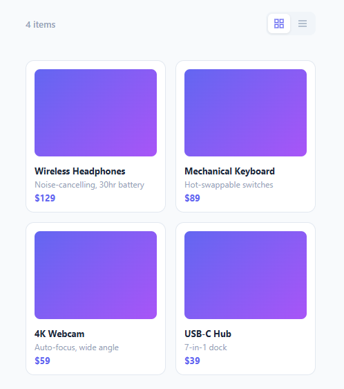
Product listings, file browsers, and search results commonly let users choose between a visual grid layout and a denser list layout. This snippet implements that switch with a single class swap on the shared container — the same card markup renders completely differently depending on whether .grid-view or .list-view is applied, with no JavaScript re-rendering of the actual items.
How one class controls two layouts
Every item uses identical markup: a .item-card containing a .item-thumb and an .item-info block. The *container* (#itemContainer) carries either .grid-view or .list-view. CSS descendant selectors like .item-container.grid-view .item-card { flex-direction: column } versus .item-container.list-view .item-card { flex-direction: row } change how each identical card lays out its own children, and the container itself switches between display: grid (grid mode) and display: flex; flex-direction: column (list mode). Because only the container's class changes, setView(view) never touches the individual item elements — no cloning, no re-rendering, no risk of losing scroll position or event listeners bound to specific cards.
How the thumbnail resizes between modes
In grid mode, the thumbnail is full width with a fixed aspect-ratio: 1.4 so every card's image area is proportional regardless of card width. In list mode, the thumbnail shrinks to a fixed 64px square and the card's flex-direction switches to row, turning what was a vertical stack (image on top, text below) into a horizontal row (small thumbnail on the left, text filling the rest) — again purely through the container-level class controlling which descendant selectors apply.
How the toggle buttons stay in sync
setView toggles the .active class and the aria-pressed attribute on both buttons together, so exactly one is always shown as active and screen readers correctly announce a toggle-button-group pattern (role="group" on the wrapper, aria-pressed per button) rather than an ambiguous pair of plain buttons.
Step by step
How to Use
- 1Load the snippetClick "Grid / List View Toggle" in the sidebar Library tab to load the item collection.
- 2Switch viewsClick the grid and list icons in the toolbar in the preview to see the layout swap instantly.
- 3Swap in real contentReplace the .item-thumb gradients with real <img> tags and update the title/description/price text.
- 4Persist the chosen viewStore the selected view in localStorage inside setView and restore it on page load.
- 5Add a third view modeAdd a new CSS class like .compact-view with its own descendant rules, and extend setView to accept and apply it.
- 6Export and saveExport as HTML/JSX/Tailwind or click "Save as" to reuse this toggle in a real product or file listing page.
Real-world uses
Common Use Cases
Got questions?
Frequently Asked Questions
Every card uses identical HTML markup regardless of the active view. Only the container's class changes between .grid-view and .list-view, and CSS descendant selectors scoped to that class control how each card's children are laid out — no JavaScript ever touches the individual item elements.
The .item-thumb rule is overridden separately for grid mode (full width, fixed aspect-ratio) and list mode (fixed 64px square), both scoped under .item-container.grid-view and .item-container.list-view respectively.
setView toggles the .active class and the aria-pressed attribute on both buttons in the same call, so exactly one button always shows the active/raised styling and screen readers hear the correct pressed state for both.
Yes — save the view name to localStorage inside setView, and on page load read that value back and call setView with it before the user interacts with the toggle.
Add a new class (e.g. .compact-view) with its own container and descendant CSS rules, add a third toggle button, and update setView to remove all view classes before adding whichever one was selected.
No — it is a single class swap driven by one small JavaScript function. It works equally well as a static HTML/CSS/JS component or embedded inside a React/Vue component's render output.
Yes — the wrapping div has role="group" with an aria-label describing its purpose, and each button reports its own pressed state via aria-pressed, which is the standard pattern for a mutually-exclusive toggle button group.