




Animated Task List — Add, Complete & Delete HTML CSS JS
Animated Task List · Animations · Plain HTML, CSS & JS · Live preview
Copy & paste
Source Code
<div class="page">
  <div class="card">
    <div class="card-header">
      <div class="header-left">
        <h2 class="title">My Tasks</h2>
        <span class="count-badge" id="countBadge">0 left</span>
      </div>
      <div class="filters">
        <button class="filter-btn active" data-filter="all">All</button>
        <button class="filter-btn" data-filter="active">Active</button>
        <button class="filter-btn" data-filter="done">Done</button>
      </div>
    </div>

    <form class="add-form" id="addForm">
      <input class="add-input" id="addInput" type="text" placeholder="Add a new task…" maxlength="80" autocomplete="off" aria-label="New task" />
      <button type="submit" class="add-btn" aria-label="Add task">
        <svg width="14" height="14" viewBox="0 0 24 24" fill="none" stroke="currentColor" stroke-width="2.8" stroke-linecap="round"><line x1="12" y1="5" x2="12" y2="19"/><line x1="5" y1="12" x2="19" y2="12"/></svg>
      </button>
    </form>

    <ul class="task-list" id="taskList" role="list" aria-label="Task list" aria-live="polite"></ul>

    <div class="empty-state" id="emptyState" hidden>
      <svg width="40" height="40" viewBox="0 0 24 24" fill="none" stroke="currentColor" stroke-width="1.5" stroke-linecap="round"><rect x="3" y="3" width="18" height="18" rx="4"/><path d="M9 12l2 2 4-4"/></svg>
      <p>No tasks here yet</p>
    </div>

    <div class="card-footer">
      <span class="footer-text" id="footerText"></span>
      <button class="clear-btn" id="clearDoneBtn">Clear done</button>
    </div>
  </div>
</div>*{box-sizing:border-box;margin:0;padding:0}
body{font-family:system-ui,sans-serif;background:linear-gradient(135deg,#f0f9ff 0%,#f5f3ff 100%);min-height:100vh;display:flex;align-items:center;justify-content:center;padding:20px}
.card{background:#fff;border-radius:20px;width:100%;max-width:460px;box-shadow:0 16px 50px rgba(99,102,241,.1);overflow:hidden}
.card-header{display:flex;align-items:center;justify-content:space-between;padding:20px 20px 16px;gap:12px;flex-wrap:wrap}
.header-left{display:flex;align-items:center;gap:10px}
.title{font-size:18px;font-weight:800;color:#1e293b}
.count-badge{font-size:11px;font-weight:700;color:#6366f1;background:#eef2ff;border-radius:20px;padding:2px 8px}
.filters{display:flex;gap:4px}
.filter-btn{font-size:11px;font-weight:600;padding:4px 10px;border-radius:20px;border:1px solid #e2e8f0;background:transparent;color:#64748b;cursor:pointer;transition:all .15s;font-family:inherit}
.filter-btn.active{background:#6366f1;border-color:#6366f1;color:#fff}
.add-form{display:flex;gap:8px;padding:0 16px 14px;border-bottom:1px solid #f1f5f9}
.add-input{flex:1;padding:10px 14px;font-size:13px;border:1.5px solid #e2e8f0;border-radius:10px;outline:none;color:#1e293b;background:#f8fafc;transition:border-color .2s;font-family:inherit}
.add-input:focus{border-color:#6366f1;background:#fff}
.add-btn{width:38px;height:38px;background:#6366f1;border:none;border-radius:10px;color:#fff;display:flex;align-items:center;justify-content:center;cursor:pointer;flex-shrink:0;transition:background .15s,transform .1s}
.add-btn:hover{background:#4f46e5}
.add-btn:active{transform:scale(.93)}
/* Task list */
.task-list{list-style:none;padding:6px 10px;min-height:60px;max-height:320px;overflow-y:auto;display:flex;flex-direction:column;gap:4px}
/* Task item */
.task-item{
display:flex;align-items:center;gap:10px;
padding:10px 12px;border-radius:10px;
background:#f8fafc;border:1px solid #f1f5f9;
transition:background .15s,border-color .15s;
animation:slideIn .28s cubic-bezier(.34,1.56,.64,1);
position:relative;overflow:hidden;
}
.task-item.done-state{background:#f0fdf4;border-color:#bbf7d0}
.task-item.removing{animation:slideOut .25s ease forwards}
@keyframes slideIn{
from{opacity:0;transform:translateY(-12px) scale(.97)}
to{opacity:1;transform:none}
}
@keyframes slideOut{
to{opacity:0;transform:translateX(20px) scale(.96);max-height:0;margin:0;padding:0;border-width:0}
}
.check-btn{width:20px;height:20px;border-radius:6px;border:2px solid #cbd5e1;background:transparent;cursor:pointer;display:flex;align-items:center;justify-content:center;flex-shrink:0;transition:background .2s,border-color .2s;color:#fff;font-size:11px}
.task-item.done-state .check-btn{background:#10b981;border-color:#10b981}
.task-text{flex:1;font-size:13px;color:#334155;transition:color .2s,text-decoration .2s}
.task-item.done-state .task-text{color:#94a3b8;text-decoration:line-through}
.delete-btn{opacity:0;width:22px;height:22px;border-radius:6px;background:none;border:none;color:#94a3b8;cursor:pointer;display:flex;align-items:center;justify-content:center;transition:opacity .15s,background .15s,color .15s;flex-shrink:0}
.task-item:hover .delete-btn{opacity:1}
.delete-btn:hover{background:#fee2e2;color:#ef4444}
/* Empty + footer */
.empty-state{display:flex;flex-direction:column;align-items:center;gap:8px;padding:28px;color:#94a3b8;font-size:13px}
.card-footer{display:flex;align-items:center;justify-content:space-between;padding:10px 16px;border-top:1px solid #f1f5f9}
.footer-text{font-size:11px;color:#94a3b8}
.clear-btn{font-size:11px;color:#6366f1;background:none;border:none;cursor:pointer;font-weight:600;font-family:inherit;padding:4px 8px;border-radius:6px;transition:background .15s}
.clear-btn:hover{background:#eef2ff}let tasks = [
{ id: 1, text: 'Design landing page mockup', done: false },
{ id: 2, text: 'Review pull request #42', done: true },
{ id: 3, text: 'Write unit tests for API module', done: false },
{ id: 4, text: 'Update project documentation', done: false },
];
let nextId = 5;
let filter = 'all';
const list = document.getElementById('taskList');
const addForm = document.getElementById('addForm');
const addInput = document.getElementById('addInput');
const countBadge = document.getElementById('countBadge');
const footerText = document.getElementById('footerText');
const emptyState = document.getElementById('emptyState');
const clearDoneBtn = document.getElementById('clearDoneBtn');
function getFiltered(){
if(filter === 'active') return tasks.filter(t => !t.done);
if(filter === 'done') return tasks.filter(t => t.done);
return tasks;
}
function render(){
const shown = getFiltered();
const total = tasks.length;
const doneCount = tasks.filter(t => t.done).length;
const leftCount = total - doneCount;
countBadge.textContent = leftCount + ' left';
footerText.textContent = total ? `${doneCount} of ${total} complete` : '';
emptyState.hidden = shown.length > 0;
// Remove deleted items with animation
list.querySelectorAll('.task-item').forEach(el => {
if(!shown.find(t => t.id === +el.dataset.id)){
el.classList.add('removing');
el.addEventListener('animationend', () => el.remove(), {once:true});
}
});
// Add new items
shown.forEach((task, i) => {
if(list.querySelector(`[data-id="${task.id}"]`)) return;
const li = document.createElement('li');
li.className = 'task-item' + (task.done ? ' done-state' : '');
li.dataset.id = task.id;
li.style.animationDelay = i * 30 + 'ms';
li.innerHTML = `
<button class="check-btn" aria-label="${task.done ? 'Mark incomplete' : 'Mark complete'}">${task.done ? '✓' : ''}</button>
<span class="task-text">${task.text}</span>
<button class="delete-btn" aria-label="Delete task">
<svg width="12" height="12" viewBox="0 0 24 24" fill="none" stroke="currentColor" stroke-width="2.5" stroke-linecap="round"><line x1="18" y1="6" x2="6" y2="18"/><line x1="6" y1="6" x2="18" y2="18"/></svg>
</button>`;
li.querySelector('.check-btn').addEventListener('click', () => toggleDone(task.id));
li.querySelector('.delete-btn').addEventListener('click', () => deleteTask(task.id));
list.appendChild(li);
});
// Update existing items' done state
list.querySelectorAll('.task-item').forEach(el => {
const t = tasks.find(t => t.id === +el.dataset.id);
if(!t) return;
const wasOk = el.classList.contains('done-state') === t.done;
if(!wasOk){
el.classList.toggle('done-state', t.done);
const cb = el.querySelector('.check-btn');
cb.textContent = t.done ? '✓' : '';
cb.setAttribute('aria-label', t.done ? 'Mark incomplete' : 'Mark complete');
}
});
}
function toggleDone(id){ tasks = tasks.map(t => t.id===id ? {...t,done:!t.done} : t); render(); }
function deleteTask(id){
const el = list.querySelector(`[data-id="${id}"]`);
if(el){ el.classList.add('removing'); el.addEventListener('animationend', () => { tasks = tasks.filter(t => t.id!==id); render(); }, {once:true}); }
}
addForm.addEventListener('submit', e => {
e.preventDefault();
const text = addInput.value.trim();
if(!text) return;
tasks.unshift({ id: nextId++, text, done: false });
addInput.value = '';
render();
});
clearDoneBtn.addEventListener('click', () => {
tasks.filter(t => t.done).forEach(t => deleteTask(t.id));
});
document.querySelectorAll('.filter-btn').forEach(btn => {
btn.addEventListener('click', () => {
filter = btn.dataset.filter;
document.querySelectorAll('.filter-btn').forEach(b => b.classList.toggle('active', b === btn));
list.innerHTML = '';
render();
});
});
render();Extend with AI
Take This Snippet Further With AI
The AI prompt for this one is for Patreon supporters ($3 a month), along with a site with no ads. Supporters enter the passcode once and it is remembered in this browser.
What's included
Features
@keyframes slideIn with cubic-bezier(.34,1.56,.64,1) (spring overshoot) + staggered delay (i * 30ms) creates a cascading ripple on list population..removing class triggers @keyframes slideOut — slides right + collapses max-height to 0. State array updates in the animationend callback, keeping DOM and data in sync..done-state: green checkbox fill, strikethrough text, light green card background — all CSS transitions, zero JS style changes.render() is the single source of truth.opacity: 0 by default; opacity: 1 on .task-item:hover. Keyboard users can tab to the button directly since it's always in the focus order.deleteTask on each completed item — each one gets its own slide-out animation independently.<ul aria-live="polite"> announces additions and deletions to screen readers without interrupting ongoing speech.About this UI Snippet
Animated Task List — Slide-In/Out Keyframes, Filter Tabs & Optimistic State Update
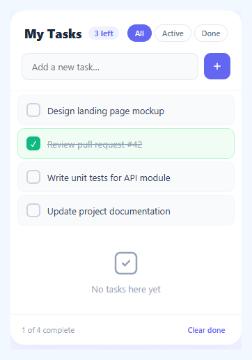
Animated lists are a foundational interaction pattern in modern web apps — tasks that slide in when added, check off with a strikethrough, and slide out when deleted make state changes feel tangible rather than instantaneous. This snippet builds a complete animated task manager: a slide-in @keyframes for new items, a CSS transition for done state (strikethrough + green border), a slide-out animation on delete, filter tabs (All / Active / Done), a live "tasks left" counter, and a "Clear done" bulk action — all in plain HTML, CSS, and vanilla JavaScript.
Animation patterns for lists are tricky because adding, removing, and updating items need separate animation strategies that coexist without flickering.
Slide-in animation for new tasks
New items use animation: slideIn .28s cubic-bezier(.34,1.56,.64,1) — a spring-overshoot easing that gives the item a slight bounce on entry. The translateY(-12px) scale(.97) start state gives the impression of the item dropping in from slightly above. When multiple items are shown (e.g., on filter change), each gets a staggered animation-delay of i * 30ms — a ripple cascade that makes the full list feel alive.
Slide-out animation on delete
Rather than immediately removing the DOM element, the delete handler adds a .removing class and listens for animationend. The animation slides the item right and collapses its height: transform: translateX(20px) scale(.96), opacity: 0, max-height: 0, padding: 0. Transitioning max-height to 0 smoothly closes the gap in the list without a jump. Crucially, the actual state array (tasks.filter) runs after the animation completes — the DOM removal and state removal are in sync.
Filter tabs without full re-render
The filter buttons switch the filter variable and clear the list, then call render(). The render function computes which items should be visible and adds only the ones not already in the DOM — an incremental DOM approach. Items that were removed by filter change are handled by the "remove deleted items" loop that also runs on each render pass. This prevents flicker from a full list teardown on every filter switch.
Live counter with ARIA live region
The <ul> has aria-live="polite" — screen readers announce additions and removals. The count badge reads "X left" (active task count) and the footer shows "X of Y complete" — two levels of progress feedback. Pair with a progress bar if you want a visual completion percentage bar across the top.
Step by step
How to Use
- 1Paste HTML, CSS, and JSA task list card renders with four pre-loaded tasks, filter tabs, an add input, and a footer with completion stats.
- 2Type a task and press EnterThe new task slides in from above with a spring bounce animation. The counter updates immediately.
- 3Click the checkbox to complete a taskThe checkbox fills green, the text gets a strikethrough and turns grey, and the card background turns light green — all via CSS class toggle.
- 4Hover and click the delete buttonThe × button appears on hover. Clicking it slides the item to the right and collapses its height before removing it from the DOM.
- 5Use the filter tabs"Active" shows only incomplete tasks. "Done" shows only completed tasks. "All" shows everything. The list re-renders with a staggered slide-in for visible items.
- 6Click "Clear done"All completed tasks animate out simultaneously. The counter and footer stats update after all animations complete.
Real-world uses
Common Use Cases
Got questions?
Frequently Asked Questions
On every state change, call localStorage.setItem('tasks', JSON.stringify(tasks)). On load, initialise: let tasks = JSON.parse(localStorage.getItem('tasks') || 'null') || defaultTasks.
Add draggable="true" to each .task-item. Use dragstart, dragover, and drop events to track the dragged item and its target. On drop, splice the tasks array and call render(). For a polished version, see the drag sort list snippet.
Add a dueDate property to each task object. Render it as a <time> element inside the list item. Add a date picker input to the add form. Highlight overdue tasks with a red background by comparing task.dueDate < new Date().toISOString().
Use useState for the tasks array. The add handler calls setTasks(prev => [newTask, ...prev]). Toggle done: setTasks(prev => prev.map(t => t.id === id ? {...t, done: !t.done} : t)). Delete: setTasks(prev => prev.filter(t => t.id !== id)). CSS animations still trigger because the DOM element is newly mounted on each add.