

Interact.js Draggable and Resizable Dashboard Panels with Snapping
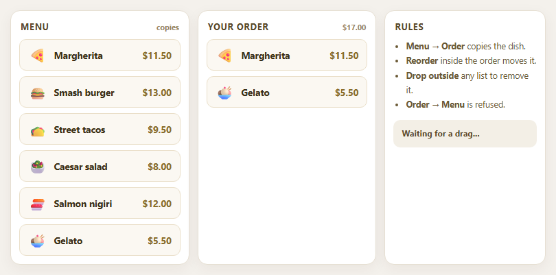
Dragula Copy vs Move Lists with Spill Control

SortableJS Shared Groups: Clone from a Palette into a Page Builder

SortableJS Drag Handle with Pinned and Locked Rows
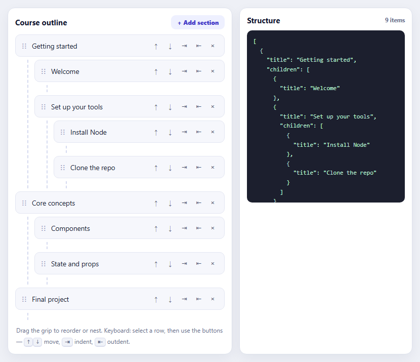
SortableJS Nested Sortable Tree with Keyboard Controls
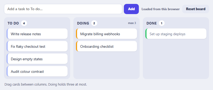
SortableJS Multi-List Kanban with Persistence and WIP Limit
Battery Indicator — Free CSS Battery Level HTML JS Snippet
Battery Indicator · Dashboards · Plain HTML, CSS & JS · Live preview
Copy & paste
Source Code
<div class="bat-card">
  <div class="bat-shell" id="batShell">
    <div class="bat-body">
      <div class="bat-fill" id="batFill"></div>
      <div class="bat-bolt" id="batBolt">
        <svg viewBox="0 0 24 24" fill="currentColor"><path d="M13 2 4 14h6l-1 8 9-12h-6z"></path></svg>
      </div>
      <span class="bat-pct" id="batPct">72%</span>
    </div>
    <div class="bat-cap"></div>
  </div>
  <label class="bat-slider">Level
    <input type="range" id="batRange" min="0" max="100" value="72">
  </label>
  <button type="button" class="bat-charge" id="batCharge">Toggle charging</button>
</div>*{box-sizing:border-box;margin:0;padding:0}
body{font-family:system-ui,-apple-system,sans-serif;background:#0f172a;color:#e2e8f0;display:flex;justify-content:center;padding:34px 18px}
.bat-card{background:#1e293b;border:1px solid #334155;border-radius:16px;padding:26px;width:100%;max-width:300px;text-align:center}
.bat-shell{display:inline-flex;align-items:center;margin-bottom:22px}
.bat-body{position:relative;width:150px;height:74px;border:3px solid #64748b;border-radius:11px;padding:5px;overflow:hidden;background:#0f172a}
.bat-cap{width:7px;height:30px;background:#64748b;border-radius:0 4px 4px 0;margin-left:2px}
.bat-fill{height:100%;border-radius:6px;width:72%;background:#22c55e;transition:width .45s cubic-bezier(.4,0,.2,1),background .35s}
.bat-shell.low .bat-fill{background:#f59e0b}
.bat-shell.crit .bat-fill{background:#ef4444}
.bat-pct{position:absolute;inset:0;display:flex;align-items:center;justify-content:center;font-size:21px;font-weight:800;color:#fff;text-shadow:0 1px 3px rgba(0,0,0,.55);font-variant-numeric:tabular-nums}
.bat-bolt{position:absolute;top:50%;left:50%;transform:translate(-50%,-50%);width:30px;height:30px;color:#fff;opacity:0;transition:opacity .25s;filter:drop-shadow(0 1px 3px rgba(0,0,0,.6))}
.bat-shell.charging .bat-bolt{opacity:1}
.bat-shell.charging .bat-pct{opacity:0}
.bat-shell.charging .bat-fill{animation:batPulse 1.6s ease-in-out infinite}
@keyframes batPulse{50%{opacity:.62}}
.bat-slider{display:block;font-size:11px;font-weight:700;color:#94a3b8;text-transform:uppercase;letter-spacing:.05em;text-align:left;margin-bottom:16px}
.bat-slider input{width:100%;margin-top:8px;accent-color:#22c55e;cursor:pointer}
.bat-charge{width:100%;background:#334155;color:#e2e8f0;border:1px solid #475569;border-radius:9px;padding:10px;font-size:12.5px;font-weight:700;cursor:pointer;font-family:inherit}
.bat-charge:hover{background:#3e4c63}
.bat-charge.on{background:#16a34a;border-color:#16a34a;color:#fff}var shell = document.getElementById('batShell');
var fill = document.getElementById('batFill');
var pct = document.getElementById('batPct');
var range = document.getElementById('batRange');
var chargeBtn = document.getElementById('batCharge');
var charging = false;
function paint() {
var level = Number(range.value);
fill.style.width = level + '%';
pct.textContent = level + '%';
// Color thresholds drive the green / amber / red states.
shell.classList.toggle('crit', level <= 12);
shell.classList.toggle('low', level > 12 && level <= 30);
}
range.addEventListener('input', paint);
chargeBtn.addEventListener('click', function () {
charging = !charging;
shell.classList.toggle('charging', charging);
chargeBtn.classList.toggle('on', charging);
chargeBtn.textContent = charging ? 'Charging\u2026 (stop)' : 'Toggle charging';
if (charging) creep();
});
// While charging, slowly fill toward 100% to simulate a live battery.
var timer = null;
function creep() {
clearInterval(timer);
timer = setInterval(function () {
if (!charging) { clearInterval(timer); return; }
var v = Number(range.value);
if (v >= 100) { clearInterval(timer); return; }
range.value = Math.min(100, v + 1);
paint();
}, 420);
}
paint();Extend with AI
Take This Snippet Further With AI
The AI prompt for this one is for Patreon supporters ($3 a month, 7 days free), along with a site with no ads. Supporters enter the passcode once and it is remembered in this browser.
What's included
Features
About this UI Snippet
Battery Indicator — Animated Charge Level Widget

A battery indicator shows a device's charge as a familiar battery icon that fills and changes color — the control you see in status bars, IoT dashboards, EV apps, and laptop settings. This snippet builds one entirely from HTML, CSS, and vanilla JavaScript: a battery shell with a cap, a fill bar that animates between levels, color thresholds, and a charging mode with an animated bolt that slowly tops the battery up. No images, no SVG sprite sheet, no dependency.
The battery shape in pure CSS
The casing is a bordered rounded rectangle (.bat-body) with a small separate nub (.bat-cap) sitting against its right edge — together they read instantly as a battery. The fill is an absolutely-positioned inner div whose width is a percentage, so the charge level maps directly to a single CSS value. overflow:hidden on the body clips the fill to the rounded corners cleanly.
Color thresholds
Charge level drives three states via class toggles: at or below 12% the shell gets .crit (red), between 13–30% it gets .low (amber), and above that it stays green. The thresholds live in one paint() function with classList.toggle(name, condition), so the color logic is declarative — change the numbers in one place and both the bar and any themed elements follow.
Smooth level transitions
The fill's width and background are transitioned with a cubic-bezier ease, so dragging the slider or stepping the level animates fluidly rather than jumping. The percentage label is centered over the bar with a text shadow so it stays readable against both the dark empty track and the bright fill.
Charging mode
Toggling charge adds a .charging class that fades in a lightning-bolt SVG (hiding the percentage), runs a gentle batPulse opacity keyframe on the fill, and starts a setInterval that increments the level by 1% every 420ms until it reaches 100% — a believable "topping up" animation. Stopping charging clears the interval immediately so no timer leaks.
Wiring to real power data
Replace the slider with a real source: the browser navigator.getBattery() API exposes level and charging, or you can feed values from a device over WebSocket. Call paint() whenever the value changes; because all rendering is centralized there, the indicator stays a thin, stateless view over whatever charge number you give it.
Step by step
How to Use
- 1Paste HTML, CSS, and JSA battery shell renders with a fill bar and a percentage label.
- 2Drag the level sliderThe fill width animates and the percentage updates as you move it.
- 3Watch the color changeBelow 30% the fill turns amber, below 12% it turns red.
- 4Toggle chargingA lightning bolt appears and the bar pulses while the level creeps up.
- 5Let it reach fullCharging stops cleanly at 100% and the interval is cleared.
- 6Feed real dataReplace the slider with navigator.getBattery() and call paint().
Real-world uses
Common Use Cases
Got questions?
Frequently Asked Questions
The body is a div with a thick border and rounded corners, and the terminal is a separate small div (the cap) placed against its right edge. The colored fill is an inner div with a percentage width, and overflow:hidden on the body clips it to the rounded corners. The whole icon is three divs and no graphics.
The paint() function calls classList.toggle('crit', level <= 12) and classList.toggle('low', level > 12 && level <= 30). Those classes change the fill background to red or amber; above 30% neither class applies and it stays green. Adjusting the breakpoints is a one-line change.
A .charging class fades in a bolt SVG, hides the percentage, and runs a pulsing opacity animation on the fill. A setInterval then raises the level by 1% every 420ms until 100%, simulating a real charge. Toggling charging off clears the interval immediately, so there are no leftover timers.
Yes. The browser navigator.getBattery() API returns a promise with level (0–1) and charging fields plus change events. Multiply level by 100, set the slider or call paint() directly, and toggle the charging class from the API's charging value. Any live source — WebSocket, polling — works the same way.
Keep the level and charging flag in state and bind the fill width to a style with the percentage. Move the creep-up setInterval into an effect (useEffect, onMounted, or ngOnInit) and clear it on cleanup to avoid leaks. In Tailwind, set the fill width with an inline style and switch the green/amber/red background via conditional classes.