


Bootstrap Popover Confirm Delete — Free Snippet
Bootstrap Popover Confirm Delete · Modals · Plain HTML, CSS & JS · Live preview
Copy & paste
Source Code
<div class="container py-5">
  <div class="list-group bspop-list" style="max-width:420px" id="bspopList">
    <div class="list-group-item d-flex justify-content-between align-items-center">
      <span>Q3-financial-report.pdf</span>
      <button class="btn btn-sm btn-outline-danger bspop-trigger" type="button">Delete</button>
    </div>
    <div class="list-group-item d-flex justify-content-between align-items-center">
      <span>brand-guidelines.sketch</span>
      <button class="btn btn-sm btn-outline-danger bspop-trigger" type="button">Delete</button>
    </div>
    <div class="list-group-item d-flex justify-content-between align-items-center">
      <span>onboarding-notes.docx</span>
      <button class="btn btn-sm btn-outline-danger bspop-trigger" type="button">Delete</button>
    </div>
  </div>
  <p class="text-muted small mt-3">Deleted: <strong id="bspopDeleted">none</strong></p>
</div>
.bspop-popover .popover-body { padding: 10px 12px; }
.bspop-popover .btn { font-size: 12px; padding: 3px 10px; }let pending = null;
// Bootstrap's popover sanitizes its HTML content by default, and <button>
// is not in that default allowlist — left as-is, both buttons below would
// be silently stripped before the popover ever renders them. Extending the
// allowList (not disabling sanitize) is the documented, still-safe way to
// permit the one extra tag this content actually needs.
const allowList = { ...bootstrap.Popover.Default.allowList, button: ['type', 'class'] };
// One popover instance per trigger, built with a custom HTML body (two real
// buttons) rather than Bootstrap's plain-text default — the standard
// "are you sure?" inline-confirm pattern, with no modal and no page reload.
document.querySelectorAll('.bspop-trigger').forEach(btn => {
const row = btn.closest('.list-group-item');
const name = row.querySelector('span').textContent;
const popover = new bootstrap.Popover(btn, {
html: true,
trigger: 'manual',
placement: 'top',
customClass: 'bspop-popover',
allowList,
content: '<div class="d-flex flex-column gap-2">' +
'<div>Delete <strong>' + name + '</strong>?</div>' +
'<div class="d-flex gap-2">' +
'<button type="button" class="btn btn-danger bspop-confirm">Delete</button>' +
'<button type="button" class="btn btn-light bspop-cancel">Cancel</button>' +
'</div></div>',
});
btn.addEventListener('click', () => {
if (pending && pending !== popover) pending.hide();
popover.toggle();
pending = popover;
});
btn.addEventListener('shown.bs.popover', () => {
const tip = document.querySelector('.popover.show .bspop-confirm, .popover.show .bspop-cancel')?.closest('.popover');
if (!tip) return;
tip.querySelector('.bspop-confirm').addEventListener('click', () => {
document.getElementById('bspopDeleted').textContent = name;
row.remove();
popover.hide();
});
tip.querySelector('.bspop-cancel').addEventListener('click', () => popover.hide());
});
});
// Clicking anywhere outside a trigger or its popover closes it.
document.addEventListener('click', e => {
if (!pending) return;
const tipEl = document.querySelector('.popover.show');
if (tipEl && (tipEl.contains(e.target))) return;
if (e.target.closest('.bspop-trigger')) return;
pending.hide();
pending = null;
});Extend with AI
Take This Snippet Further With AI
The AI prompt for this one is for Patreon supporters ($3 a month), along with a site with no ads. Supporters enter the passcode once and it is remembered in this browser.
What's included
Features
About this UI Snippet
Bootstrap Popover Confirm Delete — HTML, CSS & JavaScript
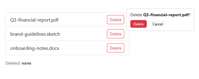
A confirmation modal is overkill for deleting one row from a list — it dims the whole page for a single yes/no decision. This snippet uses real Bootstrap 5.3's Popover component instead, configured with html: true and a custom content string containing two real buttons (Delete, Cancel), so the confirmation appears right next to the action that triggered it rather than taking over the screen.
The one non-obvious step: extending the allowList
Bootstrap's popover sanitizes any HTML content it's given by default, checked against an internal allowlist of permitted tags and attributes — and <button> is not on that default list. Passed as-is, both the Delete and Cancel buttons in the content string above would be silently stripped before the popover ever rendered, leaving an empty confirmation with nothing to click. The fix is allowList: { ...bootstrap.Popover.Default.allowList, button: ['type', 'class'] } — spreading Bootstrap's own default list and adding one explicit entry for the tag this content actually needs, rather than disabling sanitization outright (which would also drop the XSS protection sanitize:true exists for).
Each trigger gets its own bootstrap.Popover instance created with trigger: 'manual', meaning the popover only opens or closes when JavaScript explicitly calls .toggle()/.hide() — Bootstrap's default hover/click auto-triggering wouldn't leave room for the Delete/Cancel buttons inside the popover to be clicked before it closed. A page-level click listener also closes whichever popover is open if a visitor clicks anywhere outside it, and only one popover is ever open at a time.
Step by step
How to Use
- 1Load the snippetClick the snippet in the sidebar Library tab. The preview loads a 3-item file list.
- 2Click "Delete" on any rowA real Bootstrap popover opens above the button with a confirm message and two buttons.
- 3Click "Cancel"The popover closes and the row is untouched.
- 4Click "Delete" again, then confirmClick the row's Delete button, then the popover's red "Delete" — the row is removed and the "Deleted" readout updates.
- 5Try opening a popover then clicking elsewhereOpen one, then click blank space on the page — it closes without deleting anything.
Real-world uses
Common Use Cases
Got questions?
Frequently Asked Questions
Real Bootstrap 5.3 — it's the actual Popover component (new bootstrap.Popover(el, options)) with html: true and a custom content string, loaded from the genuine Bootstrap CDN.
Bootstrap's default click/hover triggers would close the popover as soon as the pointer moved to click one of its own Confirm/Cancel buttons. Manual mode means only explicit .toggle()/.hide() calls open or close it, so its interactive content stays usable.
Bootstrap sanitizes any HTML passed to a popover by default, checked against an internal allowlist of tags and attributes — and <button> isn't on that default list. Without extending it, both the Delete and Cancel buttons in the content string would be silently stripped before the popover ever renders, leaving an empty confirmation. Spreading bootstrap.Popover.Default.allowList and adding a button entry fixes this while keeping sanitization's XSS protection intact for everything else.
It removes the row from the DOM in this front-end demo. Wire the confirm handler's click listener to a real DELETE API call before removing the row for actual persistence.
No — clicking a new trigger explicitly hides any other currently-open popover first, so there's never more than one confirmation visible at a time.
Clicking its Cancel button, or clicking anywhere outside both the trigger and the open popover itself — a document-level click listener handles the outside-click case.