



Bootstrap Profile Card with Follow Toggle — Free Snippet
Bootstrap Profile Card with Follow Toggle · Cards · Plain HTML, CSS & JS · Live preview
Copy & paste
Source Code
<div class="container py-5 d-flex justify-content-center">
  <div class="card bsprofile-card">
    <div class="bsprofile-cover"></div>
    <div class="card-body text-center">
      <div class="bsprofile-avatar mx-auto">DR</div>
      <h5 class="card-title mb-0">Dana Reyes</h5>
      <p class="text-muted small mb-3">Head of Product · Fenwick</p>
      <div class="d-flex justify-content-center gap-4 mb-3">
        <div><strong id="bsprofileFollowers">2,481</strong><div class="text-muted small">Followers</div></div>
        <div><strong>312</strong><div class="text-muted small">Following</div></div>
        <div><strong>48</strong><div class="text-muted small">Posts</div></div>
      </div>
      <button class="btn w-100 fw-bold bsprofile-follow" id="bsprofileBtn" data-following="false">Follow</button>
    </div>
  </div>
</div>
.bsprofile-card { width: 300px; border: 1px solid #eceef1; border-radius: 16px; overflow: hidden; }
.bsprofile-cover { height: 80px; background: linear-gradient(135deg, #6366f1, #ec4899); }
.bsprofile-avatar {
width: 76px; height: 76px; margin-top: -46px;
border-radius: 50%; border: 4px solid #fff;
background: #111827; color: #fff;
display: flex; align-items: center; justify-content: center;
font-weight: 700; font-size: 20px;
}
.bsprofile-follow { transition: background .15s, color .15s, border-color .15s; }
.bsprofile-follow[data-following="false"] { background: #111827; border-color: #111827; color: #fff; }
.bsprofile-follow[data-following="true"] { background: #fff; border: 1.5px solid #d1d5db; color: #111827; }
.bsprofile-follow[data-following="true"]:hover { background: #fef2f2; border-color: #fca5a5; color: #dc2626; }
.bsprofile-follow[data-following="true"]:hover::after { content: " (Unfollow)"; }
.bsprofile-follow[data-following="true"] .bsprofile-label-default { display: inline; }
.bsprofile-follow[data-following="true"]:hover .bsprofile-label-default { display: none; }const btn = document.getElementById('bsprofileBtn');
const followersEl = document.getElementById('bsprofileFollowers');
const BASE = 2481;
btn.addEventListener('click', () => {
const following = btn.dataset.following === 'true';
const next = !following;
btn.dataset.following = String(next);
btn.textContent = next ? 'Following' : 'Follow';
followersEl.textContent = (next ? BASE + 1 : BASE).toLocaleString();
});Extend with AI
Take This Snippet Further With AI
The AI prompt for this one is for Patreon supporters ($3 a month, 7 days free), along with a site with no ads. Supporters enter the passcode once and it is remembered in this browser.
What's included
Features
About this UI Snippet
Bootstrap Profile Card with Follow Toggle — HTML, CSS & JavaScript
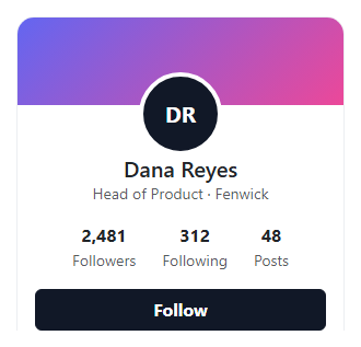
A profile card's Follow button is usually the only interactive element on the card, and this snippet makes sure it's genuinely functional: clicking it toggles a data-following attribute between "false" and "true", swaps the button's own text between "Follow" and "Following", and adjusts the visible follower count by exactly one — an increment when you follow, back down when you unfollow — built on real Bootstrap 5.3's .card component.
The hover state on an already-followed button is a deliberate, common social-app pattern: hovering "Following" reveals "(Unfollow)" and a red-tinted style, previewing what the click will do before it happens, so unfollowing never feels accidental.
Step by step
How to Use
- 1Load the snippetClick the snippet in the sidebar Library tab. The preview loads a profile card with "Follow" and 2,481 followers.
- 2Click FollowThe button becomes "Following" (light style) and the follower count increments to 2,482.
- 3Hover the Following buttonIt shows "(Unfollow)" in a red-tinted style, previewing what clicking again will do.
- 4Click again to unfollowThe button reverts to "Follow" and the count drops back to 2,481.
Real-world uses
Common Use Cases
Got questions?
Frequently Asked Questions
It updates the displayed number in this front-end demo, incrementing or decrementing by one to reflect your own follow action. Wire the click handler to a real API call for actual persistence.
A data-following attribute on the button itself holds "true" or "false", read and flipped on each click — CSS attribute selectors ([data-following="true"]) drive the different visual styles for each state.
It's a deliberate UX pattern: previewing the consequence of a click before it happens (via CSS ::after content and a color change) makes an unfollow action feel intentional rather than an accidental double-click.
Yes — replace .bsprofile-avatar's content and background with an <img> tag; keep the same circular sizing and negative top margin so it still overlaps the cover banner correctly.
The button's visible text already changes between "Follow" and "Following" (not just its color), so its state is conveyed to screen readers through the same text content a sighted user reads.