


Bootstrap Testimonial Card Carousel — Free Snippet
Bootstrap Testimonial Card Carousel · Carousels · Plain HTML, CSS & JS · Live preview
Copy & paste
Source Code
<div class="container py-5" style="max-width:560px">
  <div id="bstestiCarousel" class="carousel slide" data-bs-ride="false">
    <div class="carousel-inner">
      <div class="carousel-item active">
        <div class="card bstesti-card"><div class="card-body text-center">
          <div class="bstesti-stars">★★★★★</div>
          <p class="bstesti-quote">"Cut our onboarding time from two weeks to two days. The whole team adopted it in a single sprint."</p>
          <strong>Dana Reyes</strong><div class="text-muted small">Head of Ops, Fenwick</div>
        </div></div>
      </div>
      <div class="carousel-item">
        <div class="card bstesti-card"><div class="card-body text-center">
          <div class="bstesti-stars">★★★★★</div>
          <p class="bstesti-quote">"Support responded in minutes, not days. That alone justified switching."</p>
          <strong>Priya Nair</strong><div class="text-muted small">CTO, Loomis</div>
        </div></div>
      </div>
      <div class="carousel-item">
        <div class="card bstesti-card"><div class="card-body text-center">
          <div class="bstesti-stars">★★★★☆</div>
          <p class="bstesti-quote">"The API is exactly what you'd hope for — predictable, well documented, no surprises."</p>
          <strong>Marcus Chen</strong><div class="text-muted small">Lead Engineer, Voxel</div>
        </div></div>
      </div>
    </div>
    <button class="carousel-control-prev" type="button" data-bs-target="#bstestiCarousel" data-bs-slide="prev">
      <span class="carousel-control-prev-icon"></span>
    </button>
    <button class="carousel-control-next" type="button" data-bs-target="#bstestiCarousel" data-bs-slide="next">
      <span class="carousel-control-next-icon"></span>
    </button>
    <div class="carousel-indicators bstesti-dots position-relative mt-3">
      <button type="button" data-bs-target="#bstestiCarousel" data-bs-slide-to="0" class="active"></button>
      <button type="button" data-bs-target="#bstestiCarousel" data-bs-slide-to="1"></button>
      <button type="button" data-bs-target="#bstestiCarousel" data-bs-slide-to="2"></button>
    </div>
  </div>
</div>
.bstesti-card { border: 1px solid #eceef1; border-radius: 14px; min-height: 220px; }
.bstesti-stars { color: #f59e0b; font-size: 15px; margin-bottom: 10px; }
.bstesti-quote { font-size: 16px; color: #1f2937; margin-bottom: 16px; }
.carousel-control-prev, .carousel-control-next { width: 5%; filter: invert(1); opacity: .5; }
.bstesti-dots button { background-color: #d1d5db; width: 7px; height: 7px; border-radius: 50%; }
.bstesti-dots button.active { background-color: #6366f1; }// Bootstrap's own Carousel component handles all sliding and indicator
// sync via data-bs-* attributes — data-bs-ride="false" keeps it from
// auto-advancing, since testimonials should stay until manually browsed.
const carousel = bootstrap.Carousel.getOrCreateInstance(document.getElementById('bstestiCarousel'), { ride: false });Extend with AI
Take This Snippet Further With AI
The AI prompt for this one is for Patreon supporters ($3 a month, 7 days free), along with a site with no ads. Supporters enter the passcode once and it is remembered in this browser.
What's included
Features
About this UI Snippet
Bootstrap Testimonial Card Carousel — HTML, CSS & JavaScript
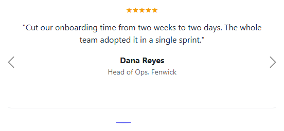
Bootstrap's Carousel component is usually shown carrying full-bleed images — this snippet uses the same real component to carry testimonial cards instead: a star rating, a quote, and an attribution, one per slide. The prev/next arrows, the clickable indicator dots, and the slide transition are all Bootstrap's own .carousel/.carousel-inner/.carousel-indicators markup, wired entirely through data-bs-target/data-bs-slide attributes.
One deliberate setting: data-bs-ride="false". Testimonials are read, not glanced at — auto-advancing them (Bootstrap's default carousel behavior) risks sliding a quote away before a visitor finishes reading it. Here the carousel only ever moves when a visitor clicks an arrow or a dot.
Step by step
How to Use
- 1Load the snippetClick the snippet in the sidebar Library tab. The preview loads the first testimonial card.
- 2Click the next arrowBootstrap's real Carousel slides smoothly to the second testimonial.
- 3Click an indicator dotJump directly to any of the three testimonials by clicking its dot.
- 4Add a fourth testimonialCopy a .carousel-item block and add a matching fourth indicator button with data-bs-slide-to="3".
Real-world uses
Common Use Cases
Got questions?
Frequently Asked Questions
Yes — the sliding, the prev/next controls, and the indicator dots are all genuine Bootstrap 5.3 Carousel behavior, driven by data-bs-target/data-bs-slide attributes, loaded from the real CDN.
data-bs-ride="false" disables Bootstrap's default auto-advance. Testimonials need to be read, not glanced at, so this carousel only moves when a visitor clicks an arrow or a dot.
Copy a .carousel-item block with your new content, and add a matching indicator button with data-bs-slide-to="3" (continuing the zero-based index) to the indicator row.
Yes — remove data-bs-ride="false" (or set it to "carousel") and optionally pass an interval option to the JS initialization, e.g. { interval: 6000 }.
Yes — they're Bootstrap's standard carousel controls, which include the correct ARIA labeling and keyboard focusability out of the box.