
Quill Rich Text Editor with Custom Toolbar and Character Limit

CodeMirror JSON Editor with Validation Gutter
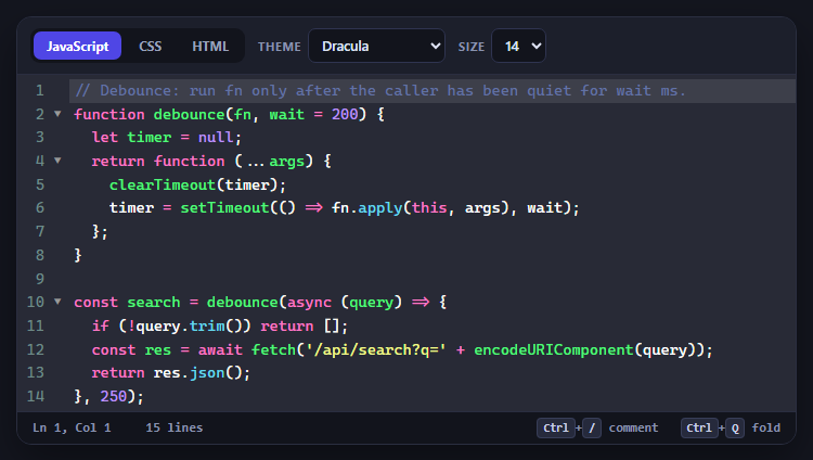
CodeMirror Code Editor with Line Numbers, Folding and Themes

Marked + DOMPurify Live Markdown Preview
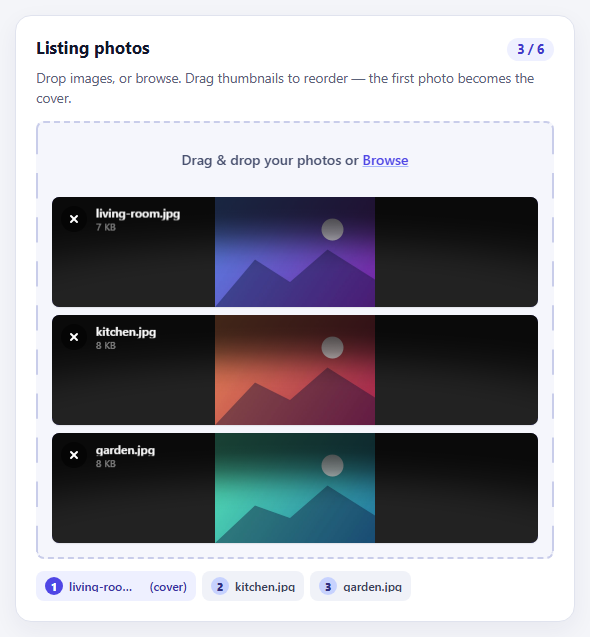
FilePond Image Upload with Preview and Reorder

Cropper.js Aspect-Ratio Presets for Social Posts
Styled Range Slider — Vendor Pseudo-Elements with a Live-Synced Fill
Styled Range Slider — CSS Vendor Pseudo-Elements with Live Fill Sync · Forms · Plain HTML, CSS & JS · Live preview
What's included
Features
About this UI Snippet
Custom-Styled Native Range Slider — WebKit and Firefox Vendor Pseudo-Elements
The native <input type="range"> is genuinely useful — real keyboard support (Arrow keys, Page Up/Down, Home/End), real form submission, real accessibility semantics — but its default appearance is inconsistent and hard to theme across browsers. This snippet keeps the native element and its behavior intact, and restyles only its rendering, using the vendor-prefixed pseudo-elements each browser engine exposes for exactly this purpose.
Why appearance: none is the starting point
-webkit-appearance: none (and the standard appearance: none) strips the browser's default slider chrome entirely, leaving a bare, unstyled <input>. Without this reset, none of the pseudo-element rules below reliably override the native rendering, because the default UI is drawn by the browser's own theme engine rather than styleable elements in the normal cascade.
Two separate pseudo-element vocabularies
There is no single standard set of pseudo-elements for range input parts — each engine defines its own, and this snippet targets both by necessity. WebKit browsers (Chrome, Safari, Edge) expose ::-webkit-slider-runnable-track for the groove and ::-webkit-slider-thumb for the draggable handle. Firefox exposes ::-moz-range-track for the groove, ::-moz-range-thumb for the handle, and — usefully — ::-moz-range-progress, a pseudo-element WebKit has no equivalent for for that automatically fills from the track's start up to the current thumb position.
How the colored fill-track effect is achieved differently per engine
In Firefox, ::-moz-range-progress does the filled-portion rendering for free — the browser handles clipping it to the current value, no script involved. WebKit has no such pseudo-element, so the filled effect there is faked with a linear-gradient hard-stop on ::-webkit-slider-runnable-track: a CSS custom property --fill marks the percentage where the gradient switches from the accent color to the track's neutral gray.
Why a few lines of JavaScript are still worth it here
Raw CSS has no way to read a range input's current numeric value and feed it back into a gradient stop as the user drags the thumb — the attr() CSS function only reads *static* HTML attributes, not the live, dragged value property, and the attribute itself (value="65" in the markup) never updates as the user interacts. Left CSS-only, the WebKit gradient fill would look correct at rest but freeze at its initial position the instant someone drags the thumb — visibly detached from where the handle actually sits. This snippet closes that gap with the smallest fix that solves it: one input-event listener per slider (in the JS tab) that recomputes the percentage and writes it straight to the --fill custom property the gradient already reads. Firefox doesn't need this at all — its native ::-moz-range-progress was already tracking live — so the same listener runs harmlessly there too, since --fill has no effect on Firefox's own progress pseudo-element.
Three variants, one mechanism
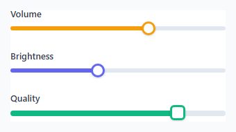
The Volume, Brightness, and Quality sliders reuse the identical pseudo-element structure and the same shared fill-sync listener, with different colors, thumb shapes (circular vs. a rounded-square "chunky" thumb for Quality), and track heights — demonstrating that once the vendor pseudo-element pattern is in place, theming additional variants is a matter of overriding a handful of color and sizing values per class, not rebuilding the slider or its sync logic from scratch.
Where a native range input still wins over a JS-built slider
A native <input type="range"> keeps full keyboard operability, screen-reader announcement of the current value, and real form submission — all free from the browser — none of which a from-scratch JS/div-based slider gets without deliberately reimplementing it. The styling here is entirely CSS (vendor pseudo-elements); the one small script only keeps a cosmetic gradient in sync and adds nothing to the input's actual behavior, so removing it still leaves a fully working, if visually static-on-drag, native slider.
Step by step
How to Use
- 1Reset appearance firstApply -webkit-appearance: none and appearance: none to the input before any pseudo-element rules, or the browser default chrome will still show through.
- 2Style both vendor prefixesYou must write both the ::-webkit- and ::-moz- rule sets — neither browser engine reads the other's vendor-prefixed pseudo-elements.
- 3Set --fill to match your default value on loadGive each slider an initial --fill percentage (or rely on the JS below to set it on load) matching its starting value, so the resting appearance is correct even before the first drag.
- 4Use accent-color as a baseline fallbackaccent-color gives a reasonably themed slider in browsers or contexts where the vendor pseudo-elements are overridden or unavailable.
- 5Add the one-listener fill syncA single input-event listener per slider (see the JS tab) recomputes the percentage and writes it to --fill live, so the WebKit gradient tracks the thumb instead of freezing at its initial value.
Real-world uses
Common Use Cases
Got questions?
Frequently Asked Questions
CSS alone cannot read a range input's live value and feed it back into a gradient hard-stop — attr() only reads the static HTML attribute, which never updates as the user drags. This snippet closes that gap with a single input-event listener (see the JS tab) that writes the current percentage to the --fill custom property the gradient reads, so the fill now tracks the thumb live.
No — Firefox's ::-moz-range-progress pseudo-element already tracks the live value natively, with no script needed. The shared listener still runs on Firefox too since it's applied to every .range element, but it has no visible effect there since --fill only affects the WebKit gradient.
Extend the same input-event listener already in the JS tab — alongside writing --fill, also set a text node's content to range.value. There is no pure-CSS way to display a range input's live numeric value.
Each rendering engine only recognizes its own vendor-prefixed pseudo-elements; ::-webkit-slider-thumb has no effect in Firefox and ::-moz-range-thumb has no effect in Chrome/Safari/Edge, so both rule sets are required for consistent cross-browser styling.
accent-color gives a reasonably themed, browser-consistent slider with a single CSS property and no vendor-prefix duplication, but it offers far less control over exact thumb shape, track height, and gradient fill effects than the full pseudo-element approach used here.
Yes — neither the styling nor the fill-sync listener touches the input's underlying behavior. Arrow keys, Page Up/Down, Home/End, and tab focus all continue to work exactly as they do on an unstyled native range input.
Build with AI
Build, Understand, Optimize, and Extend It With AI
Ask an AI assistant to explain exactly why CSS alone cannot animate the WebKit gradient fill to match the live dragged value, and to contrast that with why Firefox's ::-moz-range-progress can — this is a real, engine-level capability gap, and the single input-event listener in this snippet's JS tab is the minimal fix for it. It's also a good prompt for extending that same listener to add a live numeric value label, and for building a dual-thumb range variant using the same fill-sync pattern.
Prompt to recreate it
Copy this into your AI assistant of choice to build the effect from scratch, or as a jumping-off point for your own variant:
Build a set of three custom-styled native <input type="range"> sliders using HTML, CSS, and the smallest amount of JavaScript needed to keep a colored fill track in sync with the live dragged value, while the sliders remain fully functional native range inputs.

Requirements:
- Reset each slider's default browser appearance using appearance: none (and the -webkit- prefixed equivalent) before applying any custom styling.
- Restyle the track and thumb for WebKit browsers using ::-webkit-slider-runnable-track and ::-webkit-slider-thumb, and separately restyle them for Firefox using ::-moz-range-track and ::-moz-range-thumb, including Firefox's ::-moz-range-progress pseudo-element for its native live-filling track segment.
- Create a colored "filled" track effect on the WebKit side using a linear-gradient hard-stop driven by a --fill CSS custom property on the track pseudo-element.
- Add one input-event listener, applied to every range input, that recomputes the current percentage from (value - min) / (max - min) and writes it to --fill — so the WebKit fill tracks the thumb live instead of staying frozen at its initial value. Explain in a comment why Firefox doesn't need this (::-moz-range-progress already tracks live) but the listener is safe to apply there anyway.
- Style at least two visually distinct variants (e.g. a default slider and a differently-colored, differently-shaped "volume" slider) sharing the same underlying pseudo-element technique and the same shared fill-sync listener.
- Ensure the sliders remain fully keyboard-operable (arrow keys, Home/End) and show a visible focus outline — the JavaScript should only update the --fill custom property, never intercept or reimplement keyboard handling.
Want to tighten it up first? Run this prompt through the AI Prompt Studio to score it across 8 quality dimensions, catch anti-patterns, and tune the wording for Claude, ChatGPT, or Gemini before you paste it in.
Source Code
<div class="demo">
  <div class="slider-block">
    <label class="slider-label" for="volume">Volume</label>
    <input type="range" id="volume" class="range volume-range" min="0" max="100" value="65" />
  </div>
  <div class="slider-block">
    <label class="slider-label" for="brightness">Brightness</label>
    <input type="range" id="brightness" class="range brightness-range" min="0" max="100" value="40" />
  </div>
  <div class="slider-block">
    <label class="slider-label" for="quality">Quality</label>
    <input type="range" id="quality" class="range quality-range" min="0" max="100" value="80" step="20" />
  </div>
</div>
* { box-sizing: border-box; margin: 0; padding: 0; }
body { font-family: system-ui, sans-serif; background: #f8fafc; display: flex; align-items: center; justify-content: center; min-height: 100vh; padding: 24px; }
.demo { width: 360px; max-width: 100%; display: flex; flex-direction: column; gap: 28px; background: #fff; border: 1px solid #e2e8f0; border-radius: 14px; padding: 28px 24px; }
.slider-block { display: flex; flex-direction: column; gap: 10px; }
.slider-label { font-size: 13px; font-weight: 600; color: #374151; }
/* Reset the native appearance so vendor pseudo-elements have a clean base */
.range { -webkit-appearance: none; appearance: none; width: 100%; background: transparent; cursor: pointer; }
.range:focus-visible { outline: 2px solid #6366f1; outline-offset: 4px; border-radius: 4px; }
/* --- WebKit (Chrome, Safari, Edge) track --- */
.range::-webkit-slider-runnable-track { height: 6px; border-radius: 999px; background: linear-gradient(to right, #6366f1 0%, #6366f1 var(--fill, 50%), #e2e8f0 var(--fill, 50%), #e2e8f0 100%); }
.range::-webkit-slider-thumb { -webkit-appearance: none; appearance: none; margin-top: -7px; width: 20px; height: 20px; border-radius: 50%; background: #fff; border: 3px solid #6366f1; box-shadow: 0 1px 3px rgba(15,23,42,0.2); transition: transform 0.12s ease; }
.range::-webkit-slider-thumb:hover { transform: scale(1.12); }
/* --- Firefox track and thumb --- */
.range::-moz-range-track { height: 6px; border-radius: 999px; background: #e2e8f0; }
.range::-moz-range-progress { height: 6px; border-radius: 999px; background: #6366f1; }
.range::-moz-range-thumb { width: 20px; height: 20px; border-radius: 50%; background: #fff; border: 3px solid #6366f1; box-shadow: 0 1px 3px rgba(15,23,42,0.2); transition: transform 0.12s ease; }
.range::-moz-range-thumb:hover { transform: scale(1.12); }
/* Volume variant: warm accent color, using accent-color as a broad-support base */
.volume-range { accent-color: #f59e0b; }
.volume-range::-webkit-slider-runnable-track { background: linear-gradient(to right, #f59e0b 0%, #f59e0b var(--fill, 65%), #e2e8f0 var(--fill, 65%), #e2e8f0 100%); }
.volume-range::-webkit-slider-thumb { border-color: #f59e0b; }
.volume-range::-moz-range-progress { background: #f59e0b; }
.volume-range::-moz-range-thumb { border-color: #f59e0b; }
.brightness-range { accent-color: #6366f1; }
.brightness-range::-webkit-slider-runnable-track { background: linear-gradient(to right, #6366f1 0%, #6366f1 40%, #e2e8f0 40%, #e2e8f0 100%); }
/* Quality variant: chunky stepped thumb, larger tick-like track */
.quality-range { accent-color: #10b981; }
.quality-range::-webkit-slider-runnable-track { height: 8px; background: linear-gradient(to right, #10b981 0%, #10b981 80%, #e2e8f0 80%, #e2e8f0 100%); }
.quality-range::-webkit-slider-thumb { width: 22px; height: 22px; margin-top: -8px; border-radius: 6px; border-color: #10b981; }
.quality-range::-moz-range-track { height: 8px; }
.quality-range::-moz-range-progress { background: #10b981; }
.quality-range::-moz-range-thumb { width: 22px; height: 22px; border-radius: 6px; border-color: #10b981; }// The only JavaScript in this snippet: keep the WebKit gradient fill's
// --fill custom property in sync with the live dragged value. Firefox
// never needs this — its ::-moz-range-progress pseudo-element already
// tracks the live value natively — but WebKit (Chrome, Safari, Edge) has
// no equivalent, so without this the gradient hard-stop stays frozen at
// whatever value was baked into the CSS, visibly lagging behind the thumb
// the moment someone drags it.
document.querySelectorAll('.range').forEach(function (range) {
function syncFill() {
var min = parseFloat(range.min) || 0;
var max = parseFloat(range.max) || 100;
var pct = ((parseFloat(range.value) - min) / (max - min)) * 100;
range.style.setProperty('--fill', pct + '%');
}
range.addEventListener('input', syncFill);
syncFill();
});