


Custom Cursor — Free HTML CSS JS Snippet
Custom Cursor · Animations · Plain HTML, CSS & JS · Live preview
Copy & paste
Source Code
<div class="stage" id="stage">
  <div class="cursor-dot" id="dot"></div>
  <div class="cursor-ring" id="ring"></div>

  <div class="content">
    <h1>Custom Cursor</h1>
    <p>Move your mouse to see the custom cursor with lag effect.</p>
    <div class="interactive-items">
      <button class="item-btn" data-cursor="click">Click me</button>
      <a href="#" class="item-link" data-cursor="link">Hover link</a>
      <div class="item-text" data-cursor="text">Select text</div>
    </div>
  </div>
</div>
* { box-sizing: border-box; margin: 0; padding: 0; }
body { font-family: system-ui, sans-serif; cursor: none; }
.stage {
min-height: 100vh; background: #0f172a;
display: flex; align-items: center; justify-content: center;
padding: 40px; overflow: hidden;
}
.cursor-dot {
position: fixed; pointer-events: none; z-index: 9999;
width: 8px; height: 8px; border-radius: 50%;
background: #6366f1;
transform: translate(-50%, -50%);
transition: width 0.15s, height 0.15s, background 0.15s;
}
.cursor-ring {
position: fixed; pointer-events: none; z-index: 9998;
width: 36px; height: 36px; border-radius: 50%;
border: 2px solid rgba(99,102,241,0.5);
transform: translate(-50%, -50%);
transition: width 0.2s, height 0.2s, border-color 0.2s, border-width 0.2s;
}
.cursor-dot.clicking { width: 12px; height: 12px; background: #ec4899; }
.cursor-ring.clicking { width: 44px; height: 44px; border-color: rgba(236,72,153,0.6); }
.cursor-dot.link { background: #0ea5e9; width: 10px; height: 10px; }
.cursor-ring.link { width: 48px; height: 48px; border-color: rgba(14,165,233,0.5); }
.cursor-dot.text { width: 2px; height: 20px; border-radius: 2px; }
.cursor-ring.text { width: 0; height: 0; border: none; }
.content { text-align: center; display: flex; flex-direction: column; align-items: center; gap: 24px; }
h1 { font-size: 36px; font-weight: 800; color: #f1f5f9; }
p { font-size: 14px; color: #475569; }
.interactive-items { display: flex; gap: 16px; flex-wrap: wrap; justify-content: center; }
.item-btn { padding: 10px 22px; background: #6366f1; color: #fff; border: none; border-radius: 8px; font-size: 14px; font-weight: 600; cursor: none; font-family: inherit; }
.item-link { padding: 10px 22px; color: #0ea5e9; font-size: 14px; font-weight: 600; text-decoration: none; border: 1px solid #0ea5e933; border-radius: 8px; cursor: none; }
.item-text { padding: 10px 22px; color: #94a3b8; font-size: 14px; cursor: none; border: 1px solid #1e293b; border-radius: 8px; user-select: text; }const dot = document.getElementById('dot');
const ring = document.getElementById('ring');
let mx = 0, my = 0, rx = 0, ry = 0;
document.addEventListener('mousemove', e => { mx = e.clientX; my = e.clientY; });
(function frame() {
rx += (mx - rx) * 0.12;
ry += (my - ry) * 0.12;
dot.style.left = mx + 'px';
dot.style.top = my + 'px';
ring.style.left = rx + 'px';
ring.style.top = ry + 'px';
requestAnimationFrame(frame);
})();
document.addEventListener('mousedown', () => { dot.classList.add('clicking'); ring.classList.add('clicking'); });
document.addEventListener('mouseup', () => { dot.classList.remove('clicking'); ring.classList.remove('clicking'); });
document.querySelectorAll('[data-cursor]').forEach(el => {
const type = el.dataset.cursor;
el.addEventListener('mouseenter', () => { dot.classList.add(type); ring.classList.add(type); });
el.addEventListener('mouseleave', () => { dot.classList.remove(type); ring.classList.remove(type); });
});Extend with AI
Take This Snippet Further With AI
The AI prompt for this one is for Patreon supporters ($3 a month, 7 days free), along with a site with no ads. Supporters enter the passcode once and it is remembered in this browser.
What's included
Features
About this UI Snippet
Custom Cursor — Dot + Lagging Ring via Linear Interpolation
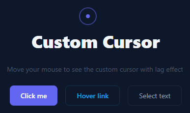
Custom cursor replaces the default OS cursor with a branded dot and lagging ring — the ring follows with a smooth delay creating an elastic feel. It pairs with a cursor-following spotlight effect. Used on creative portfolios, agency sites, and premium dark interfaces.
The lerp (linear interpolation) lag
The dot (8px) is set to the exact mouse position each frame: dot.style.left = mx + "px". The ring (36px) uses lerp: rx += (mx - rx) * 0.12. Each frame the ring moves 12% of the remaining distance to the cursor — it accelerates when far and decelerates as it catches up, creating organic following motion.
cursor: none and pointer-events: none
cursor: none on the stage hides the OS cursor. Both elements have pointer-events: none so mouse events pass through to page elements.
Context-aware hover state
Buttons and links have mouseenter/mouseleave listeners that toggle .hovering on the ring — expanding it to 60px and reducing opacity, communicating a clickable element is under the cursor.
The requestAnimationFrame loop
animateLoop() is called via requestAnimationFrame, creating a persistent animation loop that runs every frame. Inside the loop, mx and my (current mouse position) are read from module-level variables updated by mousemove. The dot moves to the exact position; the ring lerps toward it. Both use transform: translate() for GPU-composited movement with no layout recalculation.
Click feedback state
A mousedown listener adds .clicking to the ring — scaling it down to 0.7 and changing its background to a semi-transparent fill. mouseup removes the class. This gives a physical "press" sensation to the cursor.
When to use a custom cursor
Custom cursors work best on creative, dark-themed pages where the OS cursor is less visible and where the branded element reinforces the product identity. They should always be disabled on touch devices via @media (pointer: coarse) { .cursor-dot, .cursor-ring { display: none } } since touch screens have no cursor.
Accessibility note
Custom cursors can reduce accessibility by hiding the familiar OS pointer. Always maintain cursor: none only on the specific stage element, not on the entire page, so browser UI elements (scrollbars, select dropdowns) keep their native cursor.
Reducing motion preference
For users who have enabled "Reduce Motion" in their OS settings, the lerp animation and cursor ring should be simplified. Add: if (window.matchMedia("(prefers-reduced-motion: reduce)").matches) { ring.style.display = "none"; } This hides the lagging ring, keeping only the dot which follows the cursor directly without animation.
Step by step
How to Use
- 1Move the cursor in the previewMove the cursor around the dark stage to see the dot track instantly and the ring follow with a lag. Hover over buttons to see the ring expand.
- 2Change the lag speedUpdate the 0.12 lerp factor in the JS panel. Higher (0.2) responds faster; lower (0.05) lags more.
- 3Change cursor coloursUpdate background on .cursor-dot and border-color on .cursor-ring in the CSS panel.
- 4Add hover state to more elementsUpdate the querySelectorAll selector in the JS to include any elements that should expand the ring.
- 5Change ring hover sizeUpdate width/height on .cursor-ring.hovering in the CSS panel.
- 6Export in your formatClick "HTML" for a standalone file, "JSX" for a React component, or "Tailwind" for a React + Tailwind version.
Real-world uses
Common Use Cases
Got questions?
Frequently Asked Questions
Linear interpolation: rx += (mx - rx) * 0.12. Each requestAnimationFrame, rx moves 12% of the remaining distance to the cursor position. When the cursor is far away, 12% of a large gap is a big step. When close, 12% of a small gap is tiny — creating natural ease-out deceleration without an animation library.
mousemove fires at irregular intervals tied to mouse movement speed. requestAnimationFrame fires at the display refresh rate (60fps) regardless of mouse activity. Running lerp in rAF produces consistent smooth motion. If you used mousemove, the ring would stutter during fast mouse movements.
cursor: none only applies to pointer devices. Add @media (pointer: coarse) { .cursor-dot, .cursor-ring { display: none !important; } * { cursor: auto !important; } } to restore the native cursor on touch screens. pointerType in pointer events can also detect touch vs mouse at runtime.
On page load before the first mousemove, the dot and ring are at position 0,0. Fix this by initialising positions before the first frame: let mx = window.innerWidth/2, my = window.innerHeight/2, rx = mx, ry = my. This places both at the screen centre until the first real mouse event.
Add event listeners on specific elements: document.querySelectorAll("img[data-zoomable]").forEach(el => { el.addEventListener("mouseenter", () => ring.classList.add("zoom")); el.addEventListener("mouseleave", () => ring.classList.remove("zoom")); }). CSS .cursor-ring.zoom { transform: scale(1.8); } handles the visual change.
Yes. Use useRef for the dot and ring elements. Use useEffect to add the mousemove listener and start the rAF loop. Store mx/my in useRef (not useState) to avoid re-renders on every mouse move — a critical performance detail for cursor animations that update every frame.