


Flip Clock — CSS Flip Clock HTML CSS JS
Flip Clock · Animations · Plain HTML, CSS & JS · Live preview
Copy & paste
Source Code
<div class="fc-clock" id="fcClock" role="timer" aria-label="Flip clock">
  <div class="fc-group" data-unit="h"></div>
  <span class="fc-colon">:</span>
  <div class="fc-group" data-unit="m"></div>
  <span class="fc-colon">:</span>
  <div class="fc-group" data-unit="s"></div>
</div>*{box-sizing:border-box;margin:0;padding:0}
body{font-family:system-ui,-apple-system,sans-serif;background:#0f172a;min-height:100vh;display:flex;align-items:center;justify-content:center}
.fc-clock{display:flex;align-items:center;gap:8px}
.fc-group{display:flex;gap:6px}
.fc-colon{color:#475569;font-size:40px;font-weight:800;animation:fcBlink 1s steps(1) infinite}
@keyframes fcBlink{50%{opacity:.25}}
.fc-digit{position:relative;width:54px;height:74px;perspective:300px;font-size:46px;font-weight:800;font-variant-numeric:tabular-nums;color:#f8fafc}
.fc-half{position:absolute;left:0;right:0;height:37px;overflow:hidden;background:#1e293b;display:flex;justify-content:center;backface-visibility:hidden}
.fc-top{top:0;border-radius:9px 9px 0 0;align-items:flex-end;border-bottom:1px solid #0f172a}
.fc-top span{transform:translateY(50%)}
.fc-bottom{bottom:0;border-radius:0 0 9px 9px;align-items:flex-start}
.fc-bottom span{transform:translateY(-50%)}
/* The flipping leaf: a top-half that rotates down over the static bottom. */
.fc-leaf{position:absolute;top:0;left:0;right:0;height:37px;overflow:hidden;background:#1e293b;border-radius:9px 9px 0 0;display:flex;justify-content:center;align-items:flex-end;transform-origin:bottom;backface-visibility:hidden;border-bottom:1px solid #0f172a}
.fc-leaf span{transform:translateY(50%)}
.fc-flipping .fc-leaf{animation:fcFlip .45s ease-in forwards}
@keyframes fcFlip{0%{transform:rotateX(0)}100%{transform:rotateX(-90deg)}}var clock = document.getElementById('fcClock');
var groups = {};
clock.querySelectorAll('.fc-group').forEach(function (g) { groups[g.dataset.unit] = g; });
function makeDigit() {
var d = document.createElement('div');
d.className = 'fc-digit';
d.innerHTML =
'<div class="fc-half fc-top"><span>0</span></div>' +
'<div class="fc-half fc-bottom"><span>0</span></div>';
return d;
}
// Each group has two digit cells (tens, units).
Object.keys(groups).forEach(function (u) {
groups[u].appendChild(makeDigit());
groups[u].appendChild(makeDigit());
});
function setDigit(cell, value) {
var top = cell.querySelector('.fc-top span');
var bottom = cell.querySelector('.fc-bottom span');
if (top.textContent === value) return; // unchanged → no flip
// Drop a flipping leaf showing the OLD value that rotates away, revealing the new.
var leaf = document.createElement('div');
leaf.className = 'fc-leaf';
leaf.innerHTML = '<span>' + top.textContent + '</span>';
cell.appendChild(leaf);
top.textContent = value;
cell.classList.add('fc-flipping');
leaf.addEventListener('animationend', function () {
bottom.textContent = value; // settle the bottom half
cell.classList.remove('fc-flipping');
leaf.remove();
});
}
function pad(n) { return String(n).padStart(2, '0'); }
function tick() {
var now = new Date();
var parts = { h: pad(now.getHours()), m: pad(now.getMinutes()), s: pad(now.getSeconds()) };
Object.keys(groups).forEach(function (u) {
var cells = groups[u].children;
setDigit(cells[0], parts[u][0]);
setDigit(cells[1], parts[u][1]);
});
}
tick();
setInterval(tick, 1000);Extend with AI
Take This Snippet Further With AI
The AI prompt for this one is for Patreon supporters ($3 a month), along with a site with no ads. Supporters enter the passcode once and it is remembered in this browser.
What's included
Features
About this UI Snippet
Flip Clock — Live Split-Flap Time Display Where Only Changed Digits Flip
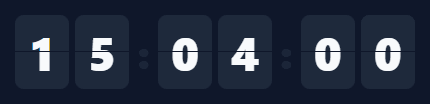
The flip clock — where each digit tumbles over like an old airport split-flap board — is one of the most recognisable retro UI effects. This snippet builds a live, ticking flip clock in plain HTML, CSS, and vanilla JavaScript, where each digit flips only when it actually changes, with no images and no library.
A digit built from two halves
Each digit cell is split into a top and bottom half, both showing the same number, separated by a thin gap — exactly like a real flap display. The number is positioned so the top half shows its upper portion and the bottom half its lower portion, with overflow: hidden clipping each. This two-half construction is what makes the flip believable: the animation can replace the top while the bottom stays put, mimicking how a physical flap hinges in the middle.
The flip is a hinged leaf
When a digit changes, a temporary "leaf" element is created showing the *old* value, layered over the top half with transform-origin: bottom. A CSS keyframe rotates it from flat to −90° (rotateX), so it hinges downward and disappears as if falling forward — revealing the new top value underneath. When the animation ends, the bottom half is updated to the new value and the leaf is removed. This old-value-falls-to-reveal-new-value sequence is the precise mechanic of a split-flap, and doing it with a disposable leaf keeps the static digit clean.
Only changed digits flip
setDigit compares the incoming value to what's shown and returns early if they're equal — so on a normal tick only the seconds' units digit flips, while the tens, minutes, and hours sit still until they actually roll over. This selective animation is both more realistic (a real flap board only moves the flaps that change) and far more efficient than re-animating all six digits every second. The blinking colons, animated with a stepped keyframe, complete the clock feel.
A precise, self-correcting tick
The clock reads the real Date every second via setInterval, so it always shows the actual system time and never drifts from accumulated error — each tick is recomputed from scratch rather than incremented. padStart keeps every unit two digits, and the units are laid out as hours, minutes, seconds with the structure generated in JavaScript so adding or removing a unit is trivial.
Drop-in and adaptable
The clock is self-contained and themeable — change the flap colour, digit size, or fonts with CSS. Point it at a target time instead of now and the same digit-flip mechanic becomes a countdown. It's a clear, complete reference for the split-flap animation technique that powers flip clocks, countdowns, and animated number displays. One detail worth keeping if you fork this: the leaf is created and removed for every flip rather than left in the DOM and reused, which keeps each digit cell free of leftover animation state between flips — reusing a single leaf node would require manually resetting its animation, which is more failure-prone than letting the browser garbage-collect a short-lived element.
Step by step
How to Use
- 1Paste HTML, CSS, and JSA flip clock renders showing the live time as HH:MM:SS with blinking colons.
- 2Watch it tickEach second, the changed digit flips like a split-flap board; unchanged digits stay still.
- 3Restyle itChange the flap colour, digit size, gap, or font to match your design.
- 4Make it a countdownCompute the digits from a remaining duration instead of the current time to count down.
- 5Add or remove unitsThe groups are generated in JS — add a unit or drop seconds by editing the structure.
- 6Use 12-hour formatConvert getHours() to 12-hour and add an AM/PM indicator if preferred.
Real-world uses
Common Use Cases
Date every second, beside a world clock for other time zones.Got questions?
Frequently Asked Questions
Each digit is two halves (top and bottom) showing the same number. When a digit changes, a temporary leaf showing the old value is layered over the top half with transform-origin:bottom and rotated from 0 to −90° via a CSS keyframe, so it hinges down and falls away — revealing the new top value beneath. On animationend, the bottom half updates to the new value and the leaf is removed.
setDigit compares the new value to the one currently shown and returns immediately if they're equal, so no leaf is created and no animation runs. On a normal tick that means only the seconds units digit flips; tens, minutes, and hours stay still until they roll over. This matches a real flap board and avoids needlessly re-animating six digits every second.
No. Each tick calls new Date() and recomputes all the digits from the real system time, rather than incrementing a counter. So even if a setInterval tick is slightly late, the next read corrects it — the display always reflects the actual time and never accumulates drift.
Instead of reading the current time, compute the remaining duration to a target (target − now), break it into hours/minutes/seconds with the same padStart formatting, and feed those into setDigit. The two-half digits and leaf-flip animation are identical — only the source of the numbers changes from "now" to "time left."
In React, run the tick in a useEffect with setInterval (cleared on unmount) and store the time in state, or keep the imperative DOM flip via refs; in Vue, use onMounted/onUnmounted; in Angular, use ngOnInit/ngOnDestroy. The two-half digit structure and leaf-flip CSS are framework-agnostic — only the interval lifecycle moves into the framework.