



Footer Trust & Payment Badges Row — Free Snippet
Footer Trust & Payment Badges Row · Footers · Plain HTML, CSS & JS · Live preview
Copy & paste
Source Code
<div class="ftb-page">
  <main class="ftb-content"><p>↑ Checkout page content above the footer</p></main>
  <footer class="ftb">
    <div class="ftb-inner">
      <div class="ftb-row ftb-seals">
        <p class="ftb-label">Shop with confidence</p>
        <div class="ftb-badges">
          <div class="ftb-badge" data-tip="256-bit TLS encryption protects every transaction end to end.">
            <svg viewBox="0 0 24 24" width="16" height="16" fill="none" stroke="currentColor" stroke-width="2"><path d="M12 2 4 5v6c0 5 3.4 8.7 8 11 4.6-2.3 8-6 8-11V5l-8-3z"/><path d="M9 12l2 2 4-4"/></svg>
            <span>SSL Secured</span>
          </div>
          <div class="ftb-badge" data-tip="Full refund within 30 days, no questions asked.">
            <svg viewBox="0 0 24 24" width="16" height="16" fill="none" stroke="currentColor" stroke-width="2"><path d="M3 12a9 9 0 1 0 3-6.7"/><path d="M3 4v5h5"/></svg>
            <span>Money-Back Guarantee</span>
          </div>
          <div class="ftb-badge" data-tip="Every seller on this marketplace passes a manual identity and business check.">
            <svg viewBox="0 0 24 24" width="16" height="16" fill="none" stroke="currentColor" stroke-width="2"><path d="M12 2l8 4v6c0 5-3.4 8.7-8 10-4.6-1.3-8-5-8-10V6l8-4z"/><path d="M9 12l2 2 4-4"/></svg>
            <span>Verified Sellers</span>
          </div>
          <div class="ftb-badge" data-tip="Every order is packed and dispatched within 24 hours.">
            <svg viewBox="0 0 24 24" width="16" height="16" fill="none" stroke="currentColor" stroke-width="2"><rect x="2" y="7" width="14" height="10" rx="1.5"/><path d="M16 10h3l3 3v4h-6z"/><circle cx="6.5" cy="19" r="1.7"/><circle cx="17.5" cy="19" r="1.7"/></svg>
            <span>Fast Dispatch</span>
          </div>
        </div>
      </div>
      <div class="ftb-row ftb-pay">
        <p class="ftb-label">We accept</p>
        <div class="ftb-icons">
          <span class="ftb-pay-icon" style="color:#1a1f71">VISA</span>
          <span class="ftb-pay-icon" style="color:#eb001b">Mastercard</span>
          <span class="ftb-pay-icon" style="color:#016fd0">AmEx</span>
          <span class="ftb-pay-icon" style="color:#003087">PayPal</span>
          <span class="ftb-pay-icon"> Pay</span>
          <span class="ftb-pay-icon">G Pay</span>
        </div>
      </div>
      <div class="ftb-bottom">
        <span>© 2026 Kestrel Retail Co.</span>
        <div class="ftb-legal"><a href="#">Privacy</a><a href="#">Terms</a><a href="#">Returns</a></div>
      </div>
    </div>
  </footer>
</div>*{box-sizing:border-box;margin:0;padding:0}
body{font-family:system-ui,-apple-system,sans-serif;background:#f8fafc}
.ftb-page{min-height:100vh;display:flex;flex-direction:column}
.ftb-content{flex:1;display:flex;align-items:center;justify-content:center;color:#94a3b8;font-size:13px;padding:50px 20px}
.ftb{background:#fff;border-top:1px solid #e2e8f0}
.ftb-inner{max-width:900px;margin:0 auto;padding:28px 24px 20px}
.ftb-row{padding:14px 0;border-bottom:1px solid #f1f5f9}
.ftb-label{font-size:11px;font-weight:800;text-transform:uppercase;letter-spacing:.6px;color:#94a3b8;margin-bottom:12px;text-align:center}
.ftb-badges{display:flex;flex-wrap:wrap;justify-content:center;gap:10px}
.ftb-badge{position:relative;display:flex;align-items:center;gap:7px;background:#f8fafc;border:1px solid #e2e8f0;border-radius:10px;padding:9px 13px;font-size:12.5px;font-weight:600;color:#334155;cursor:default}
.ftb-badge svg{color:#16a34a;flex-shrink:0}
.ftb-badge:hover{border-color:#16a34a;background:#f0fdf4}
.ftb-badge::after{content:attr(data-tip);position:absolute;bottom:calc(100% + 8px);left:50%;transform:translateX(-50%) translateY(4px);width:200px;background:#0f172a;color:#f1f5f9;font-size:11.5px;font-weight:500;line-height:1.5;padding:9px 11px;border-radius:8px;opacity:0;pointer-events:none;transition:opacity .15s,transform .15s;z-index:5}
.ftb-badge:hover::after,.ftb-badge:focus-visible::after{opacity:1;transform:translateX(-50%) translateY(0)}
.ftb-icons{display:flex;flex-wrap:wrap;justify-content:center;gap:10px}
.ftb-pay-icon{background:#fff;border:1px solid #e2e8f0;border-radius:8px;padding:8px 14px;font-size:12.5px;font-weight:800;color:#334155;letter-spacing:.2px}
.ftb-bottom{padding-top:16px;display:flex;align-items:center;justify-content:space-between;flex-wrap:wrap;gap:10px;font-size:12px;color:#94a3b8}
.ftb-legal{display:flex;gap:16px}
.ftb-legal a{color:#94a3b8;text-decoration:none}
.ftb-legal a:hover{color:#334155}
@media (max-width:520px){ .ftb-bottom{flex-direction:column;text-align:center} }document.querySelectorAll('.ftb-badge').forEach(function (b) {
b.setAttribute('tabindex', '0');
});Extend with AI
Take This Snippet Further With AI
The AI prompt for this one is for Patreon supporters ($3 a month), along with a site with no ads. Supporters enter the passcode once and it is remembered in this browser.
What's included
Features
About this UI Snippet
Footer Trust & Payment Badges Row — Security Seals with Tooltips and Payment Icons
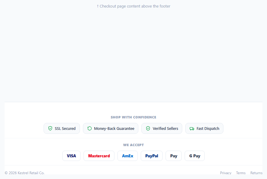
Right before a customer commits to a purchase, a footer full of trust signals does real conversion work: a row of recognizable security seals and accepted payment logos reduces the last-second hesitation that causes cart abandonment. This snippet builds a two-row trust footer — a set of hoverable security/service badges with tooltip explanations, and a plain row of accepted payment method chips — designed to sit at the bottom of a checkout or product page.
Badges with real explanations, not just icons
Each badge in .ftb-seals carries a data-tip attribute with a specific, honest sentence — "256-bit TLS encryption protects every transaction end to end," not just an unexplained padlock icon. A CSS-only tooltip, built from the badge's own ::after pseudo-element reading content: attr(data-tip), appears on :hover and :focus-visible. Using attr() to pull the tooltip text directly from the HTML means there is exactly one place to edit the copy — the data-tip attribute — with no JavaScript required to keep a separate tooltip element in sync.
Why the tooltip is CSS, not JavaScript
A hover tooltip that only needs to show and hide static text is a textbook case for pure CSS: opacity and transform transition on :hover/:focus-visible, with pointer-events: none so the tooltip itself never intercepts the next hover target. The one line of JavaScript in this component exists solely to add tabindex="0" to each badge, so keyboard users can Tab to a badge and trigger the same :focus-visible tooltip that mouse users get on hover — accessibility that a hover-only implementation would silently omit.
Payment icons as honest text chips, not fake brand logos
Rather than embedding trademarked card-network logos (which require licensing and asset management to use correctly), the payment row renders each brand name as a styled text chip in that brand's recognizable color — VISA in navy, Mastercard in red, PayPal in blue. This is a common, legally simpler pattern for demo and prototype work; a production build should swap in the official SVG marks obtained through each network's brand-asset program once the checkout is real.
Two distinct rows, one visual system
The security-seal row and the payment-icon row share the same chip visual language — rounded rectangle, light border, centered content — so they read as one cohesive trust section even though their content types differ (icon + label + tooltip vs. plain colored text). A shared .ftb-label heading style above each row ("Shop with confidence" / "We accept") gives each group its own scannable context without needing a heavier section divider.
Where this earns its keep
Trust badge rows convert best directly above or below the final call-to-action on a checkout page, not buried in a marketing footer nobody scrolls to. If you already have a trust badge strip as a standalone card component elsewhere on the page, this footer variant is the natural place to repeat the same signal at the true bottom of a long checkout flow, where a hesitant buyer's eyes land last before deciding.
Step by step
How to Use
- 1Paste HTML, CSS, and JSA two-row trust footer renders — security seals on top, payment icons below.
- 2Hover or focus a badgeA CSS tooltip appears above the badge, pulled directly from its data-tip attribute.
- 3Edit the tooltip copyChange the data-tip value on any .ftb-badge — no JavaScript edit needed.
- 4Swap in real payment logosReplace the .ftb-pay-icon text chips with your licensed SVG card-network marks.
- 5Add or remove badgesCopy a .ftb-badge div and adjust its icon, label, and data-tip; the flex row absorbs any count.
- 6Export in your formatClick HTML, JSX, or Tailwind to download the version you need.
Real-world uses
Common Use Cases
Got questions?
Frequently Asked Questions
Each badge carries a data-tip attribute, and the CSS rule content: attr(data-tip) on the badge\u2019s ::after pseudo-element reads that attribute directly and renders it as the tooltip content. Showing and hiding it is a plain opacity/transform transition on :hover and :focus-visible — no JS needed for the tooltip itself.
The single JS line adds tabindex="0" to each badge so keyboard users can Tab onto it and trigger the same :focus-visible tooltip that mouse users get on hover. Without it, the badges would be unreachable by keyboard and the tooltip content would be effectively invisible to non-mouse users.
No — they are styled text chips in each brand\u2019s recognizable color, used here to avoid bundling licensed logo files in a demo snippet. For production, obtain the official SVG marks through each card network\u2019s brand-asset program and swap them into the .ftb-pay-icon elements.
Yes — copy an existing .ftb-badge div, replace its inline SVG icon, label span text, and data-tip attribute. The flex row with flex-wrap absorbs any number of badges and re-centers them automatically.
Directly above or below the final call-to-action on a checkout or cart page, not buried in a page-wide marketing footer few users scroll to see. Trust signals work best at the exact moment of decision.
The tooltip text duplicates the badge\u2019s visible label context via data-tip, and because the badge is a focusable element, screen readers announce its own text content regardless of whether the CSS tooltip is visually shown. For stricter compliance, you can add aria-describedby pointing to a visually-hidden element containing the same tip text.