



Hero with 3D Tilting Product Mockup — Free HTML CSS JS Snippet
Hero with 3D Tilting Product Mockup · Heroes · Plain HTML, CSS & JS · Live preview
Copy & paste
Source Code
<section class="tlt-hero">
  <div class="tlt-copy">
    <span class="tlt-eyebrow">New — Studio 4.0</span>
    <h1 class="tlt-h1">Design software<br>that moves with you</h1>
    <p class="tlt-sub">A canvas that responds to every gesture. Move your cursor over the mockup — it's really tracking you, not just playing an animation.</p>
    <a href="#" class="tlt-cta">Download for free</a>
  </div>

  <div class="tlt-stage" id="tltStage">
    <div class="tlt-card" id="tltCard">
      <div class="tlt-glare" id="tltGlare"></div>
      <div class="tlt-screen">
        <div class="tlt-topbar">
          <span></span><span></span><span></span>
        </div>
        <div class="tlt-bars">
          <div class="tlt-bar" style="width:78%"></div>
          <div class="tlt-bar" style="width:52%"></div>
          <div class="tlt-bar" style="width:64%"></div>
        </div>
        <div class="tlt-blocks">
          <div class="tlt-block"></div>
          <div class="tlt-block"></div>
          <div class="tlt-block"></div>
        </div>
      </div>
    </div>
  </div>
</section>*{box-sizing:border-box;margin:0;padding:0}
body{font-family:system-ui,-apple-system,sans-serif;background:#0a0d17;color:#f1f5f9}
.tlt-hero{min-height:100vh;display:flex;flex-direction:column;align-items:center;justify-content:center;gap:52px;padding:80px 24px}
.tlt-copy{text-align:center;display:flex;flex-direction:column;align-items:center;gap:16px;max-width:600px}
.tlt-eyebrow{font-size:12px;font-weight:700;letter-spacing:.08em;text-transform:uppercase;color:#c084fc}
.tlt-h1{font-size:clamp(30px,5.2vw,54px);font-weight:800;line-height:1.12;letter-spacing:-.02em}
.tlt-sub{font-size:15.5px;color:#94a3b8;line-height:1.7;max-width:480px}
.tlt-cta{margin-top:4px;background:#a855f7;color:#fff;font-weight:700;font-size:15px;padding:12px 28px;border-radius:9px;text-decoration:none;box-shadow:0 6px 24px rgba(168,85,247,.35);transition:transform .15s}
.tlt-cta:hover{transform:translateY(-2px)}
.tlt-stage{perspective:1200px;width:min(560px,90vw)}
.tlt-card{position:relative;border-radius:20px;background:linear-gradient(160deg,#1c1f33,#12141f);border:1px solid rgba(255,255,255,.08);box-shadow:0 30px 70px rgba(0,0,0,.55);transform-style:preserve-3d;will-change:transform;transition:transform .1s ease-out}
.tlt-glare{position:absolute;inset:0;border-radius:20px;background:radial-gradient(circle at 50% 50%,rgba(255,255,255,.22),transparent 60%);opacity:0;pointer-events:none;transition:opacity .15s;z-index:2}
.tlt-screen{position:relative;padding:22px;transform:translateZ(30px)}
.tlt-topbar{display:flex;gap:6px;margin-bottom:18px}
.tlt-topbar span{width:9px;height:9px;border-radius:50%;background:rgba(255,255,255,.15)}
.tlt-topbar span:nth-child(1){background:#f87171}
.tlt-topbar span:nth-child(2){background:#facc15}
.tlt-topbar span:nth-child(3){background:#34d399}
.tlt-bars{display:flex;flex-direction:column;gap:10px;margin-bottom:20px}
.tlt-bar{height:9px;border-radius:5px;background:linear-gradient(90deg,#a855f7,#6366f1)}
.tlt-blocks{display:grid;grid-template-columns:repeat(3,1fr);gap:10px}
.tlt-block{aspect-ratio:1;border-radius:10px;background:rgba(255,255,255,.06);border:1px solid rgba(255,255,255,.08)}// Genuine pointer-tracked 3D tilt: rotation is derived from live cursor position each frame.
const stage = document.getElementById('tltStage');
const card = document.getElementById('tltCard');
const glare = document.getElementById('tltGlare');
const MAX_TILT = 14; // degrees
function onMove(e) {
const rect = stage.getBoundingClientRect();
const x = e.clientX - rect.left; // 0..width
const y = e.clientY - rect.top; // 0..height
const px = x / rect.width; // 0..1
const py = y / rect.height; // 0..1
const rotateY = (px - 0.5) * MAX_TILT * 2; // left/right
const rotateX = (0.5 - py) * MAX_TILT * 2; // up/down
card.style.transform = `rotateX(${rotateX}deg) rotateY(${rotateY}deg) scale(1.02)`;
glare.style.opacity = '1';
glare.style.background = `radial-gradient(circle at ${px * 100}% ${py * 100}%, rgba(255,255,255,.28), transparent 60%)`;
}
function onLeave() {
card.style.transform = 'rotateX(0deg) rotateY(0deg) scale(1)';
glare.style.opacity = '0';
}
stage.addEventListener('pointermove', onMove);
stage.addEventListener('pointerleave', onLeave);Extend with AI
Take This Snippet Further With AI
The AI prompt for this one is for Patreon supporters ($3 a month, 7 days free), along with a site with no ads. Supporters enter the passcode once and it is remembered in this browser.
What's included
Features
About this UI Snippet
Hero with 3D Tilting Product Mockup — Cursor-Tracked Tilt and Glare
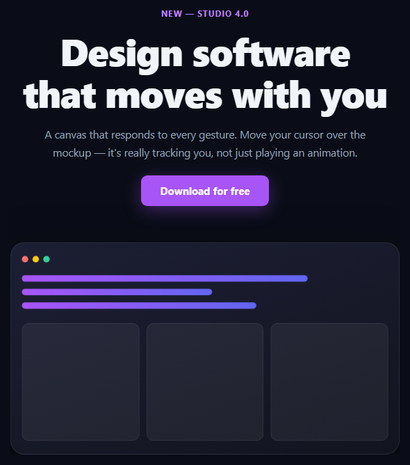
A product mockup that "tilts toward" the cursor is a small detail that reads as expensive craftsmanship — but only if it's actually tracking the pointer. This snippet computes real rotateX/rotateY values from the cursor's live position over the hero every frame, rather than looping a fixed CSS keyframe animation that ignores where the mouse actually is.
The math behind the tilt
On every pointermove over the stage, the handler reads getBoundingClientRect() to get the stage's live position and size, then computes the cursor's position as a 0–1 fraction of the stage's width and height (px, py). Centering that fraction around 0.5 and multiplying by MAX_TILT produces a signed rotation: cursor at the left edge yields a negative rotateY, cursor at the right edge yields a positive one, and the card sits flat at dead center. This is a direct, continuous function of pointer position — move the cursor one pixel, the rotation updates by a proportional fraction of a degree.
Why perspective and transform-style matter
.tlt-stage sets perspective: 1200px — without it, rotateX/rotateY on the card would have no visible depth, just a 2D squash. .tlt-card sets transform-style: preserve-3d so its child elements (the screen content) can be pushed forward in 3D space rather than being flattened onto the card's own plane; .tlt-screen uses translateZ(30px) to sit visibly above the card's base surface, giving the tilt actual depth rather than looking like a rotated flat image.
A glare that moves with the tilt, not against it
The glare layer's radial-gradient center position is recalculated every pointermove from the same px/py fractions driving the rotation — so the highlight tracks the same point the cursor is "pushing" toward, the way light behaves on a real glossy surface being tilted, rather than sitting static or drifting independently of the tilt.
A clean return to rest
pointerleave resets both the transform and the glare opacity, with the CSS transition on .tlt-card easing the snap back to flat rather than the card cutting instantly to rotateX(0) rotateY(0).
Customizing it
Adjust MAX_TILT for a subtler or more dramatic effect, add more translateZ layers inside .tlt-screen for a deeper parallax stack, or swap the abstract UI mockup for a real product screenshot. Pair it with 3D card tilt or tilt glow card for the same technique on a smaller card component, or gradient mesh hero for a different hero backdrop.
Step by step
How to Use
- 1Paste HTML, CSS, and JSThe hero renders with the mockup flat at rest.
- 2Move the cursor over the mockup areaThe card tilts toward your cursor in real 3D, tracking it continuously.
- 3Move to the edgesRotation increases toward MAX_TILT as the cursor approaches the stage bounds.
- 4Move the cursor awayThe card eases back to flat and the glare fades out.
- 5Tune MAX_TILTIncrease for a more dramatic tilt, decrease for subtlety.
- 6Swap the mockup contentReplace .tlt-screen's contents with a real screenshot or iframe.
Real-world uses
Common Use Cases
rotateX and rotateY computed from the live pointer position.translateZ for visible depth.Got questions?
Frequently Asked Questions
On pointermove, the handler reads the stage's live bounding rect, converts the cursor's clientX/clientY into a 0-1 fraction of the stage width and height, centers that fraction around 0.5, and multiplies by MAX_TILT to get signed rotateX/rotateY degrees. Because this runs on every pointermove event with the current cursor position, the rotation is a continuous function of where the cursor actually is — not a looping animation.
perspective on the parent stage establishes the 3D viewing distance — without it, rotateX/rotateY would just squash the card in 2D with no sense of depth. transform-style: preserve-3d on the card lets its child .tlt-screen element (pushed forward with translateZ) render in true 3D space relative to the card's rotation, instead of being flattened onto the card's own 2D plane.
The glare's radial-gradient center position is set from the exact same px and py fractions (0-1 cursor position within the stage) used to compute the rotation, on the same pointermove event. Since both are derived from one shared position, the highlight always sits toward the side the card is tilting toward, mimicking how light reflects off a real glossy surface as it's turned.
A pointerleave listener resets the card's transform to rotateX(0deg) rotateY(0deg) scale(1) and the glare's opacity to 0. Because .tlt-card has a CSS transition on transform, the card eases smoothly back to flat rather than snapping instantly, which reads as a natural settle rather than a glitch.
Attach the pointermove and pointerleave listeners in a mount effect (useEffect in React, onMounted in Vue) scoped to the stage ref, and clean them up on unmount. Since the effect only ever writes to style.transform and the glare's background via refs, it works the same way regardless of framework — no state re-renders are needed per pointer move if you write directly to the DOM node.