


Hover Card — Profile Preview Popover on Hover
Hover Card · Cards · Plain HTML, CSS & JS · Live preview
Copy & paste
Source Code
<p class="hc-prose">
  The library was reorganised by
  <span class="hc-trigger" tabindex="0" data-user="ada"
    data-name="Ada Lovelace" data-handle="@ada" data-bio="Mathematician & first programmer. Writes about algorithms and analytical engines."
    data-followers="12.4k" data-following="180">@ada</span>
  this week, with help from
  <span class="hc-trigger" tabindex="0" data-user="grace"
    data-name="Grace Hopper" data-handle="@grace" data-bio="Compiler pioneer. Rear Admiral. Debugged the first literal bug."
    data-followers="9.1k" data-following="64">@grace</span>.
  Hover or focus a name to preview the profile.
</p>

<div class="hc-card" id="hcCard" role="dialog" aria-hidden="true">
  <div class="hc-top">
    <div class="hc-avatar" id="hcAvatar"></div>
    <button class="hc-follow" id="hcFollow" type="button">Follow</button>
  </div>
  <strong class="hc-name" id="hcName"></strong>
  <span class="hc-handle" id="hcHandle"></span>
  <p class="hc-bio" id="hcBio"></p>
  <div class="hc-stats"><span><b id="hcFollowing"></b> Following</span><span><b id="hcFollowers"></b> Followers</span></div>
</div>*{box-sizing:border-box;margin:0;padding:0}
body{font-family:system-ui,-apple-system,sans-serif;background:#f8fafc;color:#0f172a;display:flex;justify-content:center;padding:60px 20px}
.hc-prose{max-width:440px;font-size:16px;line-height:1.9;color:#334155}
.hc-trigger{color:#4f46e5;font-weight:700;cursor:pointer;border-radius:4px;outline:none}
.hc-trigger:hover,.hc-trigger:focus-visible{text-decoration:underline;background:#eef2ff}
.hc-card{position:fixed;z-index:50;width:268px;background:#fff;border:1px solid #e2e8f0;border-radius:14px;padding:16px;box-shadow:0 18px 44px -16px rgba(0,0,0,.3);opacity:0;transform:translateY(6px) scale(.98);transition:opacity .16s,transform .16s;pointer-events:none}
.hc-card.hc-show{opacity:1;transform:translateY(0) scale(1);pointer-events:auto}
.hc-top{display:flex;align-items:flex-start;justify-content:space-between;margin-bottom:10px}
.hc-avatar{width:52px;height:52px;border-radius:50%;background:linear-gradient(135deg,#6366f1,#22d3ee);display:flex;align-items:center;justify-content:center;color:#fff;font-weight:800;font-size:20px}
.hc-follow{background:#0f172a;color:#fff;border:none;border-radius:999px;padding:6px 16px;font-size:12.5px;font-weight:700;cursor:pointer;font-family:inherit}
.hc-follow.hc-on{background:#fff;color:#0f172a;border:1px solid #cbd5e1}
.hc-name{display:block;font-size:15px;font-weight:800}
.hc-handle{display:block;font-size:13px;color:#64748b;margin-bottom:8px}
.hc-bio{font-size:13px;color:#334155;line-height:1.5;margin-bottom:10px}
.hc-stats{display:flex;gap:16px;font-size:12.5px;color:#64748b}
.hc-stats b{color:#0f172a}var card = document.getElementById('hcCard');
var triggers = Array.prototype.slice.call(document.querySelectorAll('.hc-trigger'));
var fields = { name: 'hcName', handle: 'hcHandle', bio: 'hcBio', followers: 'hcFollowers', following: 'hcFollowing' };
var openTimer = null, closeTimer = null, current = null;
function fill(t) {
document.getElementById('hcName').textContent = t.dataset.name;
document.getElementById('hcHandle').textContent = t.dataset.handle;
document.getElementById('hcBio').textContent = t.dataset.bio;
document.getElementById('hcFollowers').textContent = t.dataset.followers;
document.getElementById('hcFollowing').textContent = t.dataset.following;
document.getElementById('hcAvatar').textContent = t.dataset.name.charAt(0);
var follow = document.getElementById('hcFollow');
follow.classList.remove('hc-on'); follow.textContent = 'Follow';
}
function position(t) {
var r = t.getBoundingClientRect();
var w = card.offsetWidth, h = card.offsetHeight;
var left = Math.min(Math.max(8, r.left + r.width / 2 - w / 2), window.innerWidth - w - 8);
var top = r.bottom + 8;
if (top + h > window.innerHeight - 8) top = r.top - h - 8; // flip above if no room
card.style.left = left + 'px';
card.style.top = top + 'px';
}
function open(t) {
clearTimeout(closeTimer);
if (current === t && card.classList.contains('hc-show')) return;
current = t;
fill(t);
card.classList.add('hc-show');
card.setAttribute('aria-hidden', 'false');
position(t);
}
function scheduleOpen(t) { clearTimeout(openTimer); openTimer = setTimeout(function () { open(t); }, 220); }
function scheduleClose() { clearTimeout(openTimer); closeTimer = setTimeout(function () { card.classList.remove('hc-show'); card.setAttribute('aria-hidden', 'true'); current = null; }, 180); }
triggers.forEach(function (t) {
t.addEventListener('mouseenter', function () { scheduleOpen(t); });
t.addEventListener('mouseleave', scheduleClose);
t.addEventListener('focus', function () { open(t); });
t.addEventListener('blur', scheduleClose);
});
card.addEventListener('mouseenter', function () { clearTimeout(closeTimer); });
card.addEventListener('mouseleave', scheduleClose);
document.getElementById('hcFollow').addEventListener('click', function () {
this.classList.toggle('hc-on');
this.textContent = this.classList.contains('hc-on') ? 'Following' : 'Follow';
});Extend with AI
Take This Snippet Further With AI
The AI prompt for this one is for Patreon supporters ($3 a month), along with a site with no ads. Supporters enter the passcode once and it is remembered in this browser.
What's included
Features
About this UI Snippet
Hover Card — Intent-Delayed Profile Preview Popover
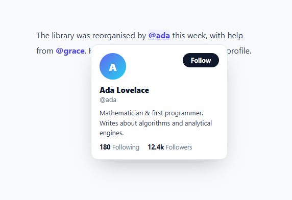
A hover card — the profile preview that appears when you hover a username, like on GitHub or X — gives a rich glimpse without a click. The hard parts aren't the visuals; they're the timing and positioning that stop it flickering or appearing off-screen. This snippet builds a polished hovercard with intent delays, edge-aware placement, and keyboard support, in plain HTML, CSS, and vanilla JavaScript.
Open and close intent
Showing the card the instant the pointer touches a trigger makes it flicker as the cursor passes over names. Instead, this uses intent delays: hovering schedules an open after ~220ms, and leaving schedules a close after ~180ms. Moving the pointer from the trigger onto the card cancels the close, so you can interact with the card's Follow button — the cooperative behaviour that makes hovercards usable rather than fiddly.
A single reusable card
Rather than a card per trigger, there's one card element that's filled from the hovered trigger's data- attributes (name, handle, bio, follower counts) and repositioned. This keeps the DOM light no matter how many usernames appear in the text, and means a long article with dozens of mentions costs one popover, not dozens.
Edge-aware positioning
When the card opens it's measured and placed centred under the trigger, then clamped so it never spills past the left or right edge of the viewport, and flipped above the trigger when there isn't room below. This fixed-positioned, collision-aware placement is what separates a real popover from one that gets cut off at the bottom of the screen.
Keyboard and screen-reader friendly
Each trigger is focusable (tabindex="0"), and focusing one opens the card immediately while blurring closes it — so keyboard users get the same preview without a mouse. The card is a role="dialog" with aria-hidden toggled as it shows and hides, and an interactive Follow button inside demonstrates that the card is fully usable, not just decorative.
Drop-in and themeable
The whole thing is one card, a fill function, and a positioner, with no dependencies. Point the data attributes at your real users (or fetch on open), restyle the card, and you have production-ready hovercards — a clean reference for the intent-timed preview-popover pattern.
Step by step
How to Use
- 1Paste HTML, CSS, and JSText renders with @mention triggers and a hidden preview card.
- 2Hover a nameAfter a short delay the profile card appears below it.
- 3Move onto the cardThe card stays open so you can click Follow.
- 4Use the keyboardTab to a mention and it opens on focus, closes on blur.
- 5Set the dataFill each trigger's data- attributes, or fetch on open.
- 6RestyleTheme the card; the timing and positioning are unaffected.
Real-world uses
Common Use Cases
Got questions?
Frequently Asked Questions
Without them the card flickers on and off as the pointer sweeps across triggers, and it closes the instant you try to move onto it. A short open delay (~220ms) means the card only appears when you actually pause on a name, and a short close delay (~180ms) plus cancelling the close when you enter the card lets you move onto it and click inside. These intent delays are what make hovercards feel deliberate.
On open the card is measured and centred under the trigger, then its left is clamped between the viewport edges and, if there is not enough room below, it flips to sit above the trigger. Because it is position: fixed and placed from the trigger's bounding rect, it stays correctly anchored even as the page scrolls.
Yes. Each trigger has tabindex=0, so it is focusable; focusing opens the card and blurring closes it, giving keyboard users the same preview. The card is a role=dialog with aria-hidden toggled, and its contents (like the Follow button) are real focusable controls, so the preview is operable without a mouse.
Yes. The fill function currently reads data- attributes, but you can replace it with a fetch keyed by the trigger's data-user, showing a brief loading state in the card while the request resolves. Cache results so re-hovering the same user is instant. The timing and positioning logic stays the same.
Render one popover component controlled by state (the active trigger and open flag), and attach mouseenter/mouseleave/focus/blur handlers to each trigger that schedule open/close with timers stored in refs. Position it in an effect after it renders. Libraries like Floating UI can handle the collision logic. Tailwind users swap the classes for utilities; the intent timing is unchanged.