



Squircle Corners in CSS: corner-shape Cards and Buttons
Squircle Corners in CSS: corner-shape Cards and Buttons · Cards · Plain HTML, CSS & JS · Live preview
About this UI Snippet
Squircle Corners With One CSS Property
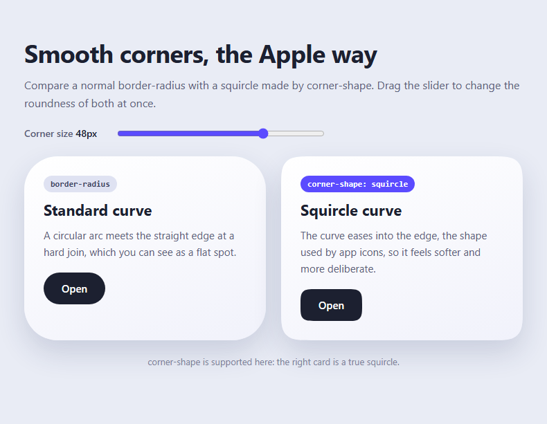
A normal border-radius joins a circular arc to a straight edge, and the join shows as a faint flat spot. The "squircle" used in app icons and iOS cards eases the curve into the edge, so it looks softer and more expensive. Designers have faked it with SVG masks and clip-paths for years. The corner-shape property now does it in CSS, and this snippet shows the difference side by side.
One declaration
Adding corner-shape: squircle to an element with a border-radius changes only the curve. The radius values, the layout and the box model stay the same. You can also try bevel, scoop, notch and superellipse() with the same property.
A fair comparison
Both cards share the same padding, shadow, gradient and radius, driven by one custom property --r. The only difference is the corner-shape line on the right card, so what you see is exactly what the property does.
Live slider
The range input writes --r on the page container, and both cards and both buttons recalculate. Buttons use half the radius with calc(var(--r) / 2), a pattern worth copying: nested elements look best when their radius is smaller than the parent's by the amount of padding.
Shadows and borders follow the shape
Unlike a clip-path hack, the box shadow, border and background all follow the squircle, because it changes the border box itself. Nothing is cut off, so focus outlines and shadows keep working.
Fallback
Browsers without support ignore corner-shape and show the normal rounded corner. A short script reports which one you are seeing. Use it with the 3D flip card or any card set to make the edges feel more refined.
Design advice
Squircles are most noticeable at larger radii, so use them on cards, sheets and app-style buttons rather than on 4px inputs. Keep one radius scale across the interface, and check that text inside a card still has enough padding near the corners, because the squircle removes slightly more area there than a circle does.
What's included
Features
Step by step
How to Use
- 1Set one radius variablePut --r on the page container (the slider writes to it) and use border-radius: var(--r) on cards.
- 2Add corner-shape: squircle to the shaped elementsThe card and button on the right have it; the ones on the left do not, which is the whole comparison.
- 3Halve the radius for nested elementsButtons use calc(var(--r) / 2) so the inner curve stays in proportion to the card around it.
- 4Drag the sliderBetween 8 and 64px, the difference between a circular arc and a squircle is easiest to see near 48px.
- 5Try the other keywordsReplace squircle with bevel, scoop or notch on a single card to see how the same radius draws different corners.
- 6Read the support noteThe line under the cards says whether the current browser understands corner-shape; if not, both cards use a normal rounded corner.
Real-world uses
Common Use Cases
Got questions?
Frequently Asked Questions
Chrome and Edge from version 139. Safari and Firefox do not support it yet. Because unsupported browsers ignore the property and keep the normal border-radius, it is a safe progressive enhancement rather than something that breaks.
A rounded corner is a circular arc, so curvature jumps from zero to a fixed value where it meets the edge. A squircle changes curvature gradually, which removes that visible join and gives the continuous, softer look of app icons.
Yes. corner-shape only changes the curve; border-radius still sets the size. Without a radius there is nothing to shape. Set both together, and drive the radius from a custom property for easy adjustment.
Yes. The shape changes the border box, so box-shadow, border, outline and background all follow it. That is the main advantage over clip-path or mask approaches, which cut off shadows and outlines.
Copy & paste
Source Code
<main class="sq-page">
  <h1>Smooth corners, the Apple way</h1>
  <p class="sq-sub">Compare a normal border-radius with a squircle made by corner-shape. Drag the slider to change the roundness of both at once.</p>

  <div class="sq-controls">
    <label for="sqRange">Corner size <output id="sqOut">48px</output></label>
    <input type="range" id="sqRange" min="8" max="64" value="48" />
  </div>

  <div class="sq-grid">
    <article class="sq-card sq-round">
      <span class="sq-tag">border-radius</span>
      <h2>Standard curve</h2>
      <p>A circular arc meets the straight edge at a hard join, which you can see as a flat spot.</p>
      <button type="button" class="sq-btn">Open</button>
    </article>
    <article class="sq-card sq-squircle">
      <span class="sq-tag sq-new">corner-shape: squircle</span>
      <h2>Squircle curve</h2>
      <p>The curve eases into the edge, the shape used by app icons, so it feels softer and more deliberate.</p>
      <button type="button" class="sq-btn">Open</button>
    </article>
  </div>
  <p class="sq-note" id="sqNote"></p>
</main>*{box-sizing:border-box;margin:0;padding:0}
body{font-family:system-ui,-apple-system,'Segoe UI',sans-serif;background:#e9ecf5;color:#1c2030;min-height:100vh}
.sq-page{--r:48px;max-width:760px;margin:0 auto;padding:52px 20px}
h1{font-size:clamp(26px,5vw,36px);letter-spacing:-.02em}
.sq-sub{margin:10px 0 22px;color:#5a6178;line-height:1.6}
.sq-controls{display:flex;align-items:center;gap:16px;margin-bottom:24px;font-size:14px;font-weight:600;color:#5a6178}
.sq-controls output{display:inline-block;min-width:44px;color:#1c2030;font-variant-numeric:tabular-nums}
.sq-controls input{flex:1;max-width:300px;accent-color:#5b4bff}
.sq-grid{display:grid;grid-template-columns:repeat(auto-fit,minmax(260px,1fr));gap:22px}
.sq-card{padding:28px;background:linear-gradient(160deg,#fff,#f1f2fb);box-shadow:0 18px 40px rgb(40 50 100 / .16);display:flex;flex-direction:column;gap:10px;align-items:flex-start}
.sq-card h2{font-size:22px}
.sq-card p{color:#5a6178;line-height:1.6;font-size:15px}
.sq-tag{font:600 12px ui-monospace,Menlo,monospace;padding:5px 10px;background:#dfe2f2;color:#394060;border-radius:99px}
.sq-new{background:#5b4bff;color:#fff}
.sq-btn{margin-top:8px;font:600 15px system-ui,sans-serif;padding:13px 26px;border:0;background:#1c2030;color:#fff;cursor:pointer}
.sq-btn:focus-visible{outline:3px solid #5b4bff;outline-offset:3px}
/* Normal rounded corners */
.sq-round{border-radius:var(--r)}
.sq-round .sq-btn{border-radius:calc(var(--r) / 2)}
/* Squircle: same radius value, different curve */
.sq-squircle{border-radius:var(--r);corner-shape:squircle}
.sq-squircle .sq-btn{border-radius:calc(var(--r) / 2);corner-shape:squircle}
/* Fallback: browsers without corner-shape keep a plain border-radius, so nothing breaks.
The shadow follows the shape in both cases because box-shadow uses the border box. */
.sq-note{margin-top:22px;font-size:13px;color:#7b8299;text-align:center}var page = document.querySelector('.sq-page');
var range = document.getElementById('sqRange');
var out = document.getElementById('sqOut');
var note = document.getElementById('sqNote');
range.addEventListener('input', function () {
page.style.setProperty('--r', range.value + 'px');
out.textContent = range.value + 'px';
});
note.textContent = CSS.supports('corner-shape', 'squircle')
? 'corner-shape is supported here: the right card is a true squircle.'
: 'corner-shape is not supported in this browser yet, so both cards show a normal rounded corner.';Extend with AI
Take This Snippet Further With AI
Paste this snippet into an AI coding assistant and ask it to explain how corner-shape differs from border-radius and why the radius is driven by a custom property. Useful follow-ups: add a bevel and scoop gallery, apply squircles to an avatar and tag set, or build a dark-mode card grid. Ask it to keep the border-radius fallback for unsupported browsers.
Prompt to recreate it
Copy this into your AI assistant of choice to build the effect from scratch, or as a jumping-off point for your own variant:
Build a squircle comparison page in plain HTML, CSS and a little JavaScript using the CSS corner-shape property.

Requirements:
- A heading, a short intro, and a range slider (8 to 64px, default 48) with a live output that updates a custom property --r on the page container.
- Two cards side by side in a responsive grid, identical in padding, gradient background and soft box-shadow. Card one uses border-radius: var(--r). Card two uses the same radius plus corner-shape: squircle. Label them "border-radius" and "corner-shape: squircle".
- Each card has a heading, a sentence and a button. Buttons use border-radius: calc(var(--r) / 2); the right button also gets corner-shape: squircle.
- Script: write --r when the slider changes and show a note using CSS.supports('corner-shape', 'squircle') that says whether the browser supports it.
- Visible focus styles on the buttons, readable contrast, and a layout that works at phone width.
Want to tighten it up first? Run this prompt through the AI Prompt Studio to score it across 8 quality dimensions, catch anti-patterns, and tune the wording for Claude, ChatGPT, or Gemini before you paste it in.