
Icon Toolbar with Roving Tabindex — WAI-ARIA Toolbar Keyboard Pattern
Icon Toolbar — Roving Tabindex Keyboard Navigation · Buttons · Plain HTML, CSS & JS · Live preview
Copy & paste
Source Code
<div class="demo">
  <div class="toolbar" role="toolbar" aria-label="Text formatting" id="toolbar">
    <button class="tbtn" data-cmd="bold" tabindex="0" aria-pressed="false" aria-label="Bold">
      <svg width="15" height="15" viewBox="0 0 24 24" fill="none" stroke="currentColor" stroke-width="2.4" stroke-linecap="round" stroke-linejoin="round"><path d="M6 4h6a3.5 3.5 0 0 1 0 7H6zM6 11h7a3.5 3.5 0 0 1 0 7H6z"/></svg>
    </button>
    <button class="tbtn" data-cmd="italic" tabindex="-1" aria-pressed="false" aria-label="Italic">
      <svg width="15" height="15" viewBox="0 0 24 24" fill="none" stroke="currentColor" stroke-width="2.4" stroke-linecap="round"><path d="M19 4h-9M5 20h9M15 4 9 20"/></svg>
    </button>
    <button class="tbtn" data-cmd="underline" tabindex="-1" aria-pressed="false" aria-label="Underline">
      <svg width="15" height="15" viewBox="0 0 24 24" fill="none" stroke="currentColor" stroke-width="2.4" stroke-linecap="round"><path d="M6 3v8a6 6 0 0 0 12 0V3M4 21h16"/></svg>
    </button>
    <div class="tbar-sep"></div>
    <button class="tbtn" data-cmd="align-left" tabindex="-1" aria-pressed="true" aria-label="Align left">
      <svg width="15" height="15" viewBox="0 0 24 24" fill="none" stroke="currentColor" stroke-width="2.4" stroke-linecap="round"><path d="M3 6h18M3 12h12M3 18h15"/></svg>
    </button>
    <button class="tbtn" data-cmd="align-center" tabindex="-1" aria-pressed="false" aria-label="Align center">
      <svg width="15" height="15" viewBox="0 0 24 24" fill="none" stroke="currentColor" stroke-width="2.4" stroke-linecap="round"><path d="M3 6h18M6 12h12M4 18h16"/></svg>
    </button>
    <button class="tbtn" data-cmd="align-right" tabindex="-1" aria-pressed="false" aria-label="Align right">
      <svg width="15" height="15" viewBox="0 0 24 24" fill="none" stroke="currentColor" stroke-width="2.4" stroke-linecap="round"><path d="M3 6h18M9 12h12M6 18h15"/></svg>
    </button>
  </div>
  <p class="hint">Focus a button, then use ← → Home End to move — Tab leaves the toolbar entirely</p>
</div>
* { box-sizing: border-box; margin: 0; padding: 0; }
body { font-family: system-ui, sans-serif; background: #f8fafc; display: flex; align-items: center; justify-content: center; min-height: 100vh; padding: 24px; flex-direction: column; gap: 12px; }
.toolbar { display: flex; align-items: center; gap: 3px; background: #fff; border: 1px solid #e2e8f0; border-radius: 12px; padding: 6px; }
.tbtn { width: 34px; height: 34px; display: flex; align-items: center; justify-content: center; background: none; border: none; border-radius: 8px; color: #475569; cursor: pointer; transition: background 0.15s, color 0.15s; }
.tbtn:hover { background: #f1f5f9; }
.tbtn[aria-pressed="true"] { background: #eef2ff; color: #4338ca; }
.tbtn:focus-visible { outline: 2px solid #6366f1; outline-offset: 1px; }
.tbar-sep { width: 1px; height: 20px; background: #e2e8f0; margin: 0 4px; }
.hint { font-size: 11.5px; color: #94a3b8; max-width: 320px; text-align: center; }const toolbar = document.getElementById('toolbar');
const buttons = Array.from(toolbar.querySelectorAll('.tbtn'));
function setActiveIndex(newIndex) {
buttons.forEach((btn, i) => {
btn.tabIndex = i === newIndex ? 0 : -1;
});
buttons[newIndex].focus();
}
toolbar.addEventListener('keydown', (e) => {
const currentIndex = buttons.findIndex((b) => b === document.activeElement);
if (currentIndex === -1) return;
let nextIndex = null;
if (e.key === 'ArrowRight') nextIndex = (currentIndex + 1) % buttons.length;
else if (e.key === 'ArrowLeft') nextIndex = (currentIndex - 1 + buttons.length) % buttons.length;
else if (e.key === 'Home') nextIndex = 0;
else if (e.key === 'End') nextIndex = buttons.length - 1;
if (nextIndex !== null) {
e.preventDefault();
setActiveIndex(nextIndex);
}
});
buttons.forEach((btn) => {
btn.addEventListener('click', () => {
const group = btn.dataset.cmd.startsWith('align-') ? 'align' : null;
if (group) {
buttons.filter((b) => b.dataset.cmd.startsWith('align-')).forEach((b) => b.setAttribute('aria-pressed', 'false'));
btn.setAttribute('aria-pressed', 'true');
} else {
const pressed = btn.getAttribute('aria-pressed') === 'true';
btn.setAttribute('aria-pressed', String(!pressed));
}
});
});Extend with AI
Take This Snippet Further With AI
The AI prompt for this one is for Patreon supporters ($3 a month), along with a site with no ads. Supporters enter the passcode once and it is remembered in this browser.
What's included
Features
About this UI Snippet
Icon Toolbar with Roving Tabindex — One Tab Stop, Arrow-Key Navigation Inside
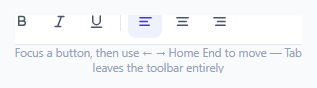
A row of icon buttons that are each individually tabindex="0" forces a keyboard user to press Tab once per button just to get past the toolbar — tedious for a five-button group, genuinely painful for a longer one. This snippet instead implements the WAI-ARIA roving tabindex pattern: the whole toolbar is a single Tab stop, and once focus is inside it, the arrow keys move focus between buttons directly.
Only one button is ever tabbable at a time
At any moment, exactly one .tbtn has tabindex="0" and every other button has tabindex="-1" — -1 means "focusable via script, but skipped by Tab." setActiveIndex() is what "roves" that single 0 between buttons: it sets every button's tabIndex in one pass, then calls .focus() on the new active one. This is the defining mechanic of the pattern — Tab always lands on (and leaves from) whichever single button currently holds the roving 0, not on every button in sequence.
Arrow keys, Home and End move focus without leaving the group
The keydown handler on the toolbar container computes the currently focused button's index via buttons.findIndex((b) => b === document.activeElement), then computes a wrapped next index for ArrowRight/ArrowLeft (using modulo arithmetic so focus cycles from the last button back to the first, and vice versa) or jumps straight to the first/last button for Home/End — matching the standard toolbar keyboard interaction model a screen reader user would expect from this role="toolbar".
Toggle state uses aria-pressed, and alignment buttons behave like a real radio group
The bold/italic/underline buttons are independent toggles — each click flips its own aria-pressed between "true"/"false" without affecting the others. The three alignment buttons behave differently: clicking one sets every other alignment button's aria-pressed back to "false" first, so only one alignment can be active at a time — mimicking a radio group's mutual exclusivity even though these are plain <button> elements, because that's the correct semantic behavior for "which single alignment is currently applied," unlike bold/italic/underline which can all be simultaneously on.
Why this matters beyond convenience
Roving tabindex isn't just a nicety — it's the documented WAI-ARIA authoring practice for composite widgets like toolbars, menus, and grids specifically because screen reader users navigating by Tab expect a *group* of related controls to be one stop in the page's overall tab order, with the browsing-within-the-group handled by a different, more specific set of keys — exactly the behavior this pattern, correctly implemented, provides.
Step by step
How to Use
- 1Focus a button and use the arrow keysTab into the toolbar once, then use ArrowLeft/ArrowRight to move between buttons, or Home/End to jump to the first/last.
- 2Add or remove buttons freelyEvery .tbtn is picked up automatically by buttons = Array.from(toolbar.querySelectorAll('.tbtn')) — no manual index list to maintain.
- 3Group mutually-exclusive buttons by a shared data-cmd prefixThe alignment buttons use "align-" as a shared prefix so clicking one turns the others off — copy this pattern for any other single-choice button group.
- 4Leave independent toggles with distinct data-cmd valuesBold/italic/underline each toggle independently since their data-cmd values don't share a common group prefix.
- 5Wire real formatting commandsReplace the aria-pressed toggling in the click handler with your actual document.execCommand, contentEditable, or rich-text editor API calls.
Real-world uses
Common Use Cases
role="toolbar" with a descriptive aria-label, and toggle buttons whose aria-pressed state is tracked properly.Got questions?
Frequently Asked Questions
Roving tabindex keeps exactly one button in a composite widget as a Tab stop (tabindex="0") while every other button is tabindex="-1" (focusable programmatically, but skipped by Tab). If every button were tabindex="0", a keyboard user would have to press Tab once per button just to get past the toolbar, which is the exact inefficiency this pattern avoids.
The keydown handler looks up buttons.findIndex((b) => b === document.activeElement), comparing the live focused DOM element against the toolbar's button list, rather than tracking a separately-maintained "current index" variable that could drift out of sync.
Alignment is inherently single-choice — text can only be left, center, or right aligned at once — so clicking one alignment button explicitly clears aria-pressed on the other two. Bold, italic and underline are independent properties that can all be active simultaneously, so their toggles don't affect each other.
No — that's the point of the pattern. Tab moves focus into or out of the toolbar as a single stop (landing on whichever button currently holds tabindex="0"); moving between buttons within the toolbar is done with the arrow keys, Home, and End instead.
Yes — swap the ArrowRight/ArrowLeft key checks for ArrowDown/ArrowUp (or support both) to match the toolbar's visual orientation, and consider adding aria-orientation="vertical" to the role="toolbar" element.
Yes — role="toolbar" with aria-label tells assistive technology this is a related group of controls, the roving tabindex ensures correct single-stop Tab behavior, and aria-pressed communicates each toggle button's current state, all matching the documented WAI-ARIA Authoring Practices toolbar pattern.