



Image Hotspot Tooltips — HTML CSS JS Snippet
Image Hotspot with Tooltips · Media · Plain HTML, CSS & JS · Live preview
Copy & paste
Source Code
<div class="demo">
  <div class="card">
    <div class="card-header">
      <h3 class="card-title">MacBook Pro Workspace</h3>
      <span class="badge">Click hotspots to explore</span>
    </div>
    <div class="hotspot-wrap" id="hotspotWrap">
      <!-- CSS-drawn workspace scene -->
      <div class="scene">
        <div class="desk"></div>
        <div class="laptop">
          <div class="screen">
            <div class="screen-content">
              <div class="code-line w80"></div>
              <div class="code-line w60"></div>
              <div class="code-line w90"></div>
              <div class="code-line w50"></div>
              <div class="code-line w70"></div>
              <div class="code-line w40"></div>
            </div>
          </div>
          <div class="laptop-base"></div>
        </div>
        <div class="monitor">
          <div class="mon-screen">
            <div class="mon-bar"></div>
            <div class="mon-content">
              <div class="chart-bar" style="height:60%"></div>
              <div class="chart-bar" style="height:85%"></div>
              <div class="chart-bar" style="height:45%"></div>
              <div class="chart-bar" style="height:70%"></div>
              <div class="chart-bar" style="height:95%"></div>
            </div>
          </div>
          <div class="mon-stand"></div>
        </div>
        <div class="keyboard"></div>
        <div class="mouse"></div>
        <div class="coffee"></div>
      </div>

      <!-- Hotspot pins -->
      <button class="pin" style="left:38%;top:28%" data-tip="0" aria-label="Laptop info">
        <span class="pin-inner"></span>
      </button>
      <button class="pin" style="left:72%;top:20%" data-tip="1" aria-label="Monitor info">
        <span class="pin-inner"></span>
      </button>
      <button class="pin" style="left:45%;top:72%" data-tip="2" aria-label="Keyboard info">
        <span class="pin-inner"></span>
      </button>
      <button class="pin" style="left:82%;top:68%" data-tip="3" aria-label="Coffee info">
        <span class="pin-inner"></span>
      </button>

      <!-- Tooltips -->
      <div class="tip" id="tip0">
        <div class="tip-name">MacBook Pro 14"</div>
        <div class="tip-detail">M3 Pro · 18GB RAM · 512GB SSD</div>
        <div class="tip-price">from $1,999</div>
      </div>
      <div class="tip" id="tip1">
        <div class="tip-name">LG UltraWide 34"</div>
        <div class="tip-detail">3440×1440 · 144Hz · USB-C</div>
        <div class="tip-price">from $649</div>
      </div>
      <div class="tip" id="tip2">
        <div class="tip-name">Keychron K2 Pro</div>
        <div class="tip-detail">Wireless · Hot-swap · RGB</div>
        <div class="tip-price">from $99</div>
      </div>
      <div class="tip" id="tip3">
        <div class="tip-name">Specialty Coffee</div>
        <div class="tip-detail">Ethiopian Yirgacheffe · Light roast</div>
        <div class="tip-price">Fuel for coding</div>
      </div>
    </div>
  </div>
</div>
* { box-sizing: border-box; margin: 0; padding: 0; }
body { font-family: system-ui, sans-serif; background: #f1f5f9; display: flex; align-items: center; justify-content: center; min-height: 100vh; padding: 20px; }
.demo { width: 100%; max-width: 520px; }
.card { background: #fff; border-radius: 16px; box-shadow: 0 4px 24px rgba(0,0,0,0.08); overflow: hidden; }
.card-header { display: flex; align-items: center; justify-content: space-between; padding: 14px 18px; border-bottom: 1px solid #f1f5f9; }
.card-title { font-size: 14px; font-weight: 700; color: #111827; }
.badge { font-size: 10px; font-weight: 600; padding: 3px 10px; background: #eef2ff; color: #6366f1; border-radius: 20px; }
.hotspot-wrap { position: relative; user-select: none; }
/* CSS-drawn scene */
.scene { width: 100%; padding-bottom: 58%; position: relative; background: linear-gradient(160deg,#1e293b 0%,#0f172a 100%); overflow: hidden; }
.desk { position: absolute; bottom: 0; left: 0; right: 0; height: 35%; background: #7c5c3a; border-radius: 4px 4px 0 0; }
.desk::after { content:''; position:absolute; top:0; left:0; right:0; height:6px; background:#6b4f31; }
.laptop { position: absolute; bottom: 33%; left: 24%; width: 30%; }
.screen { width: 100%; padding-bottom: 62%; background: #1e293b; border-radius: 4px 4px 0 0; border: 2px solid #475569; overflow: hidden; position: relative; }
.screen-content { padding: 6px 8px; display: flex; flex-direction: column; gap: 3px; position: absolute; inset: 0; }
.code-line { height: 3px; background: #3b82f6; border-radius: 2px; opacity: 0.7; }
.code-line.w80 { width: 80%; } .code-line.w60 { width: 60%; background: #a78bfa; } .code-line.w90 { width: 90%; }
.code-line.w50 { width: 50%; background: #34d399; } .code-line.w70 { width: 70%; } .code-line.w40 { width: 40%; background: #f472b6; }
.laptop-base { height: 8px; background: linear-gradient(#374151,#1f2937); border-radius: 0 0 3px 3px; margin: 0 -4%; width: 108%; }
.monitor { position: absolute; bottom: 33%; left: 54%; width: 32%; }
.mon-screen { width: 100%; padding-bottom: 66%; background: #0f172a; border: 2px solid #475569; border-radius: 4px; position: relative; overflow: hidden; }
.mon-bar { height: 5px; background: #1e293b; }
.mon-content { display: flex; align-items: flex-end; gap: 4px; padding: 4px 6px; position: absolute; bottom: 0; left: 0; right: 0; height: calc(100% - 5px); }
.chart-bar { flex: 1; background: linear-gradient(to top, #6366f1, #818cf8); border-radius: 2px 2px 0 0; }
.mon-stand { width: 30%; height: 12px; background: #374151; margin: 0 auto; border-radius: 0 0 4px 4px; }
.keyboard { position: absolute; bottom: 30%; left: 30%; width: 35%; height: 5%; background: #374151; border-radius: 3px; }
.mouse { position: absolute; bottom: 29%; left: 68%; width: 5%; padding-bottom: 7%; background: #4b5563; border-radius: 30% 30% 40% 40%; }
.coffee { position: absolute; bottom: 34%; left: 85%; width: 7%; padding-bottom: 9%; background: #92400e; border-radius: 6px; }
.coffee::before { content:''; position:absolute; top:-4px; left:5%; right:5%; height:4px; background:#78350f; border-radius:3px 3px 0 0; }
.coffee::after { content:''; position:absolute; top:4px; left:10%; right:10%; height:3px; background: rgba(255,255,255,0.15); border-radius:2px; }
/* Pins */
.pin { position: absolute; width: 24px; height: 24px; transform: translate(-50%,-50%); background: none; border: none; cursor: pointer; padding: 0; z-index: 10; }
.pin-inner { display: block; width: 18px; height: 18px; background: #fff; border: 2px solid #6366f1; border-radius: 50%; position: absolute; top: 3px; left: 3px; transition: transform 0.2s; }
.pin::before { content:''; position:absolute; inset:-4px; border-radius:50%; background:rgba(99,102,241,0.2); animation: ripple 2s infinite; }
.pin.active .pin-inner { background: #6366f1; transform: scale(1.2); }
@keyframes ripple { 0%,100%{transform:scale(1);opacity:0.5} 50%{transform:scale(1.5);opacity:0} }
/* Tooltips */
.tip { position: absolute; background: #fff; border: 1.5px solid #e2e8f0; border-radius: 10px; padding: 10px 14px; box-shadow: 0 8px 24px rgba(0,0,0,0.12); min-width: 160px; z-index: 20; display: none; animation: tipIn 0.15s ease; }
.tip.show { display: block; }
@keyframes tipIn { from { opacity:0; transform:translateY(-4px); } to { opacity:1; transform:none; } }
.tip::before { content:''; position:absolute; bottom:-6px; left:16px; width:10px; height:10px; background:#fff; border-right:1.5px solid #e2e8f0; border-bottom:1.5px solid #e2e8f0; transform:rotate(45deg); }
.tip-name { font-size: 12px; font-weight: 700; color: #111827; margin-bottom: 3px; }
.tip-detail { font-size: 11px; color: #6b7280; margin-bottom: 4px; }
.tip-price { font-size: 11px; font-weight: 700; color: #6366f1; }const POSITIONS = [
{left:'38%',top:'28%'},
{left:'72%',top:'20%'},
{left:'45%',top:'72%'},
{left:'82%',top:'68%'}
];
let activeTip = null;
document.querySelectorAll('.pin').forEach(pin => {
pin.addEventListener('click', function(e) {
e.stopPropagation();
const idx = this.getAttribute('data-tip');
const tip = document.getElementById('tip' + idx);
const wrap = document.getElementById('hotspotWrap');
const wRect = wrap.getBoundingClientRect();
const pRect = this.getBoundingClientRect();
const pl = parseFloat(POSITIONS[idx].left);
const pt = parseFloat(POSITIONS[idx].top);
if (activeTip === idx) {
tip.classList.remove('show');
this.classList.remove('active');
activeTip = null;
return;
}
document.querySelectorAll('.tip').forEach(t => t.classList.remove('show'));
document.querySelectorAll('.pin').forEach(p => p.classList.remove('active'));
// Position tooltip above pin
const tipLeft = Math.min(Math.max(pl - 8, 2), 55);
const tipTop = Math.max(pt - 28, 2);
tip.style.left = tipLeft + '%';
tip.style.top = tipTop + '%';
tip.classList.add('show');
this.classList.add('active');
activeTip = idx;
});
});
document.addEventListener('click', function() {
document.querySelectorAll('.tip').forEach(t => t.classList.remove('show'));
document.querySelectorAll('.pin').forEach(p => p.classList.remove('active'));
activeTip = null;
});Extend with AI
Take This Snippet Further With AI
The AI prompt for this one is for Patreon supporters ($3 a month, 7 days free), along with a site with no ads. Supporters enter the passcode once and it is remembered in this browser.
What's included
Features
About this UI Snippet
Image Hotspot — Clickable Pin Markers, Ripple Pulse & Positioned Tooltip Cards
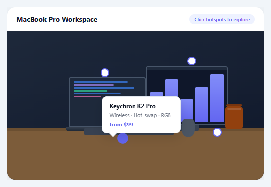
An image hotspot component overlays interactive pin markers on an image or scene, revealing detailed tooltip cards when clicked. It is widely used in product photography (shoppable lookbooks), interactive diagrams (hardware explainers, floor plans), and educational content (anatomy diagrams, historical maps). The key engineering challenge is positioning tooltips so they remain within the container bounds regardless of where on the image the pin falls.
CSS-drawn scene
Rather than requiring a real photograph (which creates licensing and file-size concerns for a snippet), the scene is drawn entirely in CSS: a dark gradient background, wooden desk surface, laptop with a screen containing coloured code lines, external monitor with a bar chart, keyboard, mouse, and coffee cup. Each element uses absolute positioning relative to the .scene container, which uses padding-bottom: 58% to maintain a fixed aspect ratio — the same technique used for responsive iframes and 16:9 video containers.
Pin placement and sizing
Each .pin button is positioned with position: absolute using percentage-based left and top values. transform: translate(-50%, -50%) centres the pin on its coordinates. This combination of percentage positioning and centring transform makes pins scale correctly as the container resizes. The pin itself is a circular .pin-inner div inside the button, giving a clickable area larger than the visual dot.
Ripple animation
Each pin has a ::before pseudo-element that runs @keyframes ripple: scaling from 1× to 1.5× while fading opacity from 0.5 to 0. This creates a continuous pulsing halo that draws attention to the interactive points without requiring user interaction. The animation uses 2s infinite so it runs permanently — useful for indicating interactivity on first load.
Active state: CSS class toggle
When a pin is clicked, JavaScript adds .active to it. The CSS rule .pin.active .pin-inner { background: #6366f1; transform: scale(1.2) } fills the pin with the accent colour and slightly enlarges it — confirming the selection. The transition on .pin-inner makes this change animate smoothly over 0.2s.
Tooltip positioning logic
The tooltip is positioned above its pin using the same percentage coordinates from the POSITIONS array. A small offset (tipTop = pt - 28) places it above the pin circle. The horizontal position is clamped with Math.min(Math.max(pl - 8, 2), 55) to prevent tooltips from overflowing the right edge of the container. The CSS arrow (::before pseudo-element with border-right and border-bottom) appears at the bottom-left of the tooltip, pointing toward the pin below.
Toggle and exclusive open
The click handler tracks activeTip. If the clicked pin's tip is already open, it closes it (toggle behaviour). Otherwise, all open tips are closed before opening the new one — only one tooltip visible at a time. document.addEventListener('click') closes all tooltips when clicking outside any pin, using e.stopPropagation() on pin clicks to prevent immediate close.
Tooltip entrance animation
@keyframes tipIn fades the tooltip in from opacity 0 and translates it up from 4px below its final position. The animation re-runs each time the .show class is added because CSS animations restart on display: none → block transitions.
React integration
Accept an image src prop and a hotspots array where each entry has x, y (percentage positions), and content (tooltip data object). Track openIndex with useState(null). Render a pin component for each hotspot using style={{ left: x+'%', top: y+'%' }}. The tooltip renders conditionally based on openIndex === index. Use a useEffect to attach a document click listener for outside-close, returning cleanup.
See also the image comparison snippet for before/after slider, the image lightbox snippet for full-screen zoom, and the image magnifier snippet for hover-zoom details.
Step by step
How to Use
- 1Replace the CSS scene with a real imageSwap the .scene div with an <img> tag or a div with background-image. Keep position:relative on the container and padding-bottom for aspect ratio.
- 2Set pin positionsSet each .pin button's left and top as percentages corresponding to where on the image the hotspot should appear. Keep data-tip matching the tip ID.
- 3Update tooltip contentEdit the .tip-name, .tip-detail, and .tip-price inside each #tipN div with your product or annotation content.
- 4Update POSITIONS in JSThe POSITIONS array in JS must match the CSS left/top values on each .pin. These are used for tooltip offset calculations.
- 5Adjust tooltip arrow directionThe ::before arrow points downward (toward the pin). For pins near the bottom of the image, flip the tooltip above by adjusting tipTop calculation and the ::before positioning.
Real-world uses
Common Use Cases
Got questions?
Frequently Asked Questions
Accept an image src and hotspots array (each with x, y, content props). Track openIndex with useState(null). Use useEffect for the document click listener with cleanup.
Replace the .scene div with a container div holding an <img> with width:100%. Keep position:relative on the container and adjust aspect ratio via padding-bottom or a fixed height.
Detect if the tooltip right edge exceeds the container width using getBoundingClientRect(). If it does, anchor the tooltip to the right instead of the left with right:X% and flip the ::before arrow.
Replace the click event listener with mouseenter/mouseleave on each .pin. Add pointer-events:none to .tip and pointer-events:auto when shown to allow clicking links inside.
Open the Export menu (or the Test Exports preview) in the snippet toolbar. It generates a plain React component, a React + Tailwind version where the pin and tooltip styles become utility classes, a Vue 3 single-file component with the open/close logic in script setup, and an Angular standalone component. Each converter preserves the markup, the ripple-pulse CSS, and the click-to-open behaviour — inline handlers map to the matching framework event bindings, so the hotspots and tooltips work identically across React, Vue, and Angular. Pass the hotspots in as a component prop or input instead of hardcoding them in the markup.
Position each pin with percentage left/top values rather than pixels, so the markers track the image as it scales. Keep the image container position:relative and the pins position:absolute inside it — the percentages then stay accurate at any width, including full-bleed mobile layouts where the scene resizes with the viewport.