


Liquid Blob — Free HTML CSS JS SVG Morph Snippet
Morphing Liquid Blob · Animations · Plain HTML, CSS & JS · Live preview
Copy & paste
Source Code
<div class="scene">
  <div class="blob-wrap">
    <svg class="blob" viewBox="0 0 200 200" xmlns="http://www.w3.org/2000/svg">
      <defs>
        <linearGradient id="grad" x1="0%" y1="0%" x2="100%" y2="100%">
          <stop offset="0%" style="stop-color:#6366f1"/>
          <stop offset="50%" style="stop-color:#8b5cf6"/>
          <stop offset="100%" style="stop-color:#ec4899"/>
        </linearGradient>
      </defs>
      <path id="blob-path" fill="url(#grad)"/>
    </svg>
    <div class="blob-inner">
      <div class="icon">✦</div>
      <span>Hover me</span>
    </div>
  </div>
  <p class="hint">CSS + SVG path morphing with requestAnimationFrame</p>
</div>
* { box-sizing: border-box; margin: 0; padding: 0; }
body { font-family: system-ui, sans-serif; background: #0f172a; display: flex; align-items: center; justify-content: center; min-height: 100vh; flex-direction: column; gap: 20px; }
.blob-wrap { position: relative; width: 220px; height: 220px; cursor: pointer; }
.blob { width: 100%; height: 100%; filter: drop-shadow(0 0 30px rgba(99,102,241,0.4)); }
.blob-inner {
position: absolute; inset: 0;
display: flex; flex-direction: column; align-items: center; justify-content: center;
gap: 6px; color: #fff;
}
.icon { font-size: 28px; animation: spin 8s linear infinite; }
@keyframes spin { to { transform: rotate(360deg); } }
.blob-inner span { font-size: 12px; font-weight: 600; letter-spacing: 1px; text-transform: uppercase; opacity: 0.8; }
.hint { font-size: 11px; color: #334155; font-family: system-ui, sans-serif; }function genBlob(t, amp) {
const cx = 100, cy = 100, r = 70;
const pts = 8;
const coords = [];
for (let i = 0; i < pts; i++) {
const angle = (i / pts) * Math.PI * 2;
const noise = amp * (Math.sin(t * 0.8 + i * 1.3) * 0.5 + Math.cos(t * 0.5 + i * 0.9) * 0.5);
const rad = r + noise;
coords.push([cx + Math.cos(angle) * rad, cy + Math.sin(angle) * rad]);
}
const d = coords.map((p, i) => {
const prev = coords[(i - 1 + pts) % pts];
const next = coords[(i + 1) % pts];
const cp1x = p[0] + (next[0] - prev[0]) * 0.2;
const cp1y = p[1] + (next[1] - prev[1]) * 0.2;
return (i === 0 ? `M${p[0]},${p[1]}` : `C${cp1x},${cp1y},${cp1x},${cp1y},${p[0]},${p[1]}`);
}).join(' ') + 'Z';
return d;
}
const path = document.getElementById('blob-path');
let t = 0, amp = 18, targetAmp = 18;
const wrap = document.querySelector('.blob-wrap');
wrap.addEventListener('mouseenter', () => targetAmp = 30);
wrap.addEventListener('mouseleave', () => targetAmp = 18);
(function frame() {
t += 0.02;
amp += (targetAmp - amp) * 0.08;
path.setAttribute('d', genBlob(t, amp));
requestAnimationFrame(frame);
})();Extend with AI
Take This Snippet Further With AI
The AI prompt for this one is for Patreon supporters ($3 a month, 7 days free), along with a site with no ads. Supporters enter the passcode once and it is remembered in this browser.
What's included
Features
About this UI Snippet
Liquid Blob — SVG Path Morphing, sin/cos Noise per Vertex & rAF Loop
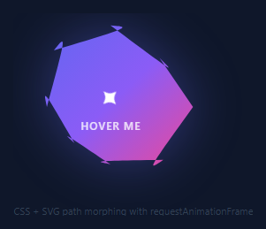
A liquid blob is an organic, constantly morphing shape that pulses and breathes. Used on AI product pages, creative agencies, and any interface communicating fluidity and organic intelligence — pair it with an aurora background, floating particles, or a gradient mesh hero.
The genBlob(t, amp) function places 8 equally-spaced points around a circle of radius 70. For each point, a noise value is calculated: amp * (Math.sin(t * 0.8 + i * 1.3) * 0.5 + Math.cos(t * 0.5 + i * 0.9) * 0.5). The t parameter increases each frame for continuous motion. The amp parameter controls deviation amplitude — higher values create more jagged morphing.
Points are converted to a smooth SVG cubic bezier path using a spline algorithm that calculates bezier control points through all vertices. requestAnimationFrame calls genBlob() every frame, updating the SVG path.
Hovering the blob toggles between normal amplitude (18) and expanded amplitude (30) via mouseenter/mouseleave listeners, creating an interactive morphing response.
SVG path morphing
The blob uses an SVG <path> element whose d attribute is animated between multiple organic shapes via SMIL animateValues or CSS @keyframes with custom properties. Each keyframe defines a different cubic bezier path with matching numbers of control points. The browser interpolates the path coordinates smoothly between keyframes, creating the organic morphing effect.
Alternative: CSS clip-path
The snippet can also use CSS clip-path: polygon() with animated coordinates to create a similar morphing blob on a div element rather than an SVG. This approach is simpler but produces slightly less smooth morphing than SVG path animation.
The blur and scale pulse
A CSS filter: blur() value that pulses slightly (0px to 2px) makes the blob edges feel soft and alive. Combined with scale animation (1.0 to 1.05), the blob breathes visually. Both filter and transform changes are GPU-composited properties — they do not trigger layout or paint recalculation.
Colour and gradient fill
The blob fill uses a radial gradient from a bright centre colour to a darker edge, creating a 3D sphere illusion. Animating the gradient coordinates (cx, cy values in the SVG radialGradient) can make the highlight follow a simulated light source as the blob morphs.
Use cases for the liquid blob
The blob works best as an ambient background element, not a foreground content container. Place it behind hero text with z-index: -1 and pointer-events: none. Multiple blobs at different sizes and positions (top-left, bottom-right) create the ambient painted background similar to the Gradient Mesh Hero snippet in this library.
Step by step
How to Use
- 1Watch and click the blobThe blob morphs continuously. Click it to toggle between normal and expanded amplitude for a click-to-burst effect.
- 2Change the morph amplitudeIn the JS panel, update the 25 (normal) and 45 (expanded) amplitude values in the animate() function.
- 3Change the animation speedUpdate the t increment value (currently +=0.015) in the animation loop to speed up or slow down the morphing.
- 4Change the blob colourUpdate the fill gradient colours on the SVG linearGradient in the HTML panel.
- 5Change the number of verticesUpdate const pts = 8 in the JS. More points (12-16) create smoother morphing; fewer (5-6) create more angular blobs.
- 6Export in your formatClick "HTML" for a standalone file, "JSX" for a React component, or "Tailwind" for a React + Tailwind version.
Real-world uses
Common Use Cases
Got questions?
Frequently Asked Questions
8 points are placed equally around a circle (i * 2π / 8). Each point's radius is perturbed by amp * (sin(t*0.8 + i*1.3)*0.5 + cos(t*0.5 + i*0.9)*0.5). Different frequencies (0.8, 0.5) and phases (i*1.3, i*0.9) per point index ensure no two points move identically, creating organic variation rather than uniform pulsing.
spline() converts the 8 perturbed points into a smooth cubic bezier curve. Without it, straight lines between adjacent points would create a faceted polygon, not an organic blob. The function calculates bezier control points that create smooth curves through all 8 vertices.
Increase the amplitude parameter: 25 (normal) to 40-50 for more dramatic morphing. Also try increasing the t increment per frame from 0.015 to 0.03 for faster motion. Be aware that very high amplitude (60+) can cause the blob to become concave (fold in on itself).
The blob uses an SVG linearGradient element in the defs. Update the stop-color values in the gradient definition in the HTML panel. You can also change the shape to use a radial gradient for a different look, or add a feGaussianBlur filter for a glowing effect.
Create multiple SVG elements each with their own path, gradient, and animation instance. Give each a different initial time offset: the first blob starts animate(t) at t=0, the second at t=100. They will be in different phases of their morphing cycles, creating organic variety.
Yes. Use useRef on the SVG path element and for the rAF handle. In useEffect, start the animation loop: const loop = () => { pathRef.current.setAttribute("d", genBlob(t, amp)); t += 0.015; rafRef.current = requestAnimationFrame(loop); }. Clean up in the return: cancelAnimationFrame(rafRef.current).