



Diagonal Shimmer Skeleton — 45° Sweep Loading Placeholder
Diagonal Shimmer Skeleton · Loaders · Plain HTML & CSS · Live preview
Copy & paste
Source Code
<div class="ds-stage">
  <div class="ds-card">
    <div class="ds-row">
      <div class="ds-block ds-avatar"></div>
      <div class="ds-col">
        <div class="ds-block ds-line w60"></div>
        <div class="ds-block ds-line w35"></div>
      </div>
    </div>
    <div class="ds-block ds-media"></div>
    <div class="ds-block ds-line w90"></div>
    <div class="ds-block ds-line w75"></div>
    <div class="ds-block ds-line w50"></div>
    <div class="ds-sweep" aria-hidden="true"></div>
  </div>
</div>*{box-sizing:border-box;margin:0;padding:0}
body{font-family:system-ui,-apple-system,sans-serif;background:#0b0f1a;min-height:100vh;display:flex;align-items:center;justify-content:center;padding:24px}
.ds-stage{width:100%;max-width:360px}
.ds-card{position:relative;overflow:hidden;background:#121729;border:1px solid #232a41;border-radius:16px;padding:20px;display:flex;flex-direction:column;gap:14px;box-shadow:0 18px 44px rgba(0,0,0,.4)}
/* Every placeholder shares one flat base colour — no per-element gradient or
animation. The illusion of light comes entirely from the single .ds-sweep
band above, so all blocks brighten in perfect diagonal sync. */
.ds-block{background:#1c2338;border-radius:8px}
.ds-row{display:flex;align-items:center;gap:12px}
.ds-avatar{width:44px;height:44px;border-radius:50%;flex-shrink:0}
.ds-col{flex:1;display:flex;flex-direction:column;gap:8px}
.ds-line{height:11px}
.ds-media{height:120px;border-radius:12px}
.w35{width:35%}.w50{width:50%}.w60{width:60%}.w75{width:75%}.w90{width:90%}
/* The sweep is ONE element covering the whole card, tilted 45deg and slid
diagonally from top-left to bottom-right. Because it sits above every
block with mix-blend-mode: overlay, it brightens each placeholder it
crosses at the same instant along its diagonal edge — a single continuous
light band traveling across unrelated shapes, not a per-block horizontal
shimmer like a standard skeleton loader. */
.ds-sweep{
position:absolute;
top:-60%; left:-60%;
width:220%; height:220%;
background:linear-gradient(45deg,
transparent 42%,
rgba(255,255,255,.14) 48%,
rgba(255,255,255,.32) 50%,
rgba(255,255,255,.14) 52%,
transparent 58%);
mix-blend-mode:overlay;
animation:dsSweep 2.2s linear infinite;
pointer-events:none;
}
@keyframes dsSweep{
from{transform:translate(-30%,-30%)}
to{transform:translate(30%,30%)}
}
@media (prefers-reduced-motion:reduce){.ds-sweep{animation:none;opacity:.4}}Extend with AI
Take This Snippet Further With AI
The AI prompt for this one is for Patreon supporters ($3 a month, 7 days free), along with a site with no ads. Supporters enter the passcode once and it is remembered in this browser.
What's included
Features
About this UI Snippet
Diagonal Shimmer Skeleton — One Continuous 45° Light Band, Not a Per-Block Sweep

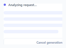
The familiar skeleton loader shimmer works by giving every placeholder its own oversized horizontal gradient and animating background-position independently on each element — every block shimmers, but each on its own strip, left to right. This snippet builds a genuinely different mechanic: a single diagonal light band, tilted 45°, that travels across the entire card as one element — so an avatar circle, a media block, and several text lines all brighten together along one continuous diagonal edge, the way light glances off a card under a raking light source, rather than each shape shimmering independently.
One sweep element, not many gradients
Every placeholder (.ds-block) is flat — a plain background colour, no gradient, no animation of its own. All of the shimmer lives in a single .ds-sweep element absolutely positioned to overshoot the card on every side (-60% inset, 220% size) so it can slide fully across without its edges ever entering the visible area. This is the structural difference from a standard skeleton: the light source is external to the placeholders, not baked into each one.
Why 45° instead of 0°
The sweep's gradient runs at linear-gradient(45deg, …), and the whole element is translated diagonally via transform: translate() in its keyframe rather than the horizontal background-position trick a standard shimmer uses. Because the band is tilted, it crosses the avatar circle, the media block, and each text line at a slightly different moment depending on their position — exactly like a beam of light raking across a physical surface — rather than a synchronized flat sweep where every element brightens at the same x-coordinate simultaneously.
mix-blend-mode does the brightening
The sweep uses mix-blend-mode: overlay so its white gradient band lightens whatever placeholder colour sits beneath it, rather than covering it opaquely. This means the sweep can sit as one element on top of every block at once — a card, an avatar, and lines of different widths — and each still reads as "the same colour, momentarily brighter," which is what keeps the illusion coherent across shapes of very different sizes.
A transform animation, not background-position
Because the sweep is one large element rather than per-block gradients, animating it with transform: translate() (GPU-composited, no layout or paint cost) is both simpler and cheaper than the standard approach's own background-position trick — one element animates instead of five or six.
Reduced motion and reuse
A prefers-reduced-motion query disables the sweep's animation and lowers its resting opacity so it still reads as "a placeholder" without motion. Compose any combination of .ds-block shapes — the sweep automatically covers whatever the card contains, so it's a drop-in alternative anywhere you'd otherwise reach for the standard skeleton loader or skeleton card grid.
Step by step
How to Use
- 1Paste HTML, CSS, and JSA profile-style card renders with avatar, media, and text placeholders.
- 2Watch the diagonal bandOne light sweep travels top-left to bottom-right across every shape at once.
- 3Compare the angleNotice the band crosses each block at a different moment, unlike a synced horizontal shimmer.
- 4Add or remove blocksAny .ds-block you add is automatically covered by the same sweep — no per-block setup.
- 5Tune the bandAdjust the gradient stops, width, and animation duration for a tighter or softer sweep.
- 6Respect motion prefsIt already dims and disables the animation under prefers-reduced-motion.
Real-world uses
Common Use Cases
mix-blend-mode: overlay brightens whatever sits beneath the band, giving a believable shine without extra gradients per block.Got questions?
Frequently Asked Questions
The standard skeleton loader gives each placeholder its own oversized horizontal gradient and animates background-position independently per element, so every shape shimmers on its own strip. This snippet uses one diagonal band, tilted 45° and animated via transform across the whole card, so every shape brightens together along a single traveling edge instead of shimmering separately.
The sweep element's gradient itself is angled at 45deg, and the element is translated along both the x and y axes in its keyframe. Because it crosses shapes at different vertical positions at different horizontal offsets, elements higher and further left brighten slightly before elements lower and further right — the diagonal geometry, not a scripted delay, produces the raking-light effect.
mix-blend-mode: overlay lightens the colour beneath it rather than covering it, so the same white gradient band reads correctly whether it's crossing a dark avatar circle or a slightly different-toned media block. A flat semi-transparent overlay would look identical everywhere and wash out the underlying shapes instead of appearing to reflect light off them.
The sweep is inset -60% on every side and sized to 220%, so its full travel range stays within that oversized box. Since the animation only translates it a modest distance, the gradient's soft edges never have to enter or exit the visible card boundary mid-animation, which would otherwise create a visible hard edge or pop.
Render the card with its placeholder blocks and the single .ds-sweep element as a sibling positioned last (so it paints on top), and toggle the whole card out for real content once your data loads. The CSS is entirely self-contained — no JavaScript drives the animation — so it ports unchanged into any framework's markup.