


Magazine Asymmetric Grid Layout — CSS Grid Editorial Article Layout
Magazine Asymmetric Grid Layout · Layouts · Plain HTML & CSS · Live preview
Copy & paste
Source Code
<div class="demo">
  <div class="mag-grid">
    <article class="mag-item feature">
      <span class="mag-cat">Design</span>
      <h2>The Quiet Return of Skeuomorphism in Interface Design</h2>
      <p>After a decade of flat minimalism, subtle depth and texture are creeping back into the products we use every day.</p>
      <span class="mag-meta">8 min read · Aug 27</span>
    </article>

    <article class="mag-item tall">
      <span class="mag-cat">Engineering</span>
      <h3>Why Rate Limiters Fail Under Real Traffic</h3>
      <p>A field guide to the token bucket, leaky bucket and sliding window algorithms, and where each one breaks down.</p>
      <span class="mag-meta">12 min read</span>
    </article>

    <article class="mag-item">
      <span class="mag-cat">Culture</span>
      <h3>Remote Teams Are Rediscovering the Office Water Cooler</h3>
      <span class="mag-meta">5 min read</span>
    </article>

    <article class="mag-item wide">
      <span class="mag-cat">Business</span>
      <h3>Pricing Pages Are Getting Weirder — and It's Working</h3>
      <p>Usage-based tiers, hidden calculators, and negotiated enterprise quotes are replacing the plain three-column table.</p>
      <span class="mag-meta">7 min read</span>
    </article>

    <article class="mag-item">
      <span class="mag-cat">Tools</span>
      <h3>A Field Guide to Modern CSS Grid Tricks</h3>
      <span class="mag-meta">6 min read</span>
    </article>

    <article class="mag-item">
      <span class="mag-cat">Opinion</span>
      <h3>Stop Building Dashboards Nobody Opens Twice</h3>
      <span class="mag-meta">4 min read</span>
    </article>
  </div>
</div>
* { box-sizing: border-box; margin: 0; padding: 0; }
body { font-family: system-ui, sans-serif; background: #f8fafc; padding: 24px; }
.mag-grid {
max-width: 760px; margin: 0 auto;
display: grid;
grid-template-columns: repeat(6, 1fr);
grid-auto-rows: 108px;
gap: 14px;
}
.mag-item { background: #fff; border: 1px solid #e2e8f0; border-radius: 16px; padding: 20px; display: flex; flex-direction: column; justify-content: flex-end; gap: 8px; overflow: hidden; transition: border-color 0.15s, transform 0.15s; }
.mag-item:hover { border-color: #c7d2fe; transform: translateY(-2px); }
.mag-item.feature { grid-column: span 4; grid-row: span 3; background: linear-gradient(150deg,#111827,#1e293b); border: none; }
.mag-item.feature h2 { font-size: 22px; font-weight: 800; color: #fff; line-height: 1.25; }
.mag-item.feature p { color: #cbd5e1; font-size: 13px; line-height: 1.6; }
.mag-item.feature .mag-cat { color: #a5b4fc; }
.mag-item.feature .mag-meta { color: #94a3b8; }
.mag-item.tall { grid-column: span 2; grid-row: span 3; }
.mag-item.tall h3 { font-size: 15px; }
.mag-item.wide { grid-column: span 4; grid-row: span 2; flex-direction: row; align-items: flex-end; justify-content: space-between; gap: 20px; }
.mag-item.wide > div, .mag-item.wide h3 { max-width: 70%; }
.mag-item:not(.feature):not(.tall):not(.wide) { grid-column: span 2; grid-row: span 2; }
.mag-cat { font-size: 10.5px; font-weight: 800; text-transform: uppercase; letter-spacing: 0.05em; color: #6366f1; }
.mag-item h2, .mag-item h3 { font-weight: 800; color: #111827; line-height: 1.35; }
.mag-item h3 { font-size: 14px; }
.mag-item p { font-size: 12px; color: #64748b; line-height: 1.55; }
.mag-meta { font-size: 10.5px; color: #94a3b8; font-weight: 600; }
@media (max-width: 620px) {
.mag-grid { grid-template-columns: repeat(2, 1fr); grid-auto-rows: auto; }
.mag-item, .mag-item.feature, .mag-item.tall, .mag-item.wide { grid-column: span 2 !important; grid-row: auto !important; flex-direction: column !important; }
.mag-item.wide > div, .mag-item.wide h3 { max-width: 100%; }
}Extend with AI
Take This Snippet Further With AI
The AI prompt for this one is for Patreon supporters ($3 a month, 7 days free), along with a site with no ads. Supporters enter the passcode once and it is remembered in this browser.
What's included
Features
About this UI Snippet
Magazine Asymmetric Grid Layout — Building an Editorial Feel with CSS Grid Spans
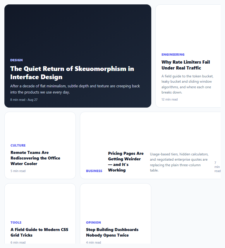
Most content grids repeat the same card shape over and over — a uniform 3-up or 4-up grid of identically sized tiles. Print magazines almost never do this: a lead story gets a large block, a sidebar gets a tall narrow column, a banner story spans wide but short. This layout recreates that editorial hierarchy on the web using CSS Grid's grid-column/grid-row span properties on top of a shared 6-column, fixed-row-height base grid.
Why a shared column/row unit makes irregular spans possible
The whole grid is built on grid-template-columns: repeat(6, 1fr) combined with grid-auto-rows: 108px — a fine-grained 6-column, fixed-height-row base unit that every tile then spans across in different amounts. .feature spans 4 columns and 3 rows (a big square-ish block), .tall spans 2 columns and 3 rows (a narrow tall column), .wide spans 4 columns and 2 rows (a short wide banner), and ordinary tiles default to 2 columns and 2 rows. Because every span is expressed in the *same* underlying unit grid, the browser's grid auto-placement algorithm can still pack everything together without gaps or manual positioning — the irregularity comes entirely from varying span sizes, not from absolute positioning or manual row/column line numbers.
Content adapts its own layout per tile type, not just its size
.wide doesn't just get a different size — it also switches its internal flex-direction to row so its heading and meta text sit side-by-side rather than stacked, matching how a banner-shaped tile actually reads best. .feature gets a dark gradient background and a larger heading size, visually functioning as the clear "lead story" the way a magazine's front-page anchor piece would. Each modifier class changes both geometry and internal composition together, rather than treating card content as a single interchangeable template stretched to different container shapes.
Collapsing gracefully at narrow widths
At the 620px breakpoint, every span modifier — .feature, .tall, .wide, and the default 2×2 — is forced back to grid-column: span 2 with grid-row: auto, and .wide's row-flex layout reverts to a column, collapsing the whole asymmetric composition into a simple, readable two-column stack. This avoids the common failure mode of editorial grids on mobile, where a tile designed to be short-and-wide on desktop becomes unreadably squeezed if its span ratio is preserved at a much narrower viewport.
Where this earns its complexity over a uniform grid
A magazine-style asymmetric grid works best for content that genuinely has a hierarchy — a blog or news homepage with one lead story and several secondary ones, a portfolio with one hero project, a dashboard summary page with one primary metric and several supporting ones — rather than a flat listing of equally-important items, where a uniform grid remains the clearer, more honest layout choice.
Step by step
How to Use
- 1Assign a size modifier class per itemUse .feature for the lead story, .tall for a narrow tall column, .wide for a short wide banner, or leave the class off for a standard 2×2 tile.
- 2Keep the total column spans balanced per "row group"The 6-column base grid packs tiles by their spans — group combinations that sum to 6 columns (e.g. feature + tall) to avoid uneven gaps.
- 3Adjust grid-auto-rows for a different base unit heightChange the 108px value to scale every tile's height proportionally, since all row spans are multiples of this unit.
- 4Add more standard tiles freelyAny .mag-item without a size modifier automatically becomes a 2-column, 2-row tile and packs into remaining grid space.
- 5Test the mobile breakpointResize the preview below 620px to confirm every tile correctly collapses to a uniform two-column stacked layout.
Real-world uses
Common Use Cases
Got questions?
Frequently Asked Questions
Because every tile's span is expressed against the same 6-column, fixed-row-height base grid, the browser's default grid auto-placement algorithm can still fit tiles together in the available cells automatically, without needing explicit grid-column-start/grid-row-start line numbers on each item.
The auto-placement algorithm will still place tiles as compactly as possible, but you may end up with uneven visual gaps or a tile appearing further down than expected — grouping combinations that sum to 6 columns (e.g. a 4-span feature next to a 2-span tall tile) keeps the composition tidiest.
Add a new modifier class with its own grid-column: span N and grid-row: span M values (using the same 6-column, 108px-row base unit), plus any content-composition changes (like .wide's row flex-direction) that size warrants.
Yes — CSS Grid auto-placement will keep filling in either the next explicit spot or the next available cell as items are added or removed; just be aware that removing a large-span tile can leave more irregular gaps than removing a standard one.
A wide, short tile has more horizontal than vertical space, so laying its heading and meta text side-by-side (row direction) uses that shape more effectively than stacking them vertically the way a tall or standard tile would.
The DOM order in this snippet places .feature first and other tiles in a sensible reading sequence, but with CSS Grid it's possible for visual position to diverge from source order if you add explicit line-based placement — keep source order matching intended reading order for the best screen reader and keyboard navigation experience.