



Masonry Grid — Free HTML CSS JS Pinterest Snippet
Masonry Grid · Layouts · Plain HTML, CSS & JS · Live preview
Copy & paste
Source Code
<div class="masonry" id="masonry"></div>* { box-sizing: border-box; margin: 0; padding: 0; }
body { font-family: system-ui, sans-serif; background: #f1f5f9; padding: 16px; }
.masonry {
columns: 3;
column-gap: 12px;
}
@media (max-width: 600px) { .masonry { columns: 2; } }
.item {
break-inside: avoid;
margin-bottom: 12px;
border-radius: 12px;
overflow: hidden;
cursor: pointer;
transition: transform 0.2s, box-shadow 0.2s;
}
.item:hover { transform: scale(1.02); box-shadow: 0 8px 24px rgba(0,0,0,0.12); }
.item-img {
width: 100%;
display: block;
}
.item-body {
background: #fff;
padding: 12px;
border-top: 1px solid #f1f5f9;
}
.item-title { font-size: 13px; font-weight: 700; color: #1e293b; margin-bottom: 4px; }
.item-sub { font-size: 11px; color: #94a3b8; }
.item-footer { display: flex; align-items: center; justify-content: space-between; margin-top: 8px; }
.item-author { display: flex; align-items: center; gap: 6px; font-size: 11px; color: #64748b; }
.item-av { width: 20px; height: 20px; border-radius: 50%; display: flex; align-items: center; justify-content: center; font-size: 8px; font-weight: 700; color: #fff; }
.item-likes { font-size: 11px; color: #94a3b8; }const items = [
{ title: 'Gradient Mesh', sub: 'CSS · Design', h: 160, grad: 'linear-gradient(135deg,#6366f1,#8b5cf6)', av: 'PS', color: '#6366f1', likes: '124' },
{ title: 'Aurora Background', sub: 'CSS · Animation', h: 220, grad: 'linear-gradient(135deg,#0ea5e9,#6366f1,#ec4899)', av: 'AJ', color: '#0ea5e9', likes: '89' },
{ title: 'Glass Card', sub: 'CSS · Cards', h: 140, grad: 'linear-gradient(135deg,#ec4899,#f97316)', av: 'MB', color: '#ec4899', likes: '204' },
{ title: 'Bento Layout', sub: 'CSS · Layout', h: 180, grad: 'linear-gradient(135deg,#10b981,#0ea5e9)', av: 'LK', color: '#10b981', likes: '67' },
{ title: 'Neon Buttons', sub: 'CSS · Buttons', h: 120, grad: 'linear-gradient(135deg,#f59e0b,#ef4444)', av: 'PS', color: '#f59e0b', likes: '312' },
{ title: 'Command Palette', sub: 'JS · Navigation', h: 200, grad: 'linear-gradient(135deg,#8b5cf6,#6366f1)', av: 'AJ', color: '#8b5cf6', likes: '445' },
{ title: 'Spotlight Effect', sub: 'JS · Animation', h: 150, grad: 'linear-gradient(135deg,#334155,#1e293b)', av: 'MB', color: '#64748b', likes: '178' },
{ title: 'Flip Card 3D', sub: 'CSS · Cards', h: 170, grad: 'linear-gradient(135deg,#ec4899,#8b5cf6)', av: 'LK', color: '#ec4899', likes: '99' },
{ title: 'Typewriter Effect', sub: 'JS · Animation', h: 130, grad: 'linear-gradient(135deg,#6366f1,#0ea5e9)', av: 'PS', color: '#6366f1', likes: '256' },
];
const grid = document.getElementById('masonry');
items.forEach(item => {
grid.innerHTML += `<div class="item">
<div class="item-img" style="height:${item.h}px;background:${item.grad}"></div>
<div class="item-body">
<div class="item-title">${item.title}</div>
<div class="item-sub">${item.sub}</div>
<div class="item-footer">
<div class="item-author"><div class="item-av" style="background:${item.color}">${item.av}</div>${item.av === 'PS' ? 'Puneet' : item.av === 'AJ' ? 'Alex' : item.av === 'MB' ? 'Maria' : 'Lisa'}</div>
<div class="item-likes">♥ ${item.likes}</div>
</div>
</div>
</div>`;
});Extend with AI
Take This Snippet Further With AI
The AI prompt for this one is for Patreon supporters ($3 a month), along with a site with no ads. Supporters enter the passcode once and it is remembered in this browser.
What's included
Features
About this UI Snippet
Masonry Grid — CSS columns Property, break-inside: avoid & JS Rendering
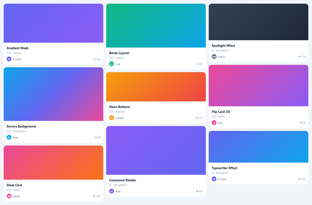
A masonry grid displays items in a multi-column layout where items of different heights fill columns naturally from top to bottom — like a Pinterest or photo gallery layout, often wired to an image lightbox on click. This snippet implements masonry using the CSS columns property.
The CSS columns approach
.masonry { columns: 3; column-gap: 12px } is the entire masonry layout. The browser fills columns from top to bottom, stacking items by height. No JavaScript positioning is needed. @media (max-width: 600px) { .masonry { columns: 2 } } reduces to two columns on mobile.
break-inside: avoid
.item { break-inside: avoid } prevents a single card from splitting across two columns. Without this, tall cards can be split at the column boundary.
JS card rendering
Cards are rendered from a JS data array rather than static HTML. Each item has a title, subtitle, height, gradient, and like count. items.forEach(item => { const div = document.createElement('div'); ... container.appendChild(div) }) builds the grid dynamically. This makes it easy to filter, sort, and update items.
How CSS columns masonry works
CSS columns: 3 divides the container into 3 equal-width columns. Child elements fill top-to-bottom in columns — left column fills first, then centre, then right. break-inside: avoid prevents a single card from splitting across two columns. The browser handles variable-height items automatically — short cards and tall cards coexist naturally without JavaScript height calculation.
Advantages over JavaScript masonry libraries
Libraries like Masonry.js calculate absolute positions for each item using JavaScript, which requires a reflow after images load and creates complex dependencies. The CSS columns approach has zero JavaScript, works without images loading, recalculates on window resize automatically, and has no dependencies. The trade-off is that columns fill left-to-right before top-to-bottom — items do not arrange by insertion order across columns.
Adding new items dynamically
Since CSS columns is layout-based, adding new items via JavaScript (container.appendChild(newCard)) automatically triggers reflow and the masonry repositions. No JavaScript layout recalculation is needed. The grid updates instantly.
Responsive masonry
Change columns count responsively: @media (max-width: 900px) { .masonry { columns: 2; } } @media (max-width: 600px) { .masonry { columns: 1; } }. Or use the CSS columns auto-fill: columns: auto; column-width: 280px — the browser places as many 280px columns as fit the container width, similar to the responsive card grid but for a top-down fill pattern.
Step by step
How to Use
- 1Load the snippetClick "Masonry Grid" in the sidebar. The preview shows cards of different heights filling three columns from top to bottom.
- 2Update card contentIn the JS panel, update the items array — change title, subtitle, height, gradient, and likes per item.
- 3Change column countUpdate columns: 3 in the CSS panel to 2 for a two-column layout or 4 for a denser grid.
- 4Add items with real imagesReplace the gradient div in each card with an <img> tag. The masonry layout handles any image height automatically.
- 5Add filteringFilter the items array and re-render: filteredItems = items.filter(i => i.category === sel). Re-build the grid from the filtered array.
- 6Export in your formatClick "HTML" for a standalone file, "JSX" for a React component, or "Tailwind" for a React + Tailwind version.
Real-world uses
Common Use Cases
Got questions?
Frequently Asked Questions
CSS columns: 3 tells the browser to divide the container into 3 equal-width columns. Children are placed top-to-bottom within each column before moving to the next. Items of different heights create the natural staggered masonry appearance.
break-inside: avoid on child elements prevents them from being split across column boundaries. Without it, a single card might have its top half in one column and its bottom half in the next.
CSS columns fills items top-to-bottom within columns (true masonry). CSS Grid fills items left-to-right in rows — you get equal row heights unless you use the experimental grid-template-rows: masonry property (limited browser support).
The CSS columns layout is column-ordered, not row-ordered, which makes drag-and-drop complex. For draggable masonry, use a JS masonry library (Masonry.js, react-masonry-css) that handles absolute positioning.
Yes. Click "JSX" for a React component. Map your items array to card components. The CSS columns layout applies identically in React. For more control, use the react-masonry-css library.
Filter the items array and re-render: filteredItems = items.filter(item => item.category === selectedCategory). Re-build the grid from the filtered array. The masonry layout automatically reflows.