


Copy & paste
Source Code
<div class="card">
  <div class="avatar">PS</div>
  <h2>Puneet Sharma</h2>
  <p class="role">Frontend Engineer</p>
  <div class="stats">
    <div class="stat">
      <strong>128</strong>
      <span>Projects</span>
    </div>
    <div class="stat">
      <strong>4.9</strong>
      <span>Rating</span>
    </div>
    <div class="stat">
      <strong>2.1k</strong>
      <span>Followers</span>
    </div>
  </div>
  <button class="btn">Follow</button>
</div>
* { box-sizing: border-box; margin: 0; padding: 0; }
body { font-family: system-ui, sans-serif; background: #f1f5f9; display: flex; align-items: center; justify-content: center; min-height: 100vh; padding: 20px; }
.card {
background: #fff;
border-radius: 16px;
padding: 32px 24px;
text-align: center;
width: 260px;
box-shadow: 0 4px 24px rgba(0,0,0,0.08);
}
.avatar {
width: 72px;
height: 72px;
border-radius: 50%;
background: linear-gradient(135deg, #6366f1, #8b5cf6);
color: #fff;
font-size: 22px;
font-weight: 800;
display: flex;
align-items: center;
justify-content: center;
margin: 0 auto 14px;
}
h2 { font-size: 17px; font-weight: 700; color: #1e293b; }
.role { font-size: 13px; color: #64748b; margin-top: 4px; margin-bottom: 20px; }
.stats {
display: flex;
justify-content: space-around;
border-top: 1px solid #f1f5f9;
border-bottom: 1px solid #f1f5f9;
padding: 16px 0;
margin-bottom: 20px;
}
.stat strong { display: block; font-size: 16px; font-weight: 700; color: #1e293b; }
.stat span { font-size: 11px; color: #94a3b8; }
.btn {
width: 100%;
padding: 10px;
background: #6366f1;
color: #fff;
border: none;
border-radius: 8px;
font-size: 14px;
font-weight: 600;
cursor: pointer;
transition: background 0.15s;
}
.btn:hover { background: #4f46e5; }Extend with AI
Take This Snippet Further With AI
The AI prompt for this one is for Patreon supporters ($3 a month), along with a site with no ads. Supporters enter the passcode once and it is remembered in this browser.
What's included
Features
About this UI Snippet
Profile Card — HTML & CSS User Card with Avatar, Stats & Follow Button
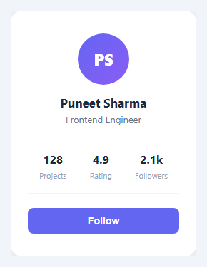
A profile card is one of the most reused UI components in web development. You need it on team pages, social apps, marketplaces, dashboards, and anywhere you display a person or entity with key metrics. The pattern is always the same: an avatar, a name, a role or tagline, some stats, and a call-to-action button.
This snippet gives you a complete, production-ready profile card in plain HTML and CSS — no JavaScript required. It is centred on the page, has a soft drop shadow, a gradient avatar circle with initials, a three-stat row, and a full-width follow button with hover state.
The avatar circle
The avatar uses a div with border-radius: 50% and a linear-gradient(135deg, #6366f1, #8b5cf6) background — an indigo-to-violet gradient. The initials inside are centred with flexbox (display: flex; align-items: center; justify-content: center). To use a real photo instead, replace the div with an <img> tag and keep border-radius: 50%; width: 72px; height: 72px; object-fit: cover to maintain the circular crop. For a presence dot or stacked avatars, see the status avatar and avatar group.
The stats row
The three-stat row uses display: flex; justify-content: space-around to distribute the stats evenly. Each stat has a <strong> for the number and a <span> for the label. The row sits between two horizontal rules created with border-top and border-bottom on the container — a clean way to separate sections without adding extra elements.
The follow button
The button uses width: 100% to span the full card width and has a background transition on hover from #6366f1 to #4f46e5 (a slightly deeper indigo). To change the button label, update the text in the HTML panel. To add a second button (for example, a Message button alongside Follow), change the button to width: calc(50% - 4px) and add a second button with an outlined style.
Replacing initials with a profile photo
In the HTML panel, replace <div class="avatar">PS</div> with <img class="avatar" src="your-photo.jpg" alt="Name" />. In the CSS panel, add object-fit: cover to the .avatar rule and remove the background and color properties. The border-radius and dimensions stay the same.
Adapting to dark mode
To add dark mode support, add a [data-theme="dark"] or @media (prefers-color-scheme: dark) block in the CSS panel and override the background, color, and box-shadow values. The card background #fff becomes a dark surface, the stat text #1e293b becomes near-white, and the shadow becomes a subtle border instead.
Saving your customised version
After editing the snippet to match your project, click "Save as" in the editor header, type a name, and press Enter. Saves to IndexedDB and appears in the Saved tab in the sidebar.
Step by step
How to Use
- 1Load the snippetClick "Profile Card" in the sidebar Library tab. The HTML and CSS panels load instantly and the preview shows the centred card.
- 2Update name, role, and initialsIn the HTML panel, replace "Puneet Sharma", "Frontend Engineer", and the "PS" initials with your own values. The card layout adjusts automatically.
- 3Update the statsReplace the 128 / 4.9 / 2.1k numbers and Projects / Rating / Followers labels with your own metrics. Add or remove stat divs as needed.
- 4Change the avatar gradient and button colourIn the CSS panel, update linear-gradient in .avatar and the background in .btn to match your brand palette. The preview updates as you type.
- 5Export in your formatClick "HTML" for a standalone file, "JSX" for a React component, or "Tailwind" for a React + Tailwind CSS version.
- 6Save your versionClick "Save as", type a name, and press Enter. Your profile card saves to IndexedDB and appears in the Saved tab.
Real-world uses
Common Use Cases
Got questions?
Frequently Asked Questions
A profile card is a compact UI component that displays a user or entity summary — typically an avatar, name, role, key stats, and a call-to-action button. Profile cards are used on social apps, marketplaces, team pages, dashboards, and anywhere users or entities need to be displayed in a grid or feed.
In the HTML panel, replace the avatar div with an img tag: give it class="avatar", set src to your image URL, and add alt text. In the CSS panel, add object-fit: cover to the .avatar rule and remove the background and color declarations. The border-radius: 50% and dimensions keep the circular shape.
In the HTML panel, add a new div with class="stat" inside the .stats container. Add a strong for the number and a span for the label. The justify-content: space-around CSS distributes all stat items evenly regardless of how many there are.
In the HTML panel, add a second button element after the first. In the CSS panel, change .btn { width: 100% } to width: calc(50% - 4px) and add a gap between them with a flex container. Give the second button a different style — for example, background: none with a border and the same text colour as the primary button.
Find linear-gradient(135deg, #6366f1, #8b5cf6) in the .avatar CSS rule and update the hex values to your brand colours. You can also use a solid background colour by replacing the gradient with background: #yourcolour.
Yes. Click "JSX" to download a React component or "Tailwind" for a React + Tailwind CSS version. For Vue or Svelte, paste the HTML into a template block and the CSS into a style block. Replace static text with props to make the card reusable across multiple users.
Add a @media (prefers-color-scheme: dark) block in the CSS panel and override the background, color, and box-shadow values. Change .card background from #fff to a dark surface colour, stat text from #1e293b to near-white, and the shadow to a subtle 1px border instead.