



Story Progress Bars — Instagram Stories HTML CSS JS
Story Progress Bars · Mobile · Plain HTML, CSS & JS · Live preview
Copy & paste
Source Code
<div class="st-viewer" id="stViewer">
  <div class="st-bars" id="stBars">
    <div class="st-bar"><span class="st-fill"></span></div>
    <div class="st-bar"><span class="st-fill"></span></div>
    <div class="st-bar"><span class="st-fill"></span></div>
    <div class="st-bar"><span class="st-fill"></span></div>
  </div>

  <div class="st-top">
    <div class="st-avatar">M</div>
    <div class="st-meta"><div class="st-name">moments</div><div class="st-time">3h ago</div></div>
  </div>

  <div class="st-slides" id="stSlides">
    <div class="st-slide active" style="background:linear-gradient(160deg,#6366f1,#4338ca)"><span class="st-emoji">🌄</span><div class="st-cap">Sunrise hike</div></div>
    <div class="st-slide" style="background:linear-gradient(160deg,#0ea5e9,#0369a1)"><span class="st-emoji">🏊</span><div class="st-cap">Morning swim</div></div>
    <div class="st-slide" style="background:linear-gradient(160deg,#f59e0b,#b45309)"><span class="st-emoji">☕</span><div class="st-cap">Coffee break</div></div>
    <div class="st-slide" style="background:linear-gradient(160deg,#ec4899,#9d174d)"><span class="st-emoji">🌃</span><div class="st-cap">City lights</div></div>
  </div>

  <button class="st-nav st-prev" id="stPrev" aria-label="Previous"></button>
  <button class="st-nav st-next" id="stNext" aria-label="Next"></button>
  <div class="st-hint">Tap sides · hold to pause</div>
</div>*{box-sizing:border-box;margin:0;padding:0}
body{font-family:system-ui,-apple-system,sans-serif;background:#0f172a;min-height:100vh;display:flex;align-items:center;justify-content:center;padding:24px}
.st-viewer{position:relative;width:280px;height:498px;border-radius:22px;overflow:hidden;box-shadow:0 25px 60px rgba(0,0,0,.5);background:#000;user-select:none}
.st-bars{position:absolute;top:12px;left:10px;right:10px;display:flex;gap:5px;z-index:4}
.st-bar{flex:1;height:3px;background:rgba(255,255,255,.35);border-radius:3px;overflow:hidden}
.st-fill{display:block;height:100%;width:100%;background:#fff;border-radius:3px;transform:scaleX(0);transform-origin:left}
.st-bar.done .st-fill{transform:scaleX(1)}
.st-bar.active .st-fill{animation:st-grow var(--dur,5s) linear forwards}
.st-viewer.paused .st-bar.active .st-fill{animation-play-state:paused}
@keyframes st-grow{from{transform:scaleX(0)}to{transform:scaleX(1)}}
.st-top{position:absolute;top:26px;left:12px;right:12px;display:flex;align-items:center;gap:9px;z-index:4}
.st-avatar{width:34px;height:34px;border-radius:50%;background:linear-gradient(135deg,#f59e0b,#ec4899);color:#fff;font-weight:800;display:flex;align-items:center;justify-content:center;font-size:15px;border:2px solid rgba(255,255,255,.8)}
.st-name{font-size:13px;font-weight:700;color:#fff;text-shadow:0 1px 3px rgba(0,0,0,.4)}
.st-time{font-size:11px;color:rgba(255,255,255,.75)}
.st-slides{position:absolute;inset:0}
.st-slide{position:absolute;inset:0;display:flex;flex-direction:column;align-items:center;justify-content:center;gap:14px;opacity:0;transition:opacity .35s ease;pointer-events:none}
.st-slide.active{opacity:1}
.st-emoji{font-size:72px;filter:drop-shadow(0 10px 20px rgba(0,0,0,.4))}
.st-cap{font-size:18px;font-weight:800;color:#fff;text-shadow:0 2px 8px rgba(0,0,0,.5)}
.st-nav{position:absolute;top:60px;bottom:0;width:40%;background:none;border:none;cursor:pointer;z-index:3}
.st-prev{left:0}
.st-next{right:0}
.st-hint{position:absolute;bottom:14px;left:0;right:0;text-align:center;font-size:11px;color:rgba(255,255,255,.6);z-index:2;pointer-events:none}var slides = document.querySelectorAll('.st-slide');
var bars = document.querySelectorAll('.st-bar');
var viewer = document.getElementById('stViewer');
var current = 0;
function show(i) {
if (i < 0) i = 0;
if (i >= slides.length) i = slides.length - 1;
current = i;
slides.forEach(function (s, n) { s.classList.toggle('active', n === i); });
bars.forEach(function (b, n) {
b.classList.remove('active', 'done');
if (n < i) b.classList.add('done');
else if (n === i) {
// restart the fill animation from zero
var fill = b.querySelector('.st-fill');
fill.style.animation = 'none';
void fill.offsetWidth;
fill.style.animation = '';
b.classList.add('active');
}
});
}
function next() { if (current < slides.length - 1) show(current + 1); else show(0); }
function prev() { show(current - 1); }
// Advance when the active bar's fill animation completes.
document.getElementById('stBars').addEventListener('animationend', function (e) {
if (e.animationName === 'st-grow') next();
});
document.getElementById('stNext').addEventListener('click', next);
document.getElementById('stPrev').addEventListener('click', prev);
// Hold anywhere to pause the timer.
function pause() { viewer.classList.add('paused'); }
function resume() { viewer.classList.remove('paused'); }
viewer.addEventListener('mousedown', pause);
viewer.addEventListener('touchstart', pause, { passive: true });
window.addEventListener('mouseup', resume);
window.addEventListener('touchend', resume);
show(0);Extend with AI
Take This Snippet Further With AI
The AI prompt for this one is for Patreon supporters ($3 a month), along with a site with no ads. Supporters enter the passcode once and it is remembered in this browser.
What's included
Features
transform: scaleX with a left origin, so progress animates on the compositor and stays smooth, not via layout-bound width.show resets the fill with the animation:none + reflow + restore trick, so re-entering a slide always replays its progress from zero.prev/next, matching the native story gesture without extra buttons.animation-play-state: paused on the active fill, freezing both the bar and the countdown until release.--dur custom property controls each slide's length, so changing pacing is one value, not code edits.opacity, a compositor-friendly crossfade rather than an abrupt swap.About this UI Snippet
Story Progress Bars — Auto-Advancing Segments, Tap Navigation & Hold-to-Pause
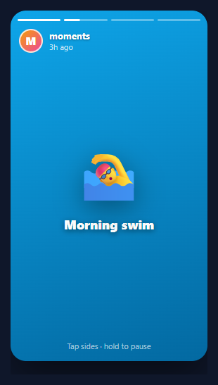
Stories — the tap-through, auto-advancing slideshow popularised by Snapchat and Instagram — are now everywhere: social apps, product tours, onboarding, and marketing. The defining UI element is the row of segmented progress bars across the top: one segment per slide, the current one filling in real time, completed ones full, upcoming ones empty. This snippet implements a complete story viewer in plain HTML, CSS, and vanilla JavaScript: auto-advancing segmented bars, tap-left/right navigation, hold-to-pause, and crossfading slides.
Segmented bars driven by one CSS animation
Each segment is a track containing a .st-fill that is scaled horizontally. The fill uses transform: scaleX (not width) with transform-origin: left, so the bar appears to fill left-to-right — and because it is a transform, the animation runs on the compositor and stays perfectly smooth. Completed bars get .done (scaleX(1)); the active bar gets .st-active, which runs the st-grow keyframe over a --dur duration (default 5s, linear). Upcoming bars stay at scaleX(0).
Auto-advance via animationend
Rather than juggling setTimeout timers (which drift and are hard to pause), the viewer advances when the active fill's animation finishes. A single animationend listener on the bars container checks for the st-grow animation and calls next(). This ties progression directly to the visible progress bar, so the slide always changes exactly when its bar completes — no desync between the timer and the indicator.
Restarting the fill cleanly
When show(i) activates a bar, it must restart the fill animation from zero even if that bar was animated before. It does this with the classic reset trick: set animation: none, force a reflow by reading offsetWidth, then clear the inline animation so the class-based one runs fresh. Without this, re-entering a slide would not replay its progress.
Tap navigation and hold-to-pause
Two transparent .st-nav buttons cover the left and right ~40% of the viewer — tapping them calls prev() and next(), exactly like the native gesture. Holding anywhere (mousedown/touchstart) adds a .paused class that sets animation-play-state: paused on the active fill, freezing both the bar and the countdown; releasing resumes it. This is the behaviour users expect when they press and hold to read a slide longer.
Crossfading slides
Slides stack absolutely and crossfade with an opacity transition (compositor-friendly), so switching feels smooth rather than abrupt. The slides here use gradient backgrounds with emoji, but each is a normal element you can swap for an image or video.
Pair this with a carousel for swipeable galleries, an onboarding tour for guided flows, or an image accordion for expandable media.
Step by step
How to Use
- 1Paste HTML, CSS, and JSA phone-style story viewer appears with four segmented bars on top; the first fills automatically over five seconds.
- 2Watch it auto-advanceWhen the first bar completes, the viewer crossfades to the next slide and that bar starts filling — looping back to the start after the last.
- 3Tap to navigateTap the right side to skip ahead and the left side to go back, just like Instagram stories.
- 4Hold to pausePress and hold anywhere — the active bar freezes mid-fill and resumes the moment you release.
- 5Change the durationSet the
--durcustom property (e.g. to 3s or 8s) to control how long each slide stays before advancing. - 6Swap in real mediaReplace each
.st-slide's gradient background with an image or a muted autoplay video for real stories.
Real-world uses
Common Use Cases
Got questions?
Frequently Asked Questions
Replace each .st-slide's gradient with background-image: url(...) or put an <img>/<video muted autoplay> inside it. For video, sync the bar duration to the clip length by setting that slide's --dur to the video duration, and call next() on the video's ended event instead of (or in addition to) the bar animation.
Track touch start/move on the viewer: a downward swipe past a threshold closes the story; horizontal swipes past the edges move to the previous/next author's story set. Keep the tap zones for within-set navigation and reserve swipes for set-level and dismiss gestures, as the native apps do.
Tying progression to the bar's animationend guarantees the slide changes exactly when its progress bar completes, even after pausing — animation-play-state pauses both together. A separate setTimeout can drift from the visual bar and is awkward to pause/resume in sync, leading to a timer that finishes before or after the bar visibly fills.
Provide visible, focusable Previous/Next controls (the snippet uses real <button>s with aria-labels) so keyboard users can navigate, and support Left/Right arrow keys mapped to prev/next. Offer a pause control and respect prefers-reduced-motion by disabling auto-advance for users who set it, since auto-moving content can be an accessibility barrier.
In React, hold current in useState, render bars from the slide array, key the active fill so it remounts (auto-restarting the animation), and advance in an onAnimationEnd handler. In Vue, use a ref and :key on the active fill with @animationend. In Angular, track current and bind [class.active]/(animationend). The scaleX keyframe and pause CSS port unchanged.