


Copy & paste
Source Code
<div class="page">
  <div class="section-head">
    <p class="eyebrow">What developers say</p>
    <h2 class="section-title">Loved by 12,000+ frontend developers</h2>
  </div>

  <div class="masonry">
    <div class="masonry-col">
      <blockquote class="tcard featured">
        <div class="stars">★★★★★</div>
        <p class="tcard-body">"I've tried every UI library out there. Nothing comes close to the quality-to-time-saved ratio of webdevpuneet.com. I ship features in hours that used to take days."</p>
        <footer class="tcard-footer">
          <div class="avatar" style="--av:linear-gradient(135deg,#6366f1,#8b5cf6)">AM</div>
          <div>
            <div class="tcard-name">Alex Martinez</div>
            <div class="tcard-role">Senior Engineer · Shopify</div>
          </div>
          <div class="tcard-logo">
            <svg width="80" height="16" viewBox="0 0 80 16" fill="none"><text x="0" y="13" font-family="system-ui" font-size="13" font-weight="800" fill="#96bf48">shopify</text></svg>
          </div>
        </footer>
      </blockquote>

      <blockquote class="tcard">
        <div class="stars">★★★★★</div>
        <p class="tcard-body">"The React exports are surprisingly clean — no bloat, no dead props. Our design system onboarding time dropped by 60%."</p>
        <footer class="tcard-footer">
          <div class="avatar" style="--av:linear-gradient(135deg,#0ea5e9,#06b6d4)">LP</div>
          <div>
            <div class="tcard-name">Layla Park</div>
            <div class="tcard-role">UI Lead · Stripe</div>
          </div>
        </footer>
      </blockquote>

      <blockquote class="tcard tcard-dark">
        <div class="stars stars-light">★★★★★</div>
        <p class="tcard-body tcard-body-light">"Every snippet just works. No broken imports, no missing dependencies. Copy → paste → ship."</p>
        <footer class="tcard-footer">
          <div class="avatar" style="--av:rgba(255,255,255,.15)">TK</div>
          <div>
            <div class="tcard-name tcard-name-light">Tom Keller</div>
            <div class="tcard-role tcard-role-light">Freelance Developer</div>
          </div>
        </footer>
      </blockquote>
    </div>

    <div class="masonry-col">
      <blockquote class="tcard">
        <div class="stars">★★★★★</div>
        <p class="tcard-body">"Our whole team switched to webdevpuneet.com for prototyping. The Figma-to-code gap disappeared practically overnight. Genuinely impressive work."</p>
        <footer class="tcard-footer">
          <div class="avatar" style="--av:linear-gradient(135deg,#f59e0b,#ef4444)">RB</div>
          <div>
            <div class="tcard-name">Rachel Burns</div>
            <div class="tcard-role">Product Manager · Linear</div>
          </div>
        </footer>
      </blockquote>

      <blockquote class="tcard">
        <div class="stars stars-4">★★★★<span class="se">★</span></div>
        <p class="tcard-body">"Great collection. The dark mode snippets are particularly well thought through. Would love more data visualisation components but what's here is excellent."</p>
        <footer class="tcard-footer">
          <div class="avatar" style="--av:linear-gradient(135deg,#10b981,#059669)">NW</div>
          <div>
            <div class="tcard-name">Noah Wilson</div>
            <div class="tcard-role">Frontend Dev · Vercel</div>
          </div>
        </footer>
      </blockquote>
    </div>

    <div class="masonry-col">
      <blockquote class="tcard">
        <div class="stars stars-4">★★★★<span class="se">★</span></div>
        <p class="tcard-body">"Saved my startup literally thousands in design hours. The pricing page components alone are worth it — and it's free?"</p>
        <footer class="tcard-footer">
          <div class="avatar" style="--av:linear-gradient(135deg,#ec4899,#f43f5e)">SW</div>
          <div>
            <div class="tcard-name">Sarah Wong</div>
            <div class="tcard-role">Founder · Notion template co.</div>
          </div>
        </footer>
      </blockquote>

      <blockquote class="tcard featured">
        <div class="stars">★★★★★</div>
        <p class="tcard-body">"The GitHub Gist sync is a killer feature. My custom snippets are available on every machine, every project. This is how developer tools should work."</p>
        <footer class="tcard-footer">
          <div class="avatar" style="--av:linear-gradient(135deg,#6366f1,#4f46e5)">DH</div>
          <div>
            <div class="tcard-name">Dev Huang</div>
            <div class="tcard-role">Staff Engineer · Atlassian</div>
          </div>
        </footer>
      </blockquote>

      <blockquote class="tcard">
        <div class="stars">★★★★★</div>
        <p class="tcard-body">"Used the kanban board and data table snippets for an internal tool. Client was blown away. Both deployed in an afternoon."</p>
        <footer class="tcard-footer">
          <div class="avatar" style="--av:linear-gradient(135deg,#f59e0b,#d97706)">MR</div>
          <div>
            <div class="tcard-name">Maria Reyes</div>
            <div class="tcard-role">Web Developer · Agency</div>
          </div>
        </footer>
      </blockquote>
    </div>
  </div>
</div>*{box-sizing:border-box;margin:0;padding:0}
body{font-family:system-ui,sans-serif;background:#f8fafc;min-height:100vh;padding:32px 20px}
.page{max-width:960px;margin:0 auto}
.section-head{text-align:center;margin-bottom:32px}
.eyebrow{font-size:11px;font-weight:700;letter-spacing:.08em;text-transform:uppercase;color:#6366f1;margin-bottom:8px}
.section-title{font-size:clamp(20px,3vw,30px);font-weight:800;color:#1e293b;line-height:1.2}
.masonry{display:grid;grid-template-columns:repeat(3,1fr);gap:16px;align-items:start}
.masonry-col{display:flex;flex-direction:column;gap:16px}
.tcard{background:#fff;border:1.5px solid #e2e8f0;border-radius:16px;padding:20px;display:flex;flex-direction:column;gap:12px;transition:box-shadow .2s,transform .2s;break-inside:avoid}
.tcard:hover{box-shadow:0 8px 28px rgba(0,0,0,.08);transform:translateY(-2px)}
.tcard.featured{border-color:#c7d2fe;box-shadow:0 4px 20px rgba(99,102,241,.1)}
.tcard-dark{background:linear-gradient(145deg,#1e1b4b,#312e81);border-color:transparent}
.stars{color:#f59e0b;font-size:14px;letter-spacing:1.5px}
.stars-light{color:#fcd34d}
.stars-4 .se{color:#e2e8f0}
.tcard-dark .stars-4 .se{color:rgba(255,255,255,.2)}
.tcard-body{font-size:13.5px;color:#334155;line-height:1.7;flex:1;font-style:italic}
.tcard-body-light{color:rgba(255,255,255,.85)}
.tcard-footer{display:flex;align-items:center;gap:10px;flex-wrap:wrap;margin-top:4px}
.avatar{width:34px;height:34px;border-radius:10px;background:var(--av);display:flex;align-items:center;justify-content:center;font-size:10px;font-weight:800;color:#fff;flex-shrink:0}
.tcard-name{font-size:12px;font-weight:700;color:#1e293b}
.tcard-name-light{color:#f1f5f9}
.tcard-role{font-size:11px;color:#64748b}
.tcard-role-light{color:rgba(255,255,255,.5)}
.tcard-logo{margin-left:auto;opacity:.6}
@media(max-width:700px){.masonry{grid-template-columns:1fr}}
@media(min-width:701px) and (max-width:900px){.masonry{grid-template-columns:repeat(2,1fr)}}Extend with AI
Take This Snippet Further With AI
The AI prompt for this one is for Patreon supporters ($3 a month, 7 days free), along with a site with no ads. Supporters enter the passcode once and it is remembered in this browser.
What's included
Features
align-items: start on the grid — cards stack by natural height within each column, no JavaScript required.--av CSS custom property on each avatar accepts any background value — solid colour, gradient, or rgba. One attribute per testimonial..featured adds indigo border + subtle indigo shadow — elevates the most impactful quotes without structural changes..tcard-dark with deep indigo gradient — breaks visual monotony in the white grid. Light modifier classes handle text and star colours inside it..stars-4 with .se (star-empty) class on the trailing star — 4-star ratings that feel more authentic than all five-star reviews.translateY(-2px) + box-shadow transition on hover — consistent interactive feel across all card variants.About this UI Snippet
Testimonial Masonry Wall — CSS Grid Column Alignment, Avatar Gradient System & Featured Card
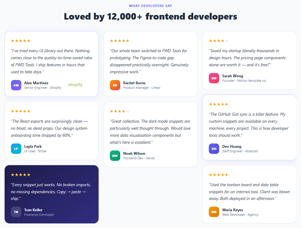
Testimonial walls are one of the most persuasive trust-building elements on SaaS and product landing pages — a dense grid of authentic customer quotes that communicates social proof at scale. A wall of 7–8 testimonials signals "many people use this" far more convincingly than a three-quote slider. This snippet builds a three-column masonry-style testimonial grid with gradient avatars, star ratings, featured card highlight, dark card variant, company attribution, and responsive column stacking.
Testimonial walls appear on the pricing pages of Notion, Linear, Stripe, Vercel, and virtually every high-converting SaaS product. The design challenge is making a dense grid of quotes feel readable rather than overwhelming — varied card heights, subtle hover lifts, featured card highlighting, and the dark card variant all create visual rhythm across the grid.
CSS Grid masonry column layout
True CSS masonry (using grid-template-rows: masonry) has limited browser support, so this implementation uses three explicit column divs with align-items: start on the grid. Each column is a flex column, and cards stack naturally within their column. Cards in different columns that have different text lengths will sit at different heights — this is the intentional "masonry" effect achieved without JavaScript. The approach is pure CSS and works in all modern browsers.
Gradient avatar system
Each testimonial uses an initials-based avatar with a --av CSS custom property accepting any CSS background value — solid colours, gradients, or even rgba for the dark card's translucent avatar. The gradient pairs (indigo/violet, sky/cyan, amber/red, emerald/green, pink/rose) are drawn from the Tailwind CSS palette and create enough visual variety that no two adjacent avatars look the same.
Featured card elevation
The .featured class applies an indigo border (#c7d2fe) and a subtle indigo box-shadow (rgba(99,102,241,.1)) — lifting the most impactful quotes slightly above the others. Featured cards are placed first in their column for maximum above-the-fold visibility. This pattern is used by Stripe's testimonial sections.
Dark card for visual rhythm
The dark card (.tcard-dark) breaks the all-white grid with a deep indigo gradient — the same technique used in pricing cards to make one option stand out. It requires careful colour handling: avatar, text, stars, and role label all need light variants. The approach uses modifier classes (.tcard-body-light, .tcard-name-light, .tcard-role-light, .stars-light) rather than descendant selectors, so the dark card is self-contained and portable.
Pair with a carousel for a testimonial slider variant that shows one quote at a time on mobile.
Step by step
How to Use
- 1Paste HTML and CSSA three-column masonry testimonial grid appears with 7 quotes. Card heights vary naturally based on quote length, creating the masonry staggered look.
- 2Identify the featured cardsAlex Martinez's and Dev Huang's cards have an indigo border and subtle shadow — the featured highlight for the most compelling quotes.
- 3Find the dark cardTom Keller's card uses a deep indigo gradient — a visual break that adds rhythm to the all-white grid.
- 4Hover over any cardCards lift with a gentle
translateY(-2px)and box-shadow on hover — a consistent interactive affordance across the grid. - 5Swap the testimonialsReplace the
<p class="tcard-body">text, update the initials in.avatar, change--avto any CSS gradient, and update name and role. - 6Adjust the column layoutMove
<blockquote>elements between the three.masonry-coldivs to balance column heights. Longer quotes should be distributed evenly.
Real-world uses
Common Use Cases
Got questions?
Frequently Asked Questions
Use JavaScript to sort testimonials by character count and distribute them to columns in a round-robin order starting with the longest quote in column 1. Alternatively, use the CSS column-count: 3 + column-gap: 16px approach with break-inside: avoid on each card — this gives true masonry but can reorder cards reading top-to-bottom per column.
Add an IntersectionObserver that adds an .visible class when cards enter the viewport. In CSS: .tcard { opacity: 0; transform: translateY(16px); transition: opacity .5s, transform .5s } and .tcard.visible { opacity: 1; transform: none }. Add staggered transition-delay based on the card's column index for a wave effect.
Replace the .avatar div with <img src="logo.png" alt="Company" class="logo-img">. Add .logo-img { width: 80px; height: 30px; object-fit: contain; opacity: .7 }. Place the logo in the .tcard-footer alongside the reviewer name and role.
Create a TestimonialCard component with {body, name, role, rating, featured, dark, avatarGradient} props. The masonry grid renders three column arrays split from a testimonials data array: [col1, col2, col3] = [0,3,6].map(i => testimonials.slice(i, i+3)). Each column renders a <div class="masonry-col"> mapping to TestimonialCard components.