




Aurora Gradient Footer — Free HTML CSS Animated Background Footer
Aurora Gradient Footer · Footers · Plain HTML & CSS · Live preview
Copy & paste
Source Code
<footer class="agf">
  <div class="agf-aurora" aria-hidden="true">
    <span class="agf-blob b1"></span>
    <span class="agf-blob b2"></span>
    <span class="agf-blob b3"></span>
  </div>
  <div class="agf-inner">
    <div class="agf-cta">
      <h2>Ready when you are.</h2>
      <p>Start free — no credit card, cancel anytime.</p>
      <a href="#" class="agf-btn">Start building <span>→</span></a>
    </div>
    <div class="agf-cols">
      <div class="agf-col">
        <h4>Product</h4>
        <a href="#">Features</a><a href="#">Integrations</a><a href="#">Changelog</a>
      </div>
      <div class="agf-col">
        <h4>Company</h4>
        <a href="#">About</a><a href="#">Careers</a><a href="#">Blog</a>
      </div>
      <div class="agf-col">
        <h4>Resources</h4>
        <a href="#">Docs</a><a href="#">Community</a><a href="#">Support</a>
      </div>
    </div>
    <div class="agf-bottom">
      <span class="agf-brand">◆ Fluxly</span>
      <span>© 2026 Fluxly, Inc. — All rights reserved.</span>
    </div>
  </div>
</footer>*{box-sizing:border-box;margin:0;padding:0}
body{font-family:system-ui,-apple-system,sans-serif;background:#05070d}
.agf{position:relative;overflow:hidden;background:#05070d;border-top:1px solid rgba(255,255,255,0.06)}
.agf-aurora{position:absolute;inset:0;pointer-events:none;filter:blur(60px);opacity:.55}
.agf-blob{position:absolute;border-radius:50%}
.b1{width:420px;height:420px;background:radial-gradient(circle,#6366f1,transparent 70%);top:-140px;left:6%;animation:drift1 16s ease-in-out infinite}
.b2{width:380px;height:380px;background:radial-gradient(circle,#ec4899,transparent 70%);top:-80px;right:8%;animation:drift2 20s ease-in-out infinite}
.b3{width:320px;height:320px;background:radial-gradient(circle,#22d3ee,transparent 70%);bottom:-160px;left:38%;animation:drift3 18s ease-in-out infinite}
@keyframes drift1{0%,100%{transform:translate(0,0) scale(1)}50%{transform:translate(60px,40px) scale(1.15)}}
@keyframes drift2{0%,100%{transform:translate(0,0) scale(1)}50%{transform:translate(-50px,30px) scale(0.9)}}
@keyframes drift3{0%,100%{transform:translate(0,0) scale(1)}50%{transform:translate(30px,-30px) scale(1.1)}}
.agf-inner{position:relative;z-index:1;max-width:960px;margin:0 auto;padding:80px 24px 32px}
.agf-cta{text-align:center;margin-bottom:64px}
.agf-cta h2{font-size:clamp(28px,5vw,42px);font-weight:800;color:#f8fafc;letter-spacing:-.02em}
.agf-cta p{font-size:15px;color:#94a3b8;margin-top:10px}
.agf-btn{display:inline-flex;align-items:center;gap:8px;margin-top:24px;background:#fff;color:#0f172a;font-size:14px;font-weight:700;padding:12px 24px;border-radius:10px;text-decoration:none;transition:transform .15s,box-shadow .15s}
.agf-btn:hover{transform:translateY(-2px);box-shadow:0 12px 30px rgba(255,255,255,0.15)}
.agf-btn span{transition:transform .15s}
.agf-btn:hover span{transform:translateX(3px)}
.agf-cols{display:grid;grid-template-columns:repeat(3,1fr);gap:24px;padding-bottom:36px;border-bottom:1px solid rgba(255,255,255,0.08)}
.agf-col h4{font-size:12px;font-weight:700;color:#f1f5f9;text-transform:uppercase;letter-spacing:.06em;margin-bottom:14px}
.agf-col{display:flex;flex-direction:column;gap:10px}
.agf-col a{color:#94a3b8;font-size:13.5px;text-decoration:none;transition:color .15s}
.agf-col a:hover{color:#f1f5f9}
.agf-bottom{display:flex;align-items:center;justify-content:space-between;padding-top:22px;gap:16px;flex-wrap:wrap}
.agf-brand{font-weight:800;color:#c7d2fe;font-size:14px}
.agf-bottom span:last-child{font-size:12px;color:#475569}
@media (max-width:640px){
.agf-cols{grid-template-columns:1fr 1fr;gap:28px 16px}
.agf-bottom{flex-direction:column;align-items:flex-start}
}Extend with AI
Take This Snippet Further With AI
The AI prompt for this one is for Patreon supporters ($3 a month), along with a site with no ads. Supporters enter the passcode once and it is remembered in this browser.
What's included
Features
About this UI Snippet
Aurora Gradient Footer — A Living Background Behind a Static CTA
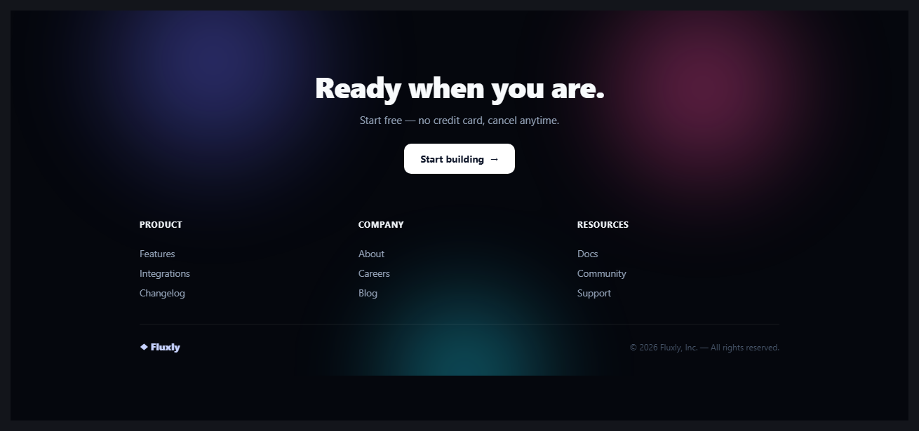
A footer's final CTA competes for attention with everything the user just scrolled past. This snippet borrows the ambient-glow trick from modern SaaS hero sections — three large, blurred, slowly drifting colour blobs — and puts it behind the footer's closing pitch instead, so the last thing on the page feels alive rather than like an afterthought bolted on once the content ran out.
Three blobs, three independent drift paths
.agf-aurora is an absolutely positioned layer holding three radial-gradient circles, each roughly 350–420px, positioned to overlap loosely across the top and bottom of the footer. Each blob runs its own @keyframes — drift1, drift2, drift3 — translating and scaling on a different duration (16s, 20s, 18s) and a different path. Giving each blob its own timing is what stops the animation from reading as one thing pulsing; three independent, slightly-out-of-sync motions is what makes it feel organic rather than mechanical, the same principle behind aurora background hero effects.
One blur() on the parent, not three
Rather than blurring each blob individually, filter: blur(60px) sits on the .agf-aurora wrapper and applies to all three children at once. This is both simpler to tune — one blur radius controls the whole effect's softness — and cheaper: the browser composites the blurred layer once rather than filtering three separate elements every frame. opacity: .55 on the same wrapper keeps the effect ambient rather than distracting from the text sitting above it.
Content sits in its own stacking layer
Everything the user actually reads — the CTA, the link columns, the bottom bar — lives inside .agf-inner at position: relative; z-index: 1, one paint layer above the aurora. This is the same content-above-effect separation used in the glare card: the ambient motion never has to fight for legibility because it is structurally behind the text, not blended with it.
A CTA that earns the space, then a real footer beneath it
The upper half is a single centred call to action — the loudest, simplest moment on the page. Below it, a conventional three-column link grid and a slim bottom bar handle the actual navigational duty, separated by a hairline border. Splitting the footer this way means the aurora effect only has to carry the emotional close of the page; it doesn't have to compete with a dense link directory sitting in the same visual field.
Step by step
How to Use
- 1Paste HTML and CSSThe aurora blobs start drifting immediately on load — no JavaScript is used.
- 2Adjust the blob coloursEach .agf-blob's radial-gradient starts with a hex colour — change b1/b2/b3 to match your brand palette.
- 3Tune the drift speed and blurEdit the animation-duration on each keyframe for faster or slower movement, and blur(60px) on .agf-aurora for a sharper or softer glow.
- 4Update the CTA and link columnsReplace the headline, subtext, button text, and the three link columns with your own content.
- 5Check performance on a low-end deviceThe blur is GPU-composited but still worth testing — if it stutters on older hardware, reduce blob size or blur radius rather than removing the animation entirely.
- 6Export in your formatClick HTML, JSX, or Tailwind to download the version you need.
Real-world uses
Common Use Cases
Got questions?
Frequently Asked Questions
It should be lightweight on any reasonably modern device — the blobs animate transform and the blur is applied once to a parent wrapper rather than per element, so the browser compositor handles most of the work off the main thread. If you notice stutter on low-end hardware, reduce blob size or blur radius before removing the animation, and consider gating it behind prefers-reduced-motion.
Filtering three separate elements individually is more expensive than filtering one shared parent layer once. It also means a single blur(60px) value controls the softness of the entire effect, rather than needing to keep three blur values in sync.
It already cannot — the aurora layer is position: absolute with no z-index, and all real content lives inside .agf-inner at position: relative; z-index: 1, placing it in a higher paint layer. The effect is structurally behind the content, not blended with it.
Yes. Each blob is an independent span with its own keyframe animation, so you can add a fourth with a new drift path and duration, or remove one — just keep each blob's timing distinct from the others so the motion continues to read as organic rather than synchronized.
Not out of the box — add a @media (prefers-reduced-motion: reduce) block that sets animation: none on each .agf-blob to freeze the blobs in place for users who have that OS setting enabled, while keeping the static gradient colours visible.
Click JSX, Vue, or Angular to download the converted component. The animation is pure CSS keyframes, so no lifecycle code is needed — the conversion is a direct markup and class-name translation.