



Copy & paste
Source Code
<div class="bento">
  <div class="cell a">
    <div class="icon">✦</div>
    <h3>Build faster</h3>
    <p>Ship production-ready components in minutes, not hours.</p>
  </div>
  <div class="cell b"><div class="big-number">99%</div><span>Satisfaction</span></div>
  <div class="cell c"><div class="icon">⚡</div><h3>Performance</h3></div>
  <div class="cell d"><div class="icon">🎨</div><h3>Design tokens</h3><p>Consistent colors, spacing, and typography.</p></div>
  <div class="cell e"><div class="stat">12k+</div><span>Components</span></div>
  <div class="cell f"><div class="icon">🔒</div><h3>Accessible</h3><p>WCAG 2.1 AA by default.</p></div>
</div>
* { box-sizing: border-box; margin: 0; padding: 0; }
body { font-family: system-ui, sans-serif; background: #0f172a; display: flex; align-items: center; justify-content: center; min-height: 100vh; padding: 20px; }
.bento { display: grid; grid-template-columns: repeat(3, 1fr); gap: 10px; width: 100%; max-width: 520px; }
.cell { background: #1e293b; border-radius: 16px; padding: 22px 20px; border: 1px solid rgba(255,255,255,0.06); transition: transform 0.2s, border-color 0.2s; }
.cell:hover { transform: translateY(-2px); border-color: rgba(99,102,241,0.3); }
.a { grid-column: span 2; background: linear-gradient(135deg, #1e1b4b, #312e81); }
.b { text-align: center; display: flex; flex-direction: column; align-items: center; justify-content: center; }
.d { grid-column: span 2; }
.e { text-align: center; display: flex; flex-direction: column; align-items: center; justify-content: center; background: linear-gradient(135deg, #4c1d95, #5b21b6); }
.icon { font-size: 24px; margin-bottom: 12px; }
h3 { font-size: 15px; font-weight: 700; color: #f1f5f9; margin-bottom: 6px; }
p { font-size: 12px; color: #64748b; line-height: 1.55; }
.big-number { font-size: 36px; font-weight: 800; color: #6366f1; line-height: 1; margin-bottom: 4px; }
.stat { font-size: 32px; font-weight: 800; color: #a78bfa; line-height: 1; margin-bottom: 4px; }
.b span, .e span { font-size: 11px; color: #64748b; text-transform: uppercase; letter-spacing: 0.5px; }Extend with AI
Take This Snippet Further With AI
The AI prompt for this one is for Patreon supporters ($3 a month, 7 days free), along with a site with no ads. Supporters enter the passcode once and it is remembered in this browser.
What's included
Features
About this UI Snippet
Bento Grid — grid-column span, Named Areas & Dark Feature Layout
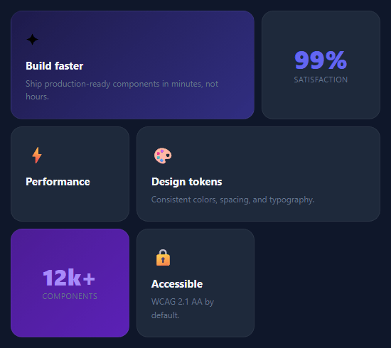
The bento grid is a modern layout pattern borrowed from Japanese bento boxes — a collection of different-sized cells arranged in a grid, each containing distinct content. Made popular by Apple and Linear, it is used on feature pages — alongside feature cards and a metric card grid — to showcase product capabilities where each feature gets a proportional amount of visual space based on its importance.
The grid structure
.bento { display: grid; grid-template-columns: repeat(3, 1fr); gap: 10px } creates a three-equal-column grid. Cells span different numbers of columns using grid-column: span N: .a { grid-column: span 2 } makes the first cell take two columns and the next cell one, creating a 2+1 row. .d { grid-column: span 2 } in the second row creates a mirrored 1+2 layout. This combination produces the visually varied bento pattern.
Named cell classes
The cells use single-letter class names (.a, .b, .c, .d, .e) as span modifiers. Most cells use the default .cell background (#1e293b). Cells .a and .e use their own gradient backgrounds to create accent points of visual interest.
The hover interaction
.cell:hover { transform: translateY(-2px); border-color: rgba(99,102,241,0.3); } lifts each cell and tints its border with the accent colour on hover. The transition: transform 0.2s, border-color 0.2s makes both smooth. The default border is rgba(255,255,255,0.06) — nearly invisible on dark background.
Content patterns
The snippet demonstrates four content patterns: emoji icon + heading + description (standard feature cell), large stat number + label (metric cell), and pure gradient accent cells. These four patterns cover most feature grid use cases.
Making it responsive
For mobile, override the grid to a single column: @media (max-width: 640px) { .bento { grid-template-columns: 1fr; } .a, .d { grid-column: span 1; } }. All cells stack vertically on narrow screens.
The grid-column: span pattern
Bento grid items use grid-column: span 2 to occupy two columns of width while using the standard row height. Some items use grid-row: span 2 for double-height cells. The container uses display: grid; grid-template-columns: repeat(4, 1fr); gap: 12px. The browser automatically positions items in the available cells following the normal document flow, wrapping to new rows as needed — for a uniform-cell variant, use the responsive card grid. No manual row/column placement is required — the span values create the varied layout automatically.
Responsive adaptation
On narrow screens, reduce the grid columns: @media (max-width: 768px) { .bento { grid-template-columns: repeat(2, 1fr); } }. Items with span 2 that were wide on desktop now span both narrow columns, becoming full-width. For mobile, single column with no spans works best. Each breakpoint may need custom span overrides for specific items.
The hover accent border
Each bento card uses border: 1px solid transparent initially. On :hover, border-color transitions to the accent colour. Combined with border-radius and the card background, this creates a lit border effect that highlights the card being hovered without moving it. Add box-shadow: 0 8px 32px rgba(accent, 0.1) on hover for additional lift.
Step by step
How to Use
- 1Load the snippetClick "Bento Grid" in the sidebar. The preview shows the dark five-cell grid with span-2 cells and gradient accent areas.
- 2Edit cell contentIn the HTML panel, update the emoji icon, h3 heading, and p description in each .cell div. Change the stat numbers in the metric cells.
- 3Change the span layoutIn the CSS panel, update grid-column: span 2 on .a and .d to span 1 or span 3 to change the cell proportions.
- 4Change accent cell gradientsUpdate the linear-gradient on .a and .e cells to your brand colours.
- 5Make it responsiveAdd @media (max-width: 640px) { .bento { grid-template-columns: 1fr; } .a, .d { grid-column: span 1; } } in the CSS panel.
- 6Export in your formatClick "HTML" for a standalone file, "JSX" for a React component, or "Tailwind" for a React + Tailwind version.
Real-world uses
Common Use Cases
Got questions?
Frequently Asked Questions
A bento grid is a CSS Grid layout where cells have varied sizes — some span one column, others span two — creating a visually asymmetric arrangement. It is named after the Japanese bento box and popularised by Apple product pages and SaaS landing pages.
grid-column: span 2 tells a grid item to occupy two consecutive column tracks. In a three-column grid, a span-2 item takes up 2/3 of the row width. The next item (span 1) fills the remaining 1/3, creating a 2+1 layout.
Add a new <div class="cell"> inside .bento. The grid auto-places it in the next available position. To control its position, add a span modifier. For a full-width cell, add .f { grid-column: span 3 } in the CSS.
Add @media (max-width: 640px) { .bento { grid-template-columns: 1fr; } .a, .d { grid-column: span 1; } }. This collapses to a single column on mobile and resets all span overrides.
Yes. Add an img inside any cell with width: 100%; height: auto; object-fit: cover; border-radius: 8px. For cells that should show only an image, remove the text content and set a fixed height on the cell.
Yes. Click "JSX" or "Tailwind" to download the export. In Tailwind, the grid maps to grid grid-cols-3 gap-2.5. span 2 cells use col-span-2. The dark background cells use bg-slate-800 and hover styles use hover:translate-y-[-2px] hover:border-indigo-500/30.