
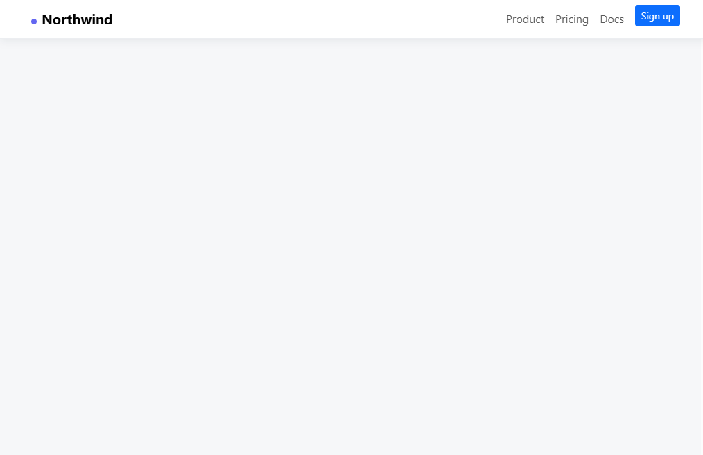


Bootstrap Mega Menu Dropdown Navbar — Free Snippet
Bootstrap Mega Menu Dropdown Navbar · Navigation · Plain HTML, CSS & JS · Live preview
Copy & paste
Source Code
<nav class="navbar navbar-expand-lg bsmega-bar">
  <div class="container">
    <a class="navbar-brand fw-bold" href="javascript:void(0)">Northwind</a>
    <button class="navbar-toggler" type="button" data-bs-toggle="collapse" data-bs-target="#bsmegaCollapse">
      <span class="navbar-toggler-icon"></span>
    </button>
    <div class="collapse navbar-collapse" id="bsmegaCollapse">
      <ul class="navbar-nav">
        <li class="nav-item dropdown bsmega-dropdown">
          <a class="nav-link dropdown-toggle" href="javascript:void(0)" data-bs-toggle="dropdown">Products</a>
          <div class="dropdown-menu bsmega-panel">
            <div class="row g-4 p-3">
              <div class="col-4">
                <h6 class="bsmega-heading">Platform</h6>
                <a class="bsmega-link" href="javascript:void(0)">Analytics</a>
                <a class="bsmega-link" href="javascript:void(0)">Automation</a>
                <a class="bsmega-link" href="javascript:void(0)">Integrations</a>
              </div>
              <div class="col-4">
                <h6 class="bsmega-heading">Solutions</h6>
                <a class="bsmega-link" href="javascript:void(0)">For startups</a>
                <a class="bsmega-link" href="javascript:void(0)">For enterprise</a>
                <a class="bsmega-link" href="javascript:void(0)">For agencies</a>
              </div>
              <div class="col-4">
                <div class="bsmega-promo">
                  <strong>New: AI Insights</strong>
                  <p class="small text-muted mb-2">Automated weekly summaries of your key metrics.</p>
                  <button class="btn btn-sm btn-dark">Learn more</button>
                </div>
              </div>
            </div>
          </div>
        </li>
        <li class="nav-item"><a class="nav-link" href="javascript:void(0)">Pricing</a></li>
        <li class="nav-item"><a class="nav-link" href="javascript:void(0)">Docs</a></li>
      </ul>
    </div>
  </div>
</nav>
<main class="bsmega-stage"><p class="text-muted small">Click "Products" above to open the mega menu.</p></main>
body { margin: 0; background: #fafafa; }
.bsmega-bar { background: #fff; border-bottom: 1px solid #eceef1; padding-block: 12px; }
.bsmega-stage { padding: 60px 24px; text-align: center; }
.bsmega-dropdown { position: static; }
.bsmega-panel {
width: 100%;
border: none;
border-radius: 0 0 14px 14px;
box-shadow: 0 20px 40px rgba(15,23,42,.1);
margin-top: 12px;
}
@media (min-width: 992px) {
.bsmega-panel { left: 0; right: 0; }
}
.bsmega-heading { font-size: 11px; text-transform: uppercase; letter-spacing: .05em; color: #9ca3af; margin-bottom: 10px; }
.bsmega-link { display: block; padding: 6px 0; color: #374151; text-decoration: none; font-size: 14px; }
.bsmega-link:hover { color: #6366f1; }
.bsmega-promo { background: #eef0ff; border-radius: 10px; padding: 16px; }// Bootstrap's own Dropdown component opens/closes the menu; this only
// reports which top-level item is currently open, for the demo readout.
document.querySelectorAll('.bsmega-dropdown').forEach(dd => {
dd.addEventListener('shown.bs.dropdown', () => console.log('mega menu opened'));
});Extend with AI
Take This Snippet Further With AI
The AI prompt for this one is for Patreon supporters ($3 a month, 7 days free), along with a site with no ads. Supporters enter the passcode once and it is remembered in this browser.
What's included
Features
About this UI Snippet
Bootstrap Mega Menu Dropdown Navbar — HTML, CSS & JavaScript

A single-column dropdown runs out of room once a "Products" menu needs to list more than four or five links. This snippet keeps Bootstrap's real Dropdown component — data-bs-toggle="dropdown", the genuine open/close and outside-click behavior — but replaces the default narrow .dropdown-menu with a full-width panel laid out in Bootstrap's own grid, grouping links into columns with a promotional callout alongside them.
The trick is entirely CSS: .bsmega-dropdown { position: static; } on the parent <li> removes the positioning context Bootstrap's dropdown would normally anchor to, so the absolutely-positioned .dropdown-menu panel is instead free to stretch left: 0; right: 0 relative to the whole navbar — a well-known, minimal-CSS technique for turning any Bootstrap dropdown into a mega menu without touching its JavaScript at all.
Step by step
How to Use
- 1Load the snippetClick the snippet in the sidebar Library tab. The preview loads with a plain navbar.
- 2Click "Products"Bootstrap's real Dropdown component opens a full-width panel with three grouped columns of links and a promo card.
- 3Click elsewhere to closeClick outside the panel — Bootstrap's own outside-click handling closes it, no custom code needed.
- 4Add a fourth columnCopy a .col-4 block and adjust to col-3 across all four for a four-column layout.
- 5Export in your formatClick "HTML" for a standalone file, "JSX" for React, or "Tailwind" for React + Tailwind CSS.
Real-world uses
Common Use Cases
Got questions?
Frequently Asked Questions
Real Bootstrap 5.3 — it uses the actual Dropdown component via data-bs-toggle="dropdown". The only custom part is CSS that lets the panel stretch full-width instead of Bootstrap's default narrow menu.
Setting position: static on the parent li removes the positioning context the dropdown menu would normally anchor to, so the absolutely-positioned panel can stretch left: 0; right: 0 relative to the whole navbar instead of just the toggle button.
Below Bootstrap's lg breakpoint, the whole navbar collapses into the standard hamburger menu, and the mega menu becomes a normal nested dropdown within it — still fully functional, just not full-width.
Yes — copy a .col-4 block and adjust the column widths (e.g. to col-3 for four columns) using Bootstrap's standard grid classes.
Yes — that's Bootstrap's own Dropdown component behavior, working exactly as it would for any standard dropdown, with no extra code required.
Yes. While the Bootstrap Mega Menu Dropdown Navbar snippet gives you one pattern to copy, the free Responsive Navbar Builder at webdevpuneet.com/navbar-builder/ designs a whole navigation bar: logo, links and dropdown menus, a mobile hamburger menu (dropdown panel, slide-in drawer or full screen) and a scroll effect (sticky, shrink, hide on scroll or transparent). It has six presets, a live preview that runs the real code, and exports HTML + CSS + vanilla JS, React, Tailwind, Vue 3 or Angular — or you can click Fork & Edit to keep editing it in My Code.