



Bootstrap Sticky Navbar with Scroll Shrink — Free Snippet
Bootstrap Sticky Navbar with Scroll Shrink · Navigation · Plain HTML, CSS & JS · Live preview
Copy & paste
Source Code
<nav class="navbar navbar-expand-lg bsshrink-bar fixed-top" id="bsshrinkNav">
  <div class="container">
    <a class="navbar-brand fw-bold" href="javascript:void(0)"><span class="bsshrink-dot"></span>Northwind</a>
    <button class="navbar-toggler" type="button" data-bs-toggle="collapse" data-bs-target="#bsshrinkCollapse">
      <span class="navbar-toggler-icon"></span>
    </button>
    <div class="collapse navbar-collapse" id="bsshrinkCollapse">
      <ul class="navbar-nav ms-auto">
        <li class="nav-item"><a class="nav-link" href="javascript:void(0)">Product</a></li>
        <li class="nav-item"><a class="nav-link" href="javascript:void(0)">Pricing</a></li>
        <li class="nav-item"><a class="nav-link" href="javascript:void(0)">Docs</a></li>
        <li class="nav-item ms-lg-2"><button class="btn btn-primary btn-sm">Sign up</button></li>
      </ul>
    </div>
  </div>
</nav>

<main class="bsshrink-stage" id="bsshrinkStage">
  <div class="bsshrink-spacer"></div>
  <p class="bsshrink-hint">Scroll down inside this preview — the navbar shrinks its padding and adds a shadow past 40px of scroll, then grows back when you scroll to the top.</p>
  <p class="bsshrink-hint">State: <strong id="bsshrinkState">expanded</strong></p>
  <div class="bsshrink-spacer bsshrink-tall"></div>
</main>
body { margin: 0; }
.bsshrink-bar {
background: #fff;
padding-block: 18px;
border-bottom: 1px solid transparent;
transition: padding .2s ease, box-shadow .2s ease, border-color .2s ease;
}
.bsshrink-bar.bsshrink-scrolled {
padding-block: 8px;
box-shadow: 0 2px 14px rgba(15,23,42,.08);
border-color: #eceef1;
}
.bsshrink-dot { display: inline-block; width: 8px; height: 8px; border-radius: 50%; background: #6366f1; margin-right: 7px; }
.bsshrink-stage { padding-top: 90px; height: 100vh; overflow-y: auto; box-sizing: border-box; background: #f6f7f9; }
.bsshrink-spacer { height: 30vh; }
.bsshrink-tall { height: 120vh; }
.bsshrink-hint { text-align: center; font-size: 13px; color: #6b7280; padding: 0 24px; }
.bsshrink-hint strong { color: #6366f1; }const nav = document.getElementById('bsshrinkNav');
const stage = document.getElementById('bsshrinkStage');
const stateEl = document.getElementById('bsshrinkState');
stage.addEventListener('scroll', () => {
const scrolled = stage.scrollTop > 40;
nav.classList.toggle('bsshrink-scrolled', scrolled);
stateEl.textContent = scrolled ? 'scrolled (shrunk)' : 'expanded';
});Extend with AI
Take This Snippet Further With AI
The AI prompt for this one is for Patreon supporters ($3 a month, 7 days free), along with a site with no ads. Supporters enter the passcode once and it is remembered in this browser.
What's included
Features
About this UI Snippet
Bootstrap Sticky Navbar with Scroll Shrink — HTML, CSS & JavaScript
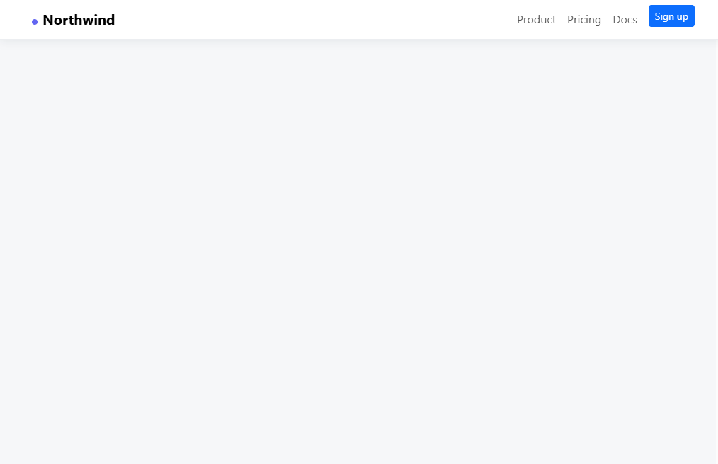
A navbar fixed to the top of the page can start to feel oversized once a visitor has scrolled past the hero — this snippet fixes that by shrinking the navbar's own padding on scroll, using real Bootstrap 5.3's navbar/navbar-collapse component underneath.
A single scroll listener compares the container's scrollTop against a 40px threshold and toggles one class, .bsshrink-scrolled, which reduces the navbar's vertical padding, adds a subtle shadow, and fades in a bottom border — all through a CSS transition, so the resize itself is smooth rather than a hard snap. The threshold is intentionally low: a navbar should visually settle almost immediately once scrolling starts, not wait for a large scroll distance.
Step by step
How to Use
- 1Load the snippetClick the snippet in the sidebar Library tab. The preview loads with a tall, padded navbar at the top.
- 2Scroll the previewScroll down inside the preview past about 40px — the navbar's padding shrinks and a shadow fades in.
- 3Scroll back to the topThe navbar expands back to its original padding and the shadow disappears.
- 4Adjust the thresholdChange the 40 in the JS panel's scrollTop comparison to control how far a visitor must scroll before it shrinks.
- 5Export in your formatClick "HTML" for a standalone file, "JSX" for React, or "Tailwind" for React + Tailwind CSS.
Real-world uses
Common Use Cases
Got questions?
Frequently Asked Questions
Yes — the actual bootstrap.min.css and bootstrap.bundle.min.js loaded from a CDN, using Bootstrap's genuine navbar and Collapse component for the mobile hamburger menu.
A scroll event listener compares the scrollable container's scrollTop against a 40px threshold and toggles one CSS class; the padding/shadow/border changes are all handled by a CSS transition on that class.
Yes — swap the listener from the preview's scroll container to window and read window.scrollY instead of stage.scrollTop; the class-toggling logic is identical either way.
No — only padding, box-shadow, and border-color change, none of which affect the position of content below the fixed navbar, so nothing jumps.
Yes — add a second rule under .bsshrink-scrolled targeting .bsshrink-dot or the brand text's font-size with its own transition; it will animate in sync with the padding change.
Yes. While the Bootstrap Sticky Navbar with Scroll Shrink snippet gives you one pattern to copy, the free Responsive Navbar Builder at webdevpuneet.com/navbar-builder/ designs a whole navigation bar: logo, links and dropdown menus, a mobile hamburger menu (dropdown panel, slide-in drawer or full screen) and a scroll effect (sticky, shrink, hide on scroll or transparent). It has six presets, a live preview that runs the real code, and exports HTML + CSS + vanilla JS, React, Tailwind, Vue 3 or Angular — or you can click Fork & Edit to keep editing it in My Code.