


3D Character Flip Reveal — Text Stagger CSS JS
3D Character Flip Reveal · Animations · Plain HTML, CSS & JS · Live preview
Copy & paste
Source Code
<div class="scene">
  <p class="eyebrow">Scroll-triggered</p>
  <h1 class="flip-heading" data-flip-text="Design in motion"></h1>
  <p class="hint">Scroll down, then back up to replay</p>
  <div class="spacer"></div>
  <h2 class="flip-heading small" data-flip-text="Every letter flips into place"></h2>
  <div class="spacer"></div>
</div>
* { box-sizing: border-box; margin: 0; padding: 0; }
body { font-family: system-ui, sans-serif; background: #0b0f1a; color: #e2e8f0; }
.scene { display: flex; flex-direction: column; align-items: center; padding: 80px 20px; text-align: center; }
.eyebrow { font-size: 12px; font-weight: 700; letter-spacing: 2px; text-transform: uppercase; color: #6366f1; margin-bottom: 14px; }
.hint { font-size: 12px; color: #475569; margin-top: 10px; }
.spacer { height: 60vh; }
.flip-heading {
font-size: clamp(28px, 6vw, 52px);
font-weight: 800;
letter-spacing: -0.01em;
perspective: 800px;
display: flex;
flex-wrap: wrap;
justify-content: center;
max-width: 780px;
}
.flip-heading.small { font-size: clamp(20px, 4vw, 32px); color: #94a3b8; max-width: 640px; }
.char {
display: inline-block;
transform-style: preserve-3d;
transform-origin: 50% 50% -0.5em;
transform: rotateX(-100deg);
opacity: 0;
color: #f8fafc;
transition: transform 0.6s cubic-bezier(0.2, 0.8, 0.2, 1), opacity 0.4s ease;
}
.flip-heading.small .char { color: #a5b4fc; }
.char.visible { transform: rotateX(0deg); opacity: 1; }
.char.space { width: 0.3em; }function buildChars(el) {
const text = el.dataset.flipText || el.textContent;
el.textContent = '';
const frag = document.createDocumentFragment();
text.split('').forEach((ch, i) => {
const span = document.createElement('span');
span.className = 'char' + (ch === ' ' ? ' space' : '');
span.textContent = ch === ' ' ? '\u00a0' : ch;
span.style.transitionDelay = (i * 28) + 'ms';
frag.appendChild(span);
});
el.appendChild(frag);
}
document.querySelectorAll('.flip-heading').forEach(buildChars);
const observer = new IntersectionObserver((entries) => {
entries.forEach((entry) => {
const chars = entry.target.querySelectorAll('.char');
if (entry.isIntersecting) {
chars.forEach((c) => c.classList.add('visible'));
} else {
chars.forEach((c) => c.classList.remove('visible'));
}
});
}, { threshold: 0.4 });
document.querySelectorAll('.flip-heading').forEach((el) => observer.observe(el));Extend with AI
Take This Snippet Further With AI
The AI prompt for this one is for Patreon supporters ($3 a month, 7 days free), along with a site with no ads. Supporters enter the passcode once and it is remembered in this browser.
What's included
Features
About this UI Snippet
3D Character Flip Reveal — rotateX Stagger, perspective & IntersectionObserver
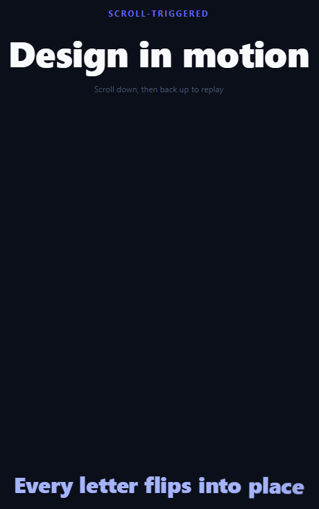
A 3D character flip reveal splits a heading into individual letters and flips each one up from a rotated, invisible state into full view, staggered so the reveal sweeps left to right like a wall of tiny split-flap tiles. It reads as more physical and dimensional than a plain fade or slide, which is why it shows up on portfolio hero sections and product landing pages that want a heading entrance with weight to it. For a flatter left-to-right stagger without the 3D rotation, see split text or scroll letter stagger; for the mechanical digit-rolling version of a flip display, see split-flap display.
Splitting the text into characters
buildChars(el) reads the heading's text from a data-flip-text attribute, clears the element, then wraps every character in its own <span class="char">. Spaces become non-breaking spaces (\u00a0) inside a .space span so word gaps survive the display: inline-block layout the flip animation needs. Doing the split once on page load — rather than hand-authoring dozens of spans in the HTML — keeps the source markup readable and lets you swap the headline by editing one attribute.
The 3D flip with perspective and transform-origin
The parent .flip-heading gets perspective: 800px, which gives child 3D transforms a vanishing point to rotate against. Each .char starts at transform: rotateX(-100deg) with opacity: 0 — tipped backward and invisible, as if lying flat behind the baseline. transform-origin: 50% 50% -0.5em pushes the rotation axis slightly behind the letter's own plane so the flip reads as a genuine 3D hinge rather than a flat squash. Adding the .visible class sets transform: rotateX(0deg) and opacity: 1, and the cubic-bezier(0.2, 0.8, 0.2, 1) easing gives the settle a slight overshoot-free snap.
Staggering with transition-delay instead of animation-delay
Because this reveal uses a plain CSS transition (triggered by toggling a class) rather than a @keyframes animation, the stagger is set via span.style.transitionDelay = (i * 28) + 'ms' in JavaScript at build time — each character's delay is proportional to its index. This is simpler to reason about than generating 50+ numbered nth-child delay rules in CSS, and it scales automatically to headlines of any length.
Re-triggering with IntersectionObserver
An IntersectionObserver watches each .flip-heading at threshold: 0.4. When a heading enters the viewport, .visible is added to every .char inside it, firing the staggered flip. When it exits, .visible is removed, resetting the characters to their hidden rotated state — so scrolling back up and down replays the reveal instead of firing only once. Delete the else branch if you want a fire-once entrance instead of a repeatable one.
Step by step
How to Use
- 1Scroll the previewScroll the heading out of view and back in — the IntersectionObserver toggles .visible each time, replaying the flip.
- 2Change the headline textEdit the data-flip-text attribute on .flip-heading in the HTML panel. The JS rebuilds character spans from that attribute automatically.
- 3Adjust the stagger speedIn the JS panel, change the 28 multiplier in span.style.transitionDelay = (i * 28) — smaller values reveal faster.
- 4Tune the flip depthIn the CSS panel, change perspective: 800px on .flip-heading (lower = more dramatic) and the -0.5em z-offset in transform-origin.
- 5Fire only onceIn the JS panel, remove the else branch inside the IntersectionObserver callback so characters stay visible after their first reveal.
- 6Export in your formatClick "HTML" for a standalone file, "JSX" for a React component, or "Tailwind" for a React + Tailwind version.
Real-world uses
Common Use Cases
Got questions?
Frequently Asked Questions
perspective: 800px on the parent element gives child rotateX() transforms a vanishing point, so the character genuinely appears to hinge in 3D space toward and away from the viewer, rather than just scaling flat. transform-origin with a negative z value (-0.5em) offsets the rotation axis behind the glyph for a more convincing hinge.
A headline can be any length, and hand-writing nth-child(1) through nth-child(40) delay rules does not scale. Setting span.style.transitionDelay = (i * 28) + "ms" at build time computes the correct delay for exactly as many characters as the text contains.
The IntersectionObserver callback adds .visible on isIntersecting and removes it otherwise. Removing the else branch (or checking a "played" flag before removing) makes the reveal fire once and stay revealed.
Give each heading its own data-flip-text attribute and the same flip-heading class. buildChars() and the observer both use querySelectorAll and run identically for every matching element.
Yes — a plain space character inside display: inline-block spans can collapse. The script replaces spaces with a non-breaking space (\u00a0) inside a .space span so word gaps render consistently.
Yes. Click "JSX" for a React component. Split the string with String.prototype.split("") in a useMemo, render a span per character with an inline transitionDelay style, and use a useRef plus IntersectionObserver in a useEffect to toggle a "visible" state.