
Color Mode Toggle — Light/Dark/System Switch UI
Color Mode Toggle · Buttons · Plain HTML, CSS & JS · Live preview
Copy & paste
Source Code
<div class="cmt-demo" id="cmtDemo">
  <div class="cmt-bar">
    <span class="cmt-logo">◆ Acme</span>
    <div class="cmt-switch" role="radiogroup" aria-label="Color theme">
      <button type="button" class="cmt-opt" data-mode="light" aria-label="Light">
        <svg viewBox="0 0 24 24" fill="none" stroke="currentColor" stroke-width="2" stroke-linecap="round"><circle cx="12" cy="12" r="4"/><path d="M12 2v2M12 20v2M4.9 4.9l1.4 1.4M17.7 17.7l1.4 1.4M2 12h2M20 12h2M4.9 19.1l1.4-1.4M17.7 6.3l1.4-1.4"/></svg>
      </button>
      <button type="button" class="cmt-opt" data-mode="system" aria-label="System">
        <svg viewBox="0 0 24 24" fill="none" stroke="currentColor" stroke-width="2" stroke-linecap="round" stroke-linejoin="round"><rect x="2" y="3" width="20" height="14" rx="2"/><path d="M8 21h8M12 17v4"/></svg>
      </button>
      <button type="button" class="cmt-opt" data-mode="dark" aria-label="Dark">
        <svg viewBox="0 0 24 24" fill="none" stroke="currentColor" stroke-width="2" stroke-linecap="round" stroke-linejoin="round"><path d="M21 12.8A9 9 0 1 1 11.2 3a7 7 0 0 0 9.8 9.8z"/></svg>
      </button>
      <span class="cmt-thumb" id="cmtThumb"></span>
    </div>
  </div>

  <div class="cmt-content">
    <h3>Good morning</h3>
    <p>This panel previews your theme. Pick Light, Dark, or System — System follows your device setting automatically.</p>
    <div class="cmt-chips"><span>Live preview</span><span class="cmt-state" id="cmtState">System · dark</span></div>
  </div>
</div>*{box-sizing:border-box;margin:0;padding:0}
body{font-family:system-ui,-apple-system,sans-serif;background:#e2e8f0;min-height:100vh;display:flex;align-items:center;justify-content:center;padding:24px}
/* Theme tokens — :root is light, [data-theme=dark] overrides. */
.cmt-demo{--bg:#ffffff;--bg2:#f1f5f9;--text:#0f172a;--text2:#64748b;--border:#e2e8f0;--accent:#6366f1;
width:100%;max-width:420px;background:var(--bg);border:1px solid var(--border);border-radius:18px;overflow:hidden;
box-shadow:0 18px 44px rgba(15,23,42,.14);transition:background .3s,border-color .3s,color .3s}
.cmt-demo[data-theme="dark"]{--bg:#0f172a;--bg2:#1e293b;--text:#f1f5f9;--text2:#94a3b8;--border:#1e293b;--accent:#818cf8}
.cmt-bar{display:flex;align-items:center;justify-content:space-between;padding:14px 18px;border-bottom:1px solid var(--border)}
.cmt-logo{font-size:14px;font-weight:800;color:var(--text)}
.cmt-switch{position:relative;display:inline-flex;background:var(--bg2);border-radius:999px;padding:3px}
.cmt-opt{position:relative;z-index:1;width:34px;height:30px;border:none;background:none;color:var(--text2);cursor:pointer;display:flex;align-items:center;justify-content:center;transition:color .2s}
.cmt-opt svg{width:16px;height:16px}
.cmt-opt.active{color:var(--accent)}
.cmt-thumb{position:absolute;top:3px;left:3px;width:34px;height:30px;background:var(--bg);border-radius:999px;box-shadow:0 1px 4px rgba(15,23,42,.18);transition:transform .25s cubic-bezier(.34,1.3,.64,1)}
.cmt-content{padding:22px 18px}
.cmt-content h3{font-size:20px;font-weight:800;color:var(--text);margin-bottom:8px}
.cmt-content p{font-size:13px;color:var(--text2);line-height:1.6;margin-bottom:16px}
.cmt-chips{display:flex;align-items:center;justify-content:space-between;font-size:11.5px}
.cmt-chips span{color:var(--text2);font-weight:600}
.cmt-state{background:var(--bg2);color:var(--text);padding:4px 10px;border-radius:999px;font-weight:700}var MODES = ['light', 'system', 'dark'];
var demo = document.getElementById('cmtDemo');
var thumb = document.getElementById('cmtThumb');
var stateEl = document.getElementById('cmtState');
var media = window.matchMedia('(prefers-color-scheme: dark)');
// In a real app, persist to localStorage and apply to <html>. This scoped demo
// applies the theme to the .cmt-demo container instead so the page stays neutral.
var mode = 'system';
function resolved(m) {
return m === 'system' ? (media.matches ? 'dark' : 'light') : m;
}
function apply() {
var theme = resolved(mode);
demo.setAttribute('data-theme', theme);
// Move the sliding thumb to the active option.
var idx = MODES.indexOf(mode);
thumb.style.transform = 'translateX(' + (idx * 34) + 'px)';
document.querySelectorAll('.cmt-opt').forEach(function (b) {
b.classList.toggle('active', b.dataset.mode === mode);
});
stateEl.textContent = mode === 'system' ? 'System · ' + theme : mode.charAt(0).toUpperCase() + mode.slice(1);
// A real app would also: localStorage.setItem('theme', mode);
}
document.querySelector('.cmt-switch').addEventListener('click', function (e) {
var btn = e.target.closest('.cmt-opt');
if (!btn) return;
mode = btn.dataset.mode;
apply();
});
// When in System mode, react live to the OS theme changing.
media.addEventListener('change', function () { if (mode === 'system') apply(); });
apply();Extend with AI
Take This Snippet Further With AI
The AI prompt for this one is for Patreon supporters ($3 a month, 7 days free), along with a site with no ads. Supporters enter the passcode once and it is remembered in this browser.
What's included
Features
About this UI Snippet
Color Mode Toggle — Three-Way Light / Dark / System Theme Switch
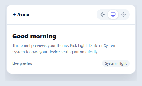
A two-state dark-mode toggle forces a choice the user shouldn't have to make: it ignores that their device already has a light/dark preference that changes with time of day. The modern pattern is a three-way switch — Light, Dark, and System — where System defers to the OS setting and updates live when it changes. This snippet builds that segmented theme control in plain HTML, CSS, and vanilla JavaScript, with a sliding thumb, CSS-variable theming, and correct System behavior.
Why "System" is the important option
"System" (sometimes "Auto") is what most users actually want as a default: it follows the device's prefers-color-scheme, so the site is light during the day and dark at night without anyone touching a setting. The key behavior is that System isn't a snapshot — it's a *live* binding. This snippet listens to the matchMedia('(prefers-color-scheme: dark)') change event and re-applies the theme whenever the OS flips, but only while the user is in System mode. Pick Light or Dark explicitly and you override the OS; pick System and you hand control back to it. Getting this live-follow behavior right is what separates a real three-way toggle from one that just has a third button.
Theming with CSS custom properties
The whole component themes through CSS variables. :root-equivalent tokens on the container (--bg, --text, --border, --accent) define the light theme, and a [data-theme="dark"] selector overrides them for dark. Every element references the variables, so switching themes is a single attribute change on one element — no per-element class toggling. A transition on the color properties makes the switch a smooth crossfade rather than an abrupt flip. This is the standard, scalable way to theme a site: define tokens once, flip one attribute.
The sliding thumb
The three options sit in a pill, and a thumb slides beneath the active one using transform: translateX() (the index times the option width), with a slight spring easing. Animating transform keeps the motion GPU-cheap and smooth, and the active icon tints to the accent color so the selection is clear from both the thumb position and the color. A small status chip echoes the current mode and, in System mode, the resolved theme ("System · dark") so the user can see what System currently maps to.
Scoped demo vs. real app
This demo applies the theme to its own container (.cmt-demo) so the surrounding page stays neutral — but in a real app you'd set data-theme on <html> and persist the choice to localStorage, then read it back on load (ideally in a tiny inline script in the <head>, before first paint, to avoid a flash of the wrong theme). The code comments mark exactly where those two lines go. The resolution logic — mode → resolved theme — is identical whether you scope it to a container or the whole document.
Accessible and keyboard-ready
The switch is a role="radiogroup" of icon buttons, each with an aria-label (Light / System / Dark), so it's operable and announced correctly. Building it from real buttons means keyboard focus and activation work without custom handling, and the visual selection never relies on color alone — the thumb position is a second, redundant indicator.
Step by step
How to Use
- 1Paste HTML, CSS, and JSA themed preview panel renders with a Light / System / Dark switch; the thumb starts on System.
- 2Pick a modeClick Light or Dark to set the theme explicitly; the panel crossfades and the thumb slides to your choice.
- 3Use SystemChoose System to follow your device's setting — the status chip shows what it currently resolves to ("System · dark").
- 4Change your OS themeWhile in System mode, flip your operating system's appearance — the panel updates live without a click.
- 5Apply to your whole siteSet data-theme on <html> instead of the demo container and define your token variables on :root and [data-theme="dark"].
- 6Persist the choiceSave the mode to localStorage on change and read it back in a head inline script before first paint to avoid a theme flash.
Real-world uses
Common Use Cases
Got questions?
Frequently Asked Questions
Define your token variables on :root (light) and a html[data-theme="dark"] selector (dark overrides), set data-theme on document.documentElement instead of the demo container, and have every component reference the variables. Switching then re-themes the entire page from one attribute change.
Read the saved mode from localStorage and set data-theme on <html> in a tiny synchronous inline <script> in the <head>, before any CSS or content paints — this applies the correct theme before first render. Doing it in a deferred script or after hydration causes a visible flash (FOUC) of the default theme first.
"Dark" is an explicit override that stays dark regardless of the OS. "System" defers to the device's prefers-color-scheme and changes live when the OS does — so a System user on a device that switches to dark at sunset gets dark automatically, while a Dark user is always dark. Persisting the mode (light/dark/system), not just the resolved theme, preserves this distinction.
On every change, localStorage.setItem('theme', mode) storing the mode value ('light' | 'dark' | 'system'). On load, read it back, default to 'system' if absent, and apply. Store the mode rather than the resolved theme so a System user keeps following the OS rather than being pinned to whatever it resolved to last time.
In React, hold the mode in useState (initialized from localStorage), apply data-theme in a useEffect, and subscribe to the matchMedia change event for System; in Vue, use ref() with onMounted/watch; in Angular, use a service with a BehaviorSubject and Renderer2. The resolution logic (mode → theme) and the matchMedia listener port unchanged.