


FAB Speed Dial Menu — Free HTML CSS JS Floating Action Button Snippet
FAB Speed Dial Menu · Buttons · Plain HTML, CSS & JS · Live preview
Copy & paste
Source Code
<div class="speed-dial" id="speedDial">
  <div class="dial-actions" id="dialActions">
    <button class="dial-item" style="--i: 0" onclick="handleAction('share')" aria-label="Share">
      <svg viewBox="0 0 24 24" width="18" height="18" fill="none" stroke="currentColor" stroke-width="2" stroke-linecap="round" stroke-linejoin="round"><circle cx="18" cy="5" r="3"/><circle cx="6" cy="12" r="3"/><circle cx="18" cy="19" r="3"/><path d="M8.6 10.6l6.8-3.8M8.6 13.4l6.8 3.8"/></svg>
      <span class="dial-tooltip">Share</span>
    </button>
    <button class="dial-item" style="--i: 1" onclick="handleAction('edit')" aria-label="Edit">
      <svg viewBox="0 0 24 24" width="18" height="18" fill="none" stroke="currentColor" stroke-width="2" stroke-linecap="round" stroke-linejoin="round"><path d="M12 20h9"/><path d="M16.5 3.5a2.1 2.1 0 0 1 3 3L7 19l-4 1 1-4Z"/></svg>
      <span class="dial-tooltip">Edit</span>
    </button>
    <button class="dial-item danger" style="--i: 2" onclick="handleAction('delete')" aria-label="Delete">
      <svg viewBox="0 0 24 24" width="18" height="18" fill="none" stroke="currentColor" stroke-width="2" stroke-linecap="round" stroke-linejoin="round"><polyline points="3 6 5 6 21 6"/><path d="M19 6l-1 14a2 2 0 0 1-2 2H8a2 2 0 0 1-2-2L5 6"/><path d="M10 11v6M14 11v6"/></svg>
      <span class="dial-tooltip">Delete</span>
    </button>
  </div>

  <button class="dial-main" id="dialMain" onclick="toggleDial()" aria-label="Open actions menu" aria-expanded="false">
    <svg viewBox="0 0 24 24" width="22" height="22" fill="none" stroke="#fff" stroke-width="2.5" stroke-linecap="round" stroke-linejoin="round">
      <line x1="12" y1="5" x2="12" y2="19"/>
      <line x1="5" y1="12" x2="19" y2="12"/>
    </svg>
  </button>
</div>
* { box-sizing: border-box; }
body { font-family: system-ui, sans-serif; background: #f8fafc; margin: 0; min-height: 100vh; }
.speed-dial {
position: fixed;
bottom: 28px;
right: 28px;
display: flex;
flex-direction: column;
align-items: center;
gap: 12px;
}
.dial-actions {
display: flex;
flex-direction: column;
align-items: center;
gap: 12px;
}
.dial-item {
width: 42px;
height: 42px;
border-radius: 50%;
border: none;
background: #fff;
color: #1e293b;
box-shadow: 0 4px 12px rgba(0,0,0,0.15);
display: flex;
align-items: center;
justify-content: center;
cursor: pointer;
position: relative;
/* Hidden and collapsed by default; each item transitions independently
with a delay based on its --i custom property, producing a stagger. */
opacity: 0;
transform: scale(0.4) translateY(10px);
pointer-events: none;
transition: opacity 0.2s ease, transform 0.2s ease;
transition-delay: 0s;
}
.dial-item.danger:hover { color: #ef4444; }
.dial-item:hover { background: #f1f5f9; }
.speed-dial.open .dial-item {
opacity: 1;
transform: scale(1) translateY(0);
pointer-events: auto;
transition-delay: calc(var(--i) * 0.05s);
}
.dial-tooltip {
position: absolute;
right: 52px;
top: 50%;
transform: translateY(-50%);
background: #1e293b;
color: #fff;
font-size: 11px;
font-weight: 600;
padding: 4px 9px;
border-radius: 6px;
white-space: nowrap;
opacity: 0;
transition: opacity 0.15s ease;
pointer-events: none;
}
.dial-item:hover .dial-tooltip { opacity: 1; }
.dial-main {
width: 56px;
height: 56px;
border-radius: 50%;
border: none;
background: #6366f1;
box-shadow: 0 8px 20px rgba(99,102,241,0.4);
display: flex;
align-items: center;
justify-content: center;
cursor: pointer;
transition: background 0.15s, transform 0.3s ease;
}
.dial-main:hover { background: #4f46e5; }
.dial-main svg { transition: transform 0.3s ease; }
/* The + icon rotates 45deg to visually become an X when the dial is open. */
.speed-dial.open .dial-main svg { transform: rotate(45deg); }const speedDial = document.getElementById('speedDial');
const dialMain = document.getElementById('dialMain');
function toggleDial() {
const isOpen = speedDial.classList.toggle('open');
dialMain.setAttribute('aria-expanded', String(isOpen));
}
function handleAction(action) {
// Replace with real behavior per action, e.g. opening a share sheet,
// navigating to an edit form, or confirming a delete.
console.log('Speed dial action:', action);
toggleDial();
}
// Close the dial when clicking anywhere outside it.
document.addEventListener('click', (e) => {
if (!speedDial.contains(e.target) && speedDial.classList.contains('open')) {
toggleDial();
}
});Extend with AI
Take This Snippet Further With AI
The AI prompt for this one is for Patreon supporters ($3 a month, 7 days free), along with a site with no ads. Supporters enter the passcode once and it is remembered in this browser.
What's included
Features
About this UI Snippet
FAB Speed Dial Menu — HTML, CSS & JavaScript Floating Action Button
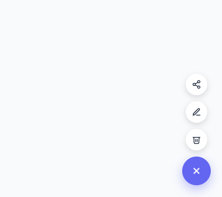
A speed dial is a floating action button (FAB) that, instead of triggering a single action directly, expands into a small vertical stack of related actions — share, edit, delete — when tapped. It's a compact way to expose several secondary actions from one persistent, low-footprint control, popularized by Material Design and now common across mobile and web apps.
This snippet builds the full interaction in plain HTML, CSS, and vanilla JavaScript.
How the stagger animation works
Each mini action button (.dial-item) carries an inline custom property, style="--i: 0", --i: 1, --i: 2, numbering its position in the stack. Every item starts hidden — opacity: 0, transform: scale(0.4) translateY(10px), and pointer-events: none so it can't be clicked while invisible. When .speed-dial gets the .open class, all three items animate to full opacity and scale, but each one's transition-delay is set to calc(var(--i) * 0.05s) — so item 0 starts immediately, item 1 waits 50ms, item 2 waits 100ms. The result is a cascading stagger where the buttons pop in one after another rather than all snapping into view simultaneously.
How the icon-to-X rotation works
The main FAB shows a plus-sign SVG (two crossed lines) by default. A single CSS rule, .speed-dial.open .dial-main svg { transform: rotate(45deg) }, rotates that whole icon 45 degrees when the dial is open — a horizontal and vertical line rotated 45° together visually form an X, so no separate icon swap or extra markup is needed; it's the exact same SVG, just rotated.
How closing works
Three things close the dial: clicking the main FAB again (which just toggles the .open class off), clicking any action item (each calls handleAction(), which also calls toggleDial() after handling the action), and clicking anywhere outside the entire .speed-dial container — handled by a single document-level click listener that checks speedDial.contains(e.target).
Tooltips on each mini button
Each .dial-item contains a .dial-tooltip span positioned absolutely to its left, shown only on :hover, so small icon-only buttons still communicate their exact purpose without adding permanent visible labels that would clutter the compact FAB stack.
Accessibility
The main button's aria-expanded attribute is kept in sync with the dial's open state on every toggle, and each mini action button has a descriptive aria-label since its content is icon-only.
Step by step
How to Use
- 1Load the snippetClick "FAB Speed Dial Menu" in the sidebar Library tab. The preview shows a single indigo circular button in the bottom-right corner.
- 2Click the FABClick it to see three mini action buttons cascade upward with a staggered pop-in animation, and the plus icon rotate into an X.
- 3Click an action or outsideClick one of the mini buttons to trigger its action and auto-close the dial, or click anywhere else on the page to close it without acting.
- 4Add or remove actionsIn the HTML panel, add or remove .dial-item buttons, giving each a unique --i value in its inline style to control its stagger order.
- 5Wire up real actionsIn the JS panel, replace the console.log inside handleAction with real logic per action name, such as opening a share sheet or a confirmation dialog.
- 6Export in your formatClick "HTML" for a standalone file, "JSX" for React, or "Tailwind" for React + Tailwind CSS.
Real-world uses
Common Use Cases
Got questions?
Frequently Asked Questions
Each mini button has an inline CSS custom property like --i: 0, --i: 1, --i: 2. When the dial opens, every item transitions to visible, but its transition-delay is computed as calc(var(--i) * 0.05s) — so higher-indexed items start their animation slightly later, creating a cascade purely through CSS, with no setTimeout or animation-timing JavaScript involved.
It is the same SVG the whole time — two crossed lines forming a plus sign. A single CSS rule rotates that icon 45 degrees when the dial is open, and a plus rotated 45 degrees visually reads as an X. There is no icon swap or second SVG.
Copy an existing .dial-item button in the HTML panel, give it a new aria-label, icon, and tooltip text, and set its inline style to --i: 3 (continuing the sequence) so it staggers in after the third item.
Even though opacity: 0 makes an element invisible, it remains clickable and focusable by default. pointer-events: none additionally removes it from mouse interaction while hidden, preventing accidental clicks on an invisible button stacked behind the main FAB.
Three things: clicking the main FAB again toggles it closed directly; clicking any mini action button calls handleAction, which also closes the dial after running; and a document-level click listener closes it whenever a click lands outside the entire .speed-dial container.
Yes. Change flex-direction on .dial-actions and adjust the fixed positioning and translateY direction in .dial-item's initial transform to match — for example flex-direction: row and translateX instead of translateY for a horizontal dial.
The main button and each mini action are real <button> elements, reachable via Tab and activatable with Enter or Space, and aria-expanded on the main button reflects open/closed state. For full keyboard support, also consider closing the dial on Escape and moving focus into it when opened via keyboard.
Yes — the component makes no assumptions about the specific actions. Swap the icons, labels, and handleAction logic for any set of two to five short, related actions you want to expose from one compact floating control.