
Pull Cord Dark Mode Toggle: GSAP Draggable Lamp Switch
Pull Cord Dark Mode Toggle: GSAP Draggable Lamp Switch · Buttons · Plain HTML, CSS & JS · Live preview
Copy & paste
Source Code
<main class="pc-scene" id="pcScene" data-theme="dark">
<div class="pc-lamp">
<div class="pc-wire"></div>
<div class="pc-shade"><span class="pc-bulb"></span></div>
<div class="pc-glow"></div>
<div class="pc-cord">
<div class="pc-line" id="pcLine"></div>
<button type="button" class="pc-bead" id="pcBead" role="switch" aria-checked="false" aria-label="Lamp and theme: pull the cord or press Enter to switch"></button>
</div>
</div>
<article class="pc-note">
<p class="pc-kicker" id="pcState">Lamp off · dark theme</p>
<h1>Night owl or early bird?</h1>
<p>Pull the cord down to switch the lamp on. The page changes theme with it. It also works with Enter or Space on the bead.</p>
<p class="pc-hint" id="pcHint">Drag the bead down to start</p>
</article>
</main>*{box-sizing:border-box;margin:0;padding:0}
.pc-scene{--bg:#0d1017;--card:#161b26;--ink:#e8ebf3;--muted:#8d95a9;--line:#262d3d;--glow:0;min-height:100vh;display:flex;align-items:flex-start;justify-content:center;gap:clamp(24px,8vw,90px);padding:0 24px;background:var(--bg);color:var(--ink);font-family:system-ui,-apple-system,sans-serif;transition:background .4s,color .4s;overflow:hidden}
.pc-scene[data-theme=light]{--bg:#f6efe0;--card:#fffaf0;--ink:#2a2418;--muted:#7a6f58;--line:#e6dbc0;--glow:1}
.pc-lamp{position:relative;width:150px;flex:none}
.pc-wire{width:2px;height:90px;margin:0 auto;background:#555c6d}
.pc-shade{position:relative;width:120px;height:66px;margin:0 auto;border-radius:60px 60px 8px 8px;background:linear-gradient(#e0a93b,#b67d17);display:flex;justify-content:center;align-items:flex-end}
.pc-bulb{width:34px;height:14px;border-radius:0 0 20px 20px;background:#4a4f5e;margin-bottom:-6px;transition:background .3s,box-shadow .3s}
.pc-scene[data-theme=light] .pc-bulb{background:#fff7c2;box-shadow:0 0 22px 10px rgba(255,226,120,.85)}
.pc-glow{position:absolute;left:50%;top:150px;width:360px;height:360px;margin-left:-180px;background:radial-gradient(circle at 50% 0,rgba(255,222,120,.55),transparent 65%);opacity:var(--glow);pointer-events:none;transition:opacity .4s}
.pc-cord{position:absolute;left:calc(50% + 34px);top:150px;width:0}
.pc-line{position:absolute;left:-1px;top:0;width:2px;height:90px;background:#9aa1b3;transform-origin:top}
.pc-bead{position:absolute;left:-13px;top:80px;width:26px;height:26px;border-radius:50%;border:0;cursor:grab;background:radial-gradient(circle at 35% 30%,#fbe7a6,#c9962a);box-shadow:0 4px 10px rgba(0,0,0,.4);touch-action:none}
.pc-bead:focus-visible{outline:3px solid #60a5fa;outline-offset:3px}
.pc-note{margin-top:clamp(70px,16vh,170px);max-width:380px;padding:26px;border-radius:18px;background:var(--card);border:1px solid var(--line);display:grid;gap:10px;transition:background .4s,border-color .4s}
.pc-kicker{font-size:12px;font-weight:700;letter-spacing:.12em;text-transform:uppercase;color:#d99a1f}
.pc-note h1{font-size:clamp(24px,4vw,34px);letter-spacing:-.02em;line-height:1.1}
.pc-note p{color:var(--muted);font-size:14px;line-height:1.55}
.pc-hint{font-weight:600}
@media(max-width:620px){.pc-scene{flex-direction:column;align-items:center;gap:0}.pc-note{margin-top:150px}}
@media(prefers-reduced-motion:reduce){.pc-scene,.pc-note,.pc-bulb,.pc-glow{transition:none}}gsap.registerPlugin(Draggable);
var scene = document.getElementById('pcScene');
var bead = document.getElementById('pcBead');
var line = document.getElementById('pcLine');
var stateEl = document.getElementById('pcState');
var hint = document.getElementById('pcHint');
var LINE = 90; // resting cord length in px
var PULL = 44; // how far the bead must travel to count as a pull
var reduce = window.matchMedia('(prefers-reduced-motion: reduce)').matches;
var lit = false;
// Stretch the cord line so it always reaches the bead.
function stretch() {
gsap.set(line, { scaleY: (LINE + gsap.getProperty(bead, 'y')) / LINE });
}
function toggle() {
lit = !lit;
scene.dataset.theme = lit ? 'light' : 'dark';
bead.setAttribute('aria-checked', String(lit));
stateEl.textContent = lit ? 'Lamp on \u00b7 light theme' : 'Lamp off \u00b7 dark theme';
hint.style.visibility = 'hidden';
}
// Let go: the bead springs back up like a stretched cord.
function recoil() {
gsap.to(bead, { y: 0, duration: reduce ? 0.01 : 1.1, ease: 'elastic.out(1, 0.3)', onUpdate: stretch });
}
Draggable.create(bead, {
type: 'y',
bounds: { minY: 0, maxY: 90 },
onDrag: stretch,
onRelease: function () { if (this.y >= PULL) toggle(); recoil(); },
onClick: function () { tug(); }
});
// A tap or Enter/Space gives the cord a short tug, then toggles at the bottom.
function tug() {
gsap.to(bead, { y: 34, duration: reduce ? 0.01 : 0.14, ease: 'power2.out', onUpdate: stretch, onComplete: function () { toggle(); recoil(); } });
}
bead.addEventListener('keydown', function (e) {
if (e.key === 'Enter' || e.key === ' ') { e.preventDefault(); tug(); }
});Extend with AI
Take This Snippet Further With AI
Paste this snippet into an AI coding assistant and ask it to explain how Draggable, a scaled cord and an elastic tween combine into a pull-chain switch, and how data-theme with CSS variables flips the whole page. Good follow-ups: save the theme in localStorage with no flash on load, add a soft click sound, or follow the user's prefers-color-scheme on first visit. Ask it to keep the keyboard and aria-checked behaviour.
Prompt to recreate it
Copy this into your AI assistant of choice to build the effect from scratch, or as a jumping-off point for your own variant:
Build a "pull cord dark mode toggle" in plain HTML, CSS and JavaScript using GSAP and its Draggable plugin (from a CDN).

Requirements:
- A scene with CSS variables for background, card, text, muted text and border, and a data-theme attribute ("dark" by default, "light" when on). Include a hanging lamp (wire, shade, bulb, a radial-gradient glow whose opacity follows a variable) and a content card with a state label, a heading, a paragraph and a hint.
- The cord is a thin div with transform-origin top, and the bead is a round button positioned at its end. Make the bead draggable with Draggable (type y, bounds from 0 to 90). While dragging, scale the cord's scaleY so it always reaches the bead.
- On release, if the bead moved at least about 44px, toggle the theme; in every case spring the bead back to y 0 with ease elastic.out(1, 0.3), updating the cord during the tween.
- The bead must be a real button with role="switch" and aria-checked updated on each toggle. Enter and Space (and a simple tap) should play a short tug then toggle. Show a visible focus ring.
- Update the state label text, hide the hint after the first toggle, and transition the theme colours.
- Respect prefers-reduced-motion by removing the spring and the colour transitions.
Want to tighten it up first? Run this prompt through the AI Prompt Studio to score it across 8 quality dimensions, catch anti-patterns, and tune the wording for Claude, ChatGPT, or Gemini before you paste it in.
What's included
Features
About this UI Snippet
Pull Cord Dark Mode Toggle: Drag a Lamp Cord to Switch Theme
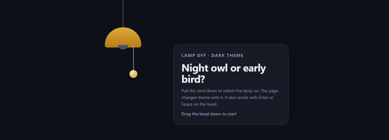
A theme switch is usually a small pill in the header that nobody notices. This one is a hanging lamp with a cord and a brass bead. Drag the bead down and the cord stretches; pull it far enough and the lamp clicks on, the glow fades in and the whole page flips from dark to light. Let go and the bead springs back with a wobble.
Draggable handles the pull
GSAP's Draggable is created on the bead with type: 'y' and bounds: { minY: 0, maxY: 90 }, so the bead can only travel straight down along the cord. There is no pointer-event code to write, and touch works the same as a mouse.
The cord is a stretched div
A thin div has transform-origin: top. On every drag update, stretch() sets its scaleY to (90 + y) / 90, so the line always meets the bead. Only transforms change, which keeps the interaction smooth.
A threshold decides the click
In onRelease, if the bead travelled at least 44px the theme toggles; a shorter pull does nothing. Either way the bead recoils with ease: 'elastic.out(1, 0.3)', which gives the springy overshoot of a real pull chain.
Theme through CSS variables
toggle() only sets data-theme on the scene. All colours are CSS custom properties redefined for [data-theme=light], including the glow's opacity, so the page, card, bulb and glow transition together. To drive a whole site, move the attribute to <html> and store the choice in localStorage.
Accessible by design
The bead is a real <button role="switch"> with aria-checked updated on every change and a clear label. Enter and Space give the cord a short tug and toggle, a tap does the same, and visible focus is styled. With prefers-reduced-motion the spring and transitions are removed. Compare it with the circular reveal theme toggle or build on it with GSAP Draggable inertia.
Step by step
How to Use
- 1Add the GSAP CDNsInclude gsap and Draggable from the CDN panel.
- 2Paste HTML, CSS and JSA hanging lamp with a cord and a bead appears beside a content card.
- 3Drag the bead downThe cord stretches; pulling past about 44px switches the lamp and theme.
- 4ReleaseThe bead springs back to rest with an elastic overshoot.
- 5Try the keyboardTab to the bead and press Enter or Space for a tug and toggle.
- 6Apply it to your siteMove data-theme to the html element and save the choice in localStorage.
Real-world uses
Common Use Cases
Got questions?
Frequently Asked Questions
Draggable moves the bead along Y. When the bead is released, onRelease checks whether it travelled at least the pull distance. If so, toggle() flips the data-theme attribute and updates aria-checked. Then a GSAP tween returns the bead to y 0 with an elastic ease.
Yes. The bead is a button with role switch. Focusing it and pressing Enter or Space runs the same tug animation and toggle. aria-checked reflects the lamp state, and a focus ring is shown. Screen reader users get a labelled on and off switch.
Set the attribute on document.documentElement instead of the scene, then save the value with localStorage in toggle(). Read it back before first paint, ideally with a tiny inline script in the head, to avoid a flash of the wrong theme.
Yes. The PULL constant is the distance in pixels, and maxY in the bounds sets how far the bead can travel. Make PULL smaller for a lighter touch or larger for a firmer pull. LINE must match the cord's resting height in CSS.