


Dyslexia Font Toggle — Free Accessible Reading Mode Snippet
Dyslexia-Friendly Reading Mode · Buttons · Plain HTML, CSS & JS · Live preview
What's included
Features
About this UI Snippet
Dyslexia-Friendly Reading Mode — Free Fonts, Spacing, Tints and a Reading Ruler
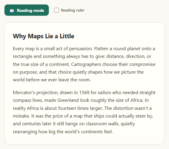
A dyslexia-friendly reading mode gives readers control over how text looks: which font it uses, how much space sits between letters, words and lines, the colour of the page behind it, and a ruler that keeps the eye on one line. This snippet packs all of that into one small, dependency-free widget: a Reading mode switch, a Preferences panel, and an article that changes instantly, with every choice saved in the browser for the next visit.
Four free fonts, honestly framed
The font picker offers Verdana (built into every computer), Atkinson Hyperlegible (designed by the Braille Institute so similar letters such as I, l and 1 are easy to tell apart), Lexend (wide, evenly spaced letterforms) and OpenDyslexic (heavier letter bottoms that some readers find helpful). All are free. The research on whether any single typeface helps people with dyslexia is mixed, so the snippet doesn't claim a "cure": it lets each reader pick what works for them. Atkinson Hyperlegible and Lexend load from Google Fonts, OpenDyslexic from a pinned Fontsource package.
Spacing, line height and tinted backgrounds
Spacing has more consistent support in the research. Three presets (Normal, Comfortable and Extra) widen letter-spacing and word-spacing to reduce crowding between letters, and a slider sets line-height from 1.4 to 2.6 so the eye finds the next line more easily. Five background tints (none, cream, blue, peach and grey) follow the common advice in the British Dyslexia Association's style guide to avoid pure white behind text, and the text colour is a soft near-black rather than #000. Everything is driven by CSS custom properties (--rm-font, --rm-letter, --rm-word, --rm-line, --rm-tint), so the whole mode is one class and five variables you can reuse anywhere.
A reading ruler that works for everyone
Most reading rulers follow the mouse, which leaves out phones, tablets and keyboard users. This one measures the real lines of text with Range.getClientRects() and snaps to them, so the band always sits exactly on a line, even after you change the font or spacing. Hover with a mouse, tap or drag on a touch screen, or focus the article and use the up and down arrow keys (Home and End jump to the first and last line). Choose Line highlight for a tinted band, or Focus mask to dim everything except the current line, the effect many paid reading tools use. The ruler has pointer-events: none, so it never blocks clicks or text selection.
Accessible and respectful by default
The switch exposes aria-pressed, the Preferences button uses aria-expanded, every option is a real radio button or range input with visible focus rings, and animations turn off for users who prefer reduced motion. Preferences are saved to localStorage with a safe fallback when storage is blocked, and Reset to defaults clears them.
Pair it with a text size adjuster to scale type, a reading mode toggle that strips a page down to its content, a high-contrast mode toggle for colour, or a text-to-speech button as an audio alternative. It complements, but doesn't replace, screen readers and dedicated assistive technology.
Step by step
How to Use
- 1Turn on Reading modeClick the switch. The article changes to Atkinson Hyperlegible, comfortable spacing, a taller line height and a cream background.
- 2Pick a fontTry Verdana, Atkinson Hyperlegible, Lexend or OpenDyslexic. Each card previews the font, and the article updates instantly.
- 3Adjust spacing and line heightChoose Normal, Comfortable or Extra spacing, then drag the line-height slider until the text feels easy to follow.
- 4Choose a background tintSwitch between none, cream, blue, peach and grey to find the colour that is most comfortable to read on.
- 5Turn on the reading rulerPick Line highlight or Focus mask, then hover, tap a line, or focus the article and press the up and down arrow keys.
- 6Reload the pageYour choices are saved in the browser and come back automatically. Click "Reset to defaults" to clear them.
Real-world uses
Common Use Cases
Got questions?
Frequently Asked Questions
There is no single best font. Studies on typefaces made for dyslexia, including OpenDyslexic, show mixed results, while clear sans-serif fonts with distinct letter shapes, such as Atkinson Hyperlegible, Lexend and Verdana, are widely recommended. That is why this snippet offers several free fonts and lets each reader choose, instead of forcing one.
Yes. OpenDyslexic is released under the SIL Open Font License, so you can use and embed it for free, including commercially. The snippet loads it from a pinned Fontsource package on jsDelivr; you can also self-host the font files.
Comfortable sets letter-spacing to 0.035em and word-spacing to 0.16em; Extra sets 0.08em and 0.32em. Line height is set separately with the slider. Wider spacing reduces crowding between letters and words, which is one of the more consistently helpful changes for many readers.
It walks the article's text nodes, calls Range.getClientRects() to get every rendered line box, and merges boxes on the same line. The ruler then snaps to the nearest line for the pointer, a tap or the arrow keys, and re-measures whenever fonts load or the spacing changes.
Yes. Every change is stored in localStorage under one key and restored on the next visit. If storage is blocked, for example in some private windows, the widget still works and simply doesn't remember the settings.
No. It is a lightweight reading preference that helps many readers, with or without a diagnosed reading difference. Offer it alongside, not instead of, screen readers, text-to-speech and other assistive tools.
Build with AI
Build, Understand, Optimize, and Extend It With AI
Paste this snippet's HTML, CSS, and JS into an AI coding assistant like Claude and ask it to explain how the reading ruler measures real text lines with Range.getClientRects() and merges line boxes, and why it re-measures after fonts load and spacing transitions finish. It is a good way to understand the trade-offs before reusing it on long pages. You can also ask the assistant to apply the preferences site-wide by moving the custom properties to the html element, to sync the saved settings to a user account, or to add a font-size control and a dark tint. Ask it to review the copy about dyslexia fonts too, so your product describes the research honestly instead of promising a cure.
Prompt to recreate it
Copy this into your AI assistant of choice to build the effect from scratch, or as a jumping-off point for your own variant:
Build a dyslexia-friendly "reading mode" widget in plain HTML, CSS, and JavaScript with no dependencies.

Requirements:
- A "Reading mode" switch button with aria-pressed, and a "Preferences" button with aria-expanded that shows or hides a preferences panel.
- Preferences: a font picker (Verdana, Atkinson Hyperlegible and Lexend from Google Fonts, OpenDyslexic from a pinned Fontsource CDN URL) shown as radio cards with an "Aa" preview; spacing presets Normal / Comfortable / Extra that change letter-spacing and word-spacing; a line-height range slider from 1.4 to 2.6 with a live value; background tints none, cream, blue, peach and grey; and a reading ruler mode Off / Line highlight / Focus mask.
- Drive the whole mode with CSS custom properties on a wrapper (font, letter spacing, word spacing, line height, tint) and one "is-on" class. Changing any preference turns reading mode on.
- Save preferences to localStorage (wrapped in try/catch) and restore them on load, with a "Reset to defaults" button.
- The reading ruler must snap to real rendered lines: measure them with Range.getClientRects() over the article's text nodes, merge boxes on the same line, and re-measure on resize, after fonts load, and after spacing changes.
- The ruler must work with a mouse (hover), touch and pen (tap or drag) and the keyboard (focusable article region; ArrowUp/ArrowDown move one line, Home/End jump), batch pointer updates with requestAnimationFrame, and use pointer-events: none.
- Focus mask mode dims everything except the current line using a large box-shadow, clipped to the article card.
- Use real radio buttons and visible focus rings, and disable transitions under prefers-reduced-motion. Don't claim any font cures dyslexia.
Want to tighten it up first? Run this prompt through the AI Prompt Studio to score it across 8 quality dimensions, catch anti-patterns, and tune the wording for Claude, ChatGPT, or Gemini before you paste it in.
Source Code
<div class="rm" id="rm">
<div class="rm-bar">
<button type="button" class="rm-switch" id="rmSwitch" aria-pressed="false">
<span class="rm-switch-track" aria-hidden="true"><span class="rm-switch-thumb"></span></span>
Reading mode
</button>
<button type="button" class="rm-prefs-btn" id="rmPrefsBtn" aria-expanded="true" aria-controls="rmPanel">
<span aria-hidden="true">⚙</span> Preferences
</button>
</div>
<form class="rm-panel" id="rmPanel" aria-label="Reading preferences">
<fieldset class="rm-group">
<legend>Font</legend>
<div class="rm-fonts">
<label class="rm-font"><input type="radio" name="font" value="verdana"><span class="rm-font-card"><span class="rm-aa" style="font-family:Verdana,Tahoma,sans-serif">Aa</span>Verdana<small>Built in</small></span></label>
<label class="rm-font"><input type="radio" name="font" value="atkinson"><span class="rm-font-card"><span class="rm-aa" style="font-family:'Atkinson Hyperlegible',sans-serif">Aa</span>Atkinson<small>Hyperlegible</small></span></label>
<label class="rm-font"><input type="radio" name="font" value="lexend"><span class="rm-font-card"><span class="rm-aa" style="font-family:'Lexend',sans-serif">Aa</span>Lexend<small>Wide, even</small></span></label>
<label class="rm-font"><input type="radio" name="font" value="opendyslexic"><span class="rm-font-card"><span class="rm-aa" style="font-family:'OpenDyslexic',sans-serif">Aa</span>OpenDyslexic<small>Weighted base</small></span></label>
</div>
</fieldset>
<fieldset class="rm-group">
<legend>Letter & word spacing</legend>
<div class="rm-seg">
<label><input type="radio" name="spacing" value="off"><span>Normal</span></label>
<label><input type="radio" name="spacing" value="comfortable"><span>Comfortable</span></label>
<label><input type="radio" name="spacing" value="extra"><span>Extra</span></label>
</div>
</fieldset>
<div class="rm-group">
<label class="rm-legend" for="rmLine">Line height <output id="rmLineOut" for="rmLine">1.9</output></label>
<input type="range" id="rmLine" name="line" min="1.4" max="2.6" step="0.1" value="1.9">
</div>
<fieldset class="rm-group">
<legend>Background tint</legend>
<div class="rm-tints">
<label><input type="radio" name="tint" value="none"><span class="rm-tint" style="background:#fffef9">None</span></label>
<label><input type="radio" name="tint" value="cream"><span class="rm-tint" style="background:#fbf3df">Cream</span></label>
<label><input type="radio" name="tint" value="blue"><span class="rm-tint" style="background:#e3eef9">Blue</span></label>
<label><input type="radio" name="tint" value="peach"><span class="rm-tint" style="background:#fde6d6">Peach</span></label>
<label><input type="radio" name="tint" value="grey"><span class="rm-tint" style="background:#ebebe8">Grey</span></label>
</div>
</fieldset>
<fieldset class="rm-group">
<legend>Reading ruler</legend>
<div class="rm-seg">
<label><input type="radio" name="ruler" value="off"><span>Off</span></label>
<label><input type="radio" name="ruler" value="line"><span>Line highlight</span></label>
<label><input type="radio" name="ruler" value="focus"><span>Focus mask</span></label>
</div>
<p class="rm-hint">Move the pointer or tap a line. With the article focused, use ↑ ↓ to move line by line.</p>
</fieldset>
<button type="button" class="rm-reset" id="rmReset">Reset to defaults</button>
</form>
<div class="rm-stage" id="rmStage" tabindex="0" role="region" aria-label="Article. When the reading ruler is on, use the up and down arrow keys to move it line by line.">
<article class="rm-text" id="rmText">
<h2>Why Maps Lie a Little</h2>
<p>Every map is a small act of persuasion. Flatten a round planet onto a rectangle and something always has to give: distance, direction, or the true size of a continent. Cartographers choose their compromise on purpose, and that choice quietly shapes how we picture the world before we ever leave the room.</p>
<p>Mercator's projection, drawn in 1569 for sailors who needed straight compass lines, made Greenland look roughly the size of Africa. In reality Africa is about fourteen times larger. The distortion wasn't a mistake. It was the price of a map that ships could actually steer by, and centuries later it still hangs on classroom walls.</p>
</article>
<div class="rm-ruler" id="rmRuler" hidden></div>
</div>
</div>@import url('https://fonts.googleapis.com/css2?family=Atkinson+Hyperlegible:wght@400;700&family=Lexend:wght@400;600&display=swap');
@import url('https://cdn.jsdelivr.net/npm/@fontsource/opendyslexic@5.2.5/index.css');
* { box-sizing: border-box; margin: 0; padding: 0; }
body { font-family: system-ui, -apple-system, 'Segoe UI', sans-serif; background: #f4f1ea; color: #2b2820; min-height: 100vh; padding: 32px 18px 48px; }
.rm {
--rm-accent: #1f6f5c;
--rm-font: system-ui, -apple-system, 'Segoe UI', sans-serif;
--rm-letter: 0;
--rm-word: 0;
--rm-line: 1.65;
--rm-tint: #fffef9;
max-width: 640px; margin: 0 auto;
}
/* ---- Toolbar ---- */
.rm-bar { display: flex; flex-wrap: wrap; align-items: center; gap: 10px; margin-bottom: 14px; }
.rm-switch, .rm-prefs-btn, .rm-reset {
display: inline-flex; align-items: center; gap: 9px;
font-family: inherit; font-size: 13.5px; font-weight: 700; line-height: 1; cursor: pointer;
border-radius: 10px; padding: 10px 14px;
}
.rm-switch { background: var(--rm-accent); color: #fff; border: 0; }
.rm-switch-track { width: 30px; height: 18px; border-radius: 9px; background: rgba(255,255,255,.35); position: relative; transition: background .2s; }
.rm-switch-thumb { position: absolute; top: 2px; left: 2px; width: 14px; height: 14px; border-radius: 50%; background: #fff; transition: transform .2s; }
.rm-switch[aria-pressed="true"] { background: #123f34; }
.rm-switch[aria-pressed="true"] .rm-switch-track { background: #6ee7b7; }
.rm-switch[aria-pressed="true"] .rm-switch-thumb { transform: translateX(12px); }
.rm-prefs-btn { background: #fff; color: #2b2820; border: 1px solid #ddd6c4; }
.rm-prefs-btn[aria-expanded="true"] { border-color: var(--rm-accent); color: var(--rm-accent); }
.rm-switch:focus-visible, .rm-prefs-btn:focus-visible, .rm-reset:focus-visible, .rm-stage:focus-visible { outline: 3px solid #f59e0b; outline-offset: 3px; }
/* ---- Preferences panel ---- */
.rm-panel { background: #fff; border: 1px solid #e6dfcd; border-radius: 14px; padding: 16px 18px; margin-bottom: 16px; display: grid; gap: 14px; }
.rm-panel[hidden] { display: none; }
.rm-group { border: 0; display: grid; gap: 8px; }
.rm-group legend, .rm-legend { font-size: 11.5px; font-weight: 800; letter-spacing: .08em; text-transform: uppercase; color: #6b6450; margin-bottom: 8px; display: flex; justify-content: space-between; }
.rm-legend output { font-weight: 700; color: var(--rm-accent); letter-spacing: 0; }
.rm-group input[type="radio"] { position: absolute; opacity: 0; width: 1px; height: 1px; }
.rm-fonts { display: grid; grid-template-columns: repeat(4, 1fr); gap: 8px; }
.rm-font-card { display: grid; justify-items: center; gap: 2px; padding: 10px 6px; border: 2px solid #ece6d6; border-radius: 11px; font-size: 12.5px; font-weight: 700; cursor: pointer; text-align: center; background: #fdfcf8; }
.rm-font-card small { font-size: 10.5px; font-weight: 500; color: #8a8270; }
.rm-aa { font-size: 24px; line-height: 1.2; font-weight: 400; }
.rm-font input:checked + .rm-font-card { border-color: var(--rm-accent); background: #ecf6f2; }
.rm-font input:focus-visible + .rm-font-card { outline: 3px solid #f59e0b; outline-offset: 2px; }
.rm-seg { display: flex; flex-wrap: wrap; background: #f3efe4; border-radius: 10px; padding: 3px; gap: 3px; }
.rm-seg label { flex: 1 1 auto; }
.rm-seg span { display: block; text-align: center; padding: 8px 10px; border-radius: 8px; font-size: 13px; font-weight: 700; color: #5c5644; cursor: pointer; }
.rm-seg input:checked + span { background: #fff; color: var(--rm-accent); box-shadow: 0 1px 3px rgba(60,50,20,.15); }
.rm-seg input:focus-visible + span { outline: 3px solid #f59e0b; outline-offset: 1px; }
.rm-tints { display: flex; flex-wrap: wrap; gap: 8px; }
.rm-tint { display: block; padding: 8px 14px; border: 2px solid #e2dccb; border-radius: 99px; font-size: 12.5px; font-weight: 700; cursor: pointer; }
.rm-tints input:checked + .rm-tint { border-color: var(--rm-accent); box-shadow: inset 0 0 0 1px var(--rm-accent); }
.rm-tints input:focus-visible + .rm-tint { outline: 3px solid #f59e0b; outline-offset: 2px; }
input[type="range"] { width: 100%; accent-color: var(--rm-accent); }
.rm-hint { font-size: 12px; color: #8a8270; }
.rm-reset { justify-self: start; background: transparent; border: 0; padding: 4px 0; color: #8a5a1f; text-decoration: underline; font-weight: 600; }
/* ---- Article + ruler ---- */
.rm-stage { position: relative; overflow: hidden; border-radius: 16px; border: 1px solid #e9e3d2; box-shadow: 0 8px 26px rgba(60,50,20,.06); background: #fffef9; transition: background .25s; }
.rm-text { padding: 30px 28px; color: #2f2b22; position: relative; z-index: 1; }
.rm-text h2 { font-size: 22px; line-height: 1.3; margin-bottom: 16px; }
.rm-text p { font-size: 17px; line-height: 1.65; margin-bottom: 16px; max-width: 60ch; }
.rm-text p:last-child { margin-bottom: 0; }
/* Reading mode: everything is driven by custom properties, so any
preference (font, spacing, line height, tint) is one variable away */
.rm.is-on .rm-stage { background: var(--rm-tint); }
.rm.is-on .rm-text { font-family: var(--rm-font); letter-spacing: var(--rm-letter); word-spacing: var(--rm-word); }
.rm.is-on .rm-text p { line-height: var(--rm-line); margin-bottom: calc(var(--rm-line) * .55em); text-align: left; }
.rm.is-on .rm-text h2 { letter-spacing: 0; }
.rm-text, .rm-text p { transition: letter-spacing .2s, word-spacing .2s, line-height .2s; }
/* The ruler snaps to real text lines. Line mode tints the band; focus mode
uses a huge box-shadow to dim everything else inside the card. */
.rm-ruler { position: absolute; left: 0; right: 0; top: 0; pointer-events: none; z-index: 2; transition: transform .12s ease-out, height .12s ease-out; }
.rm-ruler[hidden] { display: none; }
.rm-ruler.is-line { background: rgba(31,111,92,.12); border-top: 2px solid rgba(31,111,92,.45); border-bottom: 2px solid rgba(31,111,92,.45); z-index: 0; }
.rm-ruler.is-focus { box-shadow: 0 0 0 100vmax rgba(30,26,18,.5); }
@media (max-width: 520px) {
.rm-fonts { grid-template-columns: repeat(2, 1fr); }
.rm-text { padding: 24px 20px; }
}
@media (prefers-reduced-motion: reduce) {
.rm *, .rm *::before, .rm *::after { transition: none !important; }
}const KEY = 'reading-prefs-v1';
const DEFAULTS = { on: false, font: 'atkinson', spacing: 'comfortable', line: 1.9, tint: 'cream', ruler: 'off' };
const FONTS = {
verdana: "Verdana, Tahoma, 'Trebuchet MS', Arial, sans-serif",
atkinson: "'Atkinson Hyperlegible', Verdana, sans-serif",
lexend: "'Lexend', Verdana, sans-serif",
opendyslexic: "'OpenDyslexic', Verdana, sans-serif",
};
const SPACING = { off: ['0', '0'], comfortable: ['0.035em', '0.16em'], extra: ['0.08em', '0.32em'] };
const TINTS = { none: '#fffef9', cream: '#fbf3df', blue: '#e3eef9', peach: '#fde6d6', grey: '#ebebe8' };
const rm = document.getElementById('rm');
const sw = document.getElementById('rmSwitch');
const prefsBtn = document.getElementById('rmPrefsBtn');
const panel = document.getElementById('rmPanel');
const lineInput = document.getElementById('rmLine');
const lineOut = document.getElementById('rmLineOut');
const stage = document.getElementById('rmStage');
const text = document.getElementById('rmText');
const ruler = document.getElementById('rmRuler');
// Saved preferences (storage can be blocked, e.g. in private windows or sandboxed frames)
function load() {
try { return { ...DEFAULTS, ...JSON.parse(localStorage.getItem(KEY) || '{}') }; }
catch { return { ...DEFAULTS }; }
}
function save() {
try { localStorage.setItem(KEY, JSON.stringify(prefs)); } catch { /* not saved */ }
}
let prefs = load();
function apply() {
rm.classList.toggle('is-on', prefs.on);
sw.setAttribute('aria-pressed', String(prefs.on));
rm.style.setProperty('--rm-font', FONTS[prefs.font] || FONTS.verdana);
const [letter, word] = SPACING[prefs.spacing] || SPACING.off;
rm.style.setProperty('--rm-letter', letter);
rm.style.setProperty('--rm-word', word);
rm.style.setProperty('--rm-line', String(prefs.line));
rm.style.setProperty('--rm-tint', TINTS[prefs.tint] || TINTS.none);
for (const name of ['font', 'spacing', 'tint', 'ruler']) {
const input = panel.querySelector('input[name="' + name + '"][value="' + prefs[name] + '"]');
if (input) input.checked = true;
}
lineInput.value = prefs.line;
lineOut.textContent = Number(prefs.line).toFixed(1);
ruler.className = 'rm-ruler ' + (prefs.ruler === 'focus' ? 'is-focus' : 'is-line');
save();
remeasure();
}
sw.addEventListener('click', () => { prefs.on = !prefs.on; apply(); });
prefsBtn.addEventListener('click', () => {
const open = panel.hidden;
panel.hidden = !open;
prefsBtn.setAttribute('aria-expanded', String(open));
remeasure();
});
// Changing any preference also switches reading mode on
panel.addEventListener('input', e => {
const { name, value } = e.target;
if (!name) return;
prefs[name] = name === 'line' ? Number(value) : value;
if (name !== 'ruler') prefs.on = true;
apply();
});
document.getElementById('rmReset').addEventListener('click', () => {
prefs = { ...DEFAULTS };
try { localStorage.removeItem(KEY); } catch { /* ignore */ }
apply();
});
/* ---- Reading ruler: snaps to the real lines of text ---- */
let lines = [];
let current = 0;
// Every rendered line of the article, measured from the text's own line boxes
function measure() {
const base = stage.getBoundingClientRect();
const found = [];
const walker = document.createTreeWalker(text, NodeFilter.SHOW_TEXT, {
acceptNode: n => (n.nodeValue.trim() ? NodeFilter.FILTER_ACCEPT : NodeFilter.FILTER_REJECT),
});
const range = document.createRange();
for (let node = walker.nextNode(); node; node = walker.nextNode()) {
range.selectNodeContents(node);
for (const r of range.getClientRects()) {
if (r.height < 4) continue;
const top = r.top - base.top, bottom = r.bottom - base.top, mid = (top + bottom) / 2;
const same = found.find(l => Math.abs(l.mid - mid) < r.height / 2);
if (same) { same.top = Math.min(same.top, top); same.bottom = Math.max(same.bottom, bottom); }
else found.push({ top, bottom, mid });
}
}
lines = found.sort((a, b) => a.top - b.top);
current = Math.min(current, Math.max(0, lines.length - 1));
place();
}
// Re-measure after layout changes (fonts load and spacing transitions settle)
let measureTimer;
function remeasure() {
requestAnimationFrame(measure);
clearTimeout(measureTimer);
measureTimer = setTimeout(measure, 260);
}
if (document.fonts) document.fonts.ready.then(measure);
new ResizeObserver(remeasure).observe(stage);
function place() {
if (prefs.ruler === 'off' || !lines.length) { ruler.hidden = true; return; }
ruler.hidden = false;
const l = lines[current];
const pad = 5;
ruler.style.height = (l.bottom - l.top + pad * 2) + 'px';
ruler.style.transform = 'translateY(' + (l.top - pad) + 'px)';
}
function nearest(clientY) {
const y = clientY - stage.getBoundingClientRect().top;
let best = 0;
lines.forEach((l, i) => { if (Math.abs(l.mid - y) < Math.abs(lines[best].mid - y)) best = i; });
return best;
}
// Mouse hover follows the pointer; touch and pen move it on tap or drag
let pendingY = null;
function queue(clientY) {
if (prefs.ruler === 'off' || !lines.length) return;
if (pendingY === null) requestAnimationFrame(() => { current = nearest(pendingY); pendingY = null; place(); });
pendingY = clientY;
}
stage.addEventListener('pointermove', e => { if (e.pointerType === 'mouse' || e.buttons) queue(e.clientY); });
stage.addEventListener('pointerdown', e => queue(e.clientY));
// Keyboard: arrow keys move one line, Home / End jump to the first or last line
stage.addEventListener('keydown', e => {
if (prefs.ruler === 'off' || !lines.length) return;
const moves = { ArrowDown: 1, ArrowUp: -1, Home: -Infinity, End: Infinity };
if (!(e.key in moves)) return;
e.preventDefault();
current = Math.max(0, Math.min(lines.length - 1, current + moves[e.key]));
place();
// Keep the active line on screen on long pages
const top = stage.getBoundingClientRect().top + lines[current].top;
if (top < 60 || top > innerHeight - 60) scrollBy({ top: top - innerHeight / 2, behavior: 'smooth' });
});
apply();