



CSS Only Styled Radio Buttons — Custom Plan Selector, No JavaScript
Styled Radio Buttons — CSS Only Plan Selector (No JavaScript) · Forms · Plain HTML & CSS · Live preview
Copy & paste
Source Code
<div class="demo">
<form class="plan-form">
<div class="plan-option">
<input type="radio" name="plan" id="planFree" class="plan-input" checked />
<label for="planFree" class="plan-card">
<span class="plan-dot"></span>
<span class="plan-body">
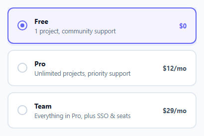
<span class="plan-name">Free</span>
<span class="plan-desc">1 project, community support</span>
</span>
<span class="plan-price">$0</span>
</label>
</div>
<div class="plan-option">
<input type="radio" name="plan" id="planPro" class="plan-input" />
<label for="planPro" class="plan-card">
<span class="plan-dot"></span>
<span class="plan-body">
<span class="plan-name">Pro</span>
<span class="plan-desc">Unlimited projects, priority support</span>
</span>
<span class="plan-price">$12/mo</span>
</label>
</div>
<div class="plan-option">
<input type="radio" name="plan" id="planTeam" class="plan-input" />
<label for="planTeam" class="plan-card">
<span class="plan-dot"></span>
<span class="plan-body">
<span class="plan-name">Team</span>
<span class="plan-desc">Everything in Pro, plus SSO & seats</span>
</span>
<span class="plan-price">$29/mo</span>
</label>
</div>
</form>
</div>* { box-sizing: border-box; margin: 0; padding: 0; }
body { font-family: system-ui, sans-serif; background: #f8fafc; display: flex; align-items: center; justify-content: center; min-height: 100vh; padding: 24px; }
.plan-form { width: 380px; max-width: 100%; display: flex; flex-direction: column; gap: 12px; }
.plan-option { position: relative; }
.plan-input { position: absolute; opacity: 0; pointer-events: none; }
.plan-card { display: flex; align-items: center; gap: 14px; padding: 16px 18px; border: 2px solid #e2e8f0; border-radius: 12px; background: #fff; cursor: pointer; transition: border-color 0.15s, background 0.15s, box-shadow 0.15s; }
.plan-card:hover { border-color: #c7d2fe; }
/* Native focus-visible on the hidden input styles its sibling label */
.plan-input:focus-visible + .plan-card { outline: 2px solid #6366f1; outline-offset: 2px; }
.plan-dot { flex-shrink: 0; width: 20px; height: 20px; border-radius: 50%; border: 2px solid #cbd5e1; position: relative; transition: border-color 0.15s; }
.plan-dot::after { content: ''; position: absolute; inset: 4px; border-radius: 50%; background: #6366f1; transform: scale(0); transition: transform 0.18s cubic-bezier(0.4, 0, 0.2, 1); }
.plan-body { flex: 1; display: flex; flex-direction: column; gap: 2px; }
.plan-name { font-size: 14px; font-weight: 700; color: #111827; }
.plan-desc { font-size: 12.5px; color: #64748b; }
.plan-price { font-size: 13px; font-weight: 700; color: #475569; }
/* Checked state restyles the whole card via the sibling combinator */
.plan-input:checked + .plan-card { border-color: #6366f1; background: #f5f3ff; box-shadow: 0 0 0 4px rgba(99,102,241,0.08); }
.plan-input:checked + .plan-card .plan-dot { border-color: #6366f1; }
.plan-input:checked + .plan-card .plan-dot::after { transform: scale(1); }
.plan-input:checked + .plan-card .plan-price { color: #6366f1; }Extend with AI
Take This Snippet Further With AI
The AI prompt for this one is for Patreon supporters ($3 a month), along with a site with no ads. Supporters enter the passcode once and it is remembered in this browser.
What's included
Features
About this UI Snippet
Custom-Styled Radio Buttons — Pure CSS :checked Sibling Styling
Native <input type="radio"> elements can be given some cosmetic styling with accent-color, but that only recolors the browser's built-in circle — it can't turn the whole surrounding card into a selectable, visually-rich control. This snippet takes the opposite approach: hide the native input entirely and drive every visual aspect of a much larger custom control from its state.
The hide-and-restyle pattern
Each radio is positioned absolute with opacity: 0; pointer-events: none, removing it visually and from the click-hit-testing path, while leaving it in the DOM, in the tab order, and fully functional as a real form control — this matters because the form still submits a real radio value on submit, with no hidden-field synchronization trick required, unlike a from-scratch JS-only widget that has to manufacture its own form data.
Sibling combinator, not descendant, and why order matters
Every dynamic style hangs off .plan-input:checked + .plan-card — the adjacent-sibling combinator +, not the general sibling ~ used elsewhere in this batch. + matches only the *next* element immediately following, which is exactly the relationship here: the <label class="plan-card"> sits directly after its <input> in the same .plan-option wrapper, with nothing between them. This is also why the input must come *before* the label in markup order — CSS combinators only look forward through following siblings, never backward.
The dot's fill uses transform, not a background swap
.plan-dot::after is an always-present, initially scale(0) filled circle. On :checked, it scales to 1. Animating a transform: scale() rather than toggling display or swapping a background color lets the fill grow outward with a spring-like cubic-bezier easing curve — a purely visual polish detail that costs nothing extra in markup since the same ::after element exists whether checked or not; only its scale changes.
Group semantics still come from the browser
All three radios share name="plan", so checking one automatically unchecks the others — the same native mutual-exclusivity guarantee used by the tab-switcher snippet in this batch, here applied to an actual form input group rather than a purely presentational switch. That distinction matters: this component is a real form field a server can read from FormData, not a UI-only simulation of one.
Accessible focus without extra markup
.plan-input:focus-visible + .plan-card puts a visible focus outline on the *card*, not the invisible input, whenever the input receives keyboard focus and the browser determines focus should be visibly indicated (as opposed to a mouse click, which typically doesn't trigger :focus-visible). This is the same sibling-combinator trick used for the checked state, just keyed to a different pseudo-class — proof that once the hide-and-restyle pattern is in place, *any* native pseudo-class on the input (:checked, :focus-visible, :disabled, :invalid) becomes available to style the visible sibling with, for free.
Where this is the only option
Rich, custom-styled form controls are common in pricing pages and account settings screens, both of which are sometimes rendered through CMS "raw HTML" blocks or A/B testing tools that inject markup without executing arbitrary JavaScript for security reasons. Because every interactive behavior here — selection, mutual exclusivity, focus indication — comes from native input semantics plus CSS selectors, the control remains fully operable, and remains a genuine submittable form field, in exactly those constrained rendering contexts.
Step by step
How to Use
- 1Keep the input immediately before its labelThe .plan-input:checked + .plan-card rule requires the label to be the very next element after its radio input in the DOM.
- 2Share one name across the groupAll radios in a group must use the same name attribute so the browser enforces single selection automatically.
- 3Wrap each pair in a positioning containerEach .plan-option wrapper gives the absolutely-positioned input a sizing context without affecting the label's own layout.
- 4Customize the card contentSwap plan-name/plan-desc/plan-price text and add or remove .plan-option blocks to fit a different form — the CSS applies uniformly to any count.
- 5Submit as a normal formBecause these are real radio inputs, wrapping them in a <form> and adding a submit button produces normal, server-readable form data — no JS collection step needed.
Real-world uses
Common Use Cases
Got questions?
Frequently Asked Questions
It is a real <input type="radio"> — screen readers announce it correctly, it participates in the native radio-group keyboard navigation, and it submits actual form data. Only its default visual rendering is hidden; its semantics are untouched.
The + (adjacent sibling) combinator matches only the element immediately following, which precisely matches the input-then-label structure used here. ~ (general sibling) would also work since there is only one label per input, but + is more explicit about the intended one-to-one relationship.
Yes — replace type="radio" with type="checkbox" and drop the shared name if independent selection is desired; every :checked-driven rule works identically since :checked applies to both input types.
Add :invalid or :required styling using the same sibling-combinator trick, e.g. .plan-form:has(.plan-input:required:not(:checked)) .plan-card — or more simply, style a :invalid state on the fieldset if you wrap the group in one with required semantics.
No — it is the more accessible choice. display:none removes an element from the accessibility tree in most browsers, while opacity:0 with pointer-events:none keeps it visually invisible but still focusable, tabbable, and announced correctly by screen readers.