



CSS Scroll-Driven Progress Bar — Native scroll() Timeline, No JS
CSS Scroll-Driven Progress Bar · Scroll · Plain HTML, CSS & JS · Live preview
Copy & paste
Source Code
<div class="sdp-bar" aria-hidden="true"></div>
<div class="sdp-badge" id="sdpBadge">Native CSS scroll-driven animation</div>
<article class="sdp-page">
  <header class="sdp-hero">
    <h1>Reading Progress, Zero JavaScript</h1>
    <p>Scroll this article. The bar above fills using nothing but the CSS <code>animation-timeline: scroll()</code> API — no scroll event listeners, no rAF loop.</p>
  </header>
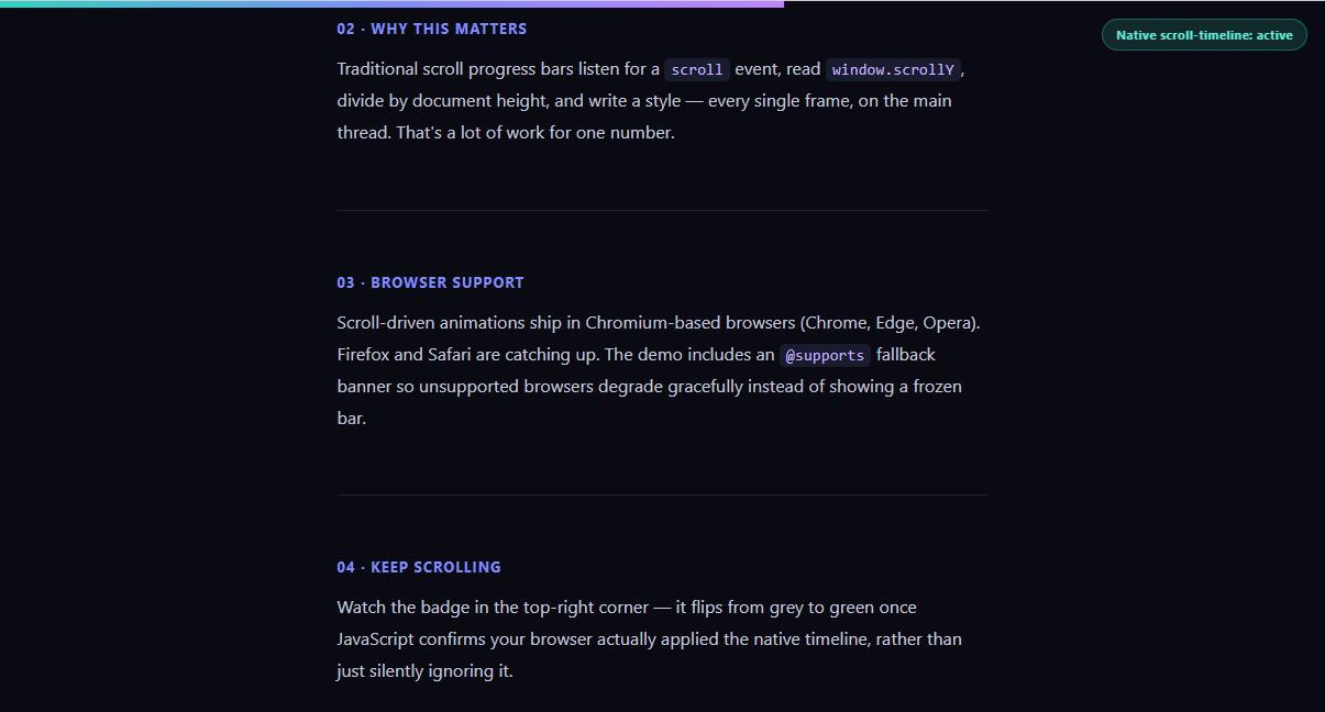
  <section class="sdp-block"><h2>01 · What's driving the bar</h2><p>The progress bar's <code>transform: scaleX()</code> is tied directly to the document's scroll position via a native CSS animation timeline. The browser's compositor updates it off the main thread, every frame, for free.</p></section>
  <section class="sdp-block"><h2>02 · Why this matters</h2><p>Traditional scroll progress bars listen for a <code>scroll</code> event, read <code>window.scrollY</code>, divide by document height, and write a style — every single frame, on the main thread. That's a lot of work for one number.</p></section>
  <section class="sdp-block"><h2>03 · Browser support</h2><p>Scroll-driven animations ship in Chromium-based browsers (Chrome, Edge, Opera). Firefox and Safari are catching up. The demo includes an <code>@supports</code> fallback banner so unsupported browsers degrade gracefully instead of showing a frozen bar.</p></section>
  <section class="sdp-block"><h2>04 · Keep scrolling</h2><p>Watch the badge in the top-right corner — it flips from grey to green once JavaScript confirms your browser actually applied the native timeline, rather than just silently ignoring it.</p></section>
  <section class="sdp-block"><h2>05 · The end</h2><p>By the time you reach here, the bar above should be completely full. No IntersectionObserver, no scroll math, no jank.</p></section>
</article>*{box-sizing:border-box;margin:0;padding:0}
body{font-family:system-ui,-apple-system,sans-serif;background:#0a0b12;color:#e6e8f5}
.sdp-bar{
position:fixed;top:0;left:0;right:0;height:6px;z-index:999;
transform-origin:0% 50%;
background:linear-gradient(90deg,#2dd4bf,#818cf8,#c084fc);
/* the entire effect: scale from 0 to 1 across the page's scroll range */
animation:sdp-grow auto linear;
animation-timeline:scroll(root);
}
@keyframes sdp-grow{from{transform:scaleX(0)}to{transform:scaleX(1)}}
/* graceful fallback for browsers without scroll-driven animation support */
@supports not (animation-timeline: scroll()){
.sdp-bar{background:#374151}
.sdp-bar::after{content:'';position:absolute;inset:0;background:repeating-linear-gradient(45deg,#4b5563,#4b5563 6px,#374151 6px,#374151 12px)}
}
.sdp-badge{position:fixed;top:16px;right:16px;z-index:999;font-size:11px;font-weight:700;letter-spacing:.04em;padding:6px 12px;border-radius:20px;background:rgba(255,255,255,.08);border:1px solid rgba(255,255,255,.15);color:#9aa0b8;transition:all .3s}
.sdp-badge.supported{background:rgba(45,212,191,.15);border-color:rgba(45,212,191,.35);color:#5eead4}
.sdp-page{max-width:640px;margin:0 auto;padding:80px 24px 40vh}
.sdp-hero{padding-bottom:60px;border-bottom:1px solid #1f2333}
.sdp-hero h1{font-size:clamp(28px,5vw,44px);letter-spacing:-.02em;margin-bottom:16px;background:linear-gradient(135deg,#fff,#818cf8);-webkit-background-clip:text;-webkit-text-fill-color:transparent;background-clip:text}
.sdp-hero p{color:#9aa0b8;line-height:1.7;font-size:16px}
.sdp-block{padding:56px 0;border-bottom:1px solid #1f2333}
.sdp-block h2{font-size:13px;font-weight:700;letter-spacing:.08em;text-transform:uppercase;color:#818cf8;margin-bottom:14px}
.sdp-block p{color:#c3c7db;line-height:1.8;font-size:16px}
code{background:rgba(129,140,248,.12);color:#c4b5fd;padding:2px 6px;border-radius:5px;font-size:.9em;font-family:ui-monospace,Consolas,monospace}// The progress bar itself needs zero JavaScript — it's driven entirely by
// "animation-timeline: scroll(root)" in the CSS above. This script only
// verifies support and flips a badge, plus offers a minimal fallback hook.
const badge = document.getElementById('sdpBadge');
const supportsScrollTimeline =
typeof CSS !== 'undefined' &&
CSS.supports('animation-timeline: scroll()');
if (supportsScrollTimeline) {
badge.textContent = 'Native scroll-timeline: active';
badge.classList.add('supported');
} else {
badge.textContent = 'Fallback: scroll-timeline unsupported';
// Minimal JS fallback: approximate the same fill with a scroll listener.
// Kept intentionally simple — this is a safety net, not the main technique.
const bar = document.querySelector('.sdp-bar');
const onScroll = () => {
const max = document.documentElement.scrollHeight - window.innerHeight;
const ratio = max > 0 ? window.scrollY / max : 0;
bar.style.transform = `scaleX(${ratio})`;
};
document.addEventListener('scroll', onScroll, { passive: true });
onScroll();
}Extend with AI
Take This Snippet Further With AI
The AI prompt for this one is for Patreon supporters ($3 a month, 7 days free), along with a site with no ads. Supporters enter the passcode once and it is remembered in this browser.
What's included
Features
About this UI Snippet
CSS Scroll-Driven Progress Bar — animation-timeline: scroll() Explained
A scroll progress bar is one of the most common pieces of DOM math on the web — read scrollY, divide by document height, write a style, every frame. This snippet replaces all of that with a single native CSS feature: scroll-driven animations. The bar's fill is a CSS keyframe animation whose timeline is the document's own scroll position, not the clock — so it plays exactly as far as you've scrolled, with no JavaScript computing it at all.
The core mechanism
The bar has animation: sdp-grow auto linear and animation-timeline: scroll(root). Normally an animation's timeline is time — sdp-grow would just play once over a fixed duration. Setting animation-timeline to scroll(root) swaps that clock for the scroll position of the document's root scroller: 0% scrolled maps to the animation's 0% keyframe, 100% scrolled maps to 100%. The keyframes themselves just scale the bar from scaleX(0) to scaleX(1) — the browser handles mapping scroll offset to animation progress natively, off the main thread, in the compositor.
Why this beats a scroll listener
A hand-rolled version needs a scroll event handler firing potentially hundreds of times per second, each computing scrollY / (scrollHeight - innerHeight) and writing a style — main-thread work competing with everything else on the page. This snippet's CSS keyframe runs on the compositor thread and updates every rendered frame regardless of main-thread load, so the bar never stutters even during heavy JS work elsewhere on the page. It pairs naturally with other scroll techniques like Reveal on Scroll or a Scroll Reveal Grid — both could migrate part of their logic to scroll timelines as browser support matures.
Graceful degradation
Scroll-driven animations currently ship in Chromium browsers (Chrome, Edge, Opera 115+) behind full support, with Firefox and Safari still rolling it out. The CSS includes an @supports not (animation-timeline: scroll()) block that swaps the bar for a striped placeholder rather than leaving it invisible or frozen. The JS layer is deliberately thin: it only checks CSS.supports('animation-timeline: scroll()') to flip a status badge, and — only when unsupported — attaches a minimal scroll listener as a safety-net fallback. The native CSS path is always what actually drives the bar when it's available.
When to reach for this vs. GSAP ScrollTrigger
If your scroll effect needs sequencing across multiple elements, scrubbing timelines with pins, or complex easing curves, a library like GSAP's ScrollTrigger (used in Scroll Reveal Grid) is still the more capable and cross-browser tool today. But for a single, simple linear or eased progress indicator — a reading bar, a scroll-to-top ring, a section indicator — native scroll timelines remove a dependency entirely and hand the work to the browser's own rendering pipeline.
Customizing it
Swap scroll(root) for scroll(nearest) to track a scrollable container instead of the whole page, change the gradient or thickness, or add a second bar bound to a view() timeline (see View Timeline Image Reveal) that only tracks a specific section rather than the whole document.
Step by step
How to Use
- 1Paste the HTML, CSS, and JSAn article with a fixed progress bar and a status badge renders — no CDN required.
- 2Scroll the articleThe bar at the very top fills proportionally to how far you've scrolled.
- 3Check the badgeIt reads "Native scroll-timeline: active" in Chromium browsers.
- 4Try it in an unsupported browserThe badge switches to a fallback message and a JS scroll listener takes over.
- 5Swap the timeline sourceChange scroll(root) to scroll(nearest) to track an inner scroll container.
- 6Adjust the gradientEdit the linear-gradient colors on .sdp-bar to match your brand.
Real-world uses
Common Use Cases
animation-timeline: scroll(), with no scroll listener and no animation frame loop.scroll(nearest) to a scrollable panel so a dashboard with tall panels has its own indicator, unlike a page-wide bar.@supports fallback so browsers without scroll timelines see a striped placeholder, and compare with reveal on scroll for JS-based reveals.Got questions?
Frequently Asked Questions
It replaces the animation's normal time-based clock with the scroll position of the nearest scrollable ancestor named — root meaning the document's own scroller. The keyframe animation's 0%–100% progress is then driven by how far that scroller has been scrolled, rather than by elapsed seconds, so the browser computes the mapping natively without any JavaScript.
As of this writing, Chromium-based browsers (Chrome, Edge, Opera) support animation-timeline: scroll() and view() fully. Firefox and Safari are progressively rolling out support. Always wrap the effect in an @supports not (animation-timeline: scroll()) block, as this snippet does, so unsupported browsers get a sensible fallback instead of a broken or invisible bar.
Yes, meaningfully. A scroll listener runs on the main thread and competes with layout, style recalculation, and any other JavaScript running on the page. The native scroll timeline is evaluated by the compositor, so the bar keeps updating smoothly even if the main thread is busy with unrelated work — there's no risk of a stuttering or delayed progress bar.
Yes — change scroll(root) to scroll(nearest), and make sure the bar's animation is applied to an element whose nearest scrollable ancestor is the container you want to track. You can also name a scroll container explicitly with scroll-timeline-name on the scroller and reference it by name in animation-timeline.
Since the effect is pure CSS, it ports directly — just include the .sdp-bar rules in your stylesheet or CSS module and render a single fixed div with that class in your layout component. The JS support-check and fallback listener can move into a mount effect (useEffect, onMounted, or ngAfterViewInit) if you want the status badge; the progress bar itself works without any framework code at all.