

Dynamic Tabs — Add, Close & Reorder Tabs (JS)
Dynamic Tabs · Navigation · Plain HTML, CSS & JS · Live preview
Copy & paste
Source Code
<div class="dt-window">
  <div class="dt-bar" id="dtBar">
    <div class="dt-tabs" id="dtTabs"></div>
    <button type="button" class="dt-add" id="dtAdd" aria-label="New tab">+</button>
  </div>
  <div class="dt-body" id="dtBody"></div>
</div>*{box-sizing:border-box;margin:0;padding:0}
body{font-family:system-ui,-apple-system,sans-serif;background:#0f172a;min-height:100vh;display:flex;align-items:center;justify-content:center;padding:24px}
.dt-window{width:100%;max-width:540px;background:#fff;border-radius:14px;overflow:hidden;box-shadow:0 18px 50px rgba(0,0,0,.4)}
.dt-bar{display:flex;align-items:center;background:#f1f5f9;padding:7px 7px 0;gap:3px}
.dt-tabs{display:flex;gap:3px;flex:1;overflow-x:auto;scrollbar-width:none}
.dt-tabs::-webkit-scrollbar{display:none}
.dt-tab{display:flex;align-items:center;gap:8px;padding:9px 12px;background:#e2e8f0;border-radius:9px 9px 0 0;font-size:13px;font-weight:600;color:#64748b;cursor:pointer;white-space:nowrap;max-width:160px;flex-shrink:0;transition:background .15s,color .15s}
.dt-tab:hover{background:#e9eef5}
.dt-tab.dt-active{background:#fff;color:#0f172a}
.dt-tab-title{overflow:hidden;text-overflow:ellipsis}
.dt-close{width:18px;height:18px;border:none;background:none;color:#94a3b8;border-radius:50%;font-size:14px;line-height:1;cursor:pointer;flex-shrink:0;display:flex;align-items:center;justify-content:center}
.dt-close:hover{background:#cbd5e1;color:#0f172a}
.dt-add{width:30px;height:30px;border:none;background:none;color:#64748b;font-size:19px;border-radius:8px;cursor:pointer;flex-shrink:0;align-self:center}
.dt-add:hover{background:#e2e8f0;color:#0f172a}
.dt-body{padding:26px;min-height:160px}
.dt-body h3{font-size:17px;font-weight:800;color:#0f172a;margin-bottom:8px}
.dt-body p{font-size:13.5px;color:#475569;line-height:1.6}
.dt-empty{color:#94a3b8;font-size:13.5px;text-align:center;padding:40px 0}var tabsEl = document.getElementById('dtTabs');
var body = document.getElementById('dtBody');
var seq = 0;
var tabs = [];
var activeId = null;
function makeTab(title, content) {
return { id: ++seq, title: title || ('Tab ' + (seq)), content: content || 'Content for ' + (title || 'this tab') + '.' };
}
function render() {
tabsEl.innerHTML = tabs.map(function (t) {
return '<div class="dt-tab ' + (t.id === activeId ? 'dt-active' : '') + '" data-id="' + t.id + '" draggable="true">' +
'<span class="dt-tab-title">' + t.title + '</span>' +
'<button class="dt-close" data-close="' + t.id + '" aria-label="Close tab">×</button></div>';
}).join('');
var active = tabs.find(function (t) { return t.id === activeId; });
body.innerHTML = active
? '<h3>' + active.title + '</h3><p>' + active.content + '</p>'
: '<p class="dt-empty">No tabs open. Click + to add one.</p>';
}
function addTab() {
var t = makeTab();
tabs.push(t);
activeId = t.id;
render();
tabsEl.scrollLeft = tabsEl.scrollWidth; // reveal the new tab
}
function closeTab(id) {
var i = tabs.findIndex(function (t) { return t.id === id; });
if (i < 0) return;
tabs.splice(i, 1);
// If we closed the active tab, activate its neighbour.
if (activeId === id) {
var next = tabs[i] || tabs[i - 1];
activeId = next ? next.id : null;
}
render();
}
tabsEl.addEventListener('click', function (e) {
var close = e.target.closest('.dt-close');
if (close) { closeTab(+close.dataset.close); return; }
var tab = e.target.closest('.dt-tab');
if (tab) { activeId = +tab.dataset.id; render(); }
});
// Middle-click closes a tab, like a browser.
tabsEl.addEventListener('auxclick', function (e) {
if (e.button !== 1) return;
var tab = e.target.closest('.dt-tab');
if (tab) { e.preventDefault(); closeTab(+tab.dataset.id); }
});
document.getElementById('dtAdd').addEventListener('click', addTab);
// Drag to reorder tabs.
var dragId = null;
tabsEl.addEventListener('dragstart', function (e) {
var tab = e.target.closest('.dt-tab');
if (tab) dragId = +tab.dataset.id;
});
tabsEl.addEventListener('dragover', function (e) {
e.preventDefault();
var over = e.target.closest('.dt-tab');
if (!over || dragId == null || +over.dataset.id === dragId) return;
var from = tabs.findIndex(function (t) { return t.id === dragId; });
var to = tabs.findIndex(function (t) { return t.id === +over.dataset.id; });
tabs.splice(to, 0, tabs.splice(from, 1)[0]);
render();
});
// Seed a few tabs.
['Overview', 'Settings', 'Activity'].forEach(function (n) { tabs.push(makeTab(n)); });
activeId = tabs[0].id;
render();Extend with AI
Take This Snippet Further With AI
The AI prompt for this one is for Patreon supporters ($3 a month), along with a site with no ads. Supporters enter the passcode once and it is remembered in this browser.
What's included
Features
About this UI Snippet
Dynamic Tabs — Browser-Style Add, Close, Middle-Click & Drag-to-Reorder Tabs
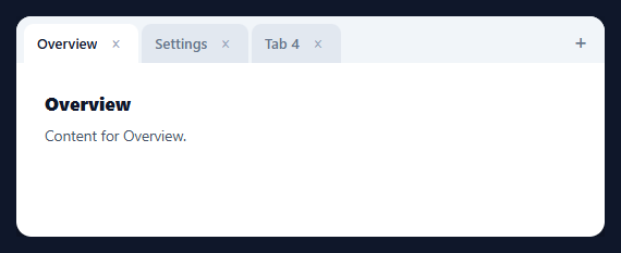
Most tab components are static — a fixed set you switch between. Dynamic tabs behave like a browser's: you can add new ones, close any of them, reorder by dragging, and the right tab activates when you close the current one. This snippet builds that full browser-style tab strip in plain HTML, CSS, and vanilla JavaScript, with no library.
State-driven, rendered from an array
Tabs live in a tabs array of { id, title, content }, with an activeId pointing at the current one. Every interaction mutates that array (or the active id) and calls render(), which redraws the strip and the body from state. This single-source-of-truth model is what keeps adding, closing, and reordering consistent — there's no DOM bookkeeping to drift, because the DOM is always a pure function of the array. Unique incrementing ids (not array indices) key each tab so reordering and closing never mix tabs up.
Smart activation when closing
The detail that makes closing feel right is which tab becomes active afterward. When you close the active tab, the component activates its neighbour — the tab that slid into its position, or the previous one if you closed the last — exactly like a browser. Closing a non-active tab leaves your selection alone. And closing the final tab drops to a clean empty state inviting a new tab. Getting this neighbour logic right is the difference between a polished tab strip and one that dumps you on a random tab.
Browser conventions: + , × and middle-click
A + button appends a new tab and scrolls the strip to reveal it; each tab has an × close button; and middle-clicking a tab closes it too (via the auxclick event with button === 1), matching the muscle memory of every browser user. Click handling is delegated — one listener on the strip routes clicks to close-vs-activate by checking closest('.dt-close') first — so it works for any number of tabs including ones added later.
Drag to reorder
Tabs are draggable, and dragstart/dragover reorder the array live: as you drag a tab over another, the dragged item is spliced into the new position and the strip re-renders, so tabs rearrange under the cursor. Reordering the array (not the DOM nodes) means the new order is real state you could persist, not just a visual shuffle.
Overflow, ellipsis, and drop-in use
The strip scrolls horizontally with a hidden scrollbar when tabs overflow, and long titles truncate with an ellipsis inside a max width, so the layout never breaks no matter how many tabs or how long their names. Because everything derives from the tabs array, you can seed it from saved state, cap the number, or wire each tab to real content — a complete reference for browser-style dynamic tabs covering add, close, reorder, and activation.
Step by step
How to Use
- 1Paste HTML, CSS, and JSA tabbed window renders with three seeded tabs and a + button.
- 2Add a tabClick + to append a new tab; the strip scrolls to reveal it and it becomes active.
- 3Close a tabClick its × or middle-click it; the neighbour activates if you closed the active one.
- 4Reorder by draggingDrag a tab over another to rearrange the order live.
- 5Switch tabsClick any tab to activate it and show its content below.
- 6Wire in real contentReplace each tab's content (and seed from saved state) to drive your own panels.
Real-world uses
Common Use Cases
auxclick.Got questions?
Frequently Asked Questions
If you close a non-active tab, your current selection is untouched. If you close the active tab, the component activates its neighbour — the tab that shifts into the closed one's index, or the previous tab if you closed the last one — exactly like a browser. Closing the final tab leaves a clean empty state. This neighbour logic is what makes closing feel natural rather than dumping you on a random tab.
Indices change when you reorder or close tabs, so using them to identify tabs leads to mix-ups — closing tab 2 could appear to close a different one after a reorder. Each tab gets a unique incrementing id, and all operations (activate, close, reorder, drag) reference that id. The DOM carries the id in data-id, so events always act on the intended tab regardless of position.
Tabs are draggable. On dragstart the dragged tab's id is recorded; on dragover (with preventDefault to allow dropping) the code finds the dragged tab and the tab under the cursor in the array, splices the dragged one into the new position, and re-renders. Because it reorders the underlying array rather than shuffling DOM nodes, the new order is real state you could save.
Middle-clicks fire the auxclick event (not click) with e.button === 1. A delegated auxclick listener on the strip checks for the middle button, finds the tab via closest('.dt-tab'), and closes it — matching the browser convention users already know. preventDefault stops any default middle-click behaviour like autoscroll.
Hold the tabs array and activeId in state (useState / ref / component properties) and render from it. Add, close, and reorder become state updates; use the framework's drag events or a small drag library for reordering. The neighbour-activation logic and id model are framework-agnostic — only the rendering and event binding change.
Yes. While the Dynamic Tabs snippet gives you one pattern to copy, the free Responsive Navbar Builder at webdevpuneet.com/navbar-builder/ designs a whole navigation bar: logo, links and dropdown menus, a mobile hamburger menu (dropdown panel, slide-in drawer or full screen) and a scroll effect (sticky, shrink, hide on scroll or transparent). It has six presets, a live preview that runs the real code, and exports HTML + CSS + vanilla JS, React, Tailwind, Vue 3 or Angular — or you can click Fork & Edit to keep editing it in My Code.