



Hide on Scroll Navbar — Free HTML CSS JS Auto-Hiding Navigation Snippet
Hide on Scroll Navbar · Navigation · Plain HTML, CSS & JS · Live preview
Copy & paste
Source Code
<nav class="navbar" id="navbar">
  <span class="brand">Acme Inc.</span>
  <div class="nav-links">
    <a href="#">Product</a>
    <a href="#">Pricing</a>
    <a href="#">Docs</a>
    <a href="#" class="cta">Sign up</a>
  </div>
</nav>

<div class="page-content">
  <div class="hero">
    <h1>Scroll down to test the navbar</h1>
    <p>Scroll down and the navbar slides up out of view. Scroll back up — even slightly — and it slides back in immediately.</p>
  </div>
  <section class="block"><h2>Section One</h2><p>Hiding the navbar on scroll-down gives long-form content more vertical space without removing navigation entirely.</p></section>
  <section class="block alt"><h2>Section Two</h2><p>Reversing direction — even by a few pixels — brings the bar back immediately, so it's never more than one scroll away.</p></section>
  <section class="block"><h2>Section Three</h2><p>This pattern is common on blogs, docs sites, and marketing pages where the reader spends most of their time scrolling down.</p></section>
  <section class="block alt"><h2>Section Four</h2><p>Combine it with a shrinking logo or condensed header state for an even more compact scrolled-down view.</p></section>
</div>
* { box-sizing: border-box; }
body { font-family: system-ui, sans-serif; margin: 0; }
.navbar {
position: fixed;
top: 0;
left: 0;
right: 0;
height: 60px;
display: flex;
align-items: center;
justify-content: space-between;
padding: 0 28px;
background: #fff;
border-bottom: 1px solid #e2e8f0;
z-index: 20;
transform: translateY(0);
transition: transform 0.25s ease;
}
/* Sliding the navbar up by its own height hides it completely; a matching
0 restores it. Only this one property ever changes. */
.navbar.hidden { transform: translateY(-100%); }
.brand { font-weight: 700; font-size: 15px; color: #1e293b; }
.nav-links { display: flex; align-items: center; gap: 22px; }
.nav-links a {
font-size: 13.5px;
font-weight: 500;
color: #475569;
text-decoration: none;
}
.nav-links a:hover { color: #1e293b; }
.nav-links a.cta {
background: #6366f1;
color: #fff;
padding: 8px 16px;
border-radius: 8px;
font-weight: 600;
}
.nav-links a.cta:hover { background: #4f46e5; }
.page-content { padding-top: 60px; background: #f8fafc; }
.hero { padding: 70px 24px; text-align: center; background: linear-gradient(135deg, #6366f1, #8b5cf6); color: #fff; }
.hero h1 { font-size: 24px; margin: 0 0 10px; }
.hero p { font-size: 14px; opacity: 0.9; max-width: 460px; margin: 0 auto; line-height: 1.6; }
.block { padding: 80px 24px; background: #fff; }
.block.alt { background: #f8fafc; }
.block h2 { font-size: 20px; color: #1e293b; margin: 0 0 10px; max-width: 560px; margin-inline: auto; }
.block p { font-size: 14px; color: #64748b; line-height: 1.7; max-width: 560px; margin: 0 auto; }const navbar = document.getElementById('navbar');
let lastScrollY = window.scrollY;
let ticking = false;
// A minimum scroll delta prevents the navbar from flickering on tiny,
// jittery scroll deltas (e.g. from a trackpad's momentum scrolling).
const MIN_SCROLL_DELTA = 8;
const REVEAL_THRESHOLD = 80;
function handleScroll() {
const currentY = window.scrollY;
const delta = currentY - lastScrollY;
if (Math.abs(delta) < MIN_SCROLL_DELTA) {
ticking = false;
return;
}
if (currentY < REVEAL_THRESHOLD) {
// Always show the navbar near the very top of the page.
navbar.classList.remove('hidden');
} else if (delta > 0) {
// Scrolling down -> hide.
navbar.classList.add('hidden');
} else {
// Scrolling up -> reveal immediately.
navbar.classList.remove('hidden');
}
lastScrollY = currentY;
ticking = false;
}
window.addEventListener('scroll', () => {
if (!ticking) {
// requestAnimationFrame batches the check to once per rendered frame,
// instead of running handleScroll on every single scroll event.
requestAnimationFrame(handleScroll);
ticking = true;
}
});Extend with AI
Take This Snippet Further With AI
The AI prompt for this one is for Patreon supporters ($3 a month, 7 days free), along with a site with no ads. Supporters enter the passcode once and it is remembered in this browser.
What's included
Features
About this UI Snippet
Hide on Scroll Navbar — HTML, CSS & JavaScript Auto-Hiding Nav
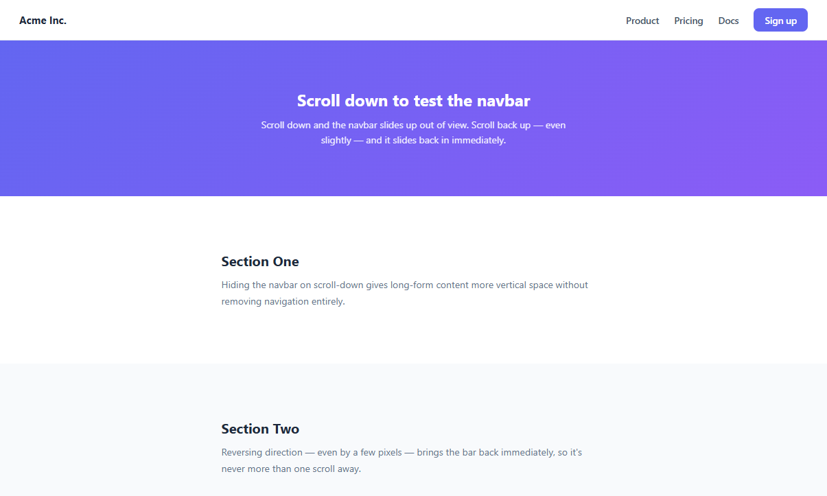
A navbar that's always visible takes up permanent vertical space on every screen, which matters most on mobile where every pixel of viewport height counts. The common fix is a navbar that hides itself while a user is actively scrolling down to read content, and reappears the instant they scroll back up looking for navigation — a pattern used across countless content-heavy mobile sites and apps.
This snippet implements that exact behavior in plain HTML, CSS, and vanilla JavaScript.
How the hide/show animation works
The navbar is position: fixed at the top of the viewport. Hiding it is a single CSS class, .hidden, that applies transform: translateY(-100%) — moving the navbar up by exactly its own height, off the top of the screen. A transition: transform 0.25s ease on the base .navbar rule makes that hide/show animate smoothly rather than snapping instantly. Only one property ever changes, which keeps the animation cheap for the browser to run — transform-only animations can run on the compositor thread without triggering layout recalculation.
How scroll direction is detected
A single lastScrollY variable stores the scroll position from the previous check. On every scroll event, delta = currentY - lastScrollY tells you both the direction (positive means scrolling down, negative means scrolling up) and the magnitude of the most recent scroll movement.
Why a minimum delta threshold matters
Trackpads and some mice report many tiny scroll events per second, and reacting to every single one — even 1-2px movements — makes the navbar flicker distractingly. MIN_SCROLL_DELTA (8px here) ignores any scroll movement smaller than that threshold, and only actually evaluates direction once a scroll of meaningful size has accumulated.
Why requestAnimationFrame wraps the handler
The native scroll event can fire dozens of times per second. Wrapping the actual direction-check logic in requestAnimationFrame, guarded by a ticking boolean, ensures the check runs at most once per rendered frame rather than once per raw scroll event — a standard throttling technique that keeps scroll-linked JavaScript from becoming a performance bottleneck.
The reveal threshold near the top
Below REVEAL_THRESHOLD (80px), the navbar is always forced visible regardless of direction — this avoids the slightly odd feeling of the navbar hiding itself while the user is still very close to the top of the page, where it should always be reliably present.
Step by step
How to Use
- 1Load the snippetClick "Hide on Scroll Navbar" in the sidebar Library tab. The preview shows a fixed navbar above a tall scrollable page.
- 2Scroll downScroll down through the page content in the preview and watch the navbar smoothly slide up out of view.
- 3Scroll up even slightlyScroll back up even a small amount and the navbar reappears immediately, sliding back down into place.
- 4Adjust the sensitivityIn the JS panel, change MIN_SCROLL_DELTA to make the navbar more (lower value) or less (higher value) sensitive to small scroll movements.
- 5Adjust the top reveal zoneIn the JS panel, change REVEAL_THRESHOLD to control how close to the top of the page the navbar is always forced visible.
- 6Export in your formatClick "HTML" for a standalone file, "JSX" for React, or "Tailwind" for React + Tailwind CSS.
Real-world uses
Common Use Cases
Got questions?
Frequently Asked Questions
The script stores the scroll position from the previous check in a lastScrollY variable and compares it to the current scrollY on each scroll event. A positive difference means the page has scrolled down since the last check; a negative difference means it scrolled up.
A MIN_SCROLL_DELTA threshold (8px by default) ignores scroll changes smaller than that amount. This prevents the navbar from flickering rapidly in response to the many tiny scroll events some trackpads and mice generate during smooth or momentum scrolling.
The scroll event can fire far more often than the screen actually repaints. Wrapping the direction-check logic in requestAnimationFrame, guarded by a ticking flag, ensures it runs at most once per rendered frame, keeping the scroll handler cheap and avoiding jank on long pages.
The REVEAL_THRESHOLD constant (80px by default) forces the navbar visible whenever the scroll position is below that value, regardless of direction — this avoids the odd feeling of the navbar hiding itself while the user is still essentially at the top of the page.
It only moves it visually, using transform: translateY(-100%). The element remains in the DOM and in the accessibility tree; if you need it to also be unreachable by keyboard when hidden, add aria-hidden="true" and toggle tabindex="-1" on its links alongside the hidden class.
Yes. Instead of translateY(-100%), define a "compact" class that reduces the navbar's height and font sizes, and toggle that class using the same scroll-direction logic instead of (or in addition to) the hide/show transform.
It can interact with them if those features also read or set scroll position rapidly. Test the combination carefully — you may need to adjust MIN_SCROLL_DELTA or temporarily disable the hide behavior during a programmatic smooth-scroll triggered by an anchor link.
The navbar remains fully focusable at all times since only its visual transform changes, not its DOM presence — but a hidden, off-screen navbar can still receive focus, which may be confusing. For full accessibility, also toggle tabindex or aria-hidden on the navbar's interactive children when it is hidden.
Yes. While the Hide on Scroll Navbar snippet gives you one pattern to copy, the free Responsive Navbar Builder at webdevpuneet.com/navbar-builder/ designs a whole navigation bar: logo, links and dropdown menus, a mobile hamburger menu (dropdown panel, slide-in drawer or full screen) and a scroll effect (sticky, shrink, hide on scroll or transparent). It has six presets, a live preview that runs the real code, and exports HTML + CSS + vanilla JS, React, Tailwind, Vue 3 or Angular — or you can click Fork & Edit to keep editing it in My Code.