




Liquid Glass Navbar — Free HTML CSS JS Glass Tab Bar
Liquid Glass Navbar · Navigation · Plain HTML, CSS & JS · Live preview
Copy & paste
Source Code
<div class="lg-root" id="lg-root" data-wall="aurora">
  <div class="lg-wall" aria-hidden="true"><span class="lg-blob b1"></span><span class="lg-blob b2"></span><span class="lg-blob b3"></span></div>

  <div class="lg-stage">
    <div class="lg-app" id="lg-app">
      <div class="lg-art" aria-hidden="true"><span class="lg-orb o1"></span><span class="lg-orb o2"></span><span class="lg-ring r1"></span><span class="lg-ring r2"></span></div>

      <div class="lg-navbar" id="lg-navbar" role="tablist" aria-label="App sections">
        <span class="lg-sheen" aria-hidden="true"></span>
        <span class="lg-rim" aria-hidden="true"></span>
        <span class="lg-pill" id="lg-pill" aria-hidden="true"></span>
        <button class="lg-item active" id="lg-tab-0" type="button" role="tab" aria-selected="true" aria-controls="lg-screen" tabindex="0" data-idx="0">
          <svg width="18" height="18" viewBox="0 0 24 24" fill="none" stroke="currentColor" stroke-width="2" stroke-linecap="round" stroke-linejoin="round" aria-hidden="true"><path d="m3 10.5 9-7.5 9 7.5"/><path d="M5 9.5V20a1 1 0 0 0 1 1h4v-6h4v6h4a1 1 0 0 0 1-1V9.5"/></svg>
          <span class="lg-label">Home</span>
        </button>
        <button class="lg-item" id="lg-tab-1" type="button" role="tab" aria-selected="false" aria-controls="lg-screen" tabindex="-1" data-idx="1">
          <svg width="18" height="18" viewBox="0 0 24 24" fill="none" stroke="currentColor" stroke-width="2" stroke-linecap="round" stroke-linejoin="round" aria-hidden="true"><circle cx="12" cy="12" r="9"/><path d="m15.5 8.5-2 5-5 2 2-5z"/></svg>
          <span class="lg-label">Explore</span>
        </button>
        <button class="lg-item" id="lg-tab-2" type="button" role="tab" aria-selected="false" aria-controls="lg-screen" tabindex="-1" data-idx="2">
          <svg width="18" height="18" viewBox="0 0 24 24" fill="none" stroke="currentColor" stroke-width="2" stroke-linecap="round" stroke-linejoin="round" aria-hidden="true"><rect x="3" y="3" width="18" height="18" rx="5"/><path d="M12 8v8M8 12h8"/></svg>
          <span class="lg-label">Create</span>
        </button>
        <button class="lg-item" id="lg-tab-3" type="button" role="tab" aria-selected="false" aria-controls="lg-screen" tabindex="-1" data-idx="3">
          <svg width="18" height="18" viewBox="0 0 24 24" fill="none" stroke="currentColor" stroke-width="2" stroke-linecap="round" stroke-linejoin="round" aria-hidden="true"><path d="M6 8a6 6 0 0 1 12 0c0 7 3 9 3 9H3s3-2 3-9"/><path d="M10.3 21a1.9 1.9 0 0 0 3.4 0"/></svg>
          <span class="lg-label">Alerts</span>
        </button>
        <button class="lg-item" id="lg-tab-4" type="button" role="tab" aria-selected="false" aria-controls="lg-screen" tabindex="-1" data-idx="4">
          <svg width="18" height="18" viewBox="0 0 24 24" fill="none" stroke="currentColor" stroke-width="2" stroke-linecap="round" stroke-linejoin="round" aria-hidden="true"><circle cx="12" cy="8" r="4"/><path d="M4 21a8 8 0 0 1 16 0"/></svg>
          <span class="lg-label">Profile</span>
        </button>
      </div>

      <section class="lg-copy" id="lg-screen" role="tabpanel" aria-labelledby="lg-tab-0">
        <span class="lg-tag lg-sw" id="lg-tag" style="--i:0">Home</span>
        <h1 class="lg-title lg-sw" id="lg-title" style="--i:1">Good evening, Maya</h1>
        <p class="lg-text lg-sw" id="lg-text" style="--i:2">Three new things have landed since you last looked in.</p>
        <ul class="lg-chips lg-sw" id="lg-chips" style="--i:3"><li>3 new posts</li><li>2 mentions</li><li>1 invite</li></ul>
      </section>
    </div>

    <div class="lg-foot">
      <p class="lg-hint">Click a tab: the glass pill stretches like liquid</p>
      <div class="lg-walls" role="group" aria-label="Wallpaper">
        <button type="button" class="lg-wallbtn on" data-wall="aurora" aria-pressed="true" aria-label="Aurora wallpaper" title="Aurora"><i></i></button>
        <button type="button" class="lg-wallbtn" data-wall="sunset" aria-pressed="false" aria-label="Sunset wallpaper" title="Sunset"><i></i></button>
        <button type="button" class="lg-wallbtn" data-wall="lagoon" aria-pressed="false" aria-label="Lagoon wallpaper" title="Lagoon"><i></i></button>
      </div>
    </div>
  </div>
</div>
* { box-sizing: border-box; margin: 0; padding: 0; }
/* Registered colour properties: a transition on them blends the colours instead of snapping */
@property --w1 { syntax: '<color>'; inherits: true; initial-value: #6366f1; }
@property --w2 { syntax: '<color>'; inherits: true; initial-value: #ec4899; }
@property --w3 { syntax: '<color>'; inherits: true; initial-value: #22d3ee; }
@property --c1 { syntax: '<color>'; inherits: true; initial-value: #6366f1; }
@property --c2 { syntax: '<color>'; inherits: true; initial-value: #a855f7; }
@property --c3 { syntax: '<color>'; inherits: true; initial-value: #38bdf8; }
@property --tint { syntax: '<color>'; inherits: true; initial-value: #a5b4fc; }
body { font-family: ui-sans-serif, system-ui, -apple-system, 'Segoe UI', Roboto, sans-serif; background: #080b1a; color: #fff; -webkit-font-smoothing: antialiased; }
.lg-root { --w1: #6366f1; --w2: #ec4899; --w3: #22d3ee; position: relative; overflow: hidden; isolation: isolate; min-height: 100vh; display: flex; align-items: center; justify-content: center; padding: 40px 20px; transition: --w1 0.9s ease, --w2 0.9s ease, --w3 0.9s ease; }
.lg-root[data-wall="sunset"] { --w1: #fb923c; --w2: #f43f5e; --w3: #8b5cf6; }
.lg-root[data-wall="lagoon"] { --w1: #14b8a6; --w2: #3b82f6; --w3: #22c55e; }
/* Wallpaper: three big blurred colour blobs drifting slowly */
.lg-wall { position: absolute; inset: 0; z-index: -1; }
.lg-blob { position: absolute; border-radius: 50%; filter: blur(80px); opacity: 0.55; will-change: transform; }
.lg-blob.b1 { width: 520px; height: 520px; left: -120px; top: -140px; background: var(--w1); animation: lgDriftA 18s ease-in-out infinite alternate; }
.lg-blob.b2 { width: 560px; height: 560px; right: -160px; top: 20%; background: var(--w2); animation: lgDriftB 22s ease-in-out infinite alternate; }
.lg-blob.b3 { width: 480px; height: 480px; left: 25%; bottom: -220px; background: var(--w3); animation: lgDriftA 26s ease-in-out infinite alternate-reverse; }
@keyframes lgDriftA { to { transform: translate(110px, 80px) scale(1.12); } }
@keyframes lgDriftB { to { transform: translate(-100px, -70px) scale(1.1); } }
.lg-stage { display: flex; flex-direction: column; align-items: center; gap: 20px; width: 100%; max-width: 860px; }
/* The "app" the glass floats over: a screen whose colours change with the tab */
.lg-app { --c1: #6366f1; --c2: #a855f7; --c3: #38bdf8; position: relative; width: 100%; height: 470px; border-radius: 30px; overflow: hidden; background: #0e1126; border: 1px solid rgba(255,255,255,0.16); box-shadow: 0 40px 90px rgba(0,0,0,0.5), inset 0 1px 0 rgba(255,255,255,0.12); transition: --c1 0.8s ease, --c2 0.8s ease, --c3 0.8s ease; }
.lg-art { position: absolute; inset: 0; background: radial-gradient(62% 90% at 12% 18%, var(--c1), transparent 62%), radial-gradient(55% 80% at 90% 22%, var(--c2), transparent 60%), radial-gradient(85% 90% at 50% 118%, var(--c3), transparent 66%), #0e1126; }
.lg-orb { position: absolute; border-radius: 50%; filter: blur(34px); opacity: 0.6; }
.lg-orb.o1 { width: 220px; height: 220px; right: 12%; top: 18%; background: var(--c3); animation: lgFloat 9s ease-in-out infinite alternate; }
.lg-orb.o2 { width: 150px; height: 150px; left: 38%; top: 38%; background: var(--c2); animation: lgFloat 12s ease-in-out infinite alternate-reverse; }
.lg-ring { position: absolute; border-radius: 50%; border: 1px solid rgba(255,255,255,0.2); }
.lg-ring.r1 { width: 380px; height: 380px; right: -60px; top: 70px; animation: lgSpin 60s linear infinite; border-style: dashed; }
.lg-ring.r2 { width: 250px; height: 250px; right: 5px; top: 135px; }
@keyframes lgFloat { to { transform: translate(-26px, 22px) scale(1.12); } }
@keyframes lgSpin { to { transform: rotate(360deg); } }
/* The glass bar */
.lg-navbar { --mx: 50%; --my: 0%; position: absolute; z-index: 3; top: 22px; left: 50%; transform: translateX(-50%); display: inline-flex; gap: 2px; padding: 6px; border-radius: 999px;
background: linear-gradient(180deg, rgba(255,255,255,0.2), rgba(255,255,255,0.07));
-webkit-backdrop-filter: blur(22px) saturate(180%) brightness(0.95); backdrop-filter: blur(22px) saturate(180%) brightness(0.95);
box-shadow: 0 16px 44px rgba(0,0,0,0.38), inset 0 1px 1px rgba(255,255,255,0.55), inset 0 -1px 1px rgba(255,255,255,0.14); }
/* The rim: a 1px gradient border, brighter at the top-left and bottom-right like a bevelled edge */
.lg-navbar::before { content: ''; position: absolute; inset: 0; border-radius: inherit; padding: 1px; pointer-events: none; z-index: 1;
background: linear-gradient(150deg, rgba(255,255,255,0.85), rgba(255,255,255,0.06) 32%, rgba(255,255,255,0.06) 68%, rgba(255,255,255,0.55));
-webkit-mask: linear-gradient(#000 0 0) content-box, linear-gradient(#000 0 0); -webkit-mask-composite: xor; mask: linear-gradient(#000 0 0) content-box exclude, linear-gradient(#000 0 0); }
.lg-rim { position: absolute; inset: 0; border-radius: inherit; padding: 1.5px; pointer-events: none; z-index: 1; opacity: 0; transition: opacity 0.3s;
background: radial-gradient(130px circle at var(--mx) var(--my), rgba(255,255,255,1), transparent 65%);
-webkit-mask: linear-gradient(#000 0 0) content-box, linear-gradient(#000 0 0); -webkit-mask-composite: xor; mask: linear-gradient(#000 0 0) content-box exclude, linear-gradient(#000 0 0); }
.lg-navbar:hover .lg-rim { opacity: 1; }
.lg-sheen { position: absolute; inset: 0; border-radius: inherit; pointer-events: none; z-index: 1; background: radial-gradient(210px circle at var(--mx) var(--my), rgba(255,255,255,0.34), transparent 62%); opacity: 0.9; }
/* The liquid pill: its position is set with left and width; it only ever animates with transform */
.lg-pill { position: absolute; z-index: 0; top: 6px; left: 6px; width: 70px; height: calc(100% - 12px); border-radius: 999px; transform-origin: left center; will-change: transform;
background: linear-gradient(180deg, rgba(255,255,255,0.36), rgba(255,255,255,0.1)), color-mix(in srgb, var(--tint) 58%, transparent);
border: 1px solid rgba(255,255,255,0.55);
box-shadow: 0 8px 22px color-mix(in srgb, var(--tint) 50%, transparent), inset 0 1px 1px rgba(255,255,255,0.9), inset 0 -7px 12px rgba(255,255,255,0.14);
transition: --tint 0.5s ease; }
.lg-item { position: relative; z-index: 2; display: inline-flex; align-items: center; gap: 8px; border: 0; background: none; padding: 11px 18px; border-radius: 999px; font: inherit; font-size: 14px; font-weight: 650; color: rgba(255,255,255,0.8); text-shadow: 0 1px 7px rgba(0,0,0,0.4); cursor: pointer; white-space: nowrap; transition: color 0.25s; }
.lg-item:hover { color: #fff; }
.lg-item.active { color: #fff; }
.lg-item:focus-visible { outline: 2px solid #fff; outline-offset: -3px; }
.lg-item svg { flex: none; }
/* Screen copy, bottom left. Each line fades out, changes, and fades back in with a small stagger */
.lg-copy { position: absolute; z-index: 2; left: 0; bottom: 0; max-width: 580px; padding: 36px 40px 38px; }
.lg-sw { transition: opacity 0.32s ease, transform 0.32s ease, filter 0.32s ease; transition-delay: calc(var(--i, 0) * 50ms); }
.lg-sw.is-out { opacity: 0; transform: translateY(10px); filter: blur(5px); transition-duration: 0.16s; transition-delay: 0s; }
.lg-tag { display: inline-block; padding: 5px 12px; border-radius: 999px; font-size: 12px; font-weight: 700; letter-spacing: 0.06em; text-transform: uppercase; background: rgba(255,255,255,0.14); border: 1px solid rgba(255,255,255,0.28); }
.lg-title { margin: 14px 0 10px; font-size: clamp(30px, 5.4vw, 46px); font-weight: 800; line-height: 1.04; letter-spacing: -0.035em; text-shadow: 0 2px 24px rgba(0,0,0,0.25); }
.lg-text { font-size: 16px; line-height: 1.6; color: rgba(255,255,255,0.82); max-width: 440px; }
.lg-chips { list-style: none; display: flex; flex-wrap: wrap; gap: 8px; margin-top: 18px; }
.lg-chips li { padding: 6px 13px; border-radius: 999px; font-size: 13px; font-weight: 600; background: rgba(255,255,255,0.12); border: 1px solid rgba(255,255,255,0.22); -webkit-backdrop-filter: blur(10px); backdrop-filter: blur(10px); }
/* Footer: hint + wallpaper switch, a second small glass control over the wallpaper */
.lg-foot { display: flex; align-items: center; gap: 14px; flex-wrap: wrap; justify-content: center; }
.lg-hint, .lg-walls { font-size: 12.5px; color: rgba(255,255,255,0.85); background: rgba(255,255,255,0.12); border: 1px solid rgba(255,255,255,0.24); -webkit-backdrop-filter: blur(14px) saturate(160%); backdrop-filter: blur(14px) saturate(160%); box-shadow: inset 0 1px 1px rgba(255,255,255,0.35); border-radius: 999px; }
.lg-hint { padding: 7px 15px; }
.lg-walls { display: flex; gap: 4px; padding: 4px; }
.lg-wallbtn { display: grid; place-items: center; width: 26px; height: 26px; border: 0; border-radius: 50%; background: none; cursor: pointer; transition: background 0.2s; }
.lg-wallbtn i { width: 16px; height: 16px; border-radius: 50%; box-shadow: inset 0 0 0 1px rgba(255,255,255,0.5); }
.lg-wallbtn:nth-child(1) i { background: linear-gradient(135deg, #6366f1, #ec4899); }
.lg-wallbtn:nth-child(2) i { background: linear-gradient(135deg, #fb923c, #f43f5e); }
.lg-wallbtn:nth-child(3) i { background: linear-gradient(135deg, #14b8a6, #3b82f6); }
.lg-wallbtn.on { background: rgba(255,255,255,0.28); }
.lg-wallbtn:focus-visible { outline: 2px solid #fff; outline-offset: 1px; }
@media (max-width: 600px) {
.lg-root { padding: 20px 12px; }
.lg-app { height: 440px; border-radius: 24px; }
.lg-label { display: none; }
.lg-item { padding: 13px 17px; }
.lg-navbar { top: 16px; }
.lg-copy { padding: 26px 24px 28px; }
}
@media (prefers-reduced-motion: reduce) {
.lg-blob, .lg-orb, .lg-ring { animation: none; }
.lg-sw, .lg-root, .lg-app, .lg-pill { transition-duration: 0.01ms !important; transition-delay: 0s !important; }
}// One entry per tab: the screen copy and the colours the whole scene fades to.
var TABS = [
{ tag: 'Home', title: 'Good evening, Maya', text: 'Three new things have landed since you last looked in.', chips: ['3 new posts', '2 mentions', '1 invite'], c1: '#6366f1', c2: '#a855f7', c3: '#38bdf8', tint: '#a5b4fc' },
{ tag: 'Explore', title: 'See what is trending', text: 'Fresh work from people you might like, refreshed every hour.', chips: ['Design', 'Motion', 'Photography'], c1: '#0ea5e9', c2: '#14b8a6', c3: '#6366f1', tint: '#7dd3fc' },
{ tag: 'Create', title: 'Start something new', text: 'Pick a canvas, drop in your first idea and share it when it is ready.', chips: ['Post', 'Story', 'Collection'], c1: '#ec4899', c2: '#f97316', c3: '#a855f7', tint: '#f9a8d4' },
{ tag: 'Alerts', title: 'You are all caught up', text: 'No new alerts. We will let you know the moment something happens.', chips: ['0 unread', 'Quiet hours on'], c1: '#f59e0b', c2: '#f43f5e', c3: '#ec4899', tint: '#fcd34d' },
{ tag: 'Profile', title: 'Your corner of the app', text: 'Edit your details, manage your plan and see who follows your work.', chips: ['1.2k followers', 'Pro plan'], c1: '#10b981', c2: '#06b6d4', c3: '#3b82f6', tint: '#6ee7b7' }
];
var root = document.getElementById('lg-root');
var app = document.getElementById('lg-app');
var navbar = document.getElementById('lg-navbar');
var pill = document.getElementById('lg-pill');
var screen = document.getElementById('lg-screen');
var items = Array.prototype.slice.call(document.querySelectorAll('.lg-item'));
var lines = [document.getElementById('lg-tag'), document.getElementById('lg-title'), document.getElementById('lg-text'), document.getElementById('lg-chips')];
var reduce = window.matchMedia && window.matchMedia('(prefers-reduced-motion: reduce)').matches;
var activeIdx = 0;
var morph = null; // the running pill animation, if any
var fadeTimer = null;
// ---- FLIP: First, Last, Invert, Play ----
// The pill is one element reused by every tab. To move it we change its real left and width
// (so layout is always correct), then use a transform to make it LOOK like it is still
// where it was, and animate that transform back to nothing. Only transform is animated, so
// the motion runs on the compositor and stays smooth.
function movePill(target, animate) {
var barRect = navbar.getBoundingClientRect();
var first = pill.getBoundingClientRect(); // FIRST: where the pill looks right now (even mid-animation)
if (morph) { morph.cancel(); morph = null; } // stop the old animation so measuring is clean
var t = target.getBoundingClientRect();
pill.style.left = (t.left - barRect.left - navbar.clientLeft) + 'px'; // jump to the real final box
pill.style.width = t.width + 'px';
if (!animate || reduce || !pill.animate) return;
var last = pill.getBoundingClientRect(); // LAST: where it really ended up
var dx = first.left - last.left; // INVERT: the offset and width ratio that cancel the jump
var sx = first.width / last.width;
var dist = Math.min(Math.abs(dx) / barRect.width, 0.6);
var stretch = (1 + dist * 0.9) * Math.max(sx, 1); // the further it travels, the more it stretches
// PLAY: transform back to identity through a stretched, squashed middle frame. Each keyframe has its own easing:
// the first leg eases out into the stretch, the second overshoots and settles. (An easing on the whole animation
// would push the middle frame past in a few milliseconds, and the stretch would hardly be seen.)
morph = pill.animate([
{ transform: 'translateX(' + dx + 'px) scale(' + sx + ', 1)', easing: 'cubic-bezier(0.2, 0.7, 0.3, 1)' },
{ transform: 'translateX(' + (dx * 0.45) + 'px) scale(' + stretch + ', 0.88)', offset: 0.4, easing: 'cubic-bezier(0.3, 1.45, 0.5, 1)' },
{ transform: 'translateX(0) scale(1, 1)' }
], { duration: 720 });
morph.onfinish = function () { morph = null; };
}
function writeScreen(tab) {
document.getElementById('lg-tag').textContent = tab.tag;
document.getElementById('lg-title').textContent = tab.title;
document.getElementById('lg-text').textContent = tab.text;
var chips = document.getElementById('lg-chips');
chips.textContent = '';
tab.chips.forEach(function (c) {
var li = document.createElement('li');
li.textContent = c;
chips.appendChild(li);
});
}
function select(idx, animate) {
if (idx === activeIdx && animate) return;
var tab = TABS[idx];
activeIdx = idx;
items.forEach(function (it, i) {
var on = i === idx;
it.classList.toggle('active', on);
it.setAttribute('aria-selected', on ? 'true' : 'false');
it.tabIndex = on ? 0 : -1; // roving tabindex: arrow keys move between tabs
});
screen.setAttribute('aria-labelledby', 'lg-tab-' + idx);
movePill(items[idx], animate);
// The scene follows: the registered colour properties fade to the new palette
app.style.setProperty('--c1', tab.c1);
app.style.setProperty('--c2', tab.c2);
app.style.setProperty('--c3', tab.c3);
pill.style.setProperty('--tint', tab.tint);
if (!animate) { writeScreen(tab); return; }
clearTimeout(fadeTimer);
lines.forEach(function (el) { el.classList.add('is-out'); });
fadeTimer = setTimeout(function () {
writeScreen(tab);
lines.forEach(function (el) { el.classList.remove('is-out'); });
}, reduce ? 0 : 170);
}
items.forEach(function (item, i) {
item.addEventListener('click', function () { select(i, true); });
});
// Arrow keys, Home and End move between tabs, like any tab list
navbar.addEventListener('keydown', function (e) {
var n = null;
if (e.key === 'ArrowRight') n = (activeIdx + 1) % items.length;
else if (e.key === 'ArrowLeft') n = (activeIdx - 1 + items.length) % items.length;
else if (e.key === 'Home') n = 0;
else if (e.key === 'End') n = items.length - 1;
if (n === null) return;
e.preventDefault();
select(n, true);
items[n].focus();
});
// Light follows the pointer: the sheen inside the glass and the bright spot on its rim
navbar.addEventListener('mousemove', function (e) {
var r = navbar.getBoundingClientRect();
navbar.style.setProperty('--mx', (e.clientX - r.left) + 'px');
navbar.style.setProperty('--my', (e.clientY - r.top) + 'px');
});
navbar.addEventListener('mouseleave', function () {
navbar.style.setProperty('--mx', '50%');
navbar.style.setProperty('--my', '0%');
});
// Wallpaper switch: the glass picks up whatever colours sit behind it
Array.prototype.forEach.call(document.querySelectorAll('.lg-wallbtn'), function (b) {
b.addEventListener('click', function () {
root.setAttribute('data-wall', b.dataset.wall);
Array.prototype.forEach.call(document.querySelectorAll('.lg-wallbtn'), function (o) {
var on = o === b;
o.classList.toggle('on', on);
o.setAttribute('aria-pressed', on ? 'true' : 'false');
});
});
});
// Place the pill without animating on load, and again if the bar changes size (resize, fonts, icon-only mode)
select(0, false);
window.addEventListener('resize', function () { movePill(items[activeIdx], false); });
if (window.ResizeObserver) new ResizeObserver(function () { movePill(items[activeIdx], false); }).observe(navbar);
if (document.fonts && document.fonts.ready) document.fonts.ready.then(function () { movePill(items[activeIdx], false); });Extend with AI
Take This Snippet Further With AI
The AI prompt for this one is for Patreon supporters ($3 a month), along with a site with no ads. Supporters enter the passcode once and it is remembered in this browser.
What's included
Features
About this UI Snippet
Liquid Glass Navbar — A Glass Tab Bar With a Stretching Liquid Pill and a Scene That Follows It
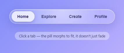
Apple's "Liquid Glass" look comes from a few ingredients layered together: a heavily blurred, saturated translucent body, a thin bevelled edge that catches light, a soft highlight that moves with your attention, and controls that feel like drops of liquid rather than flat shapes. This snippet recreates those ingredients with plain CSS and a little JavaScript, and shows them where they matter: a floating tab bar laid over a live app screen, so the blur has colour and shapes to refract. Click a tab and the pill stretches across the bar like a drop of liquid while the whole scene behind the glass changes colour.
The glass body
The bar combines backdrop-filter: blur(22px) saturate(180%) brightness(0.95) with a faint white gradient fill. The blur softens what is behind it, the saturation keeps those colours vivid instead of washed out, and the slight brightness drop stops light areas from bleaching the white labels. Two inset box-shadows add a bright hairline along the top and a faint one along the bottom, which reads as the curved thickness of a glass edge.
A rim made with a mask
The bevelled edge is a ::before pseudo-element with a diagonal gradient (bright at the top left, bright again at the bottom right) that is cut down to a 1px ring with a mask. Two mask layers, one over the content box and one over the whole box, are combined with mask-composite: exclude (xor with the -webkit- prefix), which leaves only the border. A second ring, .lg-rim, uses a radial gradient centred on the pointer so the edge glows where you hover, and a sheen layer inside the glass follows the same two CSS variables, --mx and --my.
FLIP, played with the Web Animations API
The pill is one element reused by every tab. FLIP stands for First, Last, Invert, Play. First: measure where the pill looks right now with getBoundingClientRect(), even in the middle of an earlier move. Last: cancel any running animation, then set the pill's real left and width to the clicked tab's box and measure again. Invert: the difference between the two boxes becomes a translateX and a scaleX that make the pill look as if it never moved. Play: pill.animate() runs the transform back to identity. Because animate() starts from a keyframe list, there is no forced reflow and no inline transition to clean up, and only transform is animated, so the motion stays on the compositor thread.
Making it liquid: stretch and squash
A plain slide looks mechanical. The animation has a middle keyframe at 40% where the pill is stretched horizontally and squashed vertically (scale(stretch, 0.88)), with the stretch growing with the distance travelled. Each keyframe carries its own easing: the first leg eases out into the stretch and the second, cubic-bezier(0.3, 1.45, 0.5, 1), overshoots so the pill settles with a small wobble. Easing set on the whole animation instead would hurry past the middle frame and the stretch would barely show. Tapping a far tab stretches the pill more than tapping its neighbour. Because first is measured from the pill's current on-screen box, clicking quickly between tabs continues from wherever the pill is instead of jumping.
The scene follows the tab
Each tab has three colours. They are written to --c1, --c2 and --c3 on the app, and the screen's background gradients read them. The variables are registered with @property as <color>, so a normal transition blends the old colour into the new one over 0.8 seconds, and the same trick tints the pill and the wallpaper blobs. In a browser without @property the colours switch instantly and everything else still works. The copy fades out, changes and fades back in with a 50ms stagger.
Keyboard, accessibility and motion
The bar is a role="tablist" of role="tab" buttons with aria-selected, a roving tabindex and aria-controls pointing at the screen panel, whose aria-labelledby follows the active tab. Arrow keys, Home and End move between tabs. Visitors who prefer reduced motion get an instant pill move, no drifting blobs and near-zero transitions. A ResizeObserver re-places the pill whenever the bar changes size, for example when the labels hide on small screens.
Step by step
How to Use
- 1Look at the glassThe bar floats over a coloured screen with heavy blur, a bright top edge and a pill under the active tab. The blur only looks like glass because there are colours and shapes behind it.
- 2Move the pointer over the barA soft highlight follows the cursor inside the glass and the rim glows at the same spot, as if light were catching the edge.
- 3Click a distant tabTry Profile from Home. The pill stretches and squashes as it travels, overshoots slightly, and settles. A nearby tab stretches it less.
- 4Click quickly between tabsBecause every move starts from the pill's current on-screen box, rapid clicks stay smooth and never cut.
- 5Watch the scene changeThe screen behind the bar fades to the tab's palette, the pill takes on a matching tint and the copy changes.
- 6Try the keyboardTab into the bar, then use the arrow keys, Home and End to move between tabs. The pill moves exactly as it does for a click.
- 7Change the wallpaperUse the three dots under the screen to swap the background colours. The glass picks up whatever is behind it.
- 8Make it yoursEdit the TABS array for your own labels, copy and colours. To add a tab, add a button in the HTML and an entry in TABS; the pill measures the real button, so nothing else changes.
Real-world uses
Common Use Cases
Got questions?
Frequently Asked Questions
Transform can run on the compositor thread without recalculating layout on every frame, while left and width force a layout pass each frame. FLIP gives the same visual result, a pill that slides and resizes between two real boxes, while only animating a transform.
The animation has three keyframes: the inverted start, a middle frame at 40% with scale(stretch, 0.88), and the identity end. The stretch value grows with the distance travelled, and each keyframe has its own easing, the last one overshooting, so the pill settles with a small wobble.
movePill() measures the pill's current on-screen box first, then cancels the running animation and sets the new left and width. The new animation therefore starts from where the pill visually is, so it continues smoothly instead of jumping back.
The colours are custom properties registered with @property as colour values, which lets a CSS transition interpolate them. Writing a new --c1 to --c3 on the app element makes every gradient that uses them blend over 0.8 seconds. Without @property support the colours simply switch instantly.
It works in current Chrome, Edge, Safari and Firefox, and the snippet includes the -webkit- prefix for older WebKit. Where it is unsupported the bar keeps its translucent gradient fill without the blur, which still looks acceptable.
Yes. Keep the active index in state and run movePill in a layout effect or watcher after the active tab changes, with refs for the bar and the pill. The animation is a one-shot Web Animations call, so there is no loop to clean up; only the ResizeObserver needs disconnecting on unmount.
Add a button with role="tab" in the HTML and an entry in the TABS array. movePill() reads the clicked button's real box, so a short label and a long one both fit with no pill-width setting to change.
Yes. While the Liquid Glass Navbar snippet gives you one pattern to copy, the free Responsive Navbar Builder at webdevpuneet.com/navbar-builder/ designs a whole navigation bar: logo, links and dropdown menus, a mobile hamburger menu (dropdown panel, slide-in drawer or full screen) and a scroll effect (sticky, shrink, hide on scroll or transparent). It has six presets, a live preview that runs the real code, and exports HTML + CSS + vanilla JS, React, Tailwind, Vue 3 or Angular — or you can click Fork & Edit to keep editing it in My Code.