

Material Container Transform — FAB to Sheet CSS JS
FAB Container Transform Sheet · Animations · Plain HTML, CSS & JS · Live preview
Copy & paste
Source Code
<div class="stage">
  <div class="backdrop" id="backdrop"></div>

  <button class="fab" id="fab" aria-label="Compose">
    <svg viewBox="0 0 24 24" width="22" height="22" fill="none" stroke="currentColor" stroke-width="2.5" stroke-linecap="round"><line x1="12" y1="5" x2="12" y2="19"></line><line x1="5" y1="12" x2="19" y2="12"></line></svg>
  </button>

  <div class="sheet" id="sheet">
    <div class="sheet-header">
      <h3>New Note</h3>
      <button class="close-btn" id="closeBtn" aria-label="Close">
        <svg viewBox="0 0 24 24" width="18" height="18" fill="none" stroke="currentColor" stroke-width="2.5" stroke-linecap="round"><line x1="5" y1="5" x2="19" y2="19"></line><line x1="19" y1="5" x2="5" y2="19"></line></svg>
      </button>
    </div>
    <textarea placeholder="Start typing..." class="sheet-body"></textarea>
    <button class="send-btn">Save Note</button>
  </div>
</div>
* { box-sizing: border-box; }
body { font-family: system-ui, sans-serif; background: #f1f5f9; }
.stage { position: relative; width: 100%; height: 100vh; overflow: hidden; }
.backdrop {
position: absolute; inset: 0; background: rgba(15,23,42,0.35);
opacity: 0; pointer-events: none; transition: opacity 0.35s ease;
}
.backdrop.show { opacity: 1; pointer-events: auto; }
.fab {
position: absolute; right: 28px; bottom: 28px; width: 56px; height: 56px;
border-radius: 50%; border: none; background: #6366f1; color: #fff;
display: flex; align-items: center; justify-content: center; cursor: pointer;
box-shadow: 0 10px 24px rgba(99,102,241,0.4);
transition: transform 0.15s ease, opacity 0.2s ease;
}
.fab:hover { transform: scale(1.06); }
.fab.hidden { opacity: 0; pointer-events: none; transform: scale(0.6); }
/* The sheet always occupies its final on-screen box; visibility and shape
are what animate. It starts as a 56x56 circle pinned exactly where the
FAB sits, then grows to a full rounded panel — a genuine container
transform, not a separate modal that fades in from nowhere. */
.sheet {
position: absolute; right: 28px; bottom: 28px; width: 56px; height: 56px;
border-radius: 50%; background: #fff; overflow: hidden;
box-shadow: 0 20px 50px rgba(15,23,42,0.25);
transition: width 0.4s cubic-bezier(0.4,0,0.2,1), height 0.4s cubic-bezier(0.4,0,0.2,1),
border-radius 0.4s cubic-bezier(0.4,0,0.2,1), right 0.4s cubic-bezier(0.4,0,0.2,1),
bottom 0.4s cubic-bezier(0.4,0,0.2,1);
pointer-events: none;
}
.sheet.open {
width: min(420px, calc(100% - 48px));
height: min(480px, calc(100% - 96px));
right: 24px; bottom: 24px; border-radius: 20px;
pointer-events: auto;
}
.sheet-header {
display: flex; align-items: center; justify-content: space-between;
padding: 18px 20px; border-bottom: 1px solid #e2e8f0;
opacity: 0; transition: opacity 0.2s ease 0.18s;
}
.sheet.open .sheet-header { opacity: 1; }
.sheet-header h3 { font-size: 16px; font-weight: 800; color: #0f172a; margin: 0; }
.close-btn { background: none; border: none; color: #64748b; cursor: pointer; padding: 4px; }
.sheet-body {
display: block; width: 100%; height: calc(100% - 130px); border: none; resize: none;
padding: 18px 20px; font: inherit; font-size: 14px; color: #334155; line-height: 1.6;
opacity: 0; transition: opacity 0.2s ease 0.22s;
}
.sheet.open .sheet-body { opacity: 1; }
.sheet-body:focus { outline: none; }
.send-btn {
position: absolute; left: 20px; right: 20px; bottom: 16px;
padding: 11px; border-radius: 9px; border: none; background: #6366f1; color: #fff;
font-size: 13.5px; font-weight: 700; font-family: inherit; cursor: pointer;
opacity: 0; transition: opacity 0.2s ease 0.22s, background 0.15s;
}
.sheet.open .send-btn { opacity: 1; }
.send-btn:hover { background: #4f46e5; }const fab = document.getElementById('fab');
const sheet = document.getElementById('sheet');
const backdrop = document.getElementById('backdrop');
const closeBtn = document.getElementById('closeBtn');
function openSheet() {
fab.classList.add('hidden');
backdrop.classList.add('show');
// Forcing the class on next frame (rather than immediately) guarantees the
// browser has committed the starting 56x56 circle box before the width/
// height/border-radius transition begins, so the growth is always
// visible instead of sometimes snapping straight to the open size.
requestAnimationFrame(() => sheet.classList.add('open'));
sheet.querySelector('.sheet-body').focus();
}
function closeSheet() {
sheet.classList.remove('open');
backdrop.classList.remove('show');
setTimeout(() => fab.classList.remove('hidden'), 150);
}
fab.addEventListener('click', openSheet);
closeBtn.addEventListener('click', closeSheet);
backdrop.addEventListener('click', closeSheet);
document.querySelector('.send-btn').addEventListener('click', closeSheet);
document.addEventListener('keydown', (e) => {
if (e.key === 'Escape' && sheet.classList.contains('open')) closeSheet();
});Extend with AI
Take This Snippet Further With AI
The AI prompt for this one is for Patreon supporters ($3 a month), along with a site with no ads. Supporters enter the passcode once and it is remembered in this browser.
What's included
Features
About this UI Snippet
FAB-to-Sheet Container Transform — Morphing One Element's Box Into a Full Panel
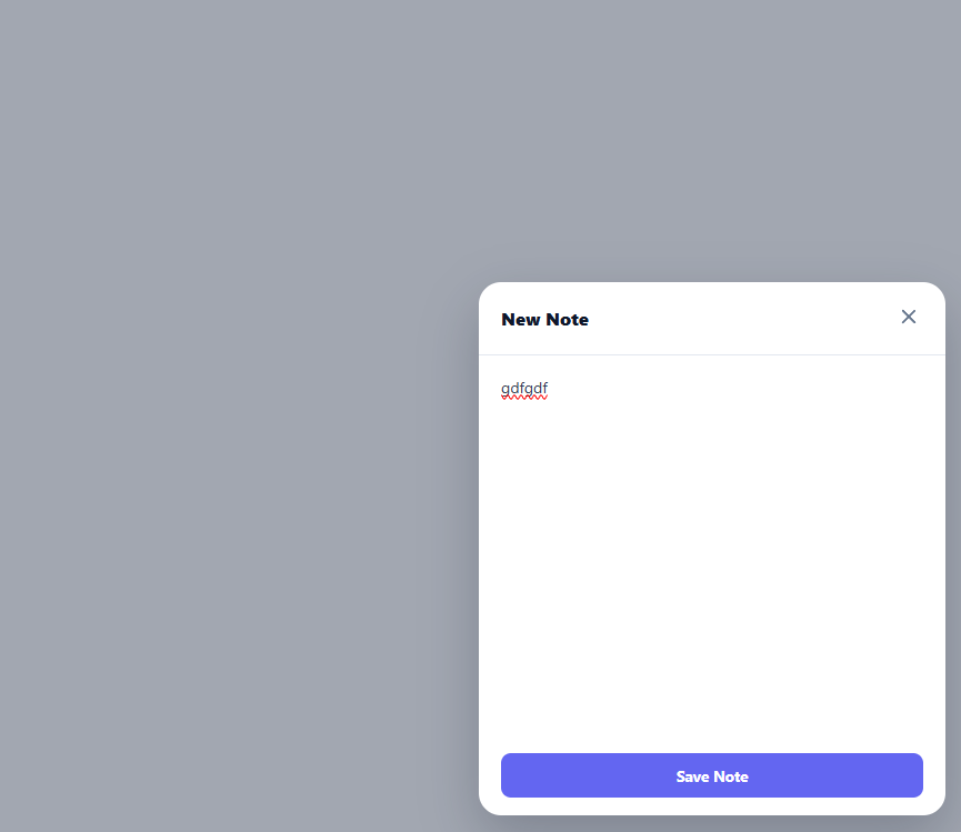
The "container transform" pattern — popularized by Material Design — is a shared-element transition where one small element visibly grows into a completely different, much larger surface, rather than the larger surface fading in from nothing. This snippet builds the canonical example: a circular floating action button that morphs, in place, into a full compose sheet.
One element, two shapes
The key decision is that .fab and .sheet are two separate elements, but only .sheet ever animates its box — it starts already positioned exactly where the FAB sits (right: 28px; bottom: 28px; width: 56px; height: 56px; border-radius: 50%), invisible-in-practice because it is a plain white circle the same size as the FAB sitting right on top of it. The FAB itself simply fades out at the same moment. This is what makes the transform read as "the button becoming the sheet" rather than "a button disappearing while an unrelated panel appears".
What actually animates
Adding the .open class to .sheet changes five properties at once — width, height, border-radius, right, and bottom — each with its own transition entry sharing a cubic-bezier(0.4, 0, 0.2, 1) curve (Material's standard "emphasized" easing). Animating border-radius alongside the size is what sells the effect: a 56px circle with border-radius: 50% smoothly relaxes into a 420px panel with border-radius: 20px, so the corners visibly soften as the box grows rather than snapping between a circle and a rounded rectangle.
Staggering the content reveal
The sheet's header, body, and save button are given opacity: 0 at rest with a transition-delay — 0.18s, 0.22s, 0.22s — so they only start fading in once the box has grown enough to actually have room for them. Without this stagger, the header text would visibly overflow and clip inside a barely-open circle for the first several frames, breaking the illusion.
Why the class is added on the next animation frame
openSheet() calls requestAnimationFrame(() => sheet.classList.add('open')) instead of adding the class synchronously. This guarantees the browser has painted the sheet's starting 56×56 circle box at least once before the transition-triggering class lands — without that one-frame delay, some browsers can coalesce the "before" and "after" states into a single paint and the growth transition never becomes visible, snapping straight to the open size instead.
Closing back into the FAB
closeSheet() simply removes .open, which reverses every property back to its starting circle values along the same transitions, and restores the FAB's visibility on a short setTimeout timed to roughly when the sheet has shrunk back down. A backdrop click, close button, save button, or the Escape key all route through this one function, so the reverse transform is always available from the same three places a user would expect to be able to dismiss a sheet.
Where this differs from a typical modal
A standard modal fades a fixed-size box in over a backdrop with no relationship to what triggered it. A container transform keeps a literal spatial connection between the trigger and the result — the sheet visibly originates from the FAB's exact position, which reads as much more responsive and grounded, especially for actions like "compose", "add", or "expand" that conceptually grow out of a single button press.
Step by step
How to Use
- 1Click the + floating action buttonIt fades out as the sheet grows from its exact position into a full panel with softening corners.
- 2Close the sheetClick the X, click the backdrop, press Escape, or click Save Note — all four reverse the transform back into the FAB.
- 3Change the open sizeEdit the width/height values on .sheet.open (currently min(420px, ...) and min(480px, ...)).
- 4Adjust the growth speedChange the 0.4s duration shared by the width/height/border-radius/position transitions on .sheet.
- 5Retime the content staggerAdjust the transition-delay values (0.18s, 0.22s) on .sheet-header, .sheet-body, and .send-btn.
- 6Export in your formatClick "HTML" for a standalone file, "JSX" for a React component, or "Tailwind" for a React + Tailwind version.
Real-world uses
Common Use Cases
Got questions?
Frequently Asked Questions
A regular modal appears as an unrelated fixed-size box with no visual connection to what opened it. Here, the sheet element starts already sized and positioned exactly like the FAB (a 56px circle in the same spot) and animates its own width, height, border-radius, and position into the open panel, so it visibly grows out of the button rather than appearing separately.
Adding the class immediately risks the browser combining the starting and ending styles into one paint, so the transition never becomes visible and the sheet just snaps open. Waiting one animation frame guarantees the starting circle has been painted first, so the following class change is guaranteed to trigger a visible transition.
If the content faded in at the same instant the box starts growing, it would visibly overflow and clip inside the still-tiny circle for the first several frames. Delaying each piece's opacity transition until the box has grown enough to contain it keeps the reveal looking clean.
Yes — change the starting right/bottom (or left/top) values on .sheet to match wherever the trigger element sits, and update openSheet()/closeSheet() to hide/show that trigger element instead of the FAB.
No. Every part of the transform is a plain CSS transition on width, height, border-radius, and position properties, toggled by adding or removing one class in JavaScript.
On open, capture the currently focused element, move focus into the sheet (already done for the textarea), and intercept Tab/Shift+Tab to cycle only within the sheet's focusable elements until it closes, at which point restore focus to the FAB.