


Focus Cards — Free HTML CSS JS Hover Blur Grid Snippet
Focus Cards · Cards · Plain HTML, CSS & JS · Live preview
Copy & paste
Source Code
<div class="fc-grid" id="fcGrid">
  <article class="fc-card" tabindex="0" style="--bg:linear-gradient(150deg,#6366f1,#0a0a14)"><div class="fc-meta"><h3>Aurora</h3><p>Northern lights</p></div></article>
  <article class="fc-card" tabindex="0" style="--bg:linear-gradient(150deg,#ec4899,#0a0a14)"><div class="fc-meta"><h3>Ember</h3><p>Desert dusk</p></div></article>
  <article class="fc-card" tabindex="0" style="--bg:linear-gradient(150deg,#22d3ee,#0a0a14)"><div class="fc-meta"><h3>Tide</h3><p>Coastal calm</p></div></article>
  <article class="fc-card" tabindex="0" style="--bg:linear-gradient(150deg,#34d399,#0a0a14)"><div class="fc-meta"><h3>Fern</h3><p>Forest floor</p></div></article>
  <article class="fc-card" tabindex="0" style="--bg:linear-gradient(150deg,#f59e0b,#0a0a14)"><div class="fc-meta"><h3>Solstice</h3><p>Golden hour</p></div></article>
  <article class="fc-card" tabindex="0" style="--bg:linear-gradient(150deg,#a78bfa,#0a0a14)"><div class="fc-meta"><h3>Nebula</h3><p>Deep space</p></div></article>
</div>*{box-sizing:border-box;margin:0;padding:0}
body{font-family:system-ui,-apple-system,sans-serif;background:#0a0a14;color:#fff;display:flex;justify-content:center;align-items:center;min-height:100vh;padding:24px}
.fc-grid{display:grid;grid-template-columns:repeat(3,1fr);gap:16px;width:100%;max-width:760px}
.fc-card{position:relative;aspect-ratio:3/4;border-radius:16px;background:var(--bg);overflow:hidden;cursor:pointer;outline:none;transition:transform .4s ease,filter .4s ease,opacity .4s ease;display:flex;align-items:flex-end;padding:18px}
.fc-card::after{content:'';position:absolute;inset:0;background:rgba(10,10,20,.0);transition:background .4s ease}
/* When the grid is hovered, every card dims and blurs EXCEPT the hovered one,
which lifts. The same applies on keyboard focus-within. */
.fc-grid:hover .fc-card,.fc-grid:focus-within .fc-card{filter:blur(2px) brightness(.6);transform:scale(.97);opacity:.8}
.fc-grid .fc-card:hover,.fc-grid .fc-card:focus-visible{filter:none;transform:scale(1.03);opacity:1;z-index:1;box-shadow:0 24px 50px -20px rgba(0,0,0,.7)}
.fc-meta{position:relative;z-index:1;transform:translateY(8px);opacity:0;transition:transform .4s ease,opacity .4s ease}
.fc-card:hover .fc-meta,.fc-card:focus-visible .fc-meta{transform:none;opacity:1}
.fc-meta h3{font-size:19px;font-weight:800}
.fc-meta p{font-size:12.5px;color:rgba(255,255,255,.75);margin-top:2px}
@media(max-width:560px){.fc-grid{grid-template-columns:repeat(2,1fr)}}// The dim-others / focus-one behaviour is pure CSS via :hover and :focus-within.
// JS only adds a click selection state so the pattern works on touch, where
// there is no hover — tapping a card focuses it and reveals its caption.
var grid = document.getElementById('fcGrid');
var cards = Array.prototype.slice.call(grid.querySelectorAll('.fc-card'));
cards.forEach(function (card) {
card.addEventListener('click', function () {
card.focus();
});
card.addEventListener('keydown', function (e) {
if (e.key === 'Enter' || e.key === ' ') { e.preventDefault(); card.focus(); }
});
});
// Tapping empty grid space (or pressing Escape) clears the focus on touch.
grid.addEventListener('click', function (e) {
if (e.target === grid && document.activeElement) document.activeElement.blur();
});
document.addEventListener('keydown', function (e) {
if (e.key === 'Escape' && document.activeElement) document.activeElement.blur();
});Extend with AI
Take This Snippet Further With AI
The AI prompt for this one is for Patreon supporters ($3 a month, 7 days free), along with a site with no ads. Supporters enter the passcode once and it is remembered in this browser.
What's included
Features
About this UI Snippet
Focus Cards — Hover One, Blur the Rest to Draw Attention
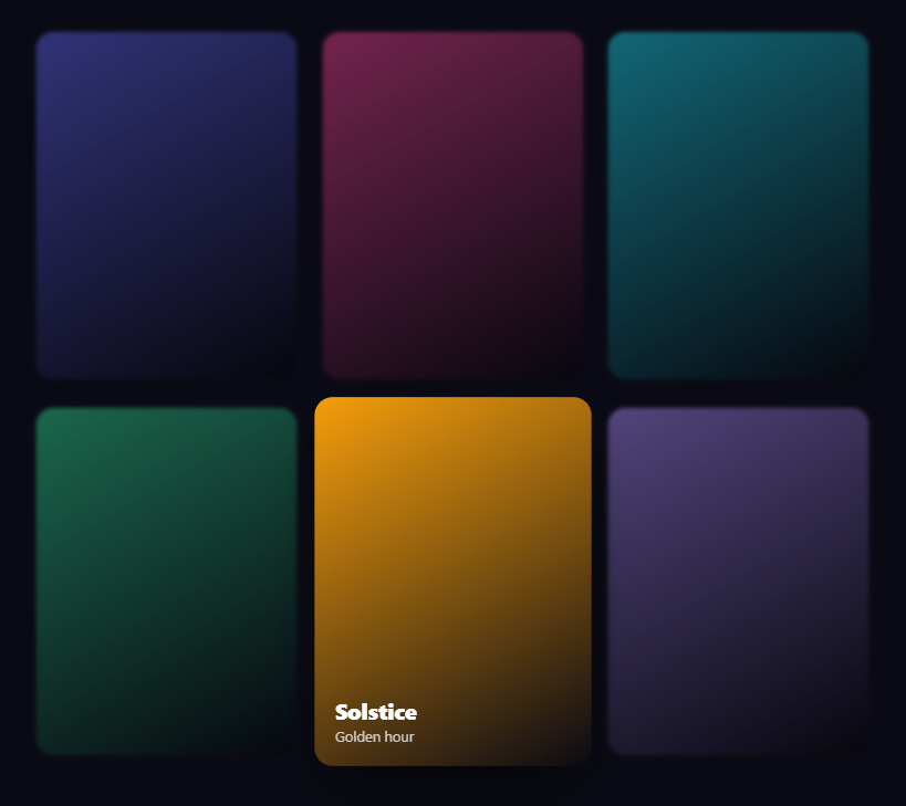
Focus cards are the grid interaction where hovering any one card sharpens and lifts it while every other card blurs and dims — pulling all attention to the one you're pointing at. It's a striking way to present a gallery, a team, or a set of features. This snippet builds it with plain HTML and CSS for the core effect, plus a little vanilla JavaScript to make it work on touch and keyboard.
The "dim the siblings" trick
The clever part is achieved entirely with CSS selector scoping. When the grid container is hovered (.fc-grid:hover), a rule blurs, darkens, and slightly shrinks every .fc-card inside it. A second, more specific rule then targets only the card actually under the cursor (.fc-card:hover) and restores it to full sharpness, scales it up, and raises its z-index and shadow. Because the hovered-card rule wins on specificity over the all-cards rule, the net effect is: everything dims except the one you're on. No JavaScript decides which card is active — the cascade does.
Captions that reveal on focus
Each card hides its title and subtitle by default at opacity: 0 and a slight downward offset. Only the focused card's .fc-meta transitions up and in, so the label appears precisely on the card you're attending to. This keeps the grid clean at rest — just colorful tiles — and surfaces information contextually, which is both elegant and reduces visual noise.
Keyboard accessibility with focus-within
The same effect is wired to keyboard navigation. Every card has tabindex="0", and the dimming rules also trigger on .fc-grid:focus-within, with the active styles applying on :focus-visible. So tabbing through the cards produces the identical blur-others-highlight-one behavior, and the caption reveals on the focused card. This means the interaction isn't mouse-only — it's fully operable from the keyboard, with the focus ring replaced by the lift-and-sharpen treatment.
Making it work on touch
Touch devices have no hover, so the JavaScript bridges the gap: tapping a card calls focus() on it, which triggers the :focus-within and :focus-visible rules and produces the same effect as hovering. Tapping empty grid space or pressing Escape blurs the active element to reset. Enter and Space also focus a card for keyboard activation. This small script is what makes the pattern usable on phones, where the pure-CSS hover version would otherwise do nothing.
Theming with a CSS variable
Each card's background is set through a --bg custom property inline, so the six gradients are data, not separate rules. Swap these for real images by setting --bg to a url() or replacing the background with an <img> — the focus logic is independent of the card's content.
Customizing it
Tune the blur(2px) and brightness(.6) for a stronger or subtler dimming, adjust the scale values for more or less lift, change the grid columns, or speed up the .4s transitions. The grid drops from three to two columns under 560px. Pair it with a pin card feature or a testimonial wall for a rich, interactive page.
Step by step
How to Use
- 1Paste HTML, CSS, and JSA grid of six colorful cards renders evenly.
- 2Hover any cardIt sharpens and lifts while the others blur and dim.
- 3See the captionThe focused card reveals its title and subtitle.
- 4Tab through themKeyboard focus produces the same blur-others effect.
- 5Tap on mobileTapping a card focuses it; tap empty space to reset.
- 6Swap in imagesSet each card's --bg to a real image.
Real-world uses
Common Use Cases
Got questions?
Frequently Asked Questions
It's pure CSS specificity. A rule on .fc-grid:hover .fc-card blurs and dims every card when the grid is hovered. A more specific rule on .fc-card:hover then restores the single card under the cursor to full sharpness and scales it up. Because the hovered-card rule outranks the all-cards rule, everything dims except the one you point at — no JavaScript picks the active card.
Yes. Every card has tabindex=0, and the dimming rules also fire on .fc-grid:focus-within with the active styles on :focus-visible. Tabbing through the cards produces the same blur-others, highlight-one behavior and reveals the focused card's caption, so the interaction is fully keyboard-operable rather than mouse-only.
The JavaScript bridges that gap. Tapping a card calls focus() on it, which triggers the focus-within and focus-visible rules and reproduces the hover effect. Tapping empty grid space or pressing Escape blurs the active element to reset, and Enter or Space also focuses a card. Without this, the CSS-only hover version would do nothing on phones.
Yes. Each card's background is set via a --bg custom property inline, so the gradients are just data. Replace --bg with a url() image, or swap the background for an <img> element inside the card. The focus, blur, and caption logic is independent of what fills the card.
Render the cards from an array with their background and labels. The hover and focus-within CSS works unchanged. Add an onClick that focuses the card element via a ref for touch, plus an Escape handler in a mount effect with cleanup. In Tailwind, use group and peer or the has-[] and focus-within variants to express the dim-siblings behavior, with blur and scale utilities.