


Glitch Text — Free HTML CSS Cyberpunk Snippet
Glitch Text Effect · Animations · Plain HTML, CSS & JS · Live preview
Copy & paste
Source Code
<div class="scene">
  <h1 class="glitch" data-text="GLITCH">GLITCH</h1>
  <p class="sub">CSS-only glitch effect using pseudo-elements and clip-path animation</p>
  <div class="btns">
    <button class="btn" onclick="setWord('GLITCH')">GLITCH</button>
    <button class="btn" onclick="setWord('ERROR')">ERROR</button>
    <button class="btn" onclick="setWord('SYSTEM')">SYSTEM</button>
    <button class="btn" onclick="setWord('BREACH')">BREACH</button>
  </div>
</div>
* { box-sizing: border-box; margin: 0; padding: 0; }
body { font-family: 'Courier New', monospace; background: #050810; display: flex; align-items: center; justify-content: center; min-height: 100vh; }
.scene { text-align: center; display: flex; flex-direction: column; align-items: center; gap: 28px; padding: 20px; }
.glitch {
font-size: clamp(48px, 12vw, 96px);
font-weight: 900;
color: #0ff;
letter-spacing: 6px;
text-transform: uppercase;
position: relative;
text-shadow: 0 0 20px rgba(0,255,255,0.4);
animation: glitch-main 2s infinite;
}
.glitch::before,
.glitch::after {
content: attr(data-text);
position: absolute; top: 0; left: 0; right: 0;
letter-spacing: 6px;
}
.glitch::before {
color: #ff2d78;
text-shadow: 0 0 12px #ff2d78;
animation: glitch-1 2s infinite;
clip-path: polygon(0 15%, 100% 15%, 100% 35%, 0 35%);
}
.glitch::after {
color: #0f0;
text-shadow: 0 0 12px #0f0;
animation: glitch-2 2s infinite;
clip-path: polygon(0 60%, 100% 60%, 100% 80%, 0 80%);
}
@keyframes glitch-main {
0%,90%,100% { transform: none; }
92% { transform: skewX(-2deg); }
94% { transform: skewX(2deg); }
96% { transform: skewX(-1deg); }
}
@keyframes glitch-1 {
0%,85%,100% { transform: none; opacity: 0; }
86% { transform: translateX(-4px) skewX(-5deg); opacity: 1; }
88% { transform: translateX(4px); opacity: 1; }
90% { transform: translateX(-2px); opacity: 1; }
92% { opacity: 0; }
}
@keyframes glitch-2 {
0%,88%,100% { transform: none; opacity: 0; }
89% { transform: translateX(4px) skewX(3deg); opacity: 1; }
91% { transform: translateX(-4px); opacity: 1; }
93% { opacity: 0; }
}
.sub { font-size: 12px; color: #334155; max-width: 380px; line-height: 1.6; font-family: system-ui, sans-serif; }
.btns { display: flex; gap: 10px; flex-wrap: wrap; justify-content: center; }
.btn { padding: 7px 16px; font-size: 12px; font-weight: 700; font-family: 'Courier New', monospace; letter-spacing: 1px; background: transparent; color: #0ff5; border: 1px solid #0ff2; border-radius: 4px; cursor: pointer; transition: all 0.15s; }
.btn:hover { border-color: #0ff; color: #0ff; background: rgba(0,255,255,0.05); }function setWord(w) {
const el = document.querySelector('.glitch');
el.textContent = w;
el.dataset.text = w;
}Extend with AI
Take This Snippet Further With AI
The AI prompt for this one is for Patreon supporters ($3 a month, 7 days free), along with a site with no ads. Supporters enter the passcode once and it is remembered in this browser.
What's included
Features
About this UI Snippet
Glitch Text — ::before/::after Layered Copies, clip-path Slices & Channel Offset
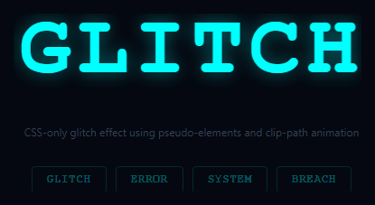
The glitch text effect simulates digital signal corruption — the text appears to tear apart into colour-separated layers that momentarily misalign. Used on cyberpunk interfaces (pair it with matrix rain and neon glow buttons), gaming titles, error screens, and dark-themed products communicating disruption.
The effect uses three layers: the original .glitch element, .glitch::before, and .glitch::after. Both pseudo-elements display the same text via content: attr(data-text) — the same value set on the element in the HTML. All three layers are absolutely positioned on top of each other.
CSS @keyframes glitch-1 and glitch-2 apply different clip-path: rect() values to each pseudo-element at different frames, slicing each into horizontal strips. translateX() and scaleX() offsets separate the cyan (::before) and red (::after) colour channels, mimicking RGB misalignment in a corrupted video signal.
The setWord(w) JS function updates both element textContent and dataset.text simultaneously to keep the pseudo-element content in sync.
The CSS animation mechanics
Two ::before and ::after pseudo-elements are stacked on top of the base text using position: absolute; inset: 0. Each has content: attr(data-text) to display the same text. They use clip-path: rect(Npx, 9999px, Mpx, 0) to show only a horizontal slice of the text at a time — this creates the "torn apart lines" look. CSS keyframes shift the slices at different random offsets: transform: translate(-2px, 3px) and transform: translate(3px, -2px). The red and cyan colour shift uses text-shadow and mix-blend-mode: screen to simulate RGB channel separation.
The animation timing
The glitch animation runs in short bursts: steps() timing with very fast keyframes (0.08s total) creates a jerky, digital corruption feel rather than a smooth animation. Using animation-iteration-count: infinite with random-length pauses (via multiple steps in the keyframe) simulates the irregular nature of actual digital glitches.
Adding glitch to any element
The snippet uses data-text attribute to clone content into pseudo-elements — this is the only technique that works for CSS-only text duplication. Add data-text="Your text" to any element and apply the glitch CSS class. Dynamic text changes need the data-text attribute updated via JavaScript: el.dataset.text = el.textContent.
Triggering glitch on hover vs continuous
The snippet animates continuously by default. For a hover-only glitch, add animation-play-state: paused to the base state and animation-play-state: running on :hover. This triggers the glitch only when the user mouses over the text — a common pattern for interactive headings on portfolio sites.
Step by step
How to Use
- 1Watch the glitch animateThe text glitches continuously via CSS keyframes. Click the phrase buttons to swap to a different word and watch the glitch animate the new text.
- 2Update the wordsIn the HTML panel, change the button labels and the onclick setWord() arguments to your own phrases.
- 3Change the glitch coloursUpdate color on .glitch::before (cyan) and .glitch::after (red) in the CSS panel to any colour pair.
- 4Adjust glitch intensityIn the CSS keyframes, increase the translateX values and clip-path rect offsets for more aggressive glitching.
- 5Pause the animation on hoverAdd .glitch:hover { animation-play-state: paused } to freeze the glitch on hover.
- 6Export in your formatClick "HTML" for a standalone file, "JSX" for a React component, or "Tailwind" for a React + Tailwind version.
Real-world uses
Common Use Cases
Got questions?
Frequently Asked Questions
.glitch::before and .glitch::after are absolutely positioned on top of the original element. Both use content: attr(data-text) which reads the data-text HTML attribute — the same value as the element's textContent. All three layers overlap perfectly until the keyframe animations offset them.
CSS pseudo-elements cannot read their parent's textContent directly. data-text is an HTML attribute that mirrors the text, and content: attr(data-text) reads it. setWord(w) updates both el.textContent and el.dataset.text simultaneously to keep them in sync.
clip-path: rect(top, right, bottom, left) clips the element to a rectangle. Different rect() values in the keyframes create the horizontal slice effect — each pseudo-element shows only a specific band of the text at any given keyframe, creating the torn-apart appearance.
Remove the animation property from .glitch, .glitch::before, and .glitch::after. Add .glitch:hover, .glitch:hover::before, .glitch:hover::after { animation: ... }. The glitch fires only when hovered and stops when the cursor leaves.
In the keyframe percentages, make most of the animation frames have no transform applied: 0%,2%,4%,100% { ... } with only 1% and 3% having the glitch transforms. This makes the glitch occur only briefly at those percentages — 98% of the time the text is stable.
Yes. Manage the displayed word in useState. Set both the element text and data-text via React: <h1 className="glitch" data-text={word}>{word}</h1>. The CSS animations work without any React changes. To cycle words, use a setInterval that updates the word state.