

Interact.js Draggable and Resizable Dashboard Panels with Snapping
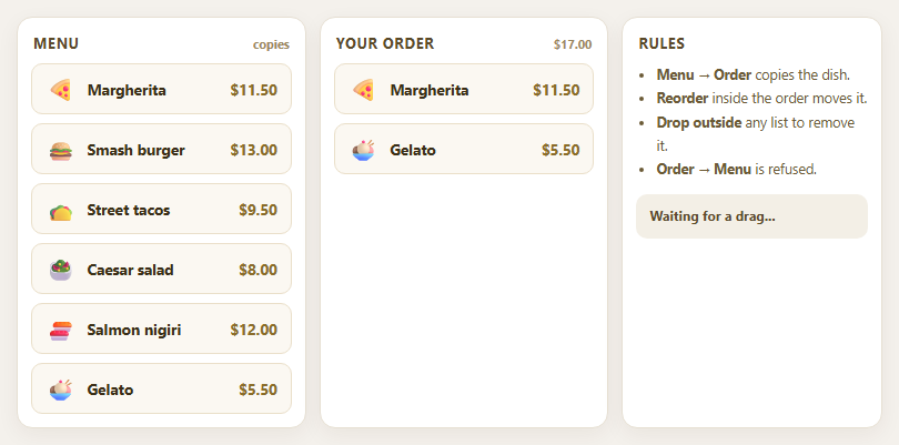
Dragula Copy vs Move Lists with Spill Control

SortableJS Shared Groups: Clone from a Palette into a Page Builder

SortableJS Drag Handle with Pinned and Locked Rows
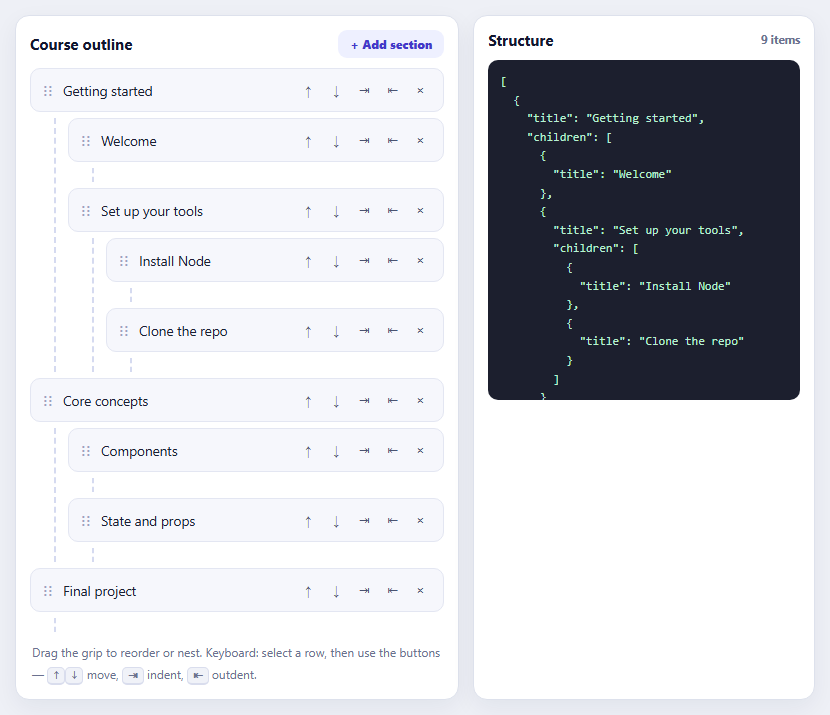
SortableJS Nested Sortable Tree with Keyboard Controls
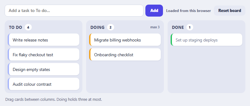
SortableJS Multi-List Kanban with Persistence and WIP Limit
Goal Progress Ring — Free Editable Circular Progress Snippet
Goal Progress Ring · Dashboards · Plain HTML, CSS & JS · Live preview
Copy & paste
Source Code
<div class="gpr-card">
  <h2 class="gpr-title">Fundraising Goal</h2>
  <div class="gpr-ring-wrap">
    <svg class="gpr-ring" viewBox="0 0 200 200" id="gprRing">
      <circle class="gpr-track" cx="100" cy="100" r="86"></circle>
      <circle class="gpr-fill" id="gprFill" cx="100" cy="100" r="86"></circle>
    </svg>
    <div class="gpr-center">
      <span class="gpr-pct" id="gprPct">0%</span>
      <span class="gpr-badge" id="gprBadge">In progress</span>
    </div>
  </div>
  <div class="gpr-amounts">
    <span class="gpr-current" id="gprCurrentLabel">$3,200</span>
    <span class="gpr-of">of</span>
    <span class="gpr-goal" id="gprGoalLabel">$5,000</span>
  </div>
  <div class="gpr-controls">
    <label class="gpr-field">
      <span>Current amount</span>
      <input type="number" id="gprCurrentInput" value="3200" min="0" step="50">
    </label>
    <label class="gpr-field">
      <span>Goal amount</span>
      <input type="number" id="gprGoalInput" value="5000" min="1" step="50">
    </label>
  </div>
</div>*{box-sizing:border-box}
body{font-family:system-ui,-apple-system,sans-serif;background:#0f1117;min-height:100vh;display:flex;align-items:center;justify-content:center;padding:24px}
.gpr-card{font-family:system-ui,-apple-system,sans-serif;background:#0f1117;color:#e9ebf5;border:1px solid #262a3b;border-radius:18px;padding:26px;max-width:340px;margin:0 auto;text-align:center}
.gpr-title{font-size:16px;margin:0 0 18px;font-weight:700}
.gpr-ring-wrap{position:relative;width:200px;height:200px;margin:0 auto}
.gpr-ring{width:100%;height:100%;transform:rotate(-90deg)}
.gpr-track{fill:none;stroke:#1c2033;stroke-width:14}
.gpr-fill{fill:none;stroke:#6366f1;stroke-width:14;stroke-linecap:round;stroke-dasharray:540.35;stroke-dashoffset:540.35;transition:stroke-dashoffset .5s cubic-bezier(.2,.8,.2,1),stroke .4s ease}
.gpr-fill.gpr-complete{stroke:#4ade80}
.gpr-center{position:absolute;inset:0;display:flex;flex-direction:column;align-items:center;justify-content:center;gap:6px}
.gpr-pct{font-size:32px;font-weight:800;letter-spacing:-.02em}
.gpr-badge{font-size:10px;font-weight:700;letter-spacing:.04em;text-transform:uppercase;color:#a8adc4;background:#1c2033;padding:4px 10px;border-radius:999px;transition:background .3s ease,color .3s ease}
.gpr-badge.gpr-complete{color:#0c1a10;background:#4ade80}
.gpr-amounts{margin-top:16px;font-size:15px;color:#c7cae0}
.gpr-current{font-weight:800;color:#f2f3fa}
.gpr-of{color:#6b7090;margin:0 6px;font-size:12px}
.gpr-goal{font-weight:700}
.gpr-controls{display:flex;gap:10px;margin-top:20px}
.gpr-field{flex:1;display:flex;flex-direction:column;gap:5px;text-align:left}
.gpr-field span{font-size:11px;color:#8b90a8}
.gpr-field input{width:100%;padding:8px 10px;border-radius:8px;border:1px solid #262a3b;background:#161927;color:#f2f3fa;font-size:13px}
.gpr-field input:focus{outline:none;border-color:#6366f1}var RADIUS = 86;
var CIRCUMFERENCE = 2 * Math.PI * RADIUS; // ~540.35, matches the CSS dasharray
var fill = document.getElementById('gprFill');
var pctEl = document.getElementById('gprPct');
var badgeEl = document.getElementById('gprBadge');
var currentLabel = document.getElementById('gprCurrentLabel');
var goalLabel = document.getElementById('gprGoalLabel');
var currentInput = document.getElementById('gprCurrentInput');
var goalInput = document.getElementById('gprGoalInput');
function formatCurrency(n) {
return '$' + Math.round(n).toLocaleString('en-US');
}
function update() {
var current = Math.max(0, Number(currentInput.value) || 0);
var goal = Math.max(1, Number(goalInput.value) || 1);
var ratio = Math.min(current / goal, 1); // cap the ring fill at 100%
var pct = Math.round(ratio * 100);
var offset = CIRCUMFERENCE * (1 - ratio);
fill.style.strokeDashoffset = offset;
pctEl.textContent = pct + '%';
currentLabel.textContent = formatCurrency(current);
goalLabel.textContent = formatCurrency(goal);
var complete = current >= goal;
fill.classList.toggle('gpr-complete', complete);
badgeEl.classList.toggle('gpr-complete', complete);
badgeEl.textContent = complete ? 'Goal reached!' : 'In progress';
}
currentInput.addEventListener('input', update);
goalInput.addEventListener('input', update);
update();Extend with AI
Take This Snippet Further With AI
The AI prompt for this one is for Patreon supporters ($3 a month, 7 days free), along with a site with no ads. Supporters enter the passcode once and it is remembered in this browser.
What's included
Features
About this UI Snippet
Goal Progress Ring — Live-Editable Circular Progress Toward a Target
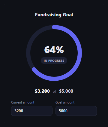
The goal progress ring is the fundraising and target-tracking widget that turns "$3,200 of $5,000 raised" into an instantly readable circle — the ring's fill proportion communicates progress before anyone reads a single number. This snippet builds a fully interactive version in plain HTML, CSS, and JavaScript using an SVG stroke-dashoffset ring.
How the ring fill actually works
The ring is an SVG circle with stroke-dasharray set to its full circumference (2 * Math.PI * 86 \u2248 540.35) and stroke-dashoffset animated to control how much of that dash is visible. update() computes ratio = current / goal (capped at 1 so overachieving a goal doesn't overflow the ring), then sets offset = CIRCUMFERENCE * (1 - ratio) — at ratio 0 the full circumference is offset (empty ring), at ratio 1 the offset is 0 (fully filled ring). The CSS transition on stroke-dashoffset makes every change animate smoothly rather than snapping.
Live-editable inputs
Two number inputs — current amount and goal amount — drive everything. Typing in either fires update() on the input event, so the ring fill, the center percentage, and the "$X of $Y" labels all recompute and animate in real time as you type, not just on blur or submit.
Celebratory completion state
When current >= goal, the ring's stroke color and the status badge both switch to green and the badge text changes to "Goal reached!" — a clear but restrained celebration (color and copy change, no confetti or overlay) that keeps the widget usable as a persistent dashboard element rather than a one-time animation.
Currency formatting
formatCurrency() uses toLocaleString('en-US') so amounts render with proper thousands separators regardless of how large the input numbers get.
Customizing it
Swap dollar amounts for any unit (steps, subscribers, pages read), change the ring's color or thickness, or make the inputs read-only and drive the ring from a live API value instead. Pair it with gradient stat ring, progress circle steps, or activity rings for a fuller goals dashboard.
Step by step
How to Use
- 1Paste HTML, CSS, and JSThe ring renders filled to the default current/goal ratio.
- 2Edit the current-amount inputThe ring fill, percentage, and label update live.
- 3Edit the goal-amount inputThe ratio recalculates against the new target.
- 4Reach or exceed the goalThe ring and badge switch to a green complete state.
- 5Swap the unitChange formatCurrency() to format steps, points, or any metric.
Real-world uses
Common Use Cases
stroke-dashoffset fill.Got questions?
Frequently Asked Questions
It uses SVG stroke-dasharray set to the circle's full circumference and stroke-dashoffset to hide part of that dash. The JS computes ratio = current / goal, then sets offset = circumference * (1 - ratio) — an offset of 0 shows the full ring, an offset equal to the circumference shows none of it. A CSS transition animates the offset change smoothly.
The ratio is capped at 1 with Math.min(current / goal, 1), so the ring never fills past a full circle even if someone enters a current amount greater than the goal. The percentage and complete state still reflect the real numbers — the badge switches to "Goal reached!" as soon as current >= goal.
No — by design it's restrained: the ring's stroke color and the status badge both switch to green with updated copy ("Goal reached!"), with no confetti or animated overlay. That keeps it usable as a persistent dashboard widget rather than a one-time celebration effect that gets stale on repeat views.
Yes — replace formatCurrency() with whatever formatting your unit needs (or none at all), and update the input labels and title text. The ring-fill math (ratio, dashoffset) is unit-agnostic and works the same for any two numbers.
Move current and goal into component state, compute ratio and offset the same way in a derived value, and bind stroke-dashoffset as an inline style or SVG attribute bound to that computed value instead of writing to the DOM directly on input events.