

Quill Rich Text Editor with Custom Toolbar and Character Limit

CodeMirror JSON Editor with Validation Gutter
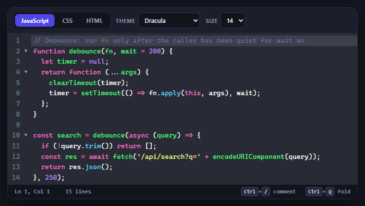
CodeMirror Code Editor with Line Numbers, Folding and Themes

Marked + DOMPurify Live Markdown Preview
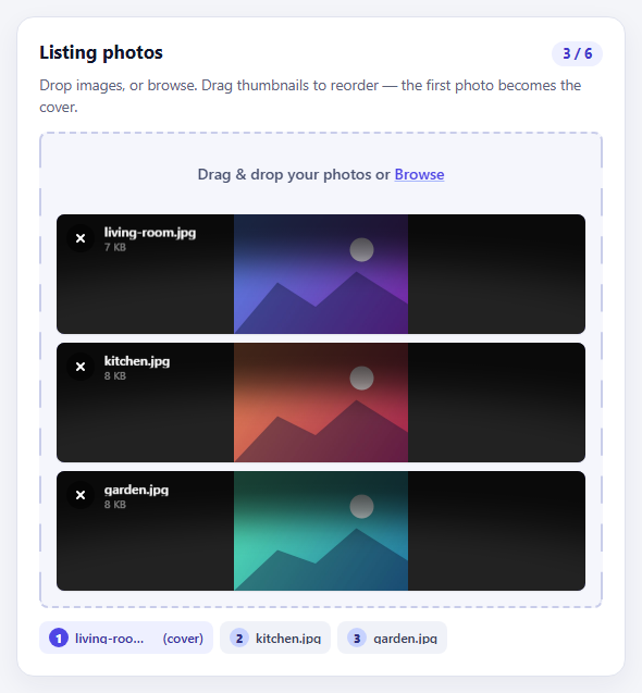
FilePond Image Upload with Preview and Reorder

Cropper.js Aspect-Ratio Presets for Social Posts
Gradient Picker — CSS Linear Gradient Builder
Gradient Picker · Forms · Plain HTML, CSS & JS · Live preview
Copy & paste
Source Code
<div class="gp-card">
  <div class="gp-preview" id="gpPreview"></div>
  <div class="gp-bar" id="gpBar">
    <div class="gp-stops" id="gpStops"></div>
  </div>
  <div class="gp-row">
    <label class="gp-angle">Angle <strong id="gpAngVal">90°</strong>
      <input type="range" id="gpAngle" min="0" max="360" value="90">
    </label>
    <input type="color" id="gpColor" value="#6366f1" aria-label="Stop color">
    <button type="button" class="gp-del" id="gpDel" title="Delete stop">Delete</button>
  </div>
  <code class="gp-css" id="gpCss"></code>
</div>*{box-sizing:border-box;margin:0;padding:0}
body{font-family:system-ui,-apple-system,sans-serif;background:#0f172a;color:#e2e8f0;display:flex;justify-content:center;padding:32px 18px}
.gp-card{background:#1e293b;border:1px solid #334155;border-radius:16px;padding:16px;width:100%;max-width:380px}
.gp-preview{height:120px;border-radius:12px;border:1px solid #334155;margin-bottom:14px}
.gp-bar{position:relative;height:26px;border-radius:7px;margin-bottom:14px;cursor:copy;border:1px solid #334155;background-image:linear-gradient(45deg,#334155 25%,transparent 25%),linear-gradient(-45deg,#334155 25%,transparent 25%),linear-gradient(45deg,transparent 75%,#334155 75%),linear-gradient(-45deg,transparent 75%,#334155 75%);background-size:10px 10px;background-position:0 0,0 5px,5px -5px,-5px 0}
.gp-stops{position:absolute;inset:0;border-radius:6px}
.gp-stop{position:absolute;top:50%;width:16px;height:16px;border-radius:50%;border:2px solid #fff;transform:translate(-50%,-50%);cursor:grab;box-shadow:0 1px 4px rgba(0,0,0,.5)}
.gp-stop.is-sel{outline:2px solid #fff;outline-offset:2px}
.gp-stop:active{cursor:grabbing}
.gp-row{display:flex;align-items:center;gap:10px;margin-bottom:12px}
.gp-angle{flex:1;font-size:11.5px;font-weight:700;color:#94a3b8;display:flex;flex-direction:column;gap:4px}
.gp-angle strong{color:#e2e8f0}
.gp-angle input{accent-color:#6366f1}
.gp-row input[type=color]{width:34px;height:30px;border:none;background:none;padding:0;cursor:pointer}
.gp-del{background:#0f172a;border:1px solid #334155;color:#f87171;border-radius:8px;padding:6px 10px;font-size:11.5px;font-weight:700;cursor:pointer;font-family:inherit}
.gp-del:hover{border-color:#ef4444}
.gp-css{display:block;background:#0f172a;border:1px solid #334155;border-radius:8px;padding:9px 12px;font-family:ui-monospace,monospace;font-size:11px;color:#7dd3fc;cursor:pointer;word-break:break-all;line-height:1.5}var stops = [ { pos:0, color:'#6366f1' }, { pos:100, color:'#22d3ee' } ];
var angle = 90, selected = 0;
var bar = document.getElementById('gpBar');
var stopsWrap = document.getElementById('gpStops');
var preview = document.getElementById('gpPreview');
var cssEl = document.getElementById('gpCss');
var colorInput = document.getElementById('gpColor');
var angleInput = document.getElementById('gpAngle');
var angleVal = document.getElementById('gpAngVal');
function cssGradient(forBar) {
var sorted = stops.slice().sort(function (a, b) { return a.pos - b.pos; });
var list = sorted.map(function (s) { return s.color + ' ' + Math.round(s.pos) + '%'; }).join(', ');
return 'linear-gradient(' + (forBar ? '90deg' : angle + 'deg') + ', ' + list + ')';
}
function render() {
preview.style.background = cssGradient(false);
stopsWrap.style.background = cssGradient(true);
stopsWrap.innerHTML = '';
stops.forEach(function (s, i) {
var el = document.createElement('div');
el.className = 'gp-stop' + (i === selected ? ' is-sel' : '');
el.style.left = s.pos + '%';
el.style.background = s.color;
el.addEventListener('pointerdown', function (e) { e.stopPropagation(); selected = i; colorInput.value = s.color; drag(i, e); render(); });
stopsWrap.appendChild(el);
});
cssEl.textContent = 'background: ' + cssGradient(false) + ';';
colorInput.value = stops[selected].color;
}
function posFromX(clientX) {
var r = bar.getBoundingClientRect();
return Math.max(0, Math.min(100, (clientX - r.left) / r.width * 100));
}
function drag(i, startEvt) {
function mv(e) { stops[i].pos = posFromX(e.clientX); render(); }
function up() { document.removeEventListener('pointermove', mv); document.removeEventListener('pointerup', up); }
document.addEventListener('pointermove', mv);
document.addEventListener('pointerup', up);
}
bar.addEventListener('click', function (e) {
if (e.target.classList.contains('gp-stop')) return;
stops.push({ pos: posFromX(e.clientX), color: stops[selected].color });
selected = stops.length - 1;
render();
});
colorInput.addEventListener('input', function () { stops[selected].color = colorInput.value; render(); });
angleInput.addEventListener('input', function () { angle = parseInt(angleInput.value, 10); angleVal.textContent = angle + '\u00b0'; render(); });
document.getElementById('gpDel').addEventListener('click', function () { if (stops.length > 2) { stops.splice(selected, 1); selected = 0; render(); } });
cssEl.addEventListener('click', function () { navigator.clipboard && navigator.clipboard.writeText(cssEl.textContent); });
render();Extend with AI
Take This Snippet Further With AI
The AI prompt for this one is for Patreon supporters ($3 a month, 7 days free), along with a site with no ads. Supporters enter the passcode once and it is remembered in this browser.
What's included
Features
About this UI Snippet
Gradient Picker — Draggable Color Stops and Angle to CSS

A gradient picker lets you build a CSS linear-gradient visually — drag colour stops along a bar, pick each stop's colour, set the angle, and copy the result. It's the core of any theme editor or design tool's gradient control. This snippet builds a complete one with draggable stops, click-to-add, delete, and live output, in plain HTML, CSS, and vanilla JavaScript.
Stops as data, rendered to a bar
The gradient is an array of { pos, color } stops. The editor renders a preview, a gradient bar (always shown at 90° so the stop positions map directly to the bar's left-to-right axis regardless of the chosen output angle), and a draggable handle per stop. Sorting the stops by position when building the CSS means you can drag stops past each other freely without breaking the output.
Drag, add, and delete
Dragging a handle updates its position live via Pointer Events with document-level tracking (so the drag continues outside the bar). Clicking an empty part of the bar adds a new stop there, inheriting the selected colour, and a delete button removes the selected stop (keeping a minimum of two). The selected stop is highlighted and bound to the colour input, so picking a colour recolours exactly the handle you're working on.
Angle and live CSS
A range slider sets the gradient angle (0–360°) for the output, shown live on the preview while the editing bar stays horizontal for predictable stop placement. The generated background: linear-gradient(…) string updates on every change and is one click to copy — paste-ready CSS, no manual typing of percentages.
A checkerboard for transparency
The bar sits on a CSS checkerboard so semi-transparent stops read correctly (if you extend it to support alpha), the same affordance every colour tool uses. The preview shows the real angled gradient as it will appear in your UI.
Self-contained and portable
The whole picker is the stops array, a render function, and pointer handlers, with no dependencies. Swap the initial stops, restyle the handles, or wire the output into your theme state — it's a clean reference for the gradient-editor pattern that design tools and CSS generators are built around.
Step by step
How to Use
- 1Paste HTML, CSS, and JSA gradient picker renders with two stops and a preview.
- 2Drag the stopsMove handles along the bar to reposition colors.
- 3Add and recolorClick the bar to add a stop; use the color input to recolor the selected one.
- 4Set the angleDrag the angle slider to rotate the gradient.
- 5Delete a stopRemove the selected stop (a minimum of two remain).
- 6Copy the CSSClick the output to copy the linear-gradient declaration.
Real-world uses
Common Use Cases
linear-gradient.Got questions?
Frequently Asked Questions
The bar represents stop positions from 0% to 100% along the gradient line, which is one-dimensional regardless of angle. Keeping the bar at 90° (horizontal) means a handle's left position maps directly to its percentage, so dragging is predictable. The angle only affects the output and the preview, where the real rotated gradient is shown — separating editing axis from display angle is how gradient tools stay usable.
Click an empty part of the gradient bar to add a stop at that position (it inherits the currently selected color), and use the delete button to remove the selected stop. A minimum of two stops is enforced because a gradient needs at least two colors. The selected stop is highlighted and bound to the color input so recoloring affects the right handle.
Yes. You can drag any stop past another freely; when building the CSS the stops are sorted by position, so the output is always valid even if the array order does not match the visual order. This lets you reorder colors by dragging without any special handling.
The picker outputs a ready-to-paste declaration like background: linear-gradient(90deg, #6366f1 0%, #22d3ee 100%); and clicking it copies it to the clipboard. You can paste that into CSS, a style attribute, or a CSS-in-JS value. To bind it to app state instead, read the stops array and angle and build the string yourself.
Hold the stops array, angle, and selected index in state and render the bar, handles, preview, and CSS string from them. Move the pointer drag into handlers that update state (attach window listeners in an effect and clean them up). Emit the gradient string via a callback or v-model so a parent theme store can consume it. Tailwind users swap the classes for utilities.