




Half-Star Rating Input — Free HTML CSS JS Precision Star Widget
Half-Star Rating Input · Forms · Plain HTML, CSS & JS · Live preview
Copy & paste
Source Code
<div class="hsr-card">
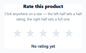
  <h3>Rate this product</h3>
  <p class="hsr-sub">Click anywhere on a star — the left half sets a half rating, the right half sets a full one.</p>
  <div class="hsr-stars" id="hsrStars" role="slider" tabindex="0" aria-label="Star rating" aria-valuemin="0" aria-valuemax="5" aria-valuenow="0">
    <span class="hsr-star" data-index="0"><span class="hsr-fill"></span></span>
    <span class="hsr-star" data-index="1"><span class="hsr-fill"></span></span>
    <span class="hsr-star" data-index="2"><span class="hsr-fill"></span></span>
    <span class="hsr-star" data-index="3"><span class="hsr-fill"></span></span>
    <span class="hsr-star" data-index="4"><span class="hsr-fill"></span></span>
  </div>
  <p class="hsr-value" id="hsrValue">No rating yet</p>
</div>*{box-sizing:border-box;margin:0;padding:0}
body{font-family:system-ui,-apple-system,sans-serif;background:#f8fafc;min-height:100vh;display:flex;align-items:center;justify-content:center;padding:24px}
.hsr-card{background:#fff;border-radius:16px;padding:28px 32px;width:100%;max-width:360px;text-align:center;box-shadow:0 4px 24px rgba(15,23,42,.08)}
.hsr-card h3{font-size:16px;font-weight:800;color:#0f172a;margin-bottom:6px}
.hsr-sub{font-size:12px;color:#64748b;line-height:1.5;margin-bottom:18px}
.hsr-stars{display:inline-flex;gap:6px;cursor:pointer;outline:none}
.hsr-stars:focus-visible .hsr-star{outline:2px solid #6366f1;outline-offset:3px;border-radius:4px}
.hsr-star{position:relative;width:38px;height:38px;color:#e2e8f0}
.hsr-star::before{content:'★';position:absolute;inset:0;font-size:38px;line-height:38px;color:#e2e8f0}
.hsr-fill{position:absolute;inset:0;width:0%;overflow:hidden;white-space:nowrap}
.hsr-fill::before{content:'★';font-size:38px;line-height:38px;color:#f59e0b}
.hsr-value{margin-top:14px;font-size:13px;font-weight:700;color:#334155}(function(){
var wrap = document.getElementById('hsrStars');
var stars = Array.prototype.slice.call(wrap.querySelectorAll('.hsr-star'));
var valueEl = document.getElementById('hsrValue');
var current = 0; // committed rating, e.g. 3.5
var hovering = false;
function render(rating) {
stars.forEach(function (star, i) {
var fill = star.querySelector('.hsr-fill');
var diff = rating - i; // how much of this star should be filled, 0..1
var pct = Math.max(0, Math.min(1, diff)) * 100;
fill.style.width = pct + '%';
});
}
function ratingFromEvent(e) {
var star = e.target.closest('.hsr-star');
if (!star) return null;
var index = Number(star.getAttribute('data-index'));
var rect = star.getBoundingClientRect();
var x = e.clientX - rect.left;
var half = x < rect.width / 2;
return index + (half ? 0.5 : 1);
}
wrap.addEventListener('mousemove', function (e) {
var r = ratingFromEvent(e);
if (r === null) return;
hovering = true;
render(r);
});
wrap.addEventListener('mouseleave', function () {
hovering = false;
render(current);
});
wrap.addEventListener('click', function (e) {
var r = ratingFromEvent(e);
if (r === null) return;
current = r;
render(current);
updateValue();
});
wrap.addEventListener('keydown', function (e) {
var step = 0.5;
if (e.key === 'ArrowRight' || e.key === 'ArrowUp') { current = Math.min(5, current + step); }
else if (e.key === 'ArrowLeft' || e.key === 'ArrowDown') { current = Math.max(0, current - step); }
else { return; }
e.preventDefault();
render(current);
updateValue();
});
function updateValue() {
wrap.setAttribute('aria-valuenow', String(current));
valueEl.textContent = current === 0 ? 'No rating yet' : current.toFixed(1) + ' out of 5 stars';
}
})();Extend with AI
Take This Snippet Further With AI
The AI prompt for this one is for Patreon supporters ($3 a month), along with a site with no ads. Supporters enter the passcode once and it is remembered in this browser.
What's included
Features
About this UI Snippet
Half-Star Rating Input — Pointer-Position Detection with a CSS Overlay Fill
Most star rating widgets only support whole-number values, but many review systems — app stores, product marketplaces, hotel booking sites — need half-star precision (3.5 out of 5, not just 3 or 4). This snippet implements that with a simple two-layer star technique and pointer-position math, no icon font or SVG masking library required.
Two stacked stars, not five discrete icons
Each .hsr-star renders a gray background star via ::before { content: '★' }, with a second, absolutely-positioned .hsr-fill element stacked exactly on top rendering the same character in gold. .hsr-fill starts at width: 0% with overflow: hidden, so only the portion of the gold star within that width is visible — clipping a full star glyph down to a partial fill is just a matter of animating that width between 0% and 100%.
Detecting which half was clicked
ratingFromEvent() reads e.clientX - rect.left to get the cursor's x-position relative to the star's own bounding box, then compares it against rect.width / 2: var half = x < rect.width / 2. Combined with the star's zero-based index, this produces a rating of index + 0.5 for a left-half click or index + 1 for a right-half click — the same math whether the event comes from a live click or a hover preview.
One render function drives both hover and committed state
render(rating) loops every star and computes diff = rating - i, clamping it to the 0–1 range with Math.max(0, Math.min(1, diff)) before converting to a percentage. A rating of 3.5 against star index 3 gives a diff of 0.5 (half-filled), against index 2 gives 1 (fully filled), and against index 4 gives a negative diff clamped to 0 (empty) — one formula naturally produces full, half, and empty stars for any rating value.
Keyboard access via ARIA slider semantics
The wrapper carries role="slider", aria-valuemin, aria-valuemax, and a live-updated aria-valuenow, with arrow-key handlers stepping the rating by 0.5 in either direction — matching the interaction model screen reader users expect from a slider, not just a decorative row of icons.
Customizing it
Change the star glyph to an SVG or icon font by swapping the content: '★' rule, adjust the step size for quarter-star precision, or wire updateValue() to submit the rating to your backend on commit.
Step by step
How to Use
- 1Paste HTML, CSS, and JSA 5-star input renders with no rating selected and a "No rating yet" label.
- 2Hover across a starThe fill preview updates live, showing a half-fill on the left half and a full fill on the right half of each star.
- 3Click to commitThe clicked position sets the rating, and the label updates to show the exact value like "3.5 out of 5 stars".
- 4Use the keyboardTab to focus the widget, then use the arrow keys to adjust the rating in 0.5-point steps.
- 5Change the step sizeIn the JS, edit the step variable in the keydown handler and the half/1 branch in ratingFromEvent() for quarter-star precision.
- 6Wire up submissionIn updateValue(), add a fetch() call to persist the rating once the user commits a value.
Real-world uses
Common Use Cases
Got questions?
Frequently Asked Questions
ratingFromEvent() reads the click's x-coordinate relative to the star's own bounding box with e.clientX - rect.left, then checks whether that position is less than half the star's width. A left-half click adds 0.5 to the star's index; a right-half click adds 1, producing the half or full rating.
Each star is two stacked ★ characters — a gray one behind, and a gold one in an absolutely positioned .hsr-fill element with overflow: hidden and a width set as a percentage. Setting that width to 50% clips the gold star glyph to reveal only its left half, giving a visually correct half-fill using plain CSS.
For each star, it computes diff = rating - starIndex, then clamps that to the 0–1 range with Math.max(0, Math.min(1, diff)) before converting to a percentage width. A rating of 3.5 gives full stars 0–2 a diff ≥ 1 (clamped to 100%), star 3 a diff of 0.5 (50% fill), and star 4 a negative diff (clamped to 0%).
Yes. The wrapper has tabindex="0" and role="slider" with aria-valuemin/max/now, and a keydown listener lets Arrow Right/Up increase and Arrow Left/Down decrease the rating in 0.5-point steps, updating both the visual fill and the announced ARIA value.
In ratingFromEvent(), replace the single width/2 comparison with a check against width/4 and width/2 and 3*width/4 to produce four possible fractional increments per star, and change the step constant in the keydown handler from 0.5 to 0.25 to match.