


Horizontal Timeline — Free HTML CSS JS Snippet
Horizontal Timeline · Layouts · Plain HTML, CSS & JS · Live preview
Copy & paste
Source Code
<div class="wrap">
  <div class="timeline-head">
    <h2 class="tl-title">Product roadmap</h2>
    <div class="tl-controls">
      <button class="tl-nav" onclick="scrollTl(-1)" aria-label="Previous">‹</button>
      <button class="tl-nav" onclick="scrollTl(1)"  aria-label="Next">›</button>
    </div>
  </div>

  <div class="tl-scroll" id="tl-scroll">
    <div class="tl-track" id="tl-track">
      <!-- Connecting line -->
      <div class="tl-line"></div>

      <div class="tl-item done" data-date="Q1 2025">
        <div class="tl-dot"><svg width="10" height="10" viewBox="0 0 24 24" fill="none" stroke="currentColor" stroke-width="3" stroke-linecap="round"><polyline points="20 6 9 17 4 12"/></svg></div>
        <div class="tl-card">
          <div class="tl-date">Q1 2025</div>
          <div class="tl-event">Foundation</div>
          <div class="tl-desc">Core infrastructure, auth system, and basic dashboard.</div>
        </div>
      </div>

      <div class="tl-item done" data-date="Q2 2025">
        <div class="tl-dot"><svg width="10" height="10" viewBox="0 0 24 24" fill="none" stroke="currentColor" stroke-width="3" stroke-linecap="round"><polyline points="20 6 9 17 4 12"/></svg></div>
        <div class="tl-card">
          <div class="tl-date">Q2 2025</div>
          <div class="tl-event">Collaboration</div>
          <div class="tl-desc">Team workspaces, real-time editing, and comment threads.</div>
        </div>
      </div>

      <div class="tl-item active" data-date="Q3 2025">
        <div class="tl-dot pulse"></div>
        <div class="tl-card current">
          <div class="tl-badge">Current</div>
          <div class="tl-date">Q3 2025</div>
          <div class="tl-event">Analytics</div>
          <div class="tl-desc">Usage dashboards, custom reports, and data export.</div>
        </div>
      </div>

      <div class="tl-item upcoming" data-date="Q4 2025">
        <div class="tl-dot"></div>
        <div class="tl-card">
          <div class="tl-date">Q4 2025</div>
          <div class="tl-event">Integrations</div>
          <div class="tl-desc">Slack, GitHub, Jira, and 30+ third-party connectors.</div>
        </div>
      </div>

      <div class="tl-item upcoming" data-date="Q1 2026">
        <div class="tl-dot"></div>
        <div class="tl-card">
          <div class="tl-date">Q1 2026</div>
          <div class="tl-event">Mobile Apps</div>
          <div class="tl-desc">Native iOS and Android apps with offline support.</div>
        </div>
      </div>

      <div class="tl-item upcoming" data-date="Q2 2026">
        <div class="tl-dot"></div>
        <div class="tl-card">
          <div class="tl-date">Q2 2026</div>
          <div class="tl-event">AI Features</div>
          <div class="tl-desc">Smart suggestions, auto-tagging, and workflow automation.</div>
        </div>
      </div>

    </div>
  </div>

  <div class="tl-progress">
    <div class="tl-prog-fill" id="tl-prog-fill"></div>
  </div>
</div>
* { box-sizing: border-box; margin: 0; padding: 0; }
body { font-family: system-ui, sans-serif; background: #f8fafc; min-height: 100vh; display: flex; align-items: center; justify-content: center; padding: 32px 24px; }
.wrap { width: 100%; max-width: 860px; display: flex; flex-direction: column; gap: 16px; }
.timeline-head { display: flex; justify-content: space-between; align-items: center; }
.tl-title { font-size: 18px; font-weight: 800; color: #0f172a; }
.tl-controls { display: flex; gap: 6px; }
.tl-nav { width: 32px; height: 32px; border-radius: 8px; border: 1.5px solid #e2e8f0; background: #fff; color: #475569; font-size: 18px; cursor: pointer; display: flex; align-items: center; justify-content: center; transition: all 0.12s; }
.tl-nav:hover { border-color: #6366f1; color: #6366f1; }
/* Scrollable track */
.tl-scroll { overflow-x: auto; scrollbar-width: none; -ms-overflow-style: none; padding-bottom: 8px; }
.tl-scroll::-webkit-scrollbar { display: none; }
.tl-track { display: flex; gap: 0; position: relative; min-width: max-content; padding: 40px 20px 16px; }
/* Connecting line */
.tl-line { position: absolute; top: 53px; left: 40px; right: 40px; height: 2px; background: #e2e8f0; z-index: 0; }
/* Items */
.tl-item { display: flex; flex-direction: column; align-items: center; gap: 0; min-width: 160px; flex: 1; position: relative; z-index: 1; }
.tl-dot { width: 24px; height: 24px; border-radius: 50%; background: #fff; border: 2px solid #e2e8f0; display: flex; align-items: center; justify-content: center; margin-bottom: 12px; flex-shrink: 0; position: relative; z-index: 2; }
.tl-item.done .tl-dot { background: #6366f1; border-color: #6366f1; color: #fff; }
.tl-item.active .tl-dot { border-color: #6366f1; }
.tl-dot.pulse { width: 24px; height: 24px; background: #6366f1; }
.tl-dot.pulse::after { content:''; position:absolute; inset:-5px; border-radius:50%; border:2px solid #6366f1; animation:pulsering 2s ease-in-out infinite; }
@keyframes pulsering { 0%,100%{opacity:0.4;transform:scale(0.9)} 50%{opacity:1;transform:scale(1.1)} }
.tl-card { background: #fff; border: 1.5px solid #e2e8f0; border-radius: 12px; padding: 12px 14px; text-align: center; width: 140px; transition: box-shadow 0.15s, border-color 0.15s; }
.tl-card:hover { border-color: #6366f1; box-shadow: 0 4px 16px rgba(99,102,241,0.1); }
.tl-card.current { border-color: #6366f1; box-shadow: 0 4px 16px rgba(99,102,241,0.12); }
.tl-badge { font-size: 9px; font-weight: 700; letter-spacing: 0.8px; text-transform: uppercase; color: #6366f1; background: rgba(99,102,241,0.1); padding: 2px 7px; border-radius: 10px; display: inline-block; margin-bottom: 6px; }
.tl-date { font-size: 10px; font-weight: 700; color: #94a3b8; text-transform: uppercase; letter-spacing: 0.5px; }
.tl-event { font-size: 13px; font-weight: 700; color: #0f172a; margin: 3px 0; }
.tl-desc { font-size: 11px; color: #64748b; line-height: 1.5; }
.tl-item.done .tl-card .tl-event { color: #6366f1; }
.tl-item.upcoming .tl-card { background: #fafafa; }
/* Scroll progress indicator */
.tl-progress { height: 3px; background: #e2e8f0; border-radius: 2px; overflow: hidden; }
.tl-prog-fill { height: 100%; background: #6366f1; border-radius: 2px; width: 0%; transition: width 0.1s; }const scroll = document.getElementById('tl-scroll');
const progFill = document.getElementById('tl-prog-fill');
scroll.addEventListener('scroll', () => {
const pct = scroll.scrollLeft / (scroll.scrollWidth - scroll.clientWidth) * 100;
progFill.style.width = pct.toFixed(1) + '%';
}, { passive: true });
function scrollTl(dir) {
scroll.scrollBy({ left: dir * 200, behavior: 'smooth' });
}
// Auto-scroll to active item on load
const active = document.querySelector('.tl-item.active');
if (active) {
setTimeout(() => {
const offset = active.offsetLeft - scroll.clientWidth / 2 + active.offsetWidth / 2;
scroll.scrollTo({ left: Math.max(0, offset), behavior: 'smooth' });
}, 300);
}Extend with AI
Take This Snippet Further With AI
The AI prompt for this one is for Patreon supporters ($3 a month, 7 days free), along with a site with no ads. Supporters enter the passcode once and it is remembered in this browser.
What's included
Features
About this UI Snippet
Horizontal Timeline — Done/Active/Upcoming States, Pulse Ring, Scroll Progress & Auto-Scroll
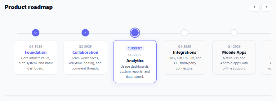
A horizontal timeline visualises a sequence of events, milestones, or phases laid out left-to-right — ideal for product roadmaps, company histories, project phases, and onboarding step indicators. Unlike vertical timelines (which work with unlimited height), horizontal timelines must handle overflow — this snippet uses horizontal scroll with hidden scrollbars, a scroll progress indicator, and arrow navigation buttons.
Three item states
Each .tl-item has one of three classes: .done (past milestones — filled indigo dot with checkmark), .active (current milestone — pulsing ring animation), or .upcoming (future milestones — empty grey dot, muted card background). The CSS responds to these classes automatically — no JavaScript state management needed for the visual differentiation.
The pulsing ring animation
The active dot has a .pulse class. Its ::after pseudo-element uses a @keyframes that oscillates scale (0.9 to 1.1) and opacity (0.4 to 1) — creating a breathing glow ring effect. This immediately draws the eye to the current timeline position.
The connecting line
A single .tl-line div is absolutely positioned at top: 53px (the dot centre) with left: 40px and right: 40px. It spans the full track width behind all dots. No JavaScript sizing needed — the absolute positioning with right: 40px automatically extends as the track grows with more items.
Overflow scroll without scrollbar
The .tl-scroll container has overflow-x: auto with scrollbar-width: none (Firefox) and ::-webkit-scrollbar { display: none } (Chrome/Safari). This allows natural scroll gestures on touch devices while hiding the scrollbar for a cleaner desktop appearance. The arrow buttons provide explicit navigation.
Auto-scroll to active item
On page load, scrollTo() centres the active item in the viewport. The timeout ensures the DOM is rendered before measuring offsetLeft. The calculation: item.offsetLeft - containerWidth/2 + itemWidth/2 centres the item precisely.
Connecting to real roadmap data
Replace the static HTML with dynamically generated items: fetch("/api/roadmap").then(r=>r.json()).then(data => { data.milestones.forEach(m => { const item = document.createElement("div"); item.className = "tl-item " + m.state; item.innerHTML = buildItemHTML(m); track.appendChild(item); }); autoScrollToActive(); }). Define buildItemHTML(m) to return the dot and card HTML from the milestone object. The auto-scroll and progress bar work identically with dynamic content.
Accessibility considerations
The horizontal timeline uses a scrollable region. Add role="region" and aria-label="Product roadmap timeline" to .tl-scroll for screen readers. Each .tl-item can include an aria-label with the date and event name. The prev/next buttons already have aria-label attributes. For keyboard users, the scroll container is focusable by default and arrow keys scroll horizontally when focused.
Step by step
How to Use
- 1Scroll horizontally or use the ‹ › arrowsThe timeline scrolls horizontally. Use arrow buttons or swipe on mobile. The thin progress bar below shows scroll position within the timeline.
- 2Update the timeline items and datesEdit each .tl-item div: change .tl-date, .tl-event, and .tl-desc text. The state classes (done/active/upcoming) control the visual appearance automatically.
- 3Change the current active itemMove class="tl-item active" to the item you want highlighted as current. Remove the .pulse class from the old dot div and add it to the new one. Move the .tl-badge "Current" label similarly.
- 4Add more timeline itemsDuplicate any .tl-item div and place it at the correct position. The connecting line automatically extends. Each item has min-width: 160px so they space consistently.
- 5Change the connecting line positionUpdate top: 53px on .tl-line to match the vertical centre of your dots. If you change the dot size or top padding, adjust this value to keep the line at dot height.
- 6Export in your formatClick "HTML" for a standalone file, "JSX" for a React component mapping a milestones array to timeline items, or "Tailwind" for a React + Tailwind CSS version.
Real-world uses
Common Use Cases
Got questions?
Frequently Asked Questions
Three CSS declarations together hide the scrollbar in all browsers while keeping scrolling functional. For Firefox: scrollbar-width: none on the container. For Chrome, Safari, Edge: .container::-webkit-scrollbar { display: none }. For Internet Explorer: -ms-overflow-style: none. The container still scrolls on touch swipe and mouse wheel horizontally — only the visual scrollbar track is hidden. This is the standard approach for all carousels and custom horizontal scroll areas.
The auto-scroll calculation: const offset = active.offsetLeft - scroll.clientWidth / 2 + active.offsetWidth / 2. This centres the active item in the visible scroll viewport. scroll.scrollTo({ left: offset, behavior: "smooth" }) animates to that position. The setTimeout(fn, 300) delay ensures the layout has rendered and offsetLeft has been computed before the scroll fires. Without the timeout, offsetLeft may be 0 during the synchronous render phase.
Define a milestones array: const milestones = [{ date: "Q1 2025", event: "Foundation", desc: "...", state: "done" }, ...]. Map to HTML: milestones.forEach(m => { const item = document.createElement("div"); item.className = "tl-item " + m.state; item.innerHTML = getItemHTML(m); track.appendChild(item); }). Where getItemHTML(m) returns the inner HTML with dot and card. Run this before the auto-scroll initialisation.
Click "JSX" to download. Define a milestones prop array with date, event, desc, and state fields. Map to timeline item divs with className derived from state. Use useRef for the scroll container. The auto-scroll useEffect depends on the milestones array. The progress bar state uses useState(0) updated by a scroll event listener attached in useEffect with cleanup.