


Vertical Timeline — Free HTML CSS Snippet
Vertical Timeline · Layouts · Plain HTML & CSS · Live preview
Copy & paste
Source Code
<div class="timeline">
  <div class="item">
    <div class="node done">✓</div>
    <div class="card">
      <div class="header">
        <strong>Project Kickoff</strong>
        <span class="date">Jan 2024</span>
      </div>
      <p>Team aligned on scope, tech stack chosen, design system bootstrapped. Repository created and CI/CD pipeline configured.</p>
      <div class="tags"><span class="tag green">Completed</span></div>
    </div>
  </div>
  <div class="item">
    <div class="node done">✓</div>
    <div class="card">
      <div class="header">
        <strong>Alpha Release</strong>
        <span class="date">Mar 2024</span>
      </div>
      <p>Core features shipped to internal testers. Authentication, dashboard, and data pipeline all functional.</p>
      <div class="tags"><span class="tag green">Completed</span></div>
    </div>
  </div>
  <div class="item active">
    <div class="node current">●</div>
    <div class="card">
      <div class="header">
        <strong>Public Beta</strong>
        <span class="date">Jun 2024</span>
      </div>
      <p>Open beta with 500 early access users. Collecting feedback, fixing edge cases, improving performance.</p>
      <div class="tags"><span class="tag blue">In Progress</span></div>
    </div>
  </div>
  <div class="item">
    <div class="node upcoming">4</div>
    <div class="card muted">
      <div class="header">
        <strong>v1.0 Launch</strong>
        <span class="date">Sep 2024</span>
      </div>
      <p>Full public launch with marketing campaign, pricing tiers, and customer support workflows.</p>
      <div class="tags"><span class="tag gray">Upcoming</span></div>
    </div>
  </div>
  <div class="item">
    <div class="node upcoming">5</div>
    <div class="card muted">
      <div class="header">
        <strong>Enterprise Tier</strong>
        <span class="date">Q1 2025</span>
      </div>
      <p>SSO, audit logs, dedicated infrastructure, SLA agreements and priority support for large teams.</p>
      <div class="tags"><span class="tag gray">Planned</span></div>
    </div>
  </div>
</div>
* { box-sizing: border-box; margin: 0; padding: 0; }
body { font-family: system-ui, sans-serif; background: #f8fafc; padding: 32px 24px; }
.timeline { max-width: 560px; margin: 0 auto; position: relative; display: flex; flex-direction: column; gap: 0; }
.timeline::before {
content: '';
position: absolute;
left: 19px; top: 20px; bottom: 20px;
width: 2px;
background: linear-gradient(to bottom, #6366f1, #e2e8f0 80%);
}
.item { display: flex; gap: 20px; position: relative; padding-bottom: 24px; }
.item:last-child { padding-bottom: 0; }
.node {
width: 40px; height: 40px; border-radius: 50%;
display: flex; align-items: center; justify-content: center;
font-size: 13px; font-weight: 700; flex-shrink: 0;
position: relative; z-index: 1;
border: 2px solid transparent;
}
.node.done { background: #6366f1; color: #fff; border-color: #6366f1; }
.node.current { background: #fff; color: #6366f1; border-color: #6366f1; box-shadow: 0 0 0 4px rgba(99,102,241,0.15); animation: pulse 2s infinite; }
.node.upcoming { background: #fff; color: #94a3b8; border-color: #e2e8f0; }
@keyframes pulse {
0%,100% { box-shadow: 0 0 0 4px rgba(99,102,241,0.15); }
50% { box-shadow: 0 0 0 8px rgba(99,102,241,0.05); }
}
.card {
flex: 1; background: #fff;
border: 1px solid #e2e8f0; border-radius: 12px;
padding: 16px; margin-top: 6px;
box-shadow: 0 2px 8px rgba(0,0,0,0.05);
transition: box-shadow 0.15s;
}
.card:hover { box-shadow: 0 4px 16px rgba(0,0,0,0.08); }
.card.muted { background: #f8fafc; box-shadow: none; }
.item.active .card { border-color: #6366f1; box-shadow: 0 4px 20px rgba(99,102,241,0.1); }
.header { display: flex; justify-content: space-between; align-items: baseline; margin-bottom: 8px; }
.header strong { font-size: 14px; color: #1e293b; }
.date { font-size: 11px; color: #94a3b8; font-weight: 500; }
p { font-size: 13px; color: #64748b; line-height: 1.6; margin-bottom: 10px; }
.tags { display: flex; gap: 6px; }
.tag { font-size: 10px; font-weight: 700; padding: 2px 8px; border-radius: 20px; }
.tag.green { background: rgba(34,197,94,0.1); color: #16a34a; }
.tag.blue { background: rgba(99,102,241,0.1); color: #4f46e5; }
.tag.gray { background: rgba(100,116,139,0.1);color: #64748b; }Extend with AI
Take This Snippet Further With AI
The AI prompt for this one is for Patreon supporters ($3 a month, 7 days free), along with a site with no ads. Supporters enter the passcode once and it is remembered in this browser.
What's included
Features
About this UI Snippet
Vertical Timeline — ::before Gradient Line, Node States & CSS Pulse
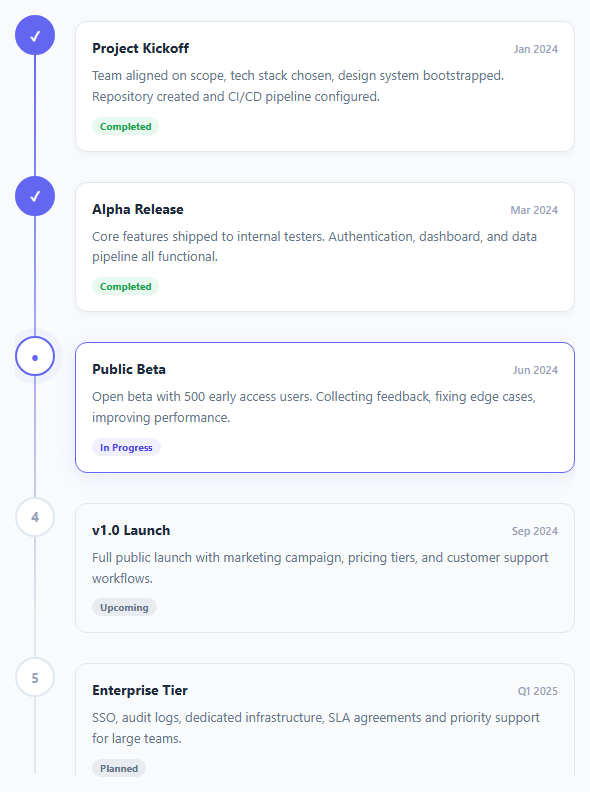
A vertical timeline displays events, steps, or milestones in chronological order along a vertical axis (for a horizontal layout, see the horizontal timeline). Used on product roadmaps, company history pages, onboarding steps, changelog entries, and project status pages. This snippet implements the full layout with a connecting gradient line, three node states, and a pulse animation on the active step — pure HTML and CSS.
The connecting gradient line
.timeline::before is an absolutely positioned pseudo-element: left: 19px; top: 20px; bottom: 20px; width: 2px — a 2px vertical bar centred on the 40px node circles. background: linear-gradient(to bottom, #6366f1, #e2e8f0 80%) fades the line from accent colour at the top to grey at 80%, suggesting that past events are defined and future events are pending.
Three node states
Each .node is a 40px circle. .done shows a filled background with a checkmark or number. .active shows a bordered circle with the accent colour. .pending shows a grey border with dimmed text. These three states communicate progress through the timeline.
The pulse animation on active
.node.active::after { animation: pulse 2s infinite } adds a growing ring behind the active node. The keyframe expands from scale(1) to scale(1.6) while fading to transparent — a soft radar-sweep that draws the eye to the current position.
Flex layout
Each .item uses display: flex; gap: 20px with the node on the left and content on the right. padding-bottom: 24px spaces items vertically. The node has position: relative; z-index: 1 to sit above the connecting line pseudo-element.
The ::before gradient line
The timeline container has ::before { content: ''; position: absolute; left: 20px; top: 0; bottom: 0; width: 2px; background: linear-gradient(to bottom, var(--accent), transparent); }. The gradient line fades from the accent colour at the top to transparent at the bottom, creating a natural end without a hard cut. Each timeline item is position: relative with left padding that offsets content from the line.
Node states
Each timeline node has one of three states: done (filled circle with checkmark — uses SVG or a Unicode ✓), active (accent ring with a CSS pulse animation), or pending (grey empty circle). The active node uses @keyframes pulse with box-shadow: 0 0 0 6px rgba(accent, 0.2) that scales in and out, creating a live "current position" indicator.
Connecting line fill animation
The fill line behind the main gradient line uses a height that increases as more steps complete. height: (completedSteps / totalSteps) * 100 + '%'. Animating this height via CSS transition: height 0.6s ease makes the line visually fill as the user progresses through the timeline.
Step by step
How to Use
- 1Load the snippetClick "Vertical Timeline" in the sidebar. The preview shows 4 steps with done, active, and pending states plus the gradient connecting line.
- 2Update step contentIn the HTML panel, change the date, title, and description text in each .item.
- 3Change node statesAdd or remove .done, .active, .pending classes on .node divs to reflect your current progress state.
- 4Add more stepsCopy an .item div and paste it inside .timeline. The connecting line auto-extends to the last item.
- 5Change the gradient line colourUpdate the linear-gradient on .timeline::before in the CSS panel to match your brand.
- 6Export in your formatClick "HTML" for a standalone file, "JSX" for a React component, or "Tailwind" for a React + Tailwind version.
Real-world uses
Common Use Cases
Got questions?
Frequently Asked Questions
.timeline::before is an absolutely positioned pseudo-element with position: absolute; left: 19px; top: 20px; bottom: 20px; width: 2px. The 19px left aligns it with the centre of the 40px node circles (40/2 - 1 = 19). The gradient fades from accent at top to grey at 80%.
.node.active::after is an absolutely positioned circle behind the active node. @keyframes pulse scales it from scale(1) to scale(1.6) while fading opacity from 0.4 to 0 over 2 seconds, repeating infinitely. This creates a radar-sweep ring effect.
Copy any .item div inside .timeline and paste it in position. Update the .node state class (done/active/pending) and the date, title, and description content. The ::before connecting line automatically extends.
Remove .active from the current node div and add it to the target node div. Remove .pending from that node. The CSS handles all visual changes — pulse animation, border colour, and text colour — automatically.
Replace the number text inside .node with an SVG element. Set width: 16px; height: 16px on the SVG and use stroke="currentColor" to inherit the node text colour.
Yes. Click "JSX" for a React component. Map over a steps array to render .item divs. Derive the node class from the step status: status === "done" ? "node done" : status === "active" ? "node active" : "node pending".