
Keyboard Keys (kbd) — Shortcut Key UI HTML CSS JS
Keyboard Keys · Buttons · Plain HTML, CSS & JS · Live preview
Copy & paste
Source Code
<div class="kbd-card">
  <h3>Keyboard shortcuts</h3>
  <ul class="kbd-list" id="kbdList"></ul>
  <p class="kbd-hint">Press any shortcut below — the keys light up.</p>
</div>*{box-sizing:border-box;margin:0;padding:0}
body{font-family:system-ui,-apple-system,sans-serif;background:#f1f5f9;min-height:100vh;display:flex;align-items:center;justify-content:center;padding:24px}
.kbd-card{background:#fff;border-radius:16px;padding:24px;width:100%;max-width:400px;box-shadow:0 18px 44px rgba(15,23,42,.08)}
.kbd-card h3{font-size:16px;font-weight:800;color:#0f172a;margin-bottom:16px}
.kbd-list{list-style:none;display:flex;flex-direction:column;gap:13px}
.kbd-list li{display:flex;align-items:center;justify-content:space-between;gap:12px}
.kbd-desc{font-size:13.5px;color:#475569;font-weight:600}
.kbd-combo{display:flex;align-items:center;gap:5px}
.kbd-plus{color:#cbd5e1;font-size:12px;font-weight:700}
kbd,.kbd{display:inline-flex;align-items:center;justify-content:center;min-width:26px;height:26px;padding:0 7px;
font-family:inherit;font-size:12px;font-weight:700;color:#334155;
background:linear-gradient(180deg,#fff,#f1f5f9);border:1px solid #cbd5e1;
border-radius:7px;box-shadow:0 2px 0 #cbd5e1,inset 0 1px 0 #fff;
transition:transform .08s,box-shadow .08s,background .08s}
.kbd.kbd-down{transform:translateY(2px);box-shadow:0 0 0 #cbd5e1,inset 0 1px 0 #fff;background:linear-gradient(180deg,#eef2ff,#e0e7ff);color:#4f46e5;border-color:#a5b4fc}// Each shortcut: the keys to display, the matching event keys, and a label.
var SHORTCUTS = [
{ keys: ['⌘', 'K'], match: ['meta', 'k'], desc: 'Open command palette' },
{ keys: ['⌘', 'S'], match: ['meta', 's'], desc: 'Save' },
{ keys: ['⌘', '⇧', 'P'], match: ['meta', 'shift', 'p'], desc: 'Command menu' },
{ keys: ['/'], match: ['/'], desc: 'Focus search' },
{ keys: ['Esc'], match: ['escape'], desc: 'Close / cancel' },
];
var list = document.getElementById('kbdList');
list.innerHTML = SHORTCUTS.map(function (s, si) {
var combo = s.keys.map(function (k, ki) {
return (ki ? '<span class="kbd-plus">+</span>' : '') + '<kbd class="kbd" data-s="' + si + '" data-k="' + ki + '">' + k + '</kbd>';
}).join('');
return '<li><span class="kbd-desc">' + s.desc + '</span><span class="kbd-combo">' + combo + '</span></li>';
}).join('');
function setDown(si, down) {
list.querySelectorAll('kbd[data-s="' + si + '"]').forEach(function (el) { el.classList.toggle('kbd-down', down); });
}
// Light up the matching shortcut's keys while it is held.
document.addEventListener('keydown', function (e) {
var typing = /^(input|textarea|select)$/i.test((e.target.tagName || ''));
SHORTCUTS.forEach(function (s, si) {
var ok = s.match.every(function (m) {
if (m === 'meta') return e.metaKey || e.ctrlKey;
if (m === 'shift') return e.shiftKey;
return e.key.toLowerCase() === m;
});
if (ok) {
if (!typing) e.preventDefault();
setDown(si, true);
}
});
});
document.addEventListener('keyup', function () {
SHORTCUTS.forEach(function (s, si) { setDown(si, false); });
});Extend with AI
Take This Snippet Further With AI
The AI prompt for this one is for Patreon supporters ($3 a month, 7 days free), along with a site with no ads. Supporters enter the passcode once and it is remembered in this browser.
What's included
Features
About this UI Snippet
Keyboard Keys — 3D Keycaps That Press Down on the Matching Shortcut
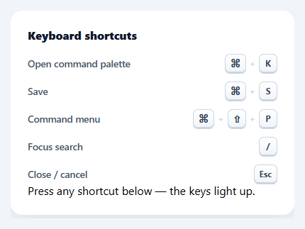
Styled keyboard keys (the <kbd> element) communicate shortcuts far better than plain text like "Cmd+K" — they look like real keycaps. This snippet builds a polished keyboard-key UI in plain HTML, CSS, and vanilla JavaScript: 3D keycaps with the right depth and shadows, laid out as a shortcut list, that actually *press down* when you hit the matching keys — no library or images.
Keycaps with real depth
Each key uses the semantic <kbd> element styled to look pressable: a subtle top-to-bottom gradient (lighter on top), a 1px border, and — the key detail — a box-shadow offset *downward* plus an inset highlight, which gives the cap a 3D lip as if it sits above the surface. This bottom-shadow-as-depth technique is what makes a keycap read as physical rather than a flat badge, the same trick behind every realistic key UI.
They press when you press
The standout feature: when you actually hit a shortcut, its on-screen keys depress. A document keydown listener checks each shortcut's modifier and key requirements against the event, and on a match adds a "down" class that translates the cap down by 2px and removes its drop shadow — so it looks pushed into the surface — then keyup releases it. Wiring the visual to real key events turns a static legend into a live demonstration, which is both delightful and genuinely instructive for teaching shortcuts.
Correct modifier matching
Each shortcut declares the keys to *display* (⌘, ⇧, K) separately from the keys to *match* (meta, shift, k), so the pretty symbols and the event logic stay decoupled. The matcher treats meta as either ⌘ or Ctrl (so it works on macOS and Windows), checks shiftKey, and compares the main key case-insensitively — the standard, cross-platform way to detect a shortcut. It also avoids hijacking keys while the user is typing in a field.
A clean shortcut list
The keys are laid out as a list pairing each shortcut with its description, with subtle + separators between caps in a combo. This description-plus-combo row is the conventional "keyboard shortcuts" layout you see in command palettes and help dialogs, and it's generated from a SHORTCUTS data array so it's easy to extend.
Drop-in and adaptable
Use the <kbd> styling alone anywhere you mention a shortcut in text, or use the whole list as a shortcuts help panel. Edit the SHORTCUTS array to your app's bindings. It's a clear, dependency-free reference for realistic keycap styling and live, cross-platform shortcut detection. If you wire these shortcuts to real actions rather than just a demo, remember the typing guard exists for a reason — a global / for search or a bare letter shortcut will otherwise fire while a user is mid-sentence in a text field, which is the most common way custom keyboard shortcuts break a normal typing experience.
Step by step
How to Use
- 1Paste HTML, CSS, and JSA shortcuts panel renders with realistic 3D keycaps next to each description.
- 2Press a shortcutHit any listed combo (e.g. ⌘K) and its on-screen keys depress, then release on keyup.
- 3Use the kbd style anywhereApply the kbd styling to inline <kbd> elements wherever you mention a shortcut in text.
- 4Edit the shortcutsChange the SHORTCUTS array — keys to display, keys to match, and the description.
- 5Match your platformmeta matches ⌘ or Ctrl automatically; adjust the display symbols per OS if needed.
- 6Wire real actionsTrigger your actual handlers in the keydown match alongside the press animation.
Real-world uses
Common Use Cases
meta matching either Command or Ctrl so one definition works across platforms.Got questions?
Frequently Asked Questions
Each <kbd> has a subtle vertical gradient (lighter top, darker bottom), a 1px border, and a box-shadow offset downward plus an inset top highlight. The downward shadow makes the cap appear to sit above the surface with a lip, and the inset highlight mimics the light edge of a real keycap. Removing that downward shadow and translating the cap down a couple pixels makes it look pressed.
A document keydown listener checks each shortcut's requirements against the event — modifiers and the main key. On a match, it adds a "down" class to that shortcut's <kbd> elements, which translates them down and flattens the shadow so they look depressed; keyup removes the class to release them. This ties the visual to actual key events, turning the legend into a live demo.
Each shortcut separates display keys (⌘, ⇧) from match keys (meta, shift, the letter). The matcher treats meta as true for either e.metaKey (⌘) or e.ctrlKey (Ctrl), so ⌘K on Mac and Ctrl+K on Windows both match, and it compares the main key case-insensitively. You can swap the displayed symbols per platform (⌘ vs Ctrl) while keeping the same match logic.
<kbd> is the semantic HTML element for keyboard input, so screen readers and assistive tech understand it represents keys the user presses, and it conveys meaning beyond styling. Styling the real element (rather than a generic span) keeps the markup meaningful and accessible while still letting you make it look like a keycap.
Render the shortcut list from an array and apply the kbd CSS. Attach the keydown/keyup listeners in a useEffect (React), onMounted/onUnmounted (Vue), or HostListener (Angular), tracking which shortcut is pressed in state to toggle the down class. The keycap styling and matcher logic are framework-agnostic — only the listeners and pressed state move into the framework.