
Minimal Hero — Free HTML CSS Clean Landing Snippet
Minimal Hero · Heroes · Plain HTML & CSS · Live preview
Copy & paste
Source Code
<section class="hero">
  <nav class="nav">
    <span class="nav-brand">Brand</span>
    <div class="nav-links">
      <a href="#">Product</a>
      <a href="#">Pricing</a>
      <a href="#">Docs</a>
    </div>
    <a href="#" class="nav-cta">Get started</a>
  </nav>

  <div class="content">
    <div class="kicker">For professional teams</div>
    <h1 class="headline">
      The clarity your<br>workflow deserves.
    </h1>
    <p class="sub">Stop juggling tools. One focused workspace for every team — designed to reduce noise and surface what matters.</p>
    <div class="cta-row">
      <a href="#" class="btn-fill">Start for free</a>
      <a href="#" class="btn-text">See how it works →</a>
    </div>
  </div>

  <div class="rule"></div>

  <div class="proof-row">
    <div class="proof-item"><strong>12k+</strong><span>Teams</span></div>
    <div class="proof-div"></div>
    <div class="proof-item"><strong>4.9 ★</strong><span>Rating</span></div>
    <div class="proof-div"></div>
    <div class="proof-item"><strong>99.9%</strong><span>Uptime</span></div>
    <div class="proof-div"></div>
    <div class="proof-item"><strong>SOC 2</strong><span>Compliant</span></div>
  </div>
</section>
* { box-sizing: border-box; margin: 0; padding: 0; }
body { font-family: system-ui, sans-serif; background: #fff; min-height: 100vh; }
.hero { min-height: 100vh; display: flex; flex-direction: column; max-width: 860px; margin: 0 auto; padding: 0 32px; }
.nav { display: flex; align-items: center; gap: 24px; padding: 20px 0; border-bottom: 1px solid #f1f5f9; }
.nav-brand { font-size: 16px; font-weight: 900; color: #0f172a; letter-spacing: -0.3px; }
.nav-links { display: flex; gap: 20px; flex: 1; }
.nav-links a { font-size: 13px; color: #64748b; text-decoration: none; font-weight: 500; transition: color 0.12s; }
.nav-links a:hover { color: #0f172a; }
.nav-cta { font-size: 13px; font-weight: 700; color: #fff; background: #0f172a; padding: 8px 18px; border-radius: 8px; text-decoration: none; transition: opacity 0.12s; }
.nav-cta:hover { opacity: 0.85; }
.content { flex: 1; display: flex; flex-direction: column; justify-content: center; padding: 80px 0 40px; gap: 20px; max-width: 620px; }
.kicker { font-size: 12px; font-weight: 700; letter-spacing: 1.5px; text-transform: uppercase; color: #6366f1; }
.headline { font-size: clamp(36px, 6vw, 64px); font-weight: 900; color: #0f172a; line-height: 1.1; letter-spacing: -1.5px; }
.sub { font-size: 16px; color: #64748b; line-height: 1.75; max-width: 460px; }
.cta-row { display: flex; align-items: center; gap: 16px; flex-wrap: wrap; padding-top: 4px; }
.btn-fill { background: #0f172a; color: #fff; font-size: 14px; font-weight: 700; padding: 12px 24px; border-radius: 10px; text-decoration: none; transition: opacity 0.12s; }
.btn-fill:hover { opacity: 0.85; }
.btn-text { font-size: 14px; font-weight: 600; color: #475569; text-decoration: none; transition: color 0.12s; }
.btn-text:hover { color: #0f172a; }
.rule { width: 100%; height: 1px; background: #f1f5f9; }
.proof-row { display: flex; align-items: center; gap: 24px; padding: 24px 0; flex-wrap: wrap; }
.proof-item { display: flex; flex-direction: column; gap: 2px; }
.proof-item strong { font-size: 16px; font-weight: 800; color: #0f172a; }
.proof-item span { font-size: 11px; color: #94a3b8; text-transform: uppercase; letter-spacing: 0.6px; font-weight: 600; }
.proof-div { width: 1px; height: 28px; background: #e2e8f0; }Extend with AI
Take This Snippet Further With AI
The AI prompt for this one is for Patreon supporters ($3 a month, 7 days free), along with a site with no ads. Supporters enter the passcode once and it is remembered in this browser.
What's included
Features
About this UI Snippet
Minimal Hero — Clean White Layout with Inline Nav, Kicker, Large Headline & Proof Stats
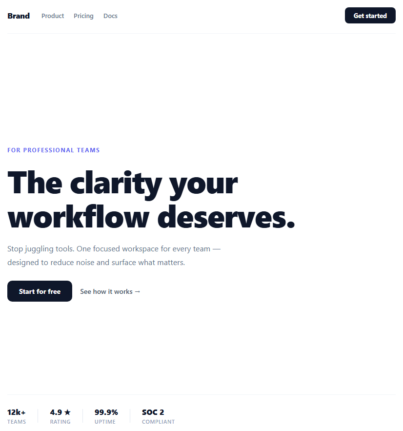
The minimal hero is the counter-movement to flashy gradient and mesh backgrounds. When your product speaks for itself, a clean white layout with strong typography communicates confidence and professionalism — the same approach used by Notion, Linear, Vercel, and Stripe at different points in their positioning. This snippet provides a complete minimal hero with an inline navigation bar, a kicker label, a large fluid headline, a subtitle, dual CTAs, and a proof stats row — all in plain HTML and CSS with zero JavaScript required.
The inline navigation
The nav sits at the top of the hero column with display: flex and a bottom border that separates it from the main content. Brand name on the left, navigation links in the centre (using flex: 1 to push them away from the brand), and a dark CTA button on the right. The nav links use colour #64748b in resting state and transition to #0f172a on hover — a subtle depth cue that does not distract from the primary CTAs.
Typography-first headline
The headline uses font-size: clamp(36px, 6vw, 64px) for fluid scaling and letter-spacing: -1.5px for the tight display type look used on premium SaaS homepages. The kicker label above uses uppercase, wide letter-spacing, and the accent colour — a three-layer hierarchy: kicker (context) → headline (value prop) → subtitle (explanation).
The dual CTA pattern
Two CTAs offer different commitment levels: the filled button ("Start for free") for users ready to sign up, and the text link ("See how it works →") for users who need more information first. The arrow on the text link signals navigation rather than action. This two-CTA pattern consistently outperforms single-CTA layouts for products with a non-trivial onboarding flow.
The proof stats row
Below a horizontal rule (signalling the end of the hero and start of social proof), four stats (12k+ Teams, 4.9 ★, 99.9% Uptime, SOC 2) are separated by 1px dividers. Each stat has a bold large number and a small uppercase label. This row addresses four common objections (adoption, quality, reliability, security) in one compact strip.
Why no background colour or image
The white background makes the page feel faster and cleaner. It also maximises contrast for the dark headline and grey subtitle. When combined with a product screenshot or illustration section below, the hero white acts as negative space that makes the demo section feel like it is floating above the page.
Step by step
How to Use
- 1Update the brand name and nav linksReplace "Brand" in the .nav-brand span with your product name. Edit the three .nav-links anchor texts (Product, Pricing, Docs) and their href values to match your site structure.
- 2Update the kicker, headline, and subtitleChange the .kicker text to your audience or positioning ("For indie developers", "For design teams"). Rewrite the h1 headline to your value proposition. Update the .sub paragraph with your benefit statement.
- 3Wire the CTA buttonsSet href="#" on .btn-fill to your signup URL and on .btn-text to your demo, video, or docs page. Change the button labels to match your primary action ("Get started", "Try free for 14 days", "Book a demo").
- 4Update the proof statsReplace the four .proof-item values (12k+, 4.9 ★, 99.9%, SOC 2) with your actual metrics. Choose stats that address common purchase objections: team size, rating, uptime, compliance certification, or years in business.
- 5Change the accent colourReplace #6366f1 in the CSS (used for the .kicker text) with your brand accent colour. Also update #0f172a (headline, dark button, nav CTA) if your brand uses a non-black primary.
- 6Export in your formatClick "HTML" for a standalone file to paste into your site, "JSX" for a React component, or "Tailwind" for a React + Tailwind CSS version.
Real-world uses
Common Use Cases
Got questions?
Frequently Asked Questions
After the .proof-row div, add a new section with a shadowed screenshot: <div style="padding: 40px 0;"><img src="screenshot.png" alt="Product screenshot" style="width:100%; border-radius:16px; box-shadow: 0 24px 80px rgba(0,0,0,0.12); border: 1px solid #e2e8f0;" /></div>. The white hero background creates a clean negative space that makes the screenshot appear to float.
Add position: sticky; top: 0; z-index: 100; background: rgba(255,255,255,0.95); backdrop-filter: blur(8px); to the .nav CSS rule. The sticky positioning keeps it visible on scroll. The backdrop-filter creates a frosted glass effect as content scrolls behind the nav bar. Remove border-bottom and add box-shadow: 0 1px 0 rgba(0,0,0,0.06) for a cleaner sticky state.
See the Hamburger Nav snippet in the Navigation category for a complete implementation. Add a hamburger button that appears on mobile via @media (max-width: 640px) { .nav-links { display: none } .burger { display: flex } }. The existing nav-brand and nav-cta stay visible. The hamburger toggles a mobile dropdown menu.
Click "JSX" to download. Use it as a server component in app/page.tsx — no "use client" needed since there is no JavaScript. For the nav CTA, use Next.js <Link href="/signup"> instead of <a>. For the proof stats, fetch real metrics from your database in an async server component and pass them as props: <MinimalHero teams={totalTeams} rating={avgRating} />.