

Orbit Loader — Animated Orbiting Dots Spinner
Orbit Loader · Loaders · Plain HTML, CSS & JS · Live preview
Copy & paste
Source Code
<div class="ob-stage">
  <div class="ob-loader" id="obLoader" role="status" aria-label="Loading">
    <div class="ob-core"></div>
    <div class="ob-orbit ob-o1"><span class="ob-planet"></span></div>
    <div class="ob-orbit ob-o2"><span class="ob-planet"></span></div>
    <div class="ob-orbit ob-o3"><span class="ob-planet"></span></div>
  </div>
  <div class="ob-controls">
    <button type="button" class="ob-chip is-on" data-speed="1">1x</button>
    <button type="button" class="ob-chip" data-speed="1.8">Fast</button>
    <button type="button" class="ob-chip" data-speed="0.5">Slow</button>
  </div>
</div>*{box-sizing:border-box;margin:0;padding:0}
body{font-family:system-ui,-apple-system,sans-serif;background:#0b1120;display:flex}
.ob-stage{margin:auto;display:flex;flex-direction:column;align-items:center;gap:30px;padding:48px}
.ob-loader{position:relative;width:120px;height:120px;--spd:1}
.ob-core{position:absolute;inset:0;margin:auto;width:22px;height:22px;border-radius:50%;background:radial-gradient(circle at 35% 30%,#a5b4fc,#6366f1);box-shadow:0 0 18px rgba(99,102,241,.7);animation:obPulse calc(2s / var(--spd)) ease-in-out infinite}
.ob-orbit{position:absolute;inset:0;border-radius:50%;border:1px solid rgba(148,163,184,.18)}
.ob-o1{transform:rotate(0deg);animation:obSpin calc(1.6s / var(--spd)) linear infinite}
.ob-o2{inset:18px;animation:obSpin calc(2.6s / var(--spd)) linear infinite reverse}
.ob-o3{inset:36px;animation:obSpin calc(3.4s / var(--spd)) linear infinite}
.ob-planet{position:absolute;top:-5px;left:50%;width:11px;height:11px;border-radius:50%;transform:translateX(-50%)}
.ob-o1 .ob-planet{background:#22d3ee;box-shadow:0 0 10px #22d3ee}
.ob-o2 .ob-planet{background:#f59e0b;box-shadow:0 0 10px #f59e0b;width:9px;height:9px}
.ob-o3 .ob-planet{background:#f472b6;box-shadow:0 0 10px #f472b6;width:8px;height:8px}
@keyframes obSpin{from{transform:rotate(0)}to{transform:rotate(360deg)}}
@keyframes obPulse{0%,100%{transform:scale(1);opacity:1}50%{transform:scale(1.25);opacity:.8}}
.ob-controls{display:flex;gap:8px}
.ob-chip{background:#1e293b;border:1px solid #334155;color:#cbd5e1;border-radius:20px;padding:6px 14px;font-size:12px;font-weight:700;cursor:pointer;font-family:inherit}
.ob-chip.is-on{background:#6366f1;border-color:#6366f1;color:#fff}
@media (prefers-reduced-motion:reduce){.ob-orbit,.ob-core{animation:none}}var loader = document.getElementById('obLoader');
var chips = Array.prototype.slice.call(document.querySelectorAll('.ob-chip'));
chips.forEach(function (chip) {
chip.addEventListener('click', function () {
chips.forEach(function (c) { c.classList.remove('is-on'); });
chip.classList.add('is-on');
loader.style.setProperty('--spd', chip.getAttribute('data-speed'));
});
});Extend with AI
Take This Snippet Further With AI
The AI prompt for this one is for Patreon supporters ($3 a month), along with a site with no ads. Supporters enter the passcode once and it is remembered in this browser.
What's included
Features
About this UI Snippet
Orbit Loader — Pure-CSS Orbiting Spinner with Speed Control
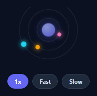
An orbit loader is a loading spinner styled as planets circling a glowing core — a more characterful alternative to a plain ring while staying lightweight and CSS-only. This snippet builds one with three independent orbits, a pulsing core, a speed control via a CSS variable, and reduced-motion support, in plain HTML and CSS with a sprinkle of JavaScript.
Orbits as rotating rings
Each orbit is a circular element that rotates with a CSS @keyframes spin, and a small "planet" dot sits at the top of each ring. Because the planet is a child of the rotating ring, spinning the ring carries the planet around its circular path — no per-frame trigonometry. Nesting three rings at decreasing inset gives concentric orbits, and giving each a different duration (and alternating direction) makes the motion feel organic rather than mechanical.
A pulsing core
In the centre, a radial-gradient core gently scales and fades on its own loop with a glowing box-shadow, anchoring the composition and adding life. The whole loader is built from a handful of divs with no images or SVG, so it's tiny and crisp at any size.
Speed via a CSS variable
All animation durations are expressed as a base time divided by a --spd custom property (e.g. calc(1.6s / var(--spd))). Changing one variable on the loader re-times every orbit and the pulse together, proportionally — so the speed control is a single style.setProperty('--spd', …) call, and a designer can re-tune the whole loader by editing one number. This is a clean demonstration of CSS variables driving coordinated animation.
Accessible and motion-safe
The loader is marked role="status" with an aria-label, so assistive tech announces that content is loading rather than ignoring a decorative spinner. A prefers-reduced-motion media query stops the animation for users who opt out, leaving a static, still-meaningful graphic — the responsible default for any looping animation.
Drop-in and themeable
Colours, sizes, orbit count, and speeds are all CSS, so restyling to match a brand or simplifying to two orbits takes minutes. It's a polished, dependency-free reference for a distinctive loading state that's still feather-light.
Step by step
How to Use
- 1Paste HTML and CSSAn orbit loader renders with three orbiting dots and a pulsing core.
- 2Drop it inShow it while content or a request is loading.
- 3Set the speedUse the chips, or set the --spd variable from your code.
- 4RecolorChange each planet and the core gradient to match your brand.
- 5Adjust orbitsAdd or remove an orbit ring and tune its duration.
- 6Respect motionIt already stops under prefers-reduced-motion.
Real-world uses
Common Use Cases
--spd variable retimes every animation proportionally.Got questions?
Frequently Asked Questions
Each orbit is a ring element that rotates via a CSS keyframe animation, and the planet dot is a child positioned at the top of that ring. When the ring rotates, the child rotates with it around the center, tracing a circle — so the orbit is pure CSS transform, with no requestAnimationFrame or trigonometry. Nesting rings at smaller insets creates concentric orbits.
Every animation duration is written as a base time divided by a --spd CSS variable, like calc(1.6s / var(--spd)). Setting --spd on the loader (the chips call style.setProperty) re-times all orbits and the core pulse together and proportionally, so the whole loader speeds up or slows down in sync from a single value. It is a neat example of variables coordinating multiple animations.
The loader has role="status" and an aria-label, so screen readers announce that something is loading instead of treating it as a meaningless decoration. It also respects prefers-reduced-motion, disabling the animation for users who are sensitive to motion while leaving a static graphic, which is the responsible way to ship any looping animation.
Yes. Add or remove an .ob-orbit element (with its planet) and give it an inset and animation duration; everything is CSS. Colors are set per planet and on the core's radial gradient, so recoloring to a brand palette or simplifying to two orbits takes a few lines and no logic changes.
Render the markup as a small component and toggle it while a loading flag is true. Expose speed as a prop that sets the --spd CSS variable via an inline style. The animations are pure CSS, so they port directly, and prefers-reduced-motion still applies. Tailwind users can apply sizing and colors with utilities and keep the keyframes in the stylesheet.